요약
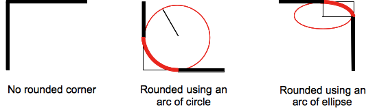
CSS의 border-radius 속성에는 둥근외곽선(rounded border)를 표현하는 방법이 정의되어 있다. 하나 혹은 두개의 반지름을 설정하여 각각 모서리의 굴곡을 설정할 수 있기 때문에, 원 혹은 타원의 모양으로 정의가 가능하다.
엘리먼트(element)에 외곽선(border)가 없어도, 반지름(radius)값은 background 속성에 적용된다. 잘려나가는(clipping) 부분에 대한 정확한 위치는 background-clip 속성값에 따라 결정된다.
4개의 모서리에 설정가능한 단축속성(shorthand)도 다음과 같이 제공된다. border-top-left-radius, border-top-right-radius, border-bottom-right-radius, border-bottom-left-radius.
border-radius:0 0 inherit inherit 와 같이 부분적으로 재정의(override)된 값을 사용할 수가 없다. 이러한 경우에는 표준속성(longhand)을 사용해야 한다.| 초기값 | as each of the properties of the shorthand: |
|---|---|
| 적용대상 | all elements; but User Agents are not required to apply to table and inline-table elements when border-collapse is collapse. The behavior on internal table elements is undefined for the moment.. It also applies to ::first-letter. |
| 상속 | no |
| Percentages | refer to the corresponding dimension of the border box |
| Media | visual |
| Computed value | as each of the properties of the shorthand:
|
| Animatable | as each of the properties of the shorthand:
|
| Canonical order | the unique non-ambiguous order defined by the formal grammar |
문법(Syntax)
기본문법: [ <length> | <percentage> ]{1,4}  [ / [ <length> | <percentage> ]{1,4}] ?
                \------------------------------/      \-------------------------------/
                           첫번째 반지름(radius) 지정                     두번째 반지름(radius) 지정(생략가능)
첫번째 반지름(radius)값을 지정하는 문법(1~4개 모서리에 설정):
border-radius: radius
border-radius: top-left-and-bottom-right top-right-and-bottom-left
border-radius: top-left top-right-and-bottom-left bottom-right
border-radius: top-left top-right bottom-right bottom-left

두번째 반지름을 지정하는 문법(1~4개 모서리에 설정):
border-radius: (first radius values) / radius
border-radius: (first radius values) / top-left-and-bottom-right top-right-and-bottom-left
border-radius: (first radius values) / top-left top-right-and-bottom-left bottom-right
border-radius: (first radius values) / top-left top-right bottom-right bottom-left

border-radius: inherit
속성 값(Values)
| radius |  |
외곽선(border)의 모서리 부분에 설정될 반지름(radius)을 나타내는 <length> 또는 <percentage> 타입의 값. 1개 값만을 설정하는 문법에서만 사용된다. |
| top-left-and-bottom-right |  |
엘리먼트(element) 외곽선(border)의 top-left와 bottom-right 모서리 부분에 설정될 반지름(radius)을 나타내는 <length> 또는 <percentage> 타입의 값. 2개 값만을 설정하는 문법에서만 사용된다. |
| top-right-and-bottom-left |  |
엘리먼트(element) 외곽선(border)의 top-right 와 bottom-left 모서리 부분에 설정될 반지름(radius)을 나타내는 <length> 또는 <percentage> 타입의 값. 2~3개의 값을 설정하는 문법에서만 사용된다. |
| top-left |  |
엘리먼트(element) 외곽선(border)의 top-left 모서리 부분에 설정될 반지름(radius)을 나타내는 <length> 또는 <percentage> 타입의 값. 3~4개의 값을 설정하는 문법에서만 사용된다. |
| top-right |  |
엘리먼트(element) 외곽선(border)의 top-right 모서리 부분에 설정될 반지름(radius)을 나타내는 <length> 또는 <percentage> 타입의 값. 3~4개의 값을 설정하는 문법에서만 사용된다. |
| bottom-right |  |
엘리먼트(element) 외곽선(border)의 bottom-right 모서리 부분에 설정될 반지름(radius)을 나타내는 <length> 또는 <percentage> 타입의 값. 3~4개의 값을 설정하는 문법에서만 사용된다. |
| bottom-left |  |
엘리먼트(element) 외곽선(border)의 bottom-left 모서리 부분에 설정될 반지름(radius)을 나타내는 <length> 또는 <percentage> 타입의 값. 3~4의 값을 설정하는 문법에서만 사용된다. |
inherit |
부모엘리먼트(parent's element)에서 상속된 4개의 계산된 값을 의미하는 키워드. |
속성값(Values)
- <length>
- 원의 반지름(radius) 또는 타원의 장반경(semi-major), 단반경(semi-minor) 축의 크기를 나타낸다. CSS의
<length>타입으로 허용가능한 어떤 단위로도 지정이 가능하다. 음수는 지정이 불가능하다. - <percentage>
- 원의 반지름(radius) 또는 타원의 장반경(semi-major), 단반경(semi-minor) 축의 크기를 %(percentage)값으로 나타낸다. 가로축의 %값은 영역의 넓이(width) 값에 대응되고 세로축의 %값은 영역의 높이(height) 값에 대응된다. 음수는 사용 불가능하다.
예제:
border-radius: 1em/5em;

/* 는 아래와 동일하다 */

border-top-left-radius:     1em 5em;
border-top-right-radius:    1em 5em;
border-bottom-right-radius: 1em 5em;
border-bottom-left-radius:  1em 5em;
border-radius: 4px 3px 6px / 2px 4px;

/* 는 아래와 동일하다 */

border-top-left-radius:     4px 2px;
border-top-right-radius:    3px 4px;
border-bottom-right-radius: 6px 2px;
border-bottom-left-radius:  3px 4px;
예제(Examples)
  border: solid 10px;
  /* 외곽선(border)이 'D'형태가 된다. */
  border-radius: 10px 40px 40px 10px;
  border: groove 1em red;
  border-radius: 2em;
  background: gold;
  border: ridge gold;
  border-radius: 13em/3em;
  border: none;
  border-radius: 40px 10px;
  border: none;
  border-radius: 50%;
주의사항(Notes)
- 점(dotted), 파선(dashed)형태의 둥근 모서리 외곽선(rounded border corners)은 Gecko엔진에서는 실선으로 표시된다. bug 382721 를 참고.
border-radius는border-collapse속성이collapse인
테이블 엘리먼트(table element)에는 적용되지 않는다.- 오래된 WebKit 엔진은 다중 값(multiple values) 설정을 서로다른 방식으로 다룬다. (아래를 참조)
명세(Specifications)
| Specification | Status | Comment |
|---|---|---|
| CSS Backgrounds and Borders Module Level 3 The definition of 'border-radius' in that specification. |
Candidate Recommendation |
브라우저 호환성(Browser compatibility)
| Feature | Firefox (Gecko) | Chrome | Internet Explorer | Opera | Safari |
|---|---|---|---|---|---|
| Basic support | 4.0 (2.0) 1.0 (1.7 or earlier)-moz |
4.0 0.2-webkit |
9.0 | 10.5 | 5.0 3.0-webkit |
| Elliptical borders | 3.5 (1.9.1) | yes | yes | yes | yes, but see below |
| 4 values for 4 corners | yes | 4.0 | yes | yes | 5.0 |
| Percentages | yes was (see below) |
yes | yes | 11.5 | 5.1 |
| Feature | iOS Safari | Opera Mini | Opera Mobile | Android Browser |
|---|---|---|---|---|
| Basic support | 3.2-webkit | No support | No support | 2.1-webkit |
| Elliptical borders | ? | No support | No support | ? |
| 4 values for 4 corners | ? | No support | No support | ? |
| Percentages | ? | No support | No support | ? |
<percentage> 속성값(values)
- 오랜된 버전의 Chrome, Safari에서는 지원되지 않는다. (2010년 11월에 수정되었다.)
- Opera에서는 11.50 버전 이하에서 오류가 있다.
- Gecko 2.0 (Firefox 4) 이하에서는 비표준형식으로 구현이 되었다. 수직/수평 반지름은 모두 border가 설정된 영역의 가로(width)에 상대적인 값이다.
- 오래된 버전의 iOS (5이하) 및 Android (WebKit 532이하)에서는 지원되지 않는다.
Gecko에서의 주의사항
Gecko 2.0에서 -moz-border-radius 는 border-radius 으로 이름이 변경되었는데, Gecko 12.0까지는 -moz-border-radius 라는 이름도 별칭의 형태로 지원되었다. CSS3 표준에 맞추기 위해서 Gecko 2.0은
- 제안서(specification)에 적합하게
<percentage>값을 처리하는 방법이 변경되었다. 임의의 크기(size)로 지정된 엘리먼트(element)에 맞는 타원(ellipse)모양의 외곽선(border)를 지정하기 위해서는border-radius: 50%라고 입력하기만하면 된다. - 둥근모서리(rounded corner)가 컨텐츠(contents)와 이미지(image)를 깍아내도록 했다.(
overflow가visible값으로 설정되어있지 않은 경우)
-moz-border-radius에 대한 지원은 Gecko 13.0 (Firefox 13.0 / Thunderbird 13.0 / SeaMonkey 2.10) 에서 중단되었다.WebKit에서의 주의사항
오래된 Safari, Chrome 버전(WebKit 532.5 이전)은
- 4개 모서리에 설정은 1개의 값으로 설정하는 것만 지원된다. 서로 다른 반지름(radius)값을 지정하기 위해서는 일반속성(Long form properties) 이 사용되어야 한다.
- 슬래시(/)를 사용할 수 없다.2개의 값이 지정된다면, 4군데의 모서리에 타원형태의 와곽선(border)이 그려질 것이다.
/* 서로 동일하다: */

-webkit-border-radius: 40px 10px;
        border-radius: 40px/10px;
Opera 주의사항
Opera(11.60이전)에서는 교체된 엘리먼트(replaced element)에 border-radius 를 적용해도 둥근 모서리가 표현되지 않는다.
See also
둥근외곽선(Border-radius)과 관련된 CSS속성: border-top-left-radius, border-top-right-radius, border-bottom-right-radius, border-bottom-left-radius