Esta tradução está incompleta. Ajude atraduzir este artigo.
Sumário
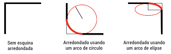
A propriedade CSS border-radius permite definir como bordas arredondadas são. A curva de cada esquina é definida usando um ou dois raios, definindo sua forma: círculo ou elipse.
O raio é aplicável a todo o background, mesmo se o elemento não tiver borda; a posição exata do recorte é definido pela propriedade background-clip.
Esta propriedade é um shorthand para definir as quatro propriedades border-top-left-radius, border-top-right-radius, border-bottom-right-radius e border-bottom-left-radius.
| Initial value | as each of the properties of the shorthand: |
|---|---|
| Aplica-se a | all elements; but User Agents are not required to apply to table and inline-table elements when border-collapse is collapse. The behavior on internal table elements is undefined for the moment.. It also applies to ::first-letter. |
| Inherited | não |
| Percentages | refer to the corresponding dimension of the border box |
| Midia | visual |
| Computed value | as each of the properties of the shorthand:
|
| Animatable | as each of the properties of the shorthand:
|
| Canonical order | the unique non-ambiguous order defined by the formal grammar |
Sintaxe
/* A sintaxe do primeiro raio permite de um a quatro valores */
/* O raio é definido para todos os 4 lados */
border-radius: 10px;

/* top-left-and-bottom-right | top-right-and-bottom-left */
border-radius: 10px 5%;

/* top-left | top-right-and-bottom-left | bottom-right */
border-radius: 2px 4px 2px;

/* top-left | top-right | bottom-right | bottom-left */
border-radius: 1px 0 3px 4px;

/* A sintaxe do segundo raio permite de um a quatro valores */
/* (first radius values) / radius */
border-radius: 10px 5% / 20px;

/* (first radius values) / top-left-and-bottom-right | top-right-and-bottom-left */
border-radius: 10px 5% / 20px 30px;

/* (first radius values) / top-left | top-right-and-bottom-left | bottom-right */
border-radius: 10px 5px 2em / 20px 25px 30%;

/* (first radius values) / top-left | top-right | bottom-right | bottom-left */
border-radius: 10px 5% / 20px 25em 30px 35em;

border-radius: inherit;
Valores
| radius |  |
Is a <length> or a <percentage> denoting a radius to use for the border in each corner of the border. It is used only in the one-value syntax. |
| top-left-and-bottom-right |  |
Is a <length> or a <percentage> denoting a radius to use for the border in the top-left and bottom-right corners of the element's box. It is used only in the two-value syntax. |
| top-right-and-bottom-left |  |
Is a <length> or a <percentage> denoting a radius to use for the border in the top-right and bottom-left corners of the element's box. It is used only in the two- and three-value syntaxes. |
| top-left |  |
Is a <length> or a <percentage> denoting a radius to use for the border in the top-left corner of the element's box. It is used only in the three- and four-value syntaxes. |
| top-right |  |
Is a <length> or a <percentage> denoting a radius to use for the border in the top-right corner of the element's box. It is used only in the four-value syntax. |
| bottom-right |  |
Is a <length> or a <percentage> denoting a radius to use for the border in the bottom-right corner of the element's box. It is used only in the three- and four-value syntaxes. |
| bottom-left |  |
Is a <length> or a <percentage> denoting a radius to use for the border in the bottom-left corner of the element's box. It is used only in the four-value syntax. |
inherit |
Is a keyword indicating that all four values are inherited from their parent's element calculated value. |
<length>- Denotes the size of the circle radius or the semi-major and semi-minor axes of the ellipsis. It can be expressed in any unit allowed by the CSS
<length>data types. Negative values are invalid. <percentage>- Denotes the size of the circle radius, or the semi-major and semi-minor axes of the ellipsis, using percentage values. Percentages for the horizontal axis refer to the width of the box, percentages for the vertical axis refer to the height of the box. Negative values are invalid.
For example:
border-radius: 1em/5em;

/* is equivalent to */

border-top-left-radius:     1em 5em;
border-top-right-radius:    1em 5em;
border-bottom-right-radius: 1em 5em;
border-bottom-left-radius:  1em 5em;
border-radius: 4px 3px 6px / 2px 4px;

/* is equivalent to: */

border-top-left-radius:     4px 2px;
border-top-right-radius:    3px 4px;
border-bottom-right-radius: 6px 2px;
border-bottom-left-radius:  3px 4px;
Sintaxe formal
<length-percentage>{1,4} [ / <length-percentage>{1,4} ]?where
<length-percentage> = <length> | <percentage>
Examples
  border: solid 10px;
  /* the border will curve into a 'D' */
  border-radius: 10px 40px 40px 10px;
  border: groove 1em red;
  border-radius: 2em;
  background: gold;
  border: ridge gold;
  border-radius: 13em/3em;
  border: none;
  border-radius: 40px 10px;
  border: none;
  border-radius: 50%;
Live Samples
Sample 1 : https://jsfiddle.net/Tripad/qnGKj/2/
Sample 2 : https://jsfiddle.net/Tripad/qnGKj/3/
Sample 3 : https://jsfiddle.net/Tripad/qnGKj/4/
Sample 4 : https://jsfiddle.net/Tripad/qnGKj/5/
Sample 5 : https://jsfiddle.net/Tripad/qnGKj/6/
Notas
- Prior to Firefox 50, dotted and dashed rounded border corners were rendered as solid; see bug 382721.
border-radiusdoes not apply to table elements whenborder-collapseiscollapse.- Old versions of WebKit handle multiple values differently, see below.
Especificações
| Specification | Status | Comment |
|---|---|---|
| CSS Backgrounds and Borders Module Level 3 The definition of 'border-radius' in that specification. |
Candidate Recommendation | Initial definition |
Compatibilidade
| Feature | Firefox (Gecko) | Chrome | Internet Explorer | Opera | Safari |
|---|---|---|---|---|---|
| Basic support | 1.0-webkit 4.0[9] |
9.0 | 10.5[8] | 3.0-webkit 5.0[9] |
|
| Elliptical borders | 3.5 (1.9.1) | (Yes)[7] | (Yes) | (Yes) | (Yes)[7] |
| 4 values for 4 corners | (Yes) | 4.0[6] | (Yes) | (Yes) | 5.0[6] |
| Percentages | (Yes)[5] 4.0 (2.0) |
(Yes)[2] | (Yes) | 11.5[3] | 5.1[2] |
| Feature | Firefox Mobile (Gecko) | iOS Safari | Opera Mini | Opera Mobile | Android Browser |
|---|---|---|---|---|---|
| Basic support | (Yes)[10] | 3.2-webkit | Não suportado | Não suportado | 2.1-webkit |
| Elliptical borders | (Yes)[10] | ? | Não suportado | Não suportado | ? |
| 4 values for 4 corners | (Yes)[10] | ? | Não suportado | Não suportado | ? |
| Percentages | (Yes)[10] | (Yes)[4] | Não suportado | Não suportado | (Yes)[4] |
[1] In Gecko 2.0 (Firefox 4 / Thunderbird 3.3 / SeaMonkey 2.1) -moz-border-radius was renamed to border-radius; -moz-border-radius was supported as an alias until Gecko 12.0 (Firefox 12.0 / Thunderbird 12.0 / SeaMonkey 2.9). In order to conform to the CSS3 standard, Gecko 2.0 changes the handling of <percentage> values to match the specification. You can specify an ellipse as border on an arbitrary sized element just with border-radius: 50%;. Gecko 2.0 also makes rounded corners clip content and images (if overflow: visible is not set)
Support for the prefixed version (-moz-border-radius) was removed in Gecko 13.0 (Firefox 13.0 / Thunderbird 13.0 / SeaMonkey 2.10).
[2] <percentage> values are not supported in older Chrome and Safari versions (it was fixed in Sepember 2010).
[3] The implementation of <percentage> values was buggy in Opera prior to 11.50.
[4] <percentage> values are not supported in iOS versions prior to 5 and Android versions prior to WebKit 532.
[5] <percentage> values are implemented in a non-standard way prior to Gecko 2.0. Both horizontal and vertical radii were relative to the width of the border box.
[6] Safari and Chrome versions prior to WebKit 532.5 support only one value for all four corners. For different radii the border-top-left-radius long form properties must be used.
[7] Safari and Chrome versions prior to WebKit 532.5 don't support the slash / notation. If two values are specified, an elliptical border is drawn on all four corners. -webkit-border-radius: 40px 10px; is equivalent to border-radius: 40px/10px;.
[8] In Opera prior to version 11.60, applying border-radius to replaced elements will not have rounded corners.
[9] Current Chrome and Safari versions ignore border-radius on <select> elements unless -webkit-appearance is overridden to an appropriate value.
[10] Prior to Gecko 50.0 (Firefox 50.0 / Thunderbird 50.0 / SeaMonkey 2.47), border styles of rounded corners (with border-radius) were always rendered as if border-style was solid. This has been fixed in Gecko 50.0.
In addition to the unprefixed support, Gecko 44.0 (Firefox 44.0 / Thunderbird 44.0 / SeaMonkey 2.41) added support for a -webkit prefixed version of the property for web compatibility reasons behind the preference layout.css.prefixes.webkit, defaulting to false. Since Gecko 49.0 (Firefox 49.0 / Thunderbird 49.0 / SeaMonkey 2.46) the preference defaults to true.
Veja também
- Border-radius-related CSS properties:
border-top-left-radius,border-top-right-radius,border-bottom-right-radius,border-bottom-left-radius