Esta traducción está incompleta. Por favor, ayuda a traducir este artículo del inglés.
Resumen
La función CSS linear-gradient() crea una <image> la cual representa un degradado lineal de colores. El resultado de esta función es un objeto CSS de tipo dato <gradient>. Cómo cualquier otro degradado, un degradado lineal en CSS no es CSS <color> sino una imagen sin dimensiones intrínsecas; que significa, que no tiene un tamaño natural o predefinido, no hay un radio. Su tamaño concreto se ajustará al del elemento al cual se le aplica.
Linear gradients are defined by an axis, the gradient line, with each point on it being of a different color. Perpendicular lines to the gradient-line have one single color, the one of the point on the gradient line.
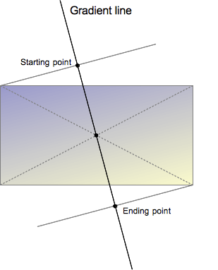
The gradient line is defined by the center of the box containing the gradient image and by an angle. The color of the gradient is defined by different points, the starting point, the ending point and, in between, optional stop-color points.
The starting point is the point on the gradient line where the color starts. It is defined by the intersection between the gradient line and a perpendicular passing by the box corner which is in the same quadrant.
Similarly the ending point is the point on the gradient line where the final color is reached. It can also be defined by an intersection between the gradient line and a perpendicular line issued by the nearby corner, but is more easily defined as the symmetric of the starting point, when a point reflection with an origin confounded with the center of the box.
These somewhat complex definitions of the starting and ending points lead to an interesting property sometimes called magic corners : the nearby corners of the starting and ending points also have the same color as the respective starting and ending points.
More than just the starting-point and ending-point colors can be specified. By defining additional color-stop points on the gradient line, the web developer can create a more customized transition between the starting and ending colors, or provide for a multi-color gradient.
The linear-gradient syntax does not allow for repeating gradients, but by using color-stop points, a similar effect can be achieved. For true repeating gradients, use the repeating-linear-gradient CSS property.
When the position of a color-stop point is implicitly defined, it is placed half-way between the point that precedes it and the one that follows it. The position can also be explicitly defined by using a <length> or a <percentage> CSS data type.
<image> data types. Therefore they can be used anywhere in CSS where an image data type is required. But, Gecko currently only supports CSS gradients as values of the background-image property, as well as within the shorthand background.For this reason,
linear-gradient won't work on background-color and other properties requesting <color>.Syntax
Formal grammar: linear-gradient( [ <angle> | to <side-or-corner> ,]? <color-stop> [, <color-stop>]+ ) \---------------------------------/ \----------------------------/ Definition of the gradient line List of color stops where<side-or-corner> = [left | right] || [top | bottom]and<color-stop> = <color> [ <percentage> | <length> ]?
linear-gradient( 45deg, blue, red );           /* A gradient on 45deg axis starting blue and finishing red */
linear-gradient( to left top, blue, red);      /* A gradient going from the bottom right to the top left starting blue and
                                                  finishing red */

linear-gradient( 0deg, blue, green 40%, red ); /* A gradient going from the bottom to top, starting blue, being green after 40%
                                                  and finishing red */
Values
<side-or-corner>- Represents the position of the starting-point of the gradient line. It consists of two keywords: the first one indicates the horizontal side,
leftorright, and the second one the vertical side,toporbottom. The order is not relevant and each of the keyword is optional.
The valuesto top,to bottom,to leftandto rightare translated into the angles0deg,180deg,270deg,90degrespectively. The others are translated into an angle that let the starting-point to be in the same quadrant than the described corner and so that the line defined by the starting-point and the corner is perpendicular to the gradient line. That way, the color described by the<color-stop>will exactly apply to the corner point. This is sometimes called the "magic corner" property. The end-point of the gradient line is the symmetrical point of the starting-point on the other direction of the center box. <angle>- An angle of direction for the gradient. See
<angle>. <color-stop>- This value is comprised of a
<color>value, followed by an optional stop position (either a percentage or a<length>along the gradient axis).
Rendering of color-stops in CSS gradients follows the same rules as color-stops in SVG gradients.
History of the syntax
The syntax of linear-gradient has evolved since the first Apple proposal implemented in 2008:
-webkit-gradient(<type>, <point> [, <radius>]?, <point> [, <radius>]? [, <stop>]*)
In the original syntax, the same function was used to create both linear and radial gradients. However, the parameters needed in each case were different, resulting in a syntax that varied with the value of the first parameter. The situation became more complicated if other types of gradients, like conical gradients, were added, requiring the use of functions and non-standard or inconsistent css value specifications. No draft was proposed to the W3C.
An alternative syntax was proposed and implemented by Mozilla in 2009. In this syntax, two CSS functions would be required; one for linear gradients, and the other for radial gradients. However, this syntax never shipped in a released product. A third syntax was proposed. This third syntax simplified the syntax for linear gradients to:
-moz-linear-gradient([ [ [top | bottom] || [left | right] ],]? <color-stop>[, <color-stop>]+);
The new syntax did not require the to(), from()and color-stop() functions, so they were dropped. The order of the top/bottom and left/right keywords was also recognized as unimportant, so Mozilla removed the constraint of having top/bottom defined first.
But the new syntax had still had one drawback: it allowed only vertical and horizontal gradients. Finally, the syntax below was proposed to the W3C. Following two more changes to solve the limitation on the direction of gradients, it was added to the CSS Images Values and Content Replacement Level 3 draft in 2011.
- The support of an
<angle>as an origin, allowing gradients of any direction. - The definition of the magic corner algorithm which eases the work of Web developers by allowing an easy definition of the exact color at the corners.
The color interpolation is also defined as happening in the pre-multiplied color space, in order to prevent non esthetic grey to appear when using color with different opacity. This syntax was implemented, prefixed, by both Webkit, without dropping the original one, and Trident (IE 10):
linear-gradient([[<angle>|[top | bottom] || [left | right] ],]? <color-stop>[, <color-stop>]+);
Unfortunately, the addition of the <angle> values to the syntax introduced an incoherence: the angle indicates a destination, but the keywords indicate a starting point.# This was fixed by a new syntax where the keyword are directions too, and preceded by the to keyword.
linear-gradient([ [[<angle>| to[top | bottom] || [left | right] ],]? <color-stop>[, <color-stop>]+);
This should be the final syntax.
A last semantic curiosity still exists between the prefixed variants and the unprefixed proposal. Following the initial Apple proposal, the prefixed variants of the syntax all uses the an <angle> defined like polar angles, that is with 0deg representing the East. To be coherent with the rest of CSS, the specification defines an angle with 0deg representing the North. To prevent sites using prefixed version of the property to get suddenly broken, even when adapting to the otherwise forward-compatible final syntax, they keep the original angle definition (0deg = East). They will switch to the correct spec when unprefixing the property. Also, as they aren't incompatible, Gecko supports, prefixed, both the syntax with the to keyword and without. Here again, the syntax without the keyword will be dropped when unprefixing.
Examples
Gradient at a 45 degree angle
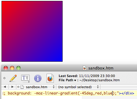
Positions can be specified along the gradient axis with a color for each of them, called "color-stops", and the areas between every color-stop smoothly transition between each other. Any one color in the gradient forms a straight line that is perpendicular to the gradient axis. In the below image, the gradient's axis starts from the top-left corner of the div, and is directed at a 45 degree angle. Two color-stops are specified, red and blue.
Gradient with multiple color stops
If the first color-stop does not have a <length> or <percentage>, it defaults to 0%. If the last color-stop does not have a <length> or <percentage>, it defaults to 100%. If a color-stop doesn't have a specified position and it isn't the first or last stop, then it is assigned the position that is half way between the previous stop and next stop.
Color-stops must be specified in order. After assigning default values to the first and last stops if necessary, if a color-stop has a specified position that is less than the specified position of any color-stop before it in the list, its position is changed to be equal to the largest specified position of any color-stop before it.
background: linear-gradient(to right, red, orange, yellow, green, blue, indigo, violet);
Repeating a linear gradient
The linear-gradient does not allow repeating gradients. By default, the gradient will stretch to fill the element it is defined on. For this functionality, see repeating-linear-gradient.
Using transparency
background-image: linear-gradient(to bottom right, red, rgba(255,0,0,0));
Gradient backgrounds are not affected by background-size if all points and lengths are specified using fixed units (as opposed to percentages or keywords, which are relative to the value of background-size).
Notes
If you set the background-image property of the <body> tag to a linear-gradient, the gradient won't fill the browser screen unless you also set the min-height property of the document root (e.g. the <html> tag) to 100%.
Specifications
| Specification | Status | Comment |
|---|---|---|
| CSS Image Values and Replaced Content Module Level 3 The definition of 'linear-gradient()' in that specification. |
Candidate Recommendation |
Browser compatibility
| Feature | Firefox (Gecko) | Chrome | Internet Explorer | Opera (Presto) | Safari |
|---|---|---|---|---|---|
Basic support(on background and background-image) |
3.6 (1.9.2)-moz[3] 16 (16) |
10.0 (534.16)-webkit [2][3] | 10.0 [1] | 11.10-o [3] | 5.1-webkit[2][3] |
On any properties that accept <image> |
No support | (Yes) | ? | ? | (Yes) |
| Legacy webkit syntax | No support | 3-webkit [2] | No support | No support | 4.0-webkit[2] |
Legacy from syntax (without to) |
3.6 (1.9.2)-moz [4] | 10.0 (534.16)-webkit [2] | 10 | 11.10-o[4] | 5.1-webkit[2] |
Standard syntax (using the to keyword) |
16 | 26.0 (537.27) | 10 | 12.10 | 6.1 |
[1] Internet Explorer 5.5 through 9.0 supports proprietary filter: progid:DXImageTransform.Microsoft.Gradient() filter.
[2] WebKit since 528 supports the legacy -webkit-gradient(linear,…) function. As of WebKit 534.16, it also supports the standard gradient syntax. Unlike in Gecko, in legacy WebKit you cannot specify both a position and angle in -webkit-linear-gradient(). You can achieve the same effect by offsetting the color stops.
[3] Gecko, Opera & Webkit considers <angle> to start to the right, instead of the top. I.e. it considered an angle of 0deg as a direction indicator pointing to the right. This is different from the latest specification where an angle of 0deg as a direction indicator points to the top.
[4] Firefox 3.6 and Opera 11.10 implemented, prefixed, an early syntax where the starting corner or side was indicated without the to keyword, and effectively considered as a from position. The to syntax has been added in Firefox 10 and Opera 11.60 , at first without removing the deprecated syntax and translation between the two is trivial:
linear-gradient(to top left, blue, red);
is almost the same as:
-moz-linear-gradient(bottom right, blue, red);
The legacy syntax, without to, is planned to go away when the prefix is removed.
Cross-browser gradients
Considering all prefixes above, here is a gradient from pink to green, top to bottom.
.grad {
  background-color: #F07575; /* fallback color if gradients are not supported */
  background-image: -webkit-linear-gradient(top, hsl(0, 80%, 70%), #bada55); /* For Chrome 25 and Safari 6, iOS 6.1, Android 4.3 */
  background-image:    -moz-linear-gradient(top, hsl(0, 80%, 70%), #bada55); /* For Firefox (3.6 to 15) */
  background-image:      -o-linear-gradient(top, hsl(0, 80%, 70%), #bada55); /* For old Opera (11.1 to 12.0) */
  background-image:         linear-gradient(to bottom, hsl(0, 80%, 70%), #bada55); /* Standard syntax; must be last */
}
The -moz- prefixed rules are used for compatibility with older versions (Fx 3.6 to Fx 15). The -webkit-prefix is the only one that still needs to be included for Android 4.3-, iOS up to 6.1, and Safari 6. When using a prefix, do not use 'to'.
See also
- Using CSS gradients,
radial-gradient(),repeating-linear-gradient(),repeating-radial-gradient(); - Some properties where it can be used:
background-image,background; - CSS Gradients Patterns Gallery, by Lea Verou;
- CSS3 Gradients Library, by Estelle Weyl.