Dieser Artikel benötigt eine redaktionelle Überprüfung. So können Sie helfen.
Diese Übersetzung ist unvollständig. Bitte helfen Sie, diesen Artikel aus dem Englischen zu übersetzen.
Die CSS linear-gradient() Funktion erstellt ein <image> welches aus einem konstanten Farbverlauf besteht. Das Ergebnis dieser Funktion ist ein Objekt des CSS <gradient> Daten-Typs. Wie jeder andere Farbverlauf, ist der CSS Farbverlauf keine CSS <color> sondern ein Bild mit keinen spezifischen Dimensionen; Also hat er weder eine natürliche oder bevorzugte Größe, noch ein Größenverhältnis. Seine genaue Größe wird durch die Größe seines zugehörigen Elements bedingt.
Ein konstanter Farbverlauf wird durch eine Achse, die gradient line, definiert wobei jeder Punkt auf dieser Linie eine andere Farbe hat. Senkrecht zur gradient line stehende Linien haben jeweils eine Farbe, die des jeweiligen Schnittpunks mit der gradient line.
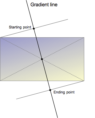 Die gradient line wird definiert durch einen Winkel und dem Mittelpunkt des Quadrates auf dem das gradienten Bild abgebildet wird. Der Farbverlauf wird durch verschiedene Punkte definiert, dem Startpunkt, dem Endpunkt und den optional dazwischen liegenden Farbunterbrechungspunkten.
Der Startpunkt ist der Punkt auf der gradient line, auf dem auch die Farbe anfängt. Er liegt genau auf dem Schnittpunkt der gradient line und einer Linie die senkrecht zu der Ecke des Bildes verläuft das im gleichen Quadranten liegt.
So ist auch der Endpunkt ein Punkt, an dem einer der beiden ausgesuchten Farben ganz erreicht wird. Er liegt auch genauso auf dem Schnittpunkt zwischen der gradient line und der aus der Ecke im gleichen Quadranten senkrecht verlaufenden Linie , einfacher ist er aber als Punktsymmetrische Spiegelung zum Startpunkt zu sehen, wobei der Spiegelpunkt dabei auf der Mitte des Bildes liegt.
Diese ungefähre und komplexe Definition des Start- und Endpunkts führt uns zu einer interessanten Eigenschaft, die manchnam magic corners genannt wird: die benachbarten Ecken der Start- und Endpunkte haben die gleiche Farbe, wie die jeweiligen Start- und Endpunkte.
Mehr als nur die Farben des Start- und Endpunkts können festgesetzt werden. Durch das definieren einiger Farbunterbrechungen, kann der Web-Entwickler einen mehr individuellen Übergang zwischen den Start- und den Endpunktfarben erreichen , oder einen mehrfarbigen Farbverlauf erstellen.
Der Syntax eines konstanten Farberlaufes erlaubt zwar keine Wiederholung von Farbverläufen, aber durch das Setzen von Farbunterbrechungen kann ein ähnlicher Effekt erzielt werden. Für wiederholende Farbverläufe,benutz die repeating-linear-gradient CSS Eigenschaft.
Wenn die Position einer Farbunterbrechung bedingungslos definiert wird, wird er genau auf halben Weg zwischen dem vorhergehenden und dem nachfolgenden Punkt gesetzt. Außerdem kann die Position genau bestimmt werden, indem ein <length> oder ein <percentage> CSS Datentyp benutzt wird.
<image> Datentypen definiert; sie können nur dann benutzt werden, wenn auch ein <image> Datentyp benötigt ist. Aus diesem Grund, wird ein linear-gradient nicht bei einer background-color und anderen Eigenschaften, die eine <color> benötigen, funktionieren.Syntax
linear-gradient( [ <angle> | to <side-or-corner> ,]? <color-stop> [, <color-stop>]+ ) \---------------------------------/ \----------------------------/ Definition of the gradient line List of color stops where<side-or-corner> = [left | right] || [top | bottom]and<color-stop> = <color> [ <percentage> | <length> ]?
linear-gradient( 45deg, blue, red );           /* A gradient on 45deg axis starting blue and finishing red */
linear-gradient( to left top, blue, red);      /* A gradient going from the bottom right to the top left starting blue and
                                                  finishing red */

linear-gradient( 0deg, blue, green 40%, red ); /* A gradient going from the bottom to top, starting blue, being green after 40%
                                                  and finishing red */
Values
<side-or-corner>- Represents the position of the starting-point of the gradient line. It consists of two keywords: the first one indicates the horizontal side,
leftorright, and the second one the vertical side,toporbottom. The order is not relevant and each of the keyword is optional.
The valuesto top,to bottom,to leftandto rightare translated into the angles0deg,180deg,270deg,90degrespectively. The others are translated into an angle that let the starting-point to be in the same quadrant than the described corner and so that the line defined by the starting-point and the corner is perpendicular to the gradient line. That way, the color described by the<color-stop>will exactly apply to the corner point. This is sometimes called the "magic corner" property. The end-point of the gradient line is the symmetrical point of the starting-point on the other direction of the center box. <angle>- An angle of direction for the gradient. See
<angle>. <color-stop>- This value is comprised of a
<color>value, followed by an optional stop position (either a percentage or a<length>along the gradient axis).
Rendering of color-stops in CSS gradients follows the same rules as color-stops in SVG gradients.
History of the syntax
The syntax of linear-gradient has evolved since the first Apple proposal implemented in 2008:
-webkit-gradient(<type>, <point> [, <radius>]?, <point> [, <radius>]? [, <stop>]*)
In the original syntax, the same function was used to create both linear and radial gradients. However, the parameters needed in each case were different, resulting in a syntax that varied with the value of the first parameter. The situation became more complicated if other types of gradients, like conical gradients, were added, requiring the use of functions and non-standard or inconsistent css value specifications. No draft was proposed to the W3C.
An alternative syntax was proposed and implemented by Mozilla in 2009. In this syntax, two CSS functions would be required; one for linear gradients, and the other for radial gradients. However, this syntax never shipped in a released product. A third syntax was proposed. This third syntax simplified the syntax for linear gradients to:
-moz-linear-gradient([ [ [top | bottom] || [left | right] ],]? <color-stop>[, <color-stop>]+);
The new syntax did not require the to(), from()and color-stop() functions, so they were dropped. The order of the top/bottom and left/right keywords was also recognized as unimportant, so Mozilla removed the constraint of having top/bottom defined first.
But the new syntax had still had one drawback: it allowed only vertical and horizontal gradients. Finally, the syntax below was proposed to the W3C. Following two more changes to solve the limitation on the direction of gradients, it was added to the CSS Images Values and Content Replacement Level 3 draft in 2011.
- The support of an
<angle>as an origin, allowing gradients of any direction. - The definition of the magic corner algorithm which eases the work of Web developers by allowing an easy definition of the exact color at the corners.
The color interpolation is also defined as happening in the pre-multiplied color space, in order to prevent non esthetic grey to appear when using color with different opacity. This syntax was implemented, prefixed, by both Webkit, without dropping the original one, and Trident (IE 10):
linear-gradient([[<angle>|[top | bottom] || [left | right] ],]? <color-stop>[, <color-stop>]+);
Unfortunately, the addition of the <angle> values to the syntax introduced an incoherence: the angle indicates a destination, but the keywords indicate a starting point.# This was fixed by a new syntax where the keyword are directions too, and preceded by the to keyword.
linear-gradient([ [[<angle>| to[top | bottom] || [left | right] ],]? <color-stop>[, <color-stop>]+);
This should be the final syntax.
A last semantic curiosity still exists between the prefixed variants and the unprefixed proposal. Following the initial Apple proposal, the prefixed variants of the syntax all uses the an <angle> defined like polar angles, that is with 0deg representing the East. To be coherent with the rest of CSS, the specification defines an angle with 0deg representing the North. To prevent sites using prefixed version of the property to get suddenly broken, even when adapting to the otherwise forward-compatible final syntax, they keep the original angle definition (0deg = East). They will switch to the correct spec when unprefixing the property. Also, as they aren't incompatible, Gecko supports, prefixed, both the syntax with the to keyword and without. Here again, the syntax without the keyword will be dropped when unprefixing.
Examples
Gradient at a 45 degree angle
Positions can be specified along the gradient axis with a color for each of them, called "color-stops", and the areas between every color-stop smoothly transition between each other. Any one color in the gradient forms a straight line that is perpendicular to the gradient axis. In the below image, the gradient's axis starts from the top-left corner of the div, and is directed at a 45 degree angle. Two color-stops are specified, red and blue.
<div style="width: 200px; height: 200px;"></div>
div {
  background: linear-gradient(135deg, red, blue);
}
Result:
Gradient that starts at 60% of the gradient line
Sometimes we don't want a gradient that starts at the beginning of the line, but later. To reach this, add a color stop with same color where you want the gradient to start.
<div style="width: 200px; height: 200px;"></div>
div {
  background: linear-gradient(135deg, red, red 60%, blue);
}
Result:
Gradient with multiple color stops
If the first color-stop does not have a <length> or <percentage>, it defaults to 0%. If the last color-stop does not have a <length> or <percentage>, it defaults to 100%. If a color-stop doesn't have a specified position and it isn't the first or last stop, then it is assigned the position that is half way between the previous stop and next stop.
Color-stops must be specified in order. After assigning default values to the first and last stops if necessary, if a color-stop has a specified position that is less than the specified position of any color-stop before it in the list, its position is changed to be equal to the largest specified position of any color-stop before it.
<div>A rainbow made from a gradient</div>
div {
  background: linear-gradient(to right, red, orange, yellow, green, blue, indigo, violet);
}
Result:
Repeating a linear gradient
The linear-gradient does not allow repeating gradients. By default, the gradient will stretch to fill the element it is defined on. For this functionality, see repeating-linear-gradient.
Using transparency
<div>Linear with transparency</div>
div {
  background: linear-gradient(to bottom right, red, rgba(255,0,0,0));
}
Result:
Gradient backgrounds are not affected by background-size if all points and lengths are specified using fixed units (as opposed to percentages or keywords, which are relative to the value of background-size).
Notes
If you set the background-image property of the <body> tag to a linear-gradient, the gradient won't fill the browser screen unless you also set the min-height property of the document root (e.g. the <html> tag) to 100%.
Specifications
| Specification | Status | Comment |
|---|---|---|
| CSS Image Values and Replaced Content Module Level 3 Die Definition von 'linear-gradient()' in dieser Spezifikation. |
Anwärter Empfehlung | Initial definition |
Browser compatibility
| Feature | Firefox (Gecko) | Chrome | Internet Explorer | Opera (Presto) | Safari |
|---|---|---|---|---|---|
Basic support (on background and background-image) |
3.6 (1.9.2)-moz[3] 16 (16)[5] |
10.0 (534.16)-webkit [2][3] | 10.0 [1] | 11.10-o [3] | 5.1-webkit[2][3] |
On border-radius |
29 (29) | (Ja) | (Ja) | (Ja) | (Ja) |
On any other property that accept <image> |
Nicht unterstützt | (Ja) | (Ja) | (Ja) | (Ja) |
| Legacy webkit syntax | Nicht unterstützt | 3-webkit [2] | Nicht unterstützt | Nicht unterstützt | 4.0-webkit[2] |
Legacy from syntax (without to) |
3.6 (1.9.2)-moz [4] | 10.0 (534.16)-webkit [2] | 10 | 11.10-o[4] | 5.1-webkit[2] |
Standard syntax (using the to keyword) |
16 (16) | 26.0 (537.27) | 10 | 12.10 | 6.1 |
| Interpolation hints (a percent without a color) | 36 (36) | 40 | 27 |
| Feature | Firefox (Gecko) | Chrome | Internet Explorer | Opera (Presto) | Safari |
|---|---|---|---|---|---|
| Basic support | 1.0 (1.9.2)-moz[3] 16.0 (16)[5] |
16-webkit |
10 | (Ja) | (Ja) |
[1] Internet Explorer 5.5 through 9.0 supports proprietary filter: progid:DXImageTransform.Microsoft.Gradient() filter.
[2] WebKit since 528 supports the legacy -webkit-gradient(linear,…) function. As of WebKit 534.16, it also supports the standard gradient syntax. Unlike in Gecko, in legacy WebKit you cannot specify both a position and angle in -webkit-linear-gradient(). You can achieve the same effect by offsetting the color stops.
[3] Gecko, Opera & Webkit considers <angle> to start to the right, instead of the top. I.e. it considered an angle of 0deg as a direction indicator pointing to the right. This is different from the latest specification where an angle of 0deg as a direction indicator points to the top.
[4] Firefox 3.6 and Opera 11.10 implemented, prefixed, an early syntax where the starting corner or side was indicated without the to keyword, and effectively considered as a from position. The to syntax has been added in Firefox 10 and Opera 11.60 , at first without removing the deprecated syntax and translation between the two is trivial:
linear-gradient(to top left, blue, red);
is almost the same as:
-moz-linear-gradient(bottom right, blue, red);
The legacy syntax, without to, is planned to go away when the prefix is removed.
[5]Before Firefox 36, Gecko didn't apply gradient on the pre-multiplied color space, leading to shade of grey unexpectedly appearing when used with transparency.
Cross-browser gradients
Considering all prefixes above, here is a gradient from pink to green, top to bottom.
.grad {
  background-color: #F07575; /* fallback color if gradients are not supported */
  background-image: -webkit-linear-gradient(top, hsl(0, 80%, 70%), #bada55); /* For Chrome 25 and Safari 6, iOS 6.1, Android 4.3 */
  background-image:    -moz-linear-gradient(top, hsl(0, 80%, 70%), #bada55); /* For Firefox (3.6 to 15) */
  background-image:      -o-linear-gradient(top, hsl(0, 80%, 70%), #bada55); /* For old Opera (11.1 to 12.0) */
  background-image:         linear-gradient(to bottom, hsl(0, 80%, 70%), #bada55); /* Standard syntax; must be last */
}
The -moz- prefixed rules are used for compatibility with older versions (Fx 3.6 to Fx 15). The -webkit-prefix is the only one that still needs to be included for Android 4.3-, iOS up to 6.1, and Safari 6. When using a prefix, do not use 'to'.
See also
- Using CSS gradients,
radial-gradient(),repeating-linear-gradient(),repeating-radial-gradient(); - Some properties where it can be used:
background-image,background; - CSS Gradients Patterns Gallery, by Lea Verou;
- CSS3 Gradients Library, by Estelle Weyl.