Dit artikel heeft een technische beoordeling nodig. Hoe u kunt helpen.
Onze vrijwilligers hebben dit artikel nog niet naar het Nederlands vertaald. Doe mee en help de klus te klaren!
CSS gradients are new types of <image> added in the CSS3 Image Module. Using CSS gradients lets you display smooth transitions between two or more specified colors. This lets you avoid using images for these effects, thereby reducing download time and bandwidth usage. In addition, because the gradient is generated by the browser, objects with gradients look better when zoomed, and you can adjust your layout much more flexibly.
Browsers support two types of gradients: linear, defined with the linear-gradient() function, and radial, defined with radial-gradient().
Linear gradients
To create a linear gradient, you set a starting point and a direction (specified as an angle) along which the gradient effect is applied. You also define color stops. Color stops are the colors you want Gecko to render smooth transitions among, and you must specify at least two of them, but can specify more to create more complex gradient effects.
Simple linear gradients
Here's a linear gradient that starts at the center (horizontally) and top (vertically), and starts blue, transitioning to white.
HTML
<div class="linear-gradient"></div>
css
.linear-gradient{
    background: linear-gradient(blue, white);
}
.linear-gradient{
    width:100px;
    height:100px;
}
Result
The following css has the same effect:
/* The old syntax, deprecated and prefixed, for old browsers */
background: -prefix-linear-gradient(top, blue, white);
/* The new syntax needed by standard-compliant browsers (Opera 12.1,
   IE 10, Firefox 16, Chrome 26, Safari 6.1), without prefix */
background: linear-gradient(to bottom, blue, white);
Changing the gradient to run from left to right
HTML
<div class="linear-gradient"></div>
CSS
.linear-gradient{
    /* The old syntax, deprecated and prefixed, for old browsers */
    background: -prefix-linear-gradient(left, blue, white);

    /* The new syntax needed by standard-compliant browsers (Opera 12.1,
     IE 10, Firefox 16, Chrome 26, Safari 6.1), without prefix */
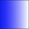
    background: linear-gradient(to right, blue, white);
}
.linear-gradient{
    width:100px;
    height:100px;
}
(See browser compatibility table for an overview of the prefixes necessary to support different browser versions).
Changing the same gradient to run from left to right:
Result
| Screen Shot | Live Demo |
 |
|
Making the gradient run diagonally
HTML
<div class="linear-gradient"></div>
CSS
.linear-gradient{
    /* The old syntax, deprecated and prefixed, for old browsers */
    background: -prefix-linear-gradient(left top, blue, white);

    /* The new syntax needed by standard-compliant browsers (Opera 12.1,
     IE 10, Firefox 16, Chrome 26, Safari 6.1), without prefix */
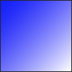
    background: linear-gradient(to bottom right, blue, white);
}
.linear-gradient{
    width:100px;
    height:100px;
}
(See browser compatibility table for an overview of the prefices necessary to support different browser versions).
You can make the gradient run diagonally by specifying both the horizontal and vertical starting positions. For example:
Result
| Screen Shot | Live Demo |
 |
|
Using angles
If you don't specify an angle, one is determined automatically based on the given direction. If you'd like more control over the direction of the gradient, you can set the angle specifically.
For example, here are two gradients, the first one with a direction of towards the right, and the second one has an angle of 70 degrees.
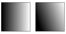
The one on the right uses CSS like this:
background: linear-gradient(70deg, black, white);
The angle is specified as an angle between a horizontal line and the gradient line, going counter-clockwise. In other words, 0deg creates a vertical gradient from the bottom to the top, while 90deg generates a left to right horizontal gradient:

background: linear-gradient(<angle>, red, white);
Note: several browsers implement, prefixed, an older draft of the specification where 0deg was pointing to the right rather than to the top. Pay attention in the value of the angle when mixing prefixed and standard linear-gradient. An easy formula to remember is 90 - x = y, where x is the standard usage, and y is the non-standard, vendor-prefixed usage.
Color stops
Color stops are points along the gradient line that will have a specific color at that location. The location can be specified as either a percentage of the length of the line, or as an absolute length. You may specify as many color stops as you like in order to achieve the desired effect.
If you specify the location as a percentage, 0% represents the starting point, while 100% represents the ending point; however, you can use values outside that range if necessary to get the effect you want.
Example: Three color stops
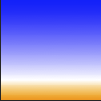
This example specifies three color stops:
| Screen Shot | Live Demo |
 |
|
/* The old syntax, deprecated and prefixed, for old browsers */
background: -prefix-linear-gradient(top, blue, white 80%, orange);

/* The new syntax needed by standard-compliant browsers (Opera 12.1,
   IE 10, Firefox 16, Chrome 26, Safari 6.1), without prefix */
background: linear-gradient(to bottom, blue, white 80%, orange);
Note that the first and last color stops don't specify a location; because of that, values of 0% and 100% are automatically assigned to the first and last colors respectively. The middle color stop specifies a location of 80%, putting it most of the way toward the bottom.
Example: Evenly spaced color stops
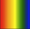
Here's an example using a wide variety of colors, all evenly spaced:
| Screen Shot | Live Demo |
 |
|
/* The old syntax, deprecated and prefixed, for old browsers */
background: -prefix-linear-gradient(left, red, orange, yellow, green, blue);

/* The new syntax needed by standard-compliant browsers (Opera 12.1,
   IE 10, Firefox 16, Chrome 26, Safari 6.1), without prefix */
background: linear-gradient(to right, red, orange, yellow, green, blue);
Notice that the color stops are automatically spaced evenly when no locations are specified.
Transparency and gradients
Gradients support transparency. You can use this, for example, when stacking multiple backgrounds, to create fading effects on background images. To achieve this, you may either use rgba colors, hsla colors, or the transparent keyword (see color values). However, be aware that some browsers render the transparent keyword as rgba(0,0,0,0) instead of rgba(255,255,255,0), which could cause some unexpected results (and potential dark spots) as the gradients blend together. Therefore it is safer to specify opaque gradients.
Here is an example of using transparency in gradients:

/* The old syntax, deprecated and prefixed, for old browsers */
background: -prefix-linear-gradient(left, rgba(255,255,255,0),
  rgba(255,255,255,1)), url(https://foo.com/image.jpg);

/* The new syntax needed by standard-compliant browsers (Opera 12.1,
   IE 10, Firefox 16, Chrome 26, Safari 6.1), without prefix */
background: linear-gradient(to right, rgba(255,255,255,0),
  rgba(255,255,255,1)), url(https://foo.com/image.jpg);
The backgrounds are stacked with the first specified background on top, and each successive background farther away. By stacking backgrounds this way, you can create very creative effects as seen above.
Radial gradients
Radial gradients are specified using the radial-gradient() functional notation. The syntax is similar to that for linear gradients, except you can specify the gradient's ending shape (whether it should be a circle or ellipse) as well as its size. By default, the ending shape is an ellipse with the same proportions than the container's box.
Color stops
You specify color stops the same way as for linear gradients. The gradient line extends out from the starting position in all directions.
Example: Evenly spaced color stops
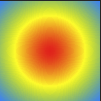
By default, as with linear gradients, the color stops are evenly spaced:
| Screen Shot | Live Demo |
 |
|
background: radial-gradient(red, yellow, rgb(30, 144, 255));
Example: Explicitly spaced color stops
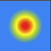
Here we specify specific locations for the color stops:
| Screen Shot | Live Demo |
 |
|
background: radial-gradient(red 5%, yellow 25%, #1E90FF 50%);
Size
This is one of the areas in which radial gradients differ from linear gradients. You can provide a size value that specifies the point that defines the size of the circle or ellipse. See this description of the size constants for specifics.
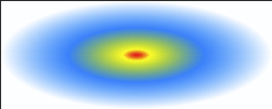
Example: closest-side for ellipses
This ellipse uses the closest-side size value, which means the size is set by the distance from the starting point (the center) to the closest side of the enclosing box.
| Screen Shot | Live Demo |
 |
|
background: radial-gradient(ellipse closest-side, red, yellow 10%, #1E90FF 50%, white);
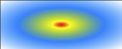
Example: farthest-corner for ellipses
This example is similar to the previous one, except that its size is specified as farthest-corner, which sets the size of the gradient by the distance from the starting point to the farthest corner of the enclosing box from the starting point.
| Screen Shot | Live Demo |
 |
|
background: radial-gradient(ellipse farthest-corner, red, yellow 10%, #1E90FF 50%, white);
Example: closest-side for circles
This example uses closest-side, which determines the circle's size as the distance between the start point (the center) and the closest side.
| Screen Shot | Live Demo |
 |
|
background: radial-gradient(circle closest-side, red, yellow 10%, #1E90FF 50%, white);
Here, the circle's radius is half the height of the box, since the top and bottom edges are equidistant from the start point and are closer than the left and right edges.
Repeating gradients
The linear-gradient() and radial-gradient() properties don't support automatically repeating the color stops. However, the repeating-linear-gradient() and repeating-radial-gradient() properties are available to offer this functionality.
Examples: Repeating linear gradient
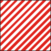
This example uses repeating-linear-gradient() to create a gradient:
| Screen Shot | Live Demo |
 |
|
background: repeating-linear-gradient(-45deg, red, red 5px, white 5px, white 10px);
Note that since no value is specified for the first color, it is automatically assigned the starting point value of each repeating portion of the gradient, i.e the effect is similar to that obtained when the starting value is given as 0px.
Another example using the repeating-linear-gradient() property.
background-color: #000;
background-image: repeating-linear-gradient(90deg, transparent, transparent 50px,
      rgba(255, 127, 0, 0.25) 50px, rgba(255, 127, 0, 0.25) 56px, transparent 56px, transparent 63px,
      rgba(255, 127, 0, 0.25) 63px, rgba(255, 127, 0, 0.25) 69px, transparent 69px, transparent 116px,
      rgba(255, 206, 0, 0.25) 116px, rgba(255, 206, 0, 0.25) 166px),
repeating-linear-gradient(0deg, transparent, transparent 50px, rgba(255, 127, 0, 0.25) 50px,
      rgba(255, 127, 0, 0.25) 56px, transparent 56px, transparent 63px, rgba(255, 127, 0, 0.25) 63px,
      rgba(255, 127, 0, 0.25) 69px, transparent 69px, transparent 116px, rgba(255, 206, 0, 0.25) 116px,
      rgba(255, 206, 0, 0.25) 166px),
repeating-linear-gradient(-45deg, transparent, transparent 5px, rgba(143, 77, 63, 0.25) 5px,
      rgba(143, 77, 63, 0.25) 10px),
repeating-linear-gradient(45deg, transparent, transparent 5px, rgba(143, 77, 63, 0.25) 5px,
      rgba(143, 77, 63, 0.25) 10px);
Example: Repeating radial gradient
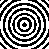
This example uses repeating-radial-gradient() to create a gradient:
| Screen Shot | Live Demo |
 |
|
background: repeating-radial-gradient(black, black 5px, white 5px, white 10px);
See also
- Gradient-related reference articles:
<image>,<gradient>,linear-gradient(),radial-gradient(),repeating-linear-gradient(),repeating-radial-gradient().
