The upcoming release of Mobile Firefox (Fennec) 1.1 features improved support for the <meta name="viewport"> tag. Previous versions of Fennec supported the width, height, and initial-scale viewport properties, but had problems with some sites designed for iPhone and Android browsers. We now support the same properties Mobile Safari does, and we also changed Fennec to render mobile sites more consistently on screens of different sizes and resolutions.
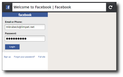
touch.facebook.com before:
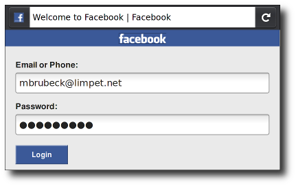
touch.facebook.com after:
You can see these changes for yourself in the latest Fennec 1.1 and trunk nightly builds for Maemo, Windows, Mac, or Linux.
Background
Mobile browsers like Fennec render pages in a virtual "window" (the viewport), usually wider than the screen, so they don't need to squeeze every page layout into a tiny window (which would break many non-mobile-optimized sites). Users can pan and zoom to see different areas of the page.
Mobile Safari introduced the "viewport meta tag" to let web developers control the viewport's size and scale. Many other mobile browsers now support this tag, although it is not part of any web standard. Apple's documentation does a good job explaining how web developers can use this tag, but we had to do some detective work to figure out exactly how to implement it in Fennec. For example, Safari's documentation says the content is a "comma-delimited list," but existing browsers and web pages use any mix of commas, semicolons, and spaces as separators.
Learn more about viewports in different mobile browsers in A Tale of Two Viewports at quirksmode.org.
Viewport basics
A typical mobile-optimized site contains something like the following:
<meta name="viewport" content="width=device-width, initial-scale=1">
The width property controls the size of the viewport. It can be set to a specific number of pixels like width=600 or to the special value device-width which is the width of the screen in CSS pixels at a scale of 100%. (There are corresponding height and device-height values, which may be useful for pages with elements that change size or position based on the viewport height.)
The initial-scale property controls the zoom level when the page is first loaded. The maximum-scale, minimum-scale, and user-scalable properties control how users are allowed to zoom the page in or out.
A pixel is not a pixel
The iPhone and many popular Android phones have 3- to 4-inch (7–10 cm) screens with 320—480 pixels (~160 dpi). Firefox for Maemo runs on the Nokia N900, which has the same physical size but 480—800 pixels (~240 dpi). Because of this, the last version of Fennec displayed many pages about one third smaller (in actual, physical size) than iPhone or Android. This caused usability and readability problems on many touch-optimized web sites. Peter-Paul Koch wrote about this problem in A pixel is not a pixel.
Fennec 1.1 for Maemo will use 1.5 hardware pixels for each CSS "pixel," following the lead of Android's WebKit-based browser. This means a page with initial-scale=1 will render at close to the same physical size in Fennec for Maemo, Mobile Safari for iPhone, and the Android Browser on both HDPI and MDPI phones. This is consistent with the CSS 2.1 specification, which says:
If the pixel density of the output device is very different from that of a typical computer display, the user agent should rescale pixel values. It is recommended that the pixel unit refer to the whole number of device pixels that best approximates the reference pixel. It is recommended that the reference pixel be the visual angle of one pixel on a device with a pixel density of 96dpi and a distance from the reader of an arm's length.
For web developers, this means that 320px be full width in portrait mode at scale=1, on all of the above-mentioned handheld devices, and they may size their layouts and images accordingly. But remember that not all mobile devices are the same width; you should also make sure that your pages work well in landscape mode, and on larger devices like the iPad and Android tablets.
On 240-dpi screens, pages with initial-scale=1 will effectively be zoomed to 150% by both Fennec and Android WebKit. Their text will be smooth and crisp, but their bitmap images will probably not take advantage of the full screen resolution. To get sharper images on these screens, web developers may want to design images – or whole layouts – at 150% of their final size (or 200%, to support 320-dpi devices such as a retina display iPhone) and then scale them down using CSS or viewport properties.
The default ratio depends on the display density. On a display with density less than 200dpi, the ratio is 1.0. On displays with density between 200 and 300dpi, the ratio is 1.5. For displays with density over 300dpi, the ratio is the integer floor(density/150dpi). Note that the default ratio is true only when the viewport scale equals 1. Otherwise, the relationship between CSS pixels and device pixels depends on the current zoom level.
Viewport width and screen width
Many sites set their viewport to "width=320, initial-scale=1" to fit precisely onto the iPhone display in portrait mode. As mentioned above, this caused problems when Fennec 1.0 rendered these sites, especially in landscape mode. To fix this, Fennec 1.1 will expand the viewport width if necessary to fill the screen at the requested scale. This matches the behavior of Android and Mobile Safari, and is especially useful on large-screen devices like the iPad. (Allen Pike's Choosing a viewport for iPad sites has a good explanation for web developers.)
For pages that set an initial or maximum scale, this means the width property actually translates into a minimum viewport width. For example, if your layout needs at least 500 pixels of width then you can use the following markup. When the screen is more than 500 pixels wide, the browser will expand the viewport (rather than zoom in) to fit the screen:
<meta name="viewport" content="width=500, initial-scale=1">
Fennec 1.1 also adds support for minimum-scale, maximum-scale, and user-scalable, with defaults and limits similar to Safari's. These properties affect the initial scale and width, as well as limiting changes in zoom level.
Mobile browsers handle orientation changes slightly differently. For example, Mobile Safari often just zooms the page when changing from portrait to landscape, instead of laying out the page as it would if originally loaded in landscape. If web developers want their scale settings to remain consistent when switching orientations on the iPhone, they must add a maximum-scale value to prevent this zooming, which has the sometimes-unwanted side effect of preventing users from zooming in:
<meta name="viewport" content="initial-scale=1, maximum-scale=1">
This is not necessary in Fennec; when the device changes orientation, Fennec updates the viewport size, the page layout, and JavaScript/CSS properties like device-width, based on its new window dimensions.
Common viewport sizes for mobile and tablet devices
If want to know what mobile and tablet devices have which viewport widths, there is a comprehensive list of mobile and tablet viewport sizes here. This gives information such as viewport width on portrait and landscape orientation as well as physical screen size, operating system and the pixel density of the device.
Specifications
| Specification | Status | Comment |
|---|---|---|
| CSS Device Adaptation The definition of '<meta name="viewport">' in that specification. |
Working Draft | Non-normatively describes the Viewport META element |
There is clearly demand for the viewport meta tag, since it is supported by most popular mobile browsers and used by thousands of web sites. It would be good to have a true standard for web pages to control viewport properties. As the standardization process proceeds, we at Mozilla will work to keep up to date with any changes.