To tłumaczenie jest niekompletne. Pomóż przetłumaczyć ten artykuł z języka angielskiego.
Nadchodzące wydanie Mobile Firefox (Fennec) 1.1 zawiera ulepszone wsparcie dla znacznika <meta name="viewport">. Poprzednie wersje Fenneca wspierały właściwości width (szerokość), height (wysokość), i initial-scale tego znacznika, jednakże witryny projektowane pod iPhone'a i urządzenia z systemem Android miały z tym problemy. Od tej chwili spieramy te same właściwości jak Mobile Safari, a także Fennec wyświetla strony mobilne zwięźle na ekranach o różnych rozmiarach i rozdzielczościach.
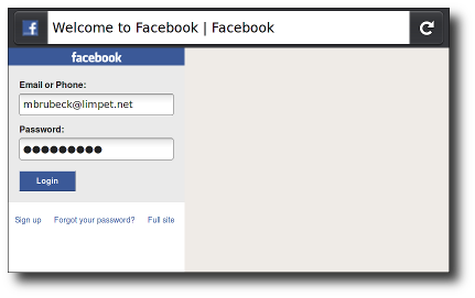
touch.facebook.com przedtem:
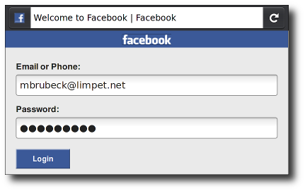
touch.facebook.com teraz:
Już teraz możesz zobaczyć te zmiany w najnowszym Fennecu 1.1 i trunk nightly builds dla Maemo, Windows, Maca czy Linuxa.
Skąd to się wzięło
Przeglądarki mobilne, takie jak Fennec wyświetlają strony w wirtualnym "okienku" (viewport), zazwyczaj jest on szerszy niż ekran, tak aby strony nie zoptymalizowane pod wyświetlanie na urządzeniach mobilnych nie musiały się ściaskać w wąskim okienku. Użytkownicy mogą sobie przybliżyć i przesuwać ekran by zobaczyć inne części strony.
Mobilna wersja Safari przedstawiła "viewport meta tag", aby pozwolić developerom na kontrolę rozmiar widocznego pola i jego skalowanie. Dziś wiele przeglądarek mobilnych wspiera już użycie tego znacznika, nie jest on jednak żadnym standardem. Dokumentacja Apple'a świetnia wyjaśnia jak developerzy mogą używać tego znacznika. Nam jednak zajęło to sporo czasu zanim rozgryzienie jak możemy zaimplementować to w Fennecu. Na przykład: dokumentacja Safari mówi, że właściwość content to "dzielona przecinkami lista", problem w tym, że obecnie działające przeglądarki i strony używają różnych mieszanek przecinków, średników i spacji jako separatorów.
Aby zaczerpnąć więcej informacji zachęcamy do przeczytaniat A Tale of Two Viewports na quirksmode.org.
Podstawy viewport
Każda witryna zoptymalizowana do wyświetlania na urządzeniach mobilnych powinna zawierać coś takiego:
<meta name="viewport" content="width=device-width, initial-scale=1">
Właściwość width (szerokość) kontroluje wielkość widocznego pola. Można jej przyisać konkretną liczbę albo specjalne słowo kluczowe - device-width, które oznacza nadanie wielkości ekranu w pikselach przy zoomie na poziomie 100%. (Istnieją również height i device-height, które przydadzą się w przypadku gdy wielkość danego elementu zależy od wysokości ekranu.)
Właściwość initial-scale kontroluje poziom zbliżenia po załadowaniu strony. Właściwości maximum-scale, minimum-scale i user-scalable mówią o tym jak bardzo przybliżać/oddalać może sam użytkownik.
Nie każdy piksel jest taki sam (A pixel is not a pixel)
iPhone'y, a także wiele popularnych urządzeniem z systemem Android posiada ekrany o wielkości od 3 do 4 cali (7–10 cm) z rozdzielczością 320—480 pixels (~160 dpi). Firefox dla Maemo działa na urządzeniu Nokia N900, które ma takie same wymiary ale rozdzielczość 480—800 pixels (~240 dpi). Dlatego też, najnowsza wersja Fenneca wyświetlała wiele stron nawet do trzech razy mniejsze niż na iPhonie czy urządzeniach z Androidem. Spowodowało to wiele problemów z użytkowaniem i czytelnością stron zoptymalizowanych pod urządzenia dotykowe. Peter-Paul Koch napisał artykuł na temat zatytułowany A pixel is not a pixel.
Fennec 1.1 for Maemo will use 1.5 hardware pixels for each CSS "pixel," following the lead of Android's WebKit-based browser. This means a page with initial-scale=1 will render at close to the same physical size in Fennec for Maemo, Mobile Safari for iPhone, and the Android Browser on both HDPI and MDPI phones. This is consistent with the CSS 2.1 specification, which says:
If the pixel density of the output device is very different from that of a typical computer display, the user agent should rescale pixel values. It is recommended that the pixel unit refer to the whole number of device pixels that best approximates the reference pixel. It is recommended that the reference pixel be the visual angle of one pixel on a device with a pixel density of 96dpi and a distance from the reader of an arm's length.
For web developers, this means that 320px be full width in portrait mode at scale=1, on all of the above-mentioned handheld devices, and they may size their layouts and images accordingly. But remember that not all mobile devices are the same width; you should also make sure that your pages work well in landscape mode, and on larger devices like the iPad and Android tablets.
On 240-dpi screens, pages with initial-scale=1 will effectively be zoomed to 150% by both Fennec and Android WebKit. Their text will be smooth and crisp, but their bitmap images will probably not take advantage of the full screen resolution. To get sharper images on these screens, web developers may want to design images – or whole layouts – at 150% of their final size (or 200%, to support 320-dpi devices such as a retina display iPhone) and then scale them down using CSS or viewport properties.
The default ratio depends on the display density. On a display with density less than 200dpi, the ratio is 1.0. On displays with density between 200 and 300dpi, the ratio is 1.5. For displays with density over 300dpi, the ratio is the integer floor(density/150dpi). Note that the default ratio is true only when the viewport scale equals 1. Otherwise, the relationship between CSS pixels and device pixels depends on the current zoom level.
Viewport width and screen width
Many sites set their viewport to "width=320, initial-scale=1" to fit precisely onto the iPhone display in portrait mode. As mentioned above, this caused problems when Fennec 1.0 rendered these sites, especially in landscape mode. To fix this, Fennec 1.1 will expand the viewport width if necessary to fill the screen at the requested scale. This matches the behavior of Android and Mobile Safari, and is especially useful on large-screen devices like the iPad. (Allen Pike's Choosing a viewport for iPad sites has a good explanation for web developers.)
For pages that set an initial or maximum scale, this means the width property actually translates into a minimum viewport width. For example, if your layout needs at least 500 pixels of width then you can use the following markup. When the screen is more than 500 pixels wide, the browser will expand the viewport (rather than zoom in) to fit the screen:
<meta name="viewport" content="width=500, initial-scale=1">
Fennec 1.1 also adds support for minimum-scale, maximum-scale, and user-scalable, with defaults and limits similar to Safari's. These properties affect the initial scale and width, as well as limiting changes in zoom level.
Mobile browsers handle orientation changes slightly differently. For example, Mobile Safari often just zooms the page when changing from portrait to landscape, instead of laying out the page as it would if originally loaded in landscape. If web developers want their scale settings to remain consistent when switching orientations on the iPhone, they must add a maximum-scale value to prevent this zooming, which has the sometimes-unwanted side effect of preventing users from zooming in:
<meta name="viewport" content="initial-scale=1, maximum-scale=1">
This is not necessary in Fennec; when the device changes orientation, Fennec updates the viewport size, the page layout, and JavaScript/CSS properties like device-width, based on its new window dimensions.
Common viewport sizes for mobile and tablet devices
If want to know what mobile and tablet devices have which viewport widths, there is a comprehensive list of mobile and tablet viewport sizes here. This gives information such as viewport width on portrait and landscape orientation as well as physical screen size, operating system and the pixel density of the device.
Specifications
| Specification | Status | Comment |
|---|---|---|
| CSS Device Adaptation The definition of '<meta name="viewport">' in that specification. |
Working Draft | Non-normatively describes the Viewport META element |
There is clearly demand for the viewport meta tag, since it is supported by most popular mobile browsers and used by thousands of web sites. It would be good to have a true standard for web pages to control viewport properties. As the standardization process proceeds, we at Mozilla will work to make sure we can implement any changes made during standardization.