Diese Übersetzung ist unvollständig. Bitte helfen Sie, diesen Artikel aus dem Englischen zu übersetzen.
Übersicht
Das HTML Element <input> ermöglicht es, interaktive Bedienelemente für webbasierte Formulare zu erstellen.
| Content categories | Flow content, listed, submittable, resettable, form-associated element, phrasing content. If the type has not the hidden value, labellable element, palpable content. |
|---|---|
| Permitted content | None, this is a void element. |
| Tag omission | Must have a start tag and must not have an end tag. |
| Permitted parent elements | Any element that accepts phrasing content. |
| DOM interface | HTMLInputElement |
Attribute
Dieses Element unterstützt die Verwendung von globalen Attributen.
type- Die Art Bedienelement, die erzeugt werden soll. Der Standard ist text, sollte dieses Attribut nicht angegeben werden. Möglich Werte sind:
button: Ein Knopf zum Drücken ohne voreingestelltes Verhalten.checkbox: Ein Kästchen zum Auswählen. Das value-Attribut muss benutzt werden, um den Wert zu definieren, der von diesem Element übermittelt wird. Mit dem checked-Attribut kann angezeigt werden, dass das Element ausgewählt ist. Es ist auch möglich das indeterminate-Attribut zu verwenden, um anzuzeigen, dass das Kästchen sich in einem undefinierten Zustand befindet (auf den meisten Plattformen wird dies durch eine horizontale Linie durch das Kästchen dargestellt).color: HTML5 Ein Bedienelement um eine Farbe festzulegen. Die Benutzerschnittstelle einer Farbauswahl muss nichts anderes tun, als einfache Farben als Text anzunehmen. (mehr Infos).date: HTML5 Ein Bedienelement um ein Datum einzugeben (Jahr, Monat und Tag, ohne Uhrzeit).datetime: HTML5 Ein Bedienelement um ein Datum mit Uhrzeit (Stunde, Minute, Sekunde und Bruchteil einer Sekunde) einzugeben, basierend auf der UTC Zeitzone.datetime-local: HTML5 Ein Bedienelement um ein Datum mit Uhrzeit einzugeben, ohne Zeitzone.email: HTML5 Ein Feld um eine E-Mail-Adresse zu bearbeiten. Der Eingabewert wird darauf überprüft, entweder eine leere Zeichenkette zu enthalten oder eine einzelne, valide E-Mail-Adresse, bevor er übermittelt wird. Die:valid- und:invalid-CSS-Pseudoklassen werden entsprechend angewandt.file: Ein Bedienelement welches den Nutzer eine Datei auswählen lässt. Das accept-Attribut definiert die Art von Dateien, welche ausgewählt werden können.hidden: Ein Bedienelement das nicht angezeigt wird, dessen Wert aber dennoch dem Server übermittelt wird.image: Ein graphischer Knopf zum Abschicken. Das src-Attribut wird benötigt, um die Quelle des Bildes anzugeben und das alt-Attribut um alternativen Text zu definieren. Die height- und width-Attribute können benutzt werden um die Größe des Bildes in Pixeln anzugeben.month: HTML5 Ein Bedienelement um Monat und Jahr einzugeben, ohne Zeitzone.number: HTML5 Ein Bedienelement um eine Gleitkommazahl einzugeben.password: Ein einzeiliges Textfeld dessen Wert verschleiert wird. Das maxlength-Attribut legt die maximale Länge des Wertes fest, welcher eingegeben werden kann.radio: Ein Schaltknopf. Das value-Attribut muss verwendet werden um den Wert, der von diesem Element übermittelt wird, festzulegen. Das checked-Attribut legt fest, ob dieses Element standardmäßig angewählt ist. Schaltknöpfe mit dem selben Wert für das name-Attribut sind in der selben Gruppe; nur ein Schaltknopf einer Gruppe kann auf einmal angewählt sein.range: HTML5 Ein Bedienelement zum Eintragen einer Zahl deren exakter Wert nicht wichtig ist. Diese Art Bedienelement verwendet die folgenden Standardwerte falls die entsprechenden Attribute nicht festgelegt werden:min: 0max: 100value:min+ (max-min)/2, orminifmaxis less thanminstep: 1
reset: Ein Knopf, der den Inhalt des Formulars auf die Standardwerte zurücksetzt.search: HTML5 Ein einzeiliges Textfeld zur Eingabe von Suchbegriffen. Zeilenumbrüche werden automatisch aus dem Eingabewert entfernt.submit: Ein Knopf zum Übermitteln des Formulars.tel: HTML5 Ein Bedienelement zum Anzeigen einer Telefonnummer. Zeilenumbrüche werden automatisch vom Eingabwert entfernt, doch sonst wird keine andere Syntax erzwungen. Attribute wie pattern und maxlength können verwendet werden um erlaubte Werte einzuschränken. Die:valid- und:invalid-CSS-Pseudoklassen werden entsprechend angewandt.text: Ein einzeiliges Textfeld; Zeilenumbrüche werden automatisch vom Eingabewert entfernt.time: HTML5 Ein Bedienelement zur Eingabe einer Uhrzeit ohne Zeitzone.url: HTML5 Ein Feld zur Eingabe einer URL. Der Eingabewert wird darauf überprüft, entweder eine leere Zeichenkette zu sein, oder eine korrekte, absolute URL, bevor er übermittelt wird. Zeilenumbrüche oder führende bzw. folgende Leerzeichen werden automatisch entfernt. Attribute wie pattern und maxlength können verwendet werden um erlaubte Werte einzuschränken. Die:valid- und:invalid-CSS-Pseudoklassen werden entsprechend angewandt.week: HTML5 Ein Bedienelement zur Eingabe eines Datums bestehend aus einer Jahreszahl und einer Wochennummer, ohne Zeitzone.
accept- If the value of the type attribute is
file, this attribute indicates the types of files that the server accepts; otherwise it is ignored. The value must be a comma-separated list of unique content type specifiers: accesskeyHTML 4 only, Veraltet seit HTML5- A single-character that the user can press to switch input focus to the control. This attribute is global in HTML5.
mozactionhint- Specifies an "action hint" used to determine how to label the enter key on mobile devices with virtual keyboards. Supported values are
go,done,next,search, andsend; these automatically get mapped to the appropriate string (and are case-insensitive). autocompleteHTML5- This attribute indicates whether the value of the control can be automatically completed by the browser. This attribute is ignored if the value of the type attribute is
hidden,checkbox,radio,file, or a button type (button,submit,reset,image). Possible values are:off: The user must explicitly enter a value into this field for every use, or the document provides its own auto-completion method; the browser does not automatically complete the entry.on: The browser can automatically complete the value based on values that the user has entered during previous uses.
If the autocomplete attribute is not specified on an input element, then the browser uses the autocomplete attribute value of the
<input>element's form owner. The form owner is either theformelement that this<input>element is a descendant of or the form element whose id is specified by the form attribute of the input element. For more information, see theautocompleteattribute in<form>. autofocusHTML5- This Boolean attribute lets you specify that a form control should have input focus when the page loads, unless the user overrides it, for example by typing in a different control. Only one form element in a document can have the autofocus attribute, which is a Boolean. It cannot be applied if the type attribute is set to
hidden(that is, you cannot automatically set focus to a hidden control). autosaveHTML5- This attribute should be defined as a unique value. If the value of the type attribute is
search, previous search term values will persist in the dropdown across page load. checked- When the value of the type attribute is
radioorcheckbox, the presence of this Boolean attribute indicates that the control is selected by default; otherwise it is ignored. disabled- This Boolean attribute indicates that the form control is not available for interaction. In particular, the
clickevent will not be dispatched on disabled controls. Also, a disabled control's value isn't submitted with the form.This attribute is ignored if the value of the type attribute is
hidden. formHTML5- The form element that the input element is associated with (its form owner). The value of the attribute must be an id of a
<form>element in the same document. If this attribute is not specified, this<input>element must be a descendant of a<form>element. This attribute enables you to place<input>elements anywhere within a document, not just as descendants of their form elements. An input can only be associated with one form. formactionHTML5- The URI of a program that processes the information submitted by the input element, if it is a submit button or image. If specified, it overrides the
actionattribute of the element's form owner. formenctypeHTML5- If the input element is a submit button or image, this attribute specifies the type of content that is used to submit the form to the server. Possible values are:
application/x-www-form-urlencoded: The default value if the attribute is not specified.multipart/form-data: Use this value if you are using an<input>element with thetypeattribute set tofile.text/plain
If this attribute is specified, it overrides the
enctypeattribute of the element's form owner. formmethodHTML5- If the input element is a submit button or image, this attribute specifies the HTTP method that the browser uses to submit the form. Possible values are:
post: The data from the form is included in the body of the form and is sent to the server.get: The data from the form are appended to the form attribute URI, with a '?' as a separator, and the resulting URI is sent to the server. Use this method when the form has no side-effects and contains only ASCII characters.
If specified, this attribute overrides the
methodattribute of the element's form owner. formnovalidateHTML5- If the input element is a submit button or image, this Boolean attribute specifies that the form is not to be validated when it is submitted. If this attribute is specified, it overrides the
novalidateattribute of the element's form owner. formtargetHTML5- If the input element is a submit button or image, this attribute is a name or keyword indicating where to display the response that is received after submitting the form. This is a name of, or keyword for, a browsing context (for example, tab, window, or inline frame). If this attribute is specified, it overrides the
targetattribute of the elements's form owner. The following keywords have special meanings:- _
self: Load the response into the same browsing context as the current one. This value is the default if the attribute is not specified. _blank: Load the response into a new unnamed browsing context._parent: Load the response into the parent browsing context of the current one. If there is no parent, this option behaves the same way as_self._top: Load the response into the top-level browsing context (that is, the browsing context that is an ancestor of the current one, and has no parent). If there is no parent, this option behaves the same way as_self.
- _
heightHTML5- If the value of the type attribute is
image, this attribute defines the height of the image displayed for the button. inputmodeHTML5- A hint to the browser for which keyboard to display. This attribute applies when the value of the type attribute is text, password, email, or url. Possible values are:
verbatim: Alphanumeric, non-prose content such as usernames and passwords.latin: Latin-script input in the user's preferred language with typing aids such as text prediction enabled. For human-to-computer communication such as search boxes.latin-name: As latin, but for human names.latin-prose: As latin, but with more aggressive typing aids. For human-to-human communication such as instant messaging for email.full-width-latin: As latin-prose, but for the user's secondary languages.kana: Kana or romaji input, typically hiragana input, using full-width characters, with support for converting to kanji. Intended for Japanese text input.katakana: Katakana input, using full-width characters, with support for converting to kanji. Intended for Japanese text input.numeric: Numeric input, including keys for the digits 0 to 9, the user's preferred thousands separator character, and the character for indicating negative numbers. Intended for numeric codes, e.g. credit card numbers. For actual numbers, prefer using <input type="number">tel: Telephone input, including asterisk and pound key. Use <input type="tel"> if possible instead.email: Email input. Use <input type="email"> if possible instead.url: URL input. Use <input type="url"> if possible instead.
listHTML5- Identifies a list of pre-defined options to suggest to the user. The value must be the id of a
<datalist>element in the same document. The browser displays only options that are valid values for this input element. This attribute is ignored when the type attribute's value ishidden,checkbox,radio,file, or a button type. maxHTML5- The maximum (numeric or date-time) value for this item, which must not be less than its minimum (min attribute) value.
maxlength- If the value of the type attribute is
text,email,search,password,tel, orurl, this attribute specifies the maximum number of characters (in Unicode code points) that the user can enter; for other control types, it is ignored. It can exceed the value of the size attribute. If it is not specified, the user can enter an unlimited number of characters. Specifying a negative number results in the default behavior; that is, the user can enter an unlimited number of characters. The constraint is evaluated only when the value of the attribute has been changed. minHTML5- The minimum (numeric or date-time) value for this item, which must not be greater than its maximum (max attribute) value.
minlengthHTML5- If the value of the type attribute is
text,email,search,password,tel, orurl, this attribute specifies the minimum number of characters (in Unicode code points) that the user can enter; for other control types, it is ignored. multipleHTML5- This Boolean attribute indicates whether the user can enter more than one value. This attribute applies when the type attribute is set to
emailorfile; otherwise it is ignored. name- The name of the control, which is submitted with the form data.
patternHTML5- A regular expression that the control's value is checked against. The pattern must match the entire value, not just some subset. Use the title attribute to describe the pattern to help the user. This attribute applies when the value of the type attribute is
text,search,tel,urloremail; otherwise it is ignored. The regular expression language is the same as JavaScript's. The pattern is not surrounded by forward slashes. placeholderHTML5- A hint to the user of what can be entered in the control . The placeholder text must not contain carriage returns or line-feeds. This attribute applies when the value of the type attribute is
text,search,tel,urloremail; otherwise it is ignored.Note: Do not use theplaceholderattribute instead of a<label>element. Their purposes are different: the<label>attribute describes the role of the form element; that is, it indicates what kind of information is expected, theplaceholderattribute is a hint about the format the content should take. There are cases in which theplaceholderattribute is never displayed to the user, so the form must be understandable without it. readonly- This Boolean attribute indicates that the user cannot modify the value of the control.
HTML5 This attribute is ignored if the value of the type attribute is
hidden,range,color,checkbox,radio,file, or a button type. requiredHTML5- This attribute specifies that the user must fill in a value before submitting a form. It cannot be used when the type attribute is
hidden,image, or a button type (submit,reset, orbutton). The:optionaland:requiredCSS pseudo-classes will be applied to the field as appropriate. selectionDirectionHTML5- The direction in which selection occurred. This is "forward" if the selection was made from left-to-right in an LTR locale or right-to-left in an RTL locale, or "backward" if the selection was made in the opposite direction. This can be "none" if the selection direction is unknown.
size- The initial size of the control. This value is in pixels unless the value of the type attribute is
textorpassword, in which case, it is an integer number of characters. Starting in HTML5, this attribute applies only when the type attribute is set totext,search,tel,url,email, orpassword; otherwise it is ignored. In addition, the size must be greater than zero. If you don't specify a size, a default value of 20 is used. spellcheckHTML5- Setting the value of this attribute to
trueindicates that the element needs to have its spelling and grammar checked. The valuedefaultindicates that the element is to act according to a default behavior, possibly based on the parent element's ownspellcheckvalue. The valuefalseindicates that the element should not be checked. src- If the value of the type attribute is
image, this attribute specifies a URI for the location of an image to display on the graphical submit button; otherwise it is ignored. stepHTML5- Works with the min and max attributes to limit the increments at which a numeric or date-time value can be set. It can be the string
anyor a positive floating point number. If this attribute is not set toany, the control accepts only values at multiples of the step value greater than the minimum. tabindexelement-specific in HTML 4, global in HTML5- The position of the element in the tabbing navigation order for the current document.
usemapHTML 4 only, Veraltet seit HTML5- The name of a
<map>element to as an image map. value- The initial value of the control. This attribute is optional except when the value of the type attribute is
radioorcheckbox.
Note that when reloading the page, Gecko and IE will ignore the value specified in the HTML source, if the value was changed before the reload. widthHTML5- If the value of the type attribute is
image, this attribute defines the width of the image displayed for the button. x-moz-errormessage- This Mozilla extension allows you to specify the error message to display when a field doesn't successfully validate.
Notes
File inputs
Note: Starting in Gecko 2.0, calling the click() method on an <input> element of type "file" opens the file picker and lets the user select files. See Using files from web applications for an example and more details.
You can't set the value of a file picker from a script; doing something like the following has no effect:
var e = getElementById("someFileInputElement");
e.value = "foo";
Error messages
If you want Firefox to present a custom error message when a field fails to validate, you can use the x-moz-errormessage attribute to do so:
<input type="email" x-moz-errormessage="Please specify a valid email address.">
Note, however, that this is not standard and will not have an effect on other browsers.
Examples
A simple input box
<!-- A basic input -->
<input type="text" name="input" value="Type here">
A common use-case scenario
<!-- A common form that includes input tags -->
<form action="getform.php" method="get">
    First name: <input type="text" name="first_name" /><br />
     Last name: <input type="text" name="last_name" /><br />
        E-mail: <input type="email" name="user_email" /><br />
<input type="submit" value="Submit" />
</form>
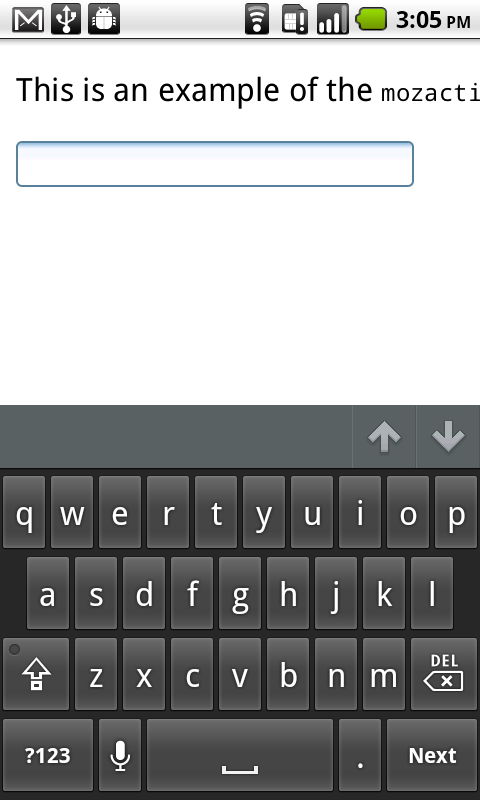
Using mozactionhint on Firefox mobile
You can use the mozactionhint attribute to specify the text for the label of the enter key on the virtual keyboard when your form is rendered on Firefox mobile. For example, to have a "Next" label, you can do this:
<input type="text" mozactionhint="next" name="sometext" />
The result is:
Specifications
| Specification | Status | Comment |
|---|---|---|
| WHATWG HTML Living Standard Die Definition von '<input>' in dieser Spezifikation. |
Lebender Standard | |
| HTML5 Die Definition von '<input>' in dieser Spezifikation. |
Empfehlung | |
| HTML 4.01 Specification Die Definition von '<form>' in dieser Spezifikation. |
Empfehlung |
Browser compatibility
| Feature | Chrome | Firefox (Gecko) | Internet Explorer | Opera | Safari |
|---|---|---|---|---|---|
| Basic support | 1.0 | 1.0 (1.7 oder früher) | 2 or earlier | 1.0 | 1.0 |
| type | 1.0 | 1.0 (1.7 oder früher) | 2 | 1.0 | 1.0 |
| type=button | 1.0 | 1.0 (1.7 oder früher) | 3 | 1.0 | 1.0 |
| type=checkbox | 1.0 | 1.0 (1.7 oder früher) 3.6 (1.9.2) for indeterminate value |
2 | 1.0 | 1.0 |
| type=color | 21.0 |
29.0 (29.0) (Not for Windows Touch yet) |
Nicht unterstützt | 11.01 | Nicht unterstützt |
| type=date | 5.0 (recognized but no UI) | Nicht unterstützt Nicht implementiert (siehe Bug 446510) |
Nicht unterstützt | 10.62 | (Ja) (recognized but no UI) |
| type=datetime | 5.0 (recognized but no UI) | Nicht unterstützt Nicht implementiert (siehe Bug 446510) |
Nicht unterstützt | 10.62 | (Ja) (recognized but no UI) |
| type=datetime-local | 5.0 (recognized but no UI) | Nicht unterstützt Nicht implementiert (siehe Bug 446510) |
Nicht unterstützt | 10.62 | (Ja) (recognized but no UI) |
| type=email | 5.0 | 4.0 (2.0) | 10 | 10.62 | ? |
| type=file | 1.0 | 1.0 (1.7 oder früher) | 3.02 | 1.0 | 1.0 |
| type=hidden | 1.0 | 1.0 (1.7 oder früher) | 2 | 1.0 | 1.0 |
| type=image | 1.0 | Gecko 2.0 only sends x and y coordinates when clicked, not longer the name/value of the element | 2 | 1.0 | 1.0 |
| type=month | 5.0 (recognized but no UI) | Nicht unterstützt Nicht implementiert (siehe Bug 446510) |
Nicht unterstützt | 10.62 | (Ja) (recognized but no UI) |
| type=number | 6.0 (Localization in Chrome 11) | 29.0 (29.0) | 10 (recognized but no UI) |
10.62 | (Ja) |
| type=password | 1.0 | 1.0 (1.7 oder früher) | 2 | 1.0 | 1.0 |
| type=radio | 1.0 | 1.0 (1.7 oder früher) 3.6 (1.9.2) for indeterminate value |
2 | 1.0 | 1.0 |
| type=range | 5.0 | 23.0 (23.0) | 10 | 10.62 (11.01 added support for a default value) | (Ja) |
| type=reset | 1.0 | 1.0 (1.7 oder früher) | 2 | 1.0 | 1.0 |
| type=search | 5.0 | 4.0 (2.0) | 10 | 11.01 | (Ja) |
| type=submit | 1.0 | 1.0 (1.7 oder früher) | 2 | 1.0 | 1.0 |
| type=tel | 5.0 | 4.0 (2.0) | 10 | 11.01 | ? |
| type=text | 1.0 | 1.0 (1.7 oder früher) | 2 | 1.0 | 1.0 |
| type=time | 5.0 (recognized but no UI) | Nicht unterstützt Nicht implementiert (siehe Bug 446510) |
Nicht unterstützt | 10.62 | (Ja) (recognized but no UI) |
| type=url | 5.0 | 4.0 (2.0) | 10 | 10.62 | ? |
| type=week | 5.0 (recognized but no UI) | Nicht unterstützt Nicht implementiert (siehe Bug 446510) |
Nicht unterstützt | 10.62 | (Ja) (recognized but no UI) |
| accept=[MIME type] | 8.0 | 16.0 (16.0) | ? | (Ja) | Nicht unterstützt |
| accept=audio/* | (Ja) | 4.0 (2.0) Filters for the following audio file extensions: .aac, .aif, .flac, .iff, .m4a, .m4b, .mid, .midi, .mp3, .mpa, .mpc, .oga, .ogg, .ra, .ram, .snd, .wav, .wma |
? | Nicht unterstützt | Nicht unterstützt |
| accept=video/* | (Ja) | 4.0 (2.0) Filters for the following video file extensions: .avi, .divx, .flv, .m4v, .mkv, .mov, .mp4, .mpeg, .mpg, .ogm, .ogv, .ogx, .rm, .rmvb, .smil, .webm, .wmv, .xvid |
? | Nicht unterstützt | Nicht unterstützt |
| accept=image/* | (Ja) | 4.0 (2.0) Filters for the following image file extensions: .jpe, .jpg, .jpeg, .gif, .png, .bmp, .ico, .svg, .svgz, .tif, .tiff, .ai, .drw, .pct, .psp, .xcf, .psd, .raw |
? | Nicht unterstützt | Nicht unterstützt |
| accesskey | 1.0 | (Ja) | 6 | 1.0 | ? |
| mozactionhint | Nicht unterstützt | 4.0 (2.0) | Nicht unterstützt | Nicht unterstützt | Nicht unterstützt |
| autocomplete | 17.0 | 4.0 (2.0) | 5 | 9.6 | 5.2 |
| autofocus | 5.0 | 4.0 (2.0) | 10 | 9.6 | 5.0 |
| checked | 1.0 | 1.0 (1.7 oder früher) | 2 | 1.0 | 1.0 |
| disabled | 1.0 | 1.0 (1.7 oder früher) | 6 | 1.0 | 1.0 |
| form | 9.0 | 4.0 (2.0) | ? | 10.62 | ? |
| formaction | 9.0 | 4.0 (2.0) | 10 | 10.62 | 5.2 |
| formenctype | 9.0 | 4.0 (2.0) | 10 | 10.62 | ? |
| formmethod | 9.0 | 4.0 (2.0) | 10 | 10.62 | 5.2 |
| formnovalidate | 5.0 (in 6.0 only worked with HTML5 doctype, validation support in 7.0 was disabled and re-enabled in 10.0) | 4.0 (2.0) | 10 | 10.62 | ? |
| formtarget | 9.0 | 4.0 (2.0) | 10 | 10.62 | 5.2 |
| height | 1.0 | 16.0 (16.0) | ? | 1.0 | ? |
| inputmode | Nicht unterstützt | Nicht unterstützt | Nicht unterstützt | Nicht unterstützt | Nicht unterstützt |
| list | 20.0 | 4.0 (2.0) | 10 | 9.6 | Nicht unterstützt |
| max | 5.0 | 16.0 (16.0) | ? | 10.62 | ? |
| maxlength | 1.0 | 1.0 (1.7 oder früher) | 2 | 1.0 | 1.0 |
| min | 5.0 | 16.0 (16.0) | ? | 10.62 | ? |
| minlength | ? | ? | ? | ? | ? |
| multiple | 1.0 (supported for type=file and type=email as of 5.0) | 3.6 (1.9.2) for type=file (Ja) for type=email |
10 | 1.0 (10.62 support for type=file and as of 11.01 type=email) | ? |
| name | 1.0 | 1.0 (1.7 oder früher) | 2 | 1.0 | 1.0 |
| pattern | 5.0 | 4.0 (2.0) | 10 | 9.6 | Nicht unterstützt |
| placeholder | 10.0 | 4.0 (2.0) | 10 | 11.00 | 5.0 |
| readonly | 1.0 | 1.0 (1.7 oder früher) | 6 (missing for type of checkbox, radio) |
1.0 | 1.0 |
| required | 5.0 (support for select element as of 10) | 4.0 (2.0) | 10 | 9.6 | Nicht unterstützt |
| size | 1.0 | 1.0 (1.7 oder früher) | 2 | 1.0 | 1.0 |
| spellcheck | 10.0 | 3.6 (1.9.2) | 10 | 11.0 | 4.0 |
| src | 1.0 | 1.0 (1.7 oder früher) | 2 | 1.0 | 1.0 |
| step | 6.0 | 16.0 (16.0) | 10 | 10.62 | 5.0 |
| tabindex | 1.0 | 1.0 (1.7 oder früher) | 6 (elements with tabindex > 0 are not navigated) | (Ja) | ? |
| width | 1.0 | 16.0 (16.0) | ? | 1.0 | ? |
| Feature | Android | Firefox Mobile (Gecko) | IE Mobile | Opera Mobile | Safari Mobile |
|---|---|---|---|---|---|
| Basic support | (Ja) | 4.0 (2.0) | (Ja) | (Ja) | (Ja) |
| type | (Ja) | (Ja) | (Ja) | (Ja) | (Ja) |
| type=button | (Ja) | (Ja) | (Ja) | (Ja) | (Ja) |
| type=checkbox | (Ja) | (Ja) | (Ja) | (Ja) | (Ja) |
| type=color | ? | 27.0 (27.0) | ? | (Ja) | ? |
| type=date | Nicht unterstützt | Nicht unterstützt | Nicht unterstützt | 10.62 | 5.0 |
| type=datetime | Nicht unterstützt | Nicht unterstützt | Nicht unterstützt | 10.62 | (Ja) |
| type=datetime-local | Nicht unterstützt | Nicht unterstützt | Nicht unterstützt | 10.62 | (Ja) |
| type=email | ? | 4.0 (2.0) | ? | (Ja) | 3.1 (no validation but gives a specific keyboard) |
| type=file | ? | ? | ? | ? | ? |
| type=hidden | (Ja) | (Ja) | (Ja) | (Ja) | (Ja) |
| type=image | (Ja) | (Ja) | (Ja) | (Ja) | (Ja) |
| type=month | Nicht unterstützt | Nicht unterstützt | Nicht unterstützt | 10.62 | (Ja) |
| type=number | 2.3 (no validation but gives a specific keyboard) | 29.0 (29.0) | ? | (Ja) | 4.0 (no validation but gives a specific keyboard) |
| type=password | (Ja) | (Ja) | (Ja) | (Ja) | (Ja) |
| type=radio | (Ja) | (Ja) | (Ja) | (Ja) | (Ja) |
| type=range | ? | Nicht unterstützt | ? | (Ja) | 5.0 |
| type=reset | (Ja) | (Ja) | (Ja) | (Ja) | (Ja) |
| type=search | ? | 4.0 (2.0) | ? | 10.62 | 4.0 |
| type=submit | (Ja) | (Ja) | (Ja) | (Ja) | (Ja) |
| type=tel | 2.3 | 4.0 (2.0) | ? | 10.62 | 3.1 |
| type=text | (Ja) | (Ja) | (Ja) | (Ja) | (Ja) |
| type=time | Nicht unterstützt | Nicht unterstützt | Nicht unterstützt | 10.62 | (Ja) |
| type=url | ? | 4.0 (2.0) | ? | 10.62 | 3.1 (no validation but gives a specific keyboard) |
| type=week | Nicht unterstützt | Nicht unterstützt | Nicht unterstützt | 10.62 | (Ja) |
| accept=[MIME type] | ? | ? | ? | ? | ? |
| accept=audio/* | ? | ? | ? | ? | ? |
| accept=image/* | ? | ? | ? | ? | ? |
| accept=video/* | ? | ? | ? | ? | ? |
| accesskey | ? | ? | ? | ? | ? |
| autocomplete | ? | 4.0 (2.0) | (Ja) | (Ja) | (Ja) |
| autofocus | 3.2 | 4.0 (2.0) | ? | (Ja) | ? |
| checked | (Ja) | (Ja) | (Ja) | (Ja) | (Ja) |
| disabled | (Ja) | 4.0 (2.0) | (Ja) | (Ja) | (Ja) |
| form | ? | ? | ? | ? | ? |
| formaction | ? | 4.0 (2.0) | ? | 10.62 | 5.0 |
| formenctype | ? | ? | ? | ? | ? |
| formmethod | ? | 4.0 (2.0) | ? | 10.62 | 5.0 |
| formnovalidate | ? | 4.0 (2.0) | ? | 10.62 | ? |
| formtarget | ? | 4.0 (2.0) | ? | 10.62 | 5.0 |
| height | ? | 16.0 (16.0) | ? | ? | ? |
| list | Nicht unterstützt | 4.0 (2.0) | ? | (Ja) | ? |
| max | ? | Nicht unterstützt Bug 556010 | ? | 10.62 | ? |
| maxlength | (Ja) | 4.0 (2.0) | (Ja) | (Ja) | (Ja) |
| min | ? | Nicht unterstützt Bug 556010 | ? | 10.62 | ? |
| minlength | ? | ? | ? | ? | ? |
| multiple | ? | (Ja) | ? | (Ja) | ? |
| name | (Ja) | 4.0 (2.0) | (Ja) | (Ja) | 1.0 |
| pattern | ? | 4.0 (2.0) | ? | (Ja) | ? |
| placeholder | 2.3 | 4.0 (2.0) | ? | 11.10 | 4 |
| readonly | (Ja) | 4.0 (2.0) | (Ja) | (Ja) | (Ja) |
| required | ? | (Ja) | ? | (Ja) | ? |
| size | (Ja) | 4.0 (2.0) | (Ja) | (Ja) | (Ja) |
| spellcheck | ? | 4.0 (2.0) | ? | 11.0 | ? |
| src | ? | ? | ? | ? | ? |
| step | ? | Nicht unterstützt Bug 556009 | ? | 10.62 | ? |
| tabindex | ? | ? | ? | ? | ? |
| width | ? | 16.0 (16.0) | ? | ? | ? |
Gecko notes
Starting in Gecko 9.0 (Firefox 9.0 / Thunderbird 9.0 / SeaMonkey 2.6), Firefox for Android lets users capture images using their camera and upload them, without having to leave the browser. Web developers can implement this feature by simply specifying setting the accept attribute's value to "image/*" on their file input, like this:
<input type="file" accept="image/*">
See also
- Other form-related elements:
<form>,<button>,<datalist>,<legend>,<label>,<select>,<optgroup>,<option>,<textarea>,<keygen>,<fieldset>,<output>,<progress>and<meter>. - Cross-browser HTML5 placeholder text