현재 번역은 완벽하지 않습니다. 한국어로 문서 번역에 동참해주세요.
The HTML <input> element is used to create interactive controls for web-based forms in order to accept data from the user. The semantics of an <input> varies considerably depending on the value of its type attribute.
- 콘텐츠 범주 Flow content, listed, submittable, resettable, form-associated element, phrasing content.
If thetypehas not thehiddenvalue, labellable element, palpable content. - 허용되는 콘텐츠 None, it is an empty element.
- 태그 생략 Must have a start tag and must not have an end tag.
- 허용되는 부모 요소 Any element that accepts phrasing content.
- DOM 인터페이스
HTMLInputElement
속성
This element includes the global attributes.
type- The type of control to display. The default type is text, if this attribute is not specified. Possible values are:
button: A push button with no default behavior.checkbox: A check box. You must use the value attribute to define the value submitted by this item. Use the checked attribute to indicate whether this item is selected. You can also use the indeterminate attribute to indicate that the checkbox is in an indeterminate state (on most platforms, this draws a horizontal line across the checkbox).color: HTML5 A control for specifying a color. A color picker's UI has no required features other than accepting simple colors as text (more info).date: HTML5 A control for entering a date (year, month, and day, with no time).datetime: HTML5 A control for entering a date and time (hour, minute, second, and fraction of a second) based on UTC time zone.datetime-local: HTML5 A control for entering a date and time, with no time zone.email: HTML5 A field for editing an e-mail address. The input value is validated to contain either the empty string or a single valid e-mail address before submitting. The:validand:invalidCSS pseudo-classes are applied as appropriate.file: A control that lets the user select a file. Use the accept attribute to define the types of files that the control can select.hidden: A control that is not displayed, but whose value is submitted to the server.image: A graphical submit button. You must use the src attribute to define the source of the image and the alt attribute to define alternative text. You can use the height and width attributes to define the size of the image in pixels.month: HTML5 A control for entering a month and year, with no time zone.number: HTML5 A control for entering a floating point number.password: A single-line text field whose value is obscured. Use the maxlength attribute to specify the maximum length of the value that can be entered.radio: A radio button. You must use the value attribute to define the value submitted by this item. Use the checked attribute to indicate whether this item is selected by default. Radio buttons that have the same value for the name attribute are in the same "radio button group"; only one radio button in a group can be selected at one time.range: HTML5 A control for entering a number whose exact value is not important. This type control uses the following default values if the corresponding attributes are not specified:min: 0max: 100value:min+ (max-min)/2, orminifmaxis less thanminstep: 1
reset: A button that resets the contents of the form to default values.search: HTML5 A single-line text field for entering search strings; line-breaks are automatically removed from the input value.submit: A button that submits the form.tel: HTML5 A control for entering a telephone number; line-breaks are automatically removed from the input value, but no other syntax is enforced. You can use attributes such as pattern and maxlength to restrict values entered in the control. The:validand:invalidCSS pseudo-classes are applied as appropriate.text: A single-line text field; line-breaks are automatically removed from the input value.time: HTML5 A control for entering a time value with no time zone.url: HTML5 A field for editing a URL. The input value is validated to contain either the empty string or a valid absolute URL before submitting. Line-breaks and leading or trailing whitespace are automatically removed from the input value. You can use attributes such as pattern and maxlength to restrict values entered in the control. The:validand:invalidCSS pseudo-classes are applied as appropriate.week: HTML5 A control for entering a date consisting of a week-year number and a week number with no time zone.
accept- If the value of the type attribute is
file, this attribute indicates the types of files that the server accepts; otherwise it is ignored. The value must be a comma-separated list of unique content type specifiers: accesskeyHTML 4 only, 안씀 HTML5- A single-character that the user can press to switch input focus to the control. This attribute is global in HTML5.
mozactionhint- Specifies an "action hint" used to determine how to label the enter key on mobile devices with virtual keyboards. Supported values are
go,done,next,search, andsend; these automatically get mapped to the appropriate string (and are case-insensitive). autocapitalize- This is a nonstandard attribute used by iOS Safari Mobile which controls whether and how the text value should be automatically capitalized as it is entered/edited by the user. The non-deprecated values are available in iOS 5 and later. Possible values are:
none: Completely disables automatic capitalizationsentences: Automatically capitalize the first letter of sentences.words: Automatically capitalize the first letter of words.characters: Automatically capitalize all characters.on: Deprecated since iOS 5.off: Deprecated since iOS 5.
autocompleteHTML5- This attribute indicates whether the value of the control can be automatically completed by the browser. This attribute is ignored if the value of the type attribute is
hidden, password,checkbox,radio,file, or a button type (button,submit,reset,image). Possible values are:off: The user must explicitly enter a value into this field for every use, or the document provides its own auto-completion method; the browser does not automatically complete the entry.on: The browser can automatically complete the value based on values that the user has entered during previous uses.
If the autocomplete attribute is not specified on an input element, then the browser uses the autocomplete attribute value of the
<input>element's form owner. The form owner is either theformelement that this<input>element is a descendant of or the form element whose id is specified by the form attribute of the input element. For more information, see theautocompleteattribute in<form>.The autocomplete attribute also controls whether Firefox will, unlike other browsers, persist the dynamic disabled state and (if applicable) dynamic checkedness of an
<input>across page loads. The persistence feature is enabled by default. Setting the value of the autocomplete attribute tooffdisables this feature; this works even when the autocomplete attribute would normally not apply to the<input>by virtue of its type. See bug 654072. autocorrect- This is a nonstandard attribute supported by Safari that is used to control whether autocorrection should be enabled when the user is entering/editing the text value of the
<input>. Possible attribute values are:on: Enable autocorrectionoff: Disable autocorrection
autofocusHTML5- This Boolean attribute lets you specify that a form control should have input focus when the page loads, unless the user overrides it, for example by typing in a different control. Only one form element in a document can have the autofocus attribute, which is a Boolean. It cannot be applied if the type attribute is set to
hidden(that is, you cannot automatically set focus to a hidden control). autosaveHTML5- This attribute should be defined as a unique value. If the value of the type attribute is
search, previous search term values will persist in the dropdown across page load. checked-
When the value of the type attribute is
radioorcheckbox, the presence of this Boolean attribute indicates that the control is selected by default; otherwise it is ignored.Firefox will, unlike other browsers, by default, persist the dynamic checked state of an
<input>across page loads. Use theautocompleteattribute to control this feature. disabled-
This Boolean attribute indicates that the form control is not available for interaction. In particular, the
clickevent will not be dispatched on disabled controls. Also, a disabled control's value isn't submitted with the form.Firefox will, unlike other browsers, by default, persist the dynamic disabled state of an
<input>across page loads. Use theautocompleteattribute to control this feature. formHTML5- The form element that the input element is associated with (its form owner). The value of the attribute must be an id of a
<form>element in the same document. If this attribute is not specified, this<input>element must be a descendant of a<form>element. This attribute enables you to place<input>elements anywhere within a document, not just as descendants of their form elements. An input can only be associated with one form. formactionHTML5- The URI of a program that processes the information submitted by the input element, if it is a submit button or image. If specified, it overrides the
actionattribute of the element's form owner. formenctypeHTML5- If the input element is a submit button or image, this attribute specifies the type of content that is used to submit the form to the server. Possible values are:
application/x-www-form-urlencoded: The default value if the attribute is not specified.multipart/form-data: Use this value if you are using an<input>element with thetypeattribute set tofile.text/plain
If this attribute is specified, it overrides the
enctypeattribute of the element's form owner. formmethodHTML5- If the input element is a submit button or image, this attribute specifies the HTTP method that the browser uses to submit the form. Possible values are:
post: The data from the form is included in the body of the form and is sent to the server.get: The data from the form are appended to the form attribute URI, with a '?' as a separator, and the resulting URI is sent to the server. Use this method when the form has no side-effects and contains only ASCII characters.
If specified, this attribute overrides the
methodattribute of the element's form owner. formnovalidateHTML5- If the input element is a submit button or image, this Boolean attribute specifies that the form is not to be validated when it is submitted. If this attribute is specified, it overrides the
novalidateattribute of the element's form owner. formtargetHTML5- If the input element is a submit button or image, this attribute is a name or keyword indicating where to display the response that is received after submitting the form. This is a name of, or keyword for, a browsing context (for example, tab, window, or inline frame). If this attribute is specified, it overrides the
targetattribute of the elements's form owner. The following keywords have special meanings:- _
self: Load the response into the same browsing context as the current one. This value is the default if the attribute is not specified. _blank: Load the response into a new unnamed browsing context._parent: Load the response into the parent browsing context of the current one. If there is no parent, this option behaves the same way as_self._top: Load the response into the top-level browsing context (that is, the browsing context that is an ancestor of the current one, and has no parent). If there is no parent, this option behaves the same way as_self.
- _
heightHTML5- If the value of the type attribute is
image, this attribute defines the height of the image displayed for the button. incremental- This is a nonstandard attribute supported by Safari that only applies when the type is
search. If the attribute is present, regardless of what its value is, the<input>firessearchevents as the user edits the text value. The event is only fired after an implementation-defined timeout has elapsed since the most recent keystroke; new keystrokes reset the timeout. In other words, the event firing is debounced. If the attribute is absent, thesearchevent is only fired when the user explicitly initiates a search (e.g. by pressing the Enter key while within field). inputmodeHTML5- A hint to the browser for which keyboard to display. This attribute applies when the value of the type attribute is text, password, email, or url. Possible values are:
verbatim: Alphanumeric, non-prose content such as usernames and passwords.latin: Latin-script input in the user's preferred language with typing aids such as text prediction enabled. For human-to-computer communication such as search boxes.latin-name: As latin, but for human names.latin-prose: As latin, but with more aggressive typing aids. For human-to-human communication such as instant messaging or email.full-width-latin: As latin-prose, but for the user's secondary languages.kana: Kana or romaji input, typically hiragana input, using full-width characters, with support for converting to kanji. Intended for Japanese text input.katakana: Katakana input, using full-width characters, with support for converting to kanji. Intended for Japanese text input.numeric: Numeric input, including keys for the digits 0 to 9, the user's preferred thousands separator character, and the character for indicating negative numbers. Intended for numeric codes, e.g. credit card numbers. For actual numbers, prefer using <input type="number">tel: Telephone input, including asterisk and pound key. Use <input type="tel"> if possible instead.email: Email input. Use <input type="email"> if possible instead.url: URL input. Use <input type="url"> if possible instead.
listHTML5- Identifies a list of pre-defined options to suggest to the user. The value must be the id of a
<datalist>element in the same document. The browser displays only options that are valid values for this input element. This attribute is ignored when the type attribute's value ishidden,checkbox,radio,file, or a button type. maxHTML5- The maximum (numeric or date-time) value for this item, which must not be less than its minimum (min attribute) value.
maxlength- If the value of the type attribute is
text,email,search,password,tel, orurl, this attribute specifies the maximum number of characters (in Unicode code points) that the user can enter; for other control types, it is ignored. It can exceed the value of the size attribute. If it is not specified, the user can enter an unlimited number of characters. Specifying a negative number results in the default behavior; that is, the user can enter an unlimited number of characters. The constraint is evaluated only when the value of the attribute has been changed. minHTML5- The minimum (numeric or date-time) value for this item, which must not be greater than its maximum (max attribute) value.
minlengthHTML5- If the value of the type attribute is
text,email,search,password,tel, orurl, this attribute specifies the minimum number of characters (in Unicode code points) that the user can enter; for other control types, it is ignored. multipleHTML5- This Boolean attribute indicates whether the user can enter more than one value. This attribute applies when the type attribute is set to
emailorfile; otherwise it is ignored. name- The name of the control, which is submitted with the form data.
patternHTML5- A regular expression that the control's value is checked against. The pattern must match the entire value, not just some subset. Use the title attribute to describe the pattern to help the user. This attribute applies when the value of the type attribute is
text,search,tel,urloremail; otherwise it is ignored. The regular expression language is the same as JavaScript's. The pattern is not surrounded by forward slashes. placeholderHTML5- A hint to the user of what can be entered in the control . The placeholder text must not contain carriage returns or line-feeds. This attribute applies when the value of the type attribute is
text,search,tel,urloremail; otherwise it is ignored.참고: Do not use theplaceholderattribute instead of a<label>element. Their purposes are different: the<label>attribute describes the role of the form element; that is, it indicates what kind of information is expected, theplaceholderattribute is a hint about the format the content should take. There are cases in which theplaceholderattribute is never displayed to the user, so the form must be understandable without it. readonlyHTML5- This Boolean attribute indicates that the user cannot modify the value of the control. It is ignored if the value of the type attribute is
hidden,range,color,checkbox,radio,file, or a button type (such asbuttonorsubmit). requiredHTML5- This attribute specifies that the user must fill in a value before submitting a form. It cannot be used when the type attribute is
hidden,image, or a button type (submit,reset, orbutton). The:optionaland:requiredCSS pseudo-classes will be applied to the field as appropriate. results- This is a nonstandard attribute supported by Safari that only applies when the type is
search. It is used to control the maximum number of entries that should be displayed in the<input>'s native dropdown list of past search queries. Its value should be a nonnegative decimal integer. selectionDirectionHTML5- The direction in which selection occurred. This is "forward" if the selection was made from left-to-right in an LTR locale or right-to-left in an RTL locale, or "backward" if the selection was made in the opposite direction. This can be "none" if the selection direction is unknown.
size- The initial size of the control. This value is in pixels unless the value of the type attribute is
textorpassword, in which case, it is an integer number of characters. Starting in HTML5, this attribute applies only when the type attribute is set totext,search,tel,url,email, orpassword; otherwise it is ignored. In addition, the size must be greater than zero. If you don't specify a size, a default value of 20 is used. spellcheckHTML5- Setting the value of this attribute to
trueindicates that the element needs to have its spelling and grammar checked. The valuedefaultindicates that the element is to act according to a default behavior, possibly based on the parent element's ownspellcheckvalue. The valuefalseindicates that the element should not be checked. src- If the value of the type attribute is
image, this attribute specifies a URI for the location of an image to display on the graphical submit button; otherwise it is ignored. stepHTML5- Works with the min and max attributes to limit the increments at which a numeric or date-time value can be set. It can be the string
anyor a positive floating point number. If this attribute is not set toany, the control accepts only values at multiples of the step value greater than the minimum. tabindexelement-specific in HTML 4, global in HTML5- The position of the element in the tabbing navigation order for the current document.
usemapHTML 4 only, 안씀 HTML5- The name of a
<map>element to as an image map. value- The initial value of the control. This attribute is optional except when the value of the type attribute is
radioorcheckbox.
Note that when reloading the page, Gecko and IE will ignore the value specified in the HTML source, if the value was changed before the reload. widthHTML5- If the value of the type attribute is
image, this attribute defines the width of the image displayed for the button. x-moz-errormessage- This Mozilla extension allows you to specify the error message to display when a field doesn't successfully validate.
참고
File inputs
Note: Starting in Gecko 2.0, calling the click() method on an <input> element of type "file" opens the file picker and lets the user select files. See Using files from web applications for an example and more details.
You can't set the value of a file picker from a script; doing something like the following has no effect:
var e = getElementById("someFileInputElement");
e.value = "foo";
Error messages
If you want Firefox to present a custom error message when a field fails to validate, you can use the x-moz-errormessage attribute to do so:
<input type="email" x-moz-errormessage="Please specify a valid email address.">
Note, however, that this is not standard and will not have an effect on other browsers.
예제
A simple input box
<!-- A basic input -->
<input type="text" name="input" value="Type here">
A common use-case scenario
<!-- A common form that includes input tags -->
<form action="getform.php" method="get">
    <label>First name: <input type="text" name="first_name" /></label><br />
     <label>Last name: <input type="text" name="last_name" /></label><br />
        <label>E-mail: <input type="email" name="user_email" /></label><br />
<input type="submit" value="Submit" />
</form>
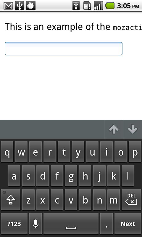
Using mozactionhint on Firefox mobile
You can use the mozactionhint attribute to specify the text for the label of the enter key on the virtual keyboard when your form is rendered on Firefox mobile. For example, to have a "Next" label, you can do this:
<input type="text" mozactionhint="next" name="sometext" />
The result is:
사양
| 사양 | 상태 | 주석 |
|---|---|---|
| WHATWG HTML Living Standard The definition of '<input>' in that specification. |
Living Standard | |
| HTML5 The definition of '<input>' in that specification. |
Recommendation | |
| HTML 4.01 Specification The definition of '<form>' in that specification. |
Recommendation |
브라우저 호환성
| 기능 | Chrome | Firefox (Gecko) | Internet Explorer | Opera | Safari |
|---|---|---|---|---|---|
| Basic support | 1.0 | 1.0 (1.7 or earlier) | 2 or earlier | 1.0 | 1.0 |
| type | 1.0 | 1.0 (1.7 or earlier) | 2 | 1.0 | 1.0 |
| type=button | 1.0 | 1.0 (1.7 or earlier) | 3 | 1.0 | 1.0 |
| type=checkbox | 1.0 | 1.0 (1.7 or earlier) 3.6 (1.9.2) for indeterminate value |
2 | 1.0 | 1.0 |
| type=color | 21.0 |
29.0 (29.0) (Not for Windows Touch yet) |
Not supported | 11.01 | Not supported |
| type=date | 5.0 | Not supported Unimplemented (see bug 825294) |
Not supported | 10.62 | (Yes) (recognized but no UI) |
| type=datetime |
Not supported |
Not supported Unimplemented (see bug 825294) |
Not supported | 10.62 | (Yes) (recognized but no UI) |
| type=datetime-local | 5.0 | Not supported Unimplemented (see bug 825294) |
Not supported | 10.62 | (Yes) (recognized but no UI) |
| type=email | 5.0 | 4.0 (2.0) | 10 | 10.62 | ? |
| type=file | 1.0 | 1.0 (1.7 or earlier) | 3.02 | 1.0 | 1.0 |
| type=hidden | 1.0 | 1.0 (1.7 or earlier) | 2 | 1.0 | 1.0 |
| type=image | 1.0 | Gecko 2.0 only sends x and y coordinates when clicked, not longer the name/value of the element | 2 | 1.0 | 1.0 |
| type=month | 5.0 | Not supported Unimplemented (see bug 446510) |
Not supported | 10.62 | (Yes) (recognized but no UI) |
| type=number | 6.0 (Localization in Chrome 11) | 29.0 (29.0) | 10 (recognized but no UI) |
10.62 | (Yes) |
| type=password | 1.0 | 1.0 (1.7 or earlier) | 2 | 1.0 | 1.0 |
| type=radio | 1.0 | 1.0 (1.7 or earlier) 3.6 (1.9.2) for indeterminate value |
2 | 1.0 | 1.0 |
| type=range | 5.0 | 23.0 (23.0) | 10 | 10.62 (11.01 added support for a default value) | (Yes) |
| type=reset | 1.0 | 1.0 (1.7 or earlier) | 2 | 1.0 | 1.0 |
| type=search | 5.0 | 4.0 (2.0) | 10 | 11.01 | (Yes) |
| type=submit | 1.0 | 1.0 (1.7 or earlier) | 2 | 1.0 | 1.0 |
| type=tel | 5.0 | 4.0 (2.0) | 10 | 11.01 | ? |
| type=text | 1.0 | 1.0 (1.7 or earlier) | 2 | 1.0 | 1.0 |
| type=time | 5.0 | Not supported Unimplemented (see bug 825294) |
Not supported | 10.62 | (Yes) (recognized but no UI) |
| type=url | 5.0 | 4.0 (2.0) | 10 | 10.62 | ? |
| type=week | 5.0 | Not supported Unimplemented (see bug 825294) |
Not supported | 10.62 | (Yes) (recognized but no UI) |
|
accept=[file extension] |
(Yes) | Not supported | 10 | ? | Not supported |
|
accept=[MIME type] |
8.0 | 16.0 (16.0) | 10 | 10 | Not supported |
| accept=audio/* | (Yes) | 4.0 (2.0) Filters for the following audio file extensions: .aac, .aif, .flac, .iff, .m4a, .m4b, .mid, .midi, .mp3, .mpa, .mpc, .oga, .ogg, .ra, .ram, .snd, .wav, .wma |
10 | Not supported | Not supported |
| accept=video/* | (Yes) | 4.0 (2.0) Filters for the following video file extensions: .avi, .divx, .flv, .m4v, .mkv, .mov, .mp4, .mpeg, .mpg, .ogm, .ogv, .ogx, .rm, .rmvb, .smil, .webm, .wmv, .xvid |
10 | Not supported | Not supported |
| accept=image/* | (Yes) | 4.0 (2.0) Filters for the following image file extensions: .jpe, .jpg, .jpeg, .gif, .png, .bmp, .ico, .svg, .svgz, .tif, .tiff, .ai, .drw, .pct, .psp, .xcf, .psd, .raw |
10 | Not supported | Not supported |
| accept=[. + ext] | ? | 37.0 (37.0) | ? | ? | ? |
| accesskey | 1.0 | (Yes) | 6 | 1.0 | ? |
| mozactionhint | Not supported | 4.0 (2.0) | Not supported | Not supported | Not supported |
| autocomplete | 17.0 | 4.0 (2.0) | 5 | 9.6 | 5.2 |
| autofocus | 5.0 | 4.0 (2.0) | 10 | 9.6 | 5.0 |
| checked | 1.0 | 1.0 (1.7 or earlier) | 2 | 1.0 | 1.0 |
| disabled | 1.0 | 1.0 (1.7 or earlier) | 6 | 1.0 | 1.0 |
| form | 9.0 | 4.0 (2.0) | ? | 10.62 | ? |
| formaction | 9.0 | 4.0 (2.0) | 10 | 10.62 | 5.2 |
| formenctype | 9.0 | 4.0 (2.0) | 10 | 10.62 | ? |
| formmethod | 9.0 | 4.0 (2.0) | 10 | 10.62 | 5.2 |
| formnovalidate | 5.0 (in 6.0 only worked with HTML5 doctype, validation support in 7.0 was disabled and re-enabled in 10.0) | 4.0 (2.0) | 10 | 10.62 | ? |
| formtarget | 9.0 | 4.0 (2.0) | 10 | 10.62 | 5.2 |
| height | 1.0 | 16.0 (16.0) | ? | 1.0 | ? |
| incremental | (Yes) | Not supported | Not supported | Not supported | (Yes) |
| inputmode | Not supported | Not supported | Not supported | Not supported | Not supported |
| list | 20.0 | 4.0 (2.0) | 10 | 9.6 | Not supported |
| max | 5.0 | 16.0 (16.0) | ? | 10.62 | ? |
| maxlength | 1.0 | 1.0 (1.7 or earlier) | 2 | 1.0 | 1.0 |
| min | 5.0 | 16.0 (16.0) | ? | 10.62 | ? |
| minlength | 40.0 | ? | ? | ? | ? |
| multiple | 1.0 (supported for type=file and type=email as of 5.0) | 3.6 (1.9.2) for type=file (Yes) for type=email |
10 | 1.0 (10.62 support for type=file and as of 11.01 type=email) | ? |
| name | 1.0 | 1.0 (1.7 or earlier) | 2 | 1.0 | 1.0 |
| pattern | 5.0 | 4.0 (2.0) | 10 | 9.6 | Not supported |
| placeholder | 10.0 | 4.0 (2.0) | 10 | 11.00 | 5.0 |
| readonly | 1.0 | 1.0 (1.7 or earlier) | 6 (missing for type of checkbox, radio) |
1.0 | 1.0 |
| required | 5.0 (support for select element as of 10) | 4.0 (2.0) | 10 | 9.6 | Not supported |
| size | 1.0 | 1.0 (1.7 or earlier) | 2 | 1.0 | 1.0 |
| spellcheck | 10.0 | 3.6 (1.9.2) | 10 | 11.0 | 4.0 |
| src | 1.0 | 1.0 (1.7 or earlier) | 2 | 1.0 | 1.0 |
| step | 6.0 | 16.0 (16.0) | 10 | 10.62 | 5.0 |
| tabindex | 1.0 | 1.0 (1.7 or earlier) | 6 (elements with tabindex > 0 are not navigated) | (Yes) | ? |
| width | 1.0 | 16.0 (16.0) | ? | 1.0 | ? |
| 기능능 | Android | Firefox Mobile (Gecko) | IE Mobile | Opera Mobile | Safari Mobile |
|---|---|---|---|---|---|
| Basic support | (Yes) | 4.0 (2.0) | (Yes) | (Yes) | (Yes) |
| type | (Yes) | (Yes) | (Yes) | (Yes) | (Yes) |
| type=button | (Yes) | (Yes) | (Yes) | (Yes) | (Yes) |
| type=checkbox | (Yes) | (Yes) | (Yes) | (Yes) | (Yes) |
| type=color | ? | 27.0 (27.0) | ? | (Yes) | ? |
| type=date | Not supported | Not supported | Not supported | 10.62 | 5.0 |
| type=datetime | Not supported | Not supported | Not supported | 10.62 | (Yes) |
| type=datetime-local | Not supported | Not supported | Not supported | 10.62 | (Yes) |
| type=email | ? | 4.0 (2.0) | ? | (Yes) | 3.1 (no validation but gives a specific keyboard) |
| type=file | ? | ? | ? | ? | (Yes) [1] |
| type=hidden | (Yes) | (Yes) | (Yes) | (Yes) | (Yes) |
| type=image | (Yes) | (Yes) | (Yes) | (Yes) | (Yes) |
| type=month | Not supported | Not supported | Not supported | 10.62 | (Yes) |
| type=number | 2.3 (no validation but gives a specific keyboard) | 29.0 (29.0) | ? | (Yes) | 4.0 (no validation but gives a specific keyboard) |
| type=password | (Yes) | (Yes) | (Yes) | (Yes) | (Yes) |
| type=radio | (Yes) | (Yes) | (Yes) | (Yes) | (Yes) |
| type=range | ? | Not supported | ? | (Yes) | 5.0 |
| type=reset | (Yes) | (Yes) | (Yes) | (Yes) | (Yes) |
| type=search | ? | 4.0 (2.0) | ? | 10.62 | 4.0 |
| type=submit | (Yes) | (Yes) | (Yes) | (Yes) | (Yes) |
| type=tel | 2.3 | 4.0 (2.0) | ? | 10.62 | 3.1 |
| type=text | (Yes) | (Yes) | (Yes) | (Yes) | (Yes) |
| type=time | Not supported | Not supported | Not supported | 10.62 | (Yes) |
| type=url | ? | 4.0 (2.0) | ? | 10.62 | 3.1 (no validation but gives a specific keyboard) |
| type=week | Not supported | Not supported | Not supported | 10.62 | (Yes) |
| accept=[MIME type] | ? | ? | ? | ? | ? |
| accept=audio/* | ? | ? | ? | ? | ? |
| accept=image/* | ? | ? | ? | ? | ? |
| accept=video/* | ? | ? | ? | ? | ? |
| accept=[. + ext] | ? | 37.0 (37.0) | ? | ? | ? |
| accesskey | ? | ? | ? | ? | ? |
| autocomplete | ? | 4.0 (2.0) | (Yes) | (Yes) | (Yes) |
| autofocus | 3.2 | 4.0 (2.0) | ? | (Yes) | ? |
| checked | (Yes) | (Yes) | (Yes) | (Yes) | (Yes) |
| disabled | (Yes) | 4.0 (2.0) | (Yes) | (Yes) | (Yes) |
| form | ? | ? | ? | ? | ? |
| formaction | ? | 4.0 (2.0) | ? | 10.62 | 5.0 |
| formenctype | ? | ? | ? | ? | ? |
| formmethod | ? | 4.0 (2.0) | ? | 10.62 | 5.0 |
| formnovalidate | ? | 4.0 (2.0) | ? | 10.62 | ? |
| formtarget | ? | 4.0 (2.0) | ? | 10.62 | 5.0 |
| height | ? | 16.0 (16.0) | ? | ? | ? |
| list | Not supported | 4.0 (2.0) | ? | (Yes) | ? |
| max | ? | 16.0 (16.0) (UI might remain unimplemented) | ? | 10.62 | ? |
| maxlength | (Yes) | 4.0 (2.0) | (Yes) | (Yes) | (Yes) |
| min | ? | 16.0 (16.0) (UI might remain unimplemented) | ? | 10.62 | ? |
| minlength | ? | ? | ? | 27.0 | ? |
| multiple | ? | (Yes) | ? | (Yes) | ? |
| name | (Yes) | 4.0 (2.0) | (Yes) | (Yes) | 1.0 |
| pattern | ? | 4.0 (2.0) | ? | (Yes) | (Yes) |
| placeholder | 2.3 | 4.0 (2.0) | ? | 11.10 | 4 |
| readonly | (Yes) | 4.0 (2.0) | (Yes) | (Yes) | (Yes) |
| required | ? | (Yes) | ? | (Yes) | ? |
| size | (Yes) | 4.0 (2.0) | (Yes) | (Yes) | (Yes) |
| spellcheck | ? | 4.0 (2.0) | ? | 11.0 | ? |
| src | ? | ? | ? | ? | ? |
| step | ? | 16.0 (16.0) (UI might remain unimplemented) | ? | 10.62 | ? |
| tabindex | ? | ? | ? | ? | ? |
| width | ? | 16.0 (16.0) | ? | ? | ? |
[1]: File uploads were broken in Mobile Safari for iOS 8.0 and 8.0.1. The bug was fixed in iOs 8.0.2.
Safari Mobile for iOS applies a default style of opacity: 0.4<input> elements. Other major browsers don't currently share this particular default style.
On Safari Mobile for iOS, setting display: block<input> of type="date", type="time", type="datetime-local", or type="month" causes the text within the <input> to become vertically misaligned. See WebKit bug #139848.
As of Chrome v39, an <input type="date"> styled with display: table-cell; width: 100%;min-width imposed by Chrome and it cannot become narrower than this minimum width. See Chromium bug #346051.
Gecko 참고
Firefox will, unlike other browsers, by default, persist the dynamic disabled state and (if applicable) dynamic checkedness of an <input> across page loads. Setting the value of the autocomplete attribute to off disables this feature; this works even when the autocomplete attribute would normally not apply to the <input> by virtue of its type. See bug 654072.
Starting in Gecko 9.0 (Firefox 9.0 / Thunderbird 9.0 / SeaMonkey 2.6), Firefox for Android lets users capture images using their camera and upload them, without having to leave the browser. Web developers can implement this feature by simply specifying setting the accept attribute's value to "image/*" on their file input, like this:
<input type="file" accept="image/*">
Firefox for Android sets a default background-image gradient on all type="text", type="file", type="button", and type="submit" inputs. This can be disabled using background-image: none.
Firefox for Android also sets a default border on all <input type="file"> elements.
Localization
The allowed inputs for certain <input> types depend on the locale. In some locales, 1,000.00 is a valid number, while in other locales the valid way to enter this number is 1.000,00.
Firefox uses the following heuristics to determine the locale to validate the user's input (at least for type="number"):
- Try the language specified by a 'lang'/'xml:lang' attribute on the element or any of its parents;
- Try the language specified by any Content-Language HTTP header or
- If none specified, use the browser's locale.
같이 보기
- Other form-related elements:
<form>,<button>,<datalist>,<legend>,<label>,<select>,<optgroup>,<option>,<textarea>,<keygen>,<fieldset>,<output>,<progress>and<meter>. - Cross-browser HTML5 placeholder text