Esta traducción está incompleta. Por favor, ayuda a traducir este artículo del inglés.
Cuando se está construyendo un formulario HTML, uno de los aspectos más importantes es estructurarlo correctamente. ¿Cuál es el motivo?
- Un formulario bien formado facilita su usabilidad para todo usuario.
- Una estructura correcta facilita la accesibilidad al formulario. La accesibilidad en los formularios HTML es esencial, pues favorece que usuarios con algún tipo de impedimento físico puedan usarlo. Un software de asistencia suele mediar entre el formulario y el usuario. La cooperación entre las partes es vital, y la forma en que un formulario ayuda es exponiendo una estructura al asistente fácil de interpretar y semánticamente correcta. Veremos cómo podemos conseguir hacer un formulario accesible. No es difícil, pero requiere una serie de medidas que necesitamos conocer.
La flexibilidad de los formularios HTML los convierte en una de las estructuras más complejas en HTML. Combinando elementos de formulario ( input, label, textarea ... ) y configurándolos a través de sus atributos, se puede construir cualquier tipo de formulario básico. Es cierto que existen tecnologías que permiten crear formularios enriquecidos, como por ejemplo XForms (ahora obsoleta), pero estos tipos de formularios, desafortunadamente, no están soportados por todos los navegadores. Debido a esto, la mayoría de las veces delegaremos en JavaScript para mejorar los formularios HTML.
En este artículo, cubriremos en detalle la manera en que se usan los elementos de formulario HTML. Si deseas profundizar sobre la construcción de widgets personalizados, tienes a tu disposición el artículo Cómo construir widgets de formulario personalizados.
Estructura global
El elemento <form>
El elemento <form> es el elemento que define formalmente un formulario.
<form>
  ... elementos del formulario ...
</form>
Los atributos del formulario determinan el modo general en el que éste se comportará:
<form atributo1="valor" atributo2="valor" ...>
  ...
</form>
Cada vez que se desea crear un formulario HTML se debe, pues, comenzar con el elemento <form>. Muchos asistentes o plugins del navegador pueden fácilmente descubrir los elementos <form> e implementar ganchos ( hooks ) especiales para hacerlos más fáciles de usar.
El elemento <form> soporta los siguientes atributos, siendo todos ellos opcionales.
| Nombre del atributo | Valor por defecto | Descripción |
|---|---|---|
accept-charset |
UNKNOWN |
Una lista separada por espacios de charsets que el servidor acepta. El valor predeterminado es la cadena especial |
action |
El URI de la página web que procesará la información enviada a través del formulario. | |
autocomplete |
on |
Indica si los widgets en este formulario pueden tener sus valores autocompletados por el navegador de manera predeterminada. puede tomar los valores on y off |
enctype |
application/x-www-form-urlencoded |
cuando el valor del atributo method es POST, este atriburo es el tipo MIME del contenido que se envía al servidor. Valores posibles son:
|
method |
get |
El método HTTP que el navegador usa para enviar el formulario. Este atributo puede tomar dos valores: get o post. |
name |
El nombre del formulario. Debe ser único para permitir diferenciarlo de otros formularios en el documento. El nombre no de debe ser la cadena vacía. Es habitual usar como nombre el valor del id. | |
novalidate |
(false) |
Cuando este atributo está presente, indica que el formulario no realizará una validación en el momento de enviarlo con submit. |
target |
_self |
Especifica dónde debe mostrarse (cargarse) la respuesta recibida tras el envío del formulario. Los siguientes valores se aceptan:
|
Nota que siempre es posible usar un widget de formulario fuera de un elemento <form>, pero al hacerlo, el widget no tiene nada que hacer con cualquier otro formulario del documento. Se necesitará un plan especial, mediante JavaScript, para personalizar su comportamiento. Los widgets son incapaces de hacer nada al respecto por ellos mismos.
Técnicamente hablando, HTML5 introduce el atributo form sobre los elementos del formulario. Esto debería permitir una conexión explícita entre tales elementos y un formulario incluso con aquellos elementos que se encuentran fuera del elemento <form>. Desafortunadamente, esta característica todavía no se encuentra lo suficientemente bien implementada en todos los navegadores como para confiar en ella.
Los elementos <fieldset> y <legend>
El elemento <fieldset> es un modo conveniente de crear grupos de widgets que comparten el mismo propósito. Un elemento <fieldset> puede ser etiquetado con un elemento <legend>, describiendo éste formalmente el propósito del elemento<fieldset>.
Muchos asistentes usarán el elemento <legend> como si fuera parte de la etiqueta de cada widget que se encuentra dentro de su correspondiente elemento <fieldset>. Por ejemplo, algunos lectores de pantalla, como Jaws or NVDA pronunciarán el contenido del elemento legend antes de pronunciar las etiquetas de cada widget.
A continuación un pequeño ejemplo:
<form>
  <fieldset>
    <legend>Raza del personaje</legend>
    <p>
      <input type="radio" name="raza" id="raza_1" value="humano" />
      <label for="raza_1">Humano</label>
    </p>
    <p>
      <input type="radio" name="raza" id="raza_2" value="elfo" />
      <label for="raza_2">Elfo</label>
    </p>
    <p>
      <input type="radio" name="raza" id="raza_3" value="enano" />
      <label for="raza_3">Enano</label>
    </p>
  </fieldset>
</form>
Con este ejemplo, un lector de pantalla pronunciará ¨Raza del personaje humano¨ para el primer widget, ¨Raza del personaje elfo¨ para el segundo, y ¨Raza del personaje enano¨ para el tercero.
El caso de uso en este ejemplo es uno de los más importantes. Siempre que tengas un grupo de botones tipo radio ( excluyentes entre sí ), debes asegurarte de que todos ellos se encuentran anidados dentro de un elemento <fieldset>. Existen otros casos de uso. En general, el elemento <fieldset> puede emplearse para delimitar secciones en el interior del formulario. Debido a su fuerte influencia sobre los asistentes, el elemento <fieldset> es uno de los elementos clave para construir formularios accesibles. No obstante, no se debe incurrir en su abuso desmesurado; trata de imaginarte como se escucharía la interpretación del formulario por parte de un asistente. Es ésta una buena práctica siempre que te encuentres diseñando un formulario. Si sientes que suena recargado o extraño, intenta mejorar la estructura del formulario.
El elemento <fieldset> soporta los siguientes atributos específicos:
| Nombre del atributo | valor por defecto | Descripción |
|---|---|---|
disabled |
(false) | Si este atributo booleano es establecido a true, entonces todos sus controles hijos ( sin contar el contenido de su primer hijo opcional <legend>) son desactivados y no editables. Ellos no recibirán ningún evento del navegador, como clicks de ratón, ni aquellos relacionados con el foco. Es habitual que los navegadores muestren el estado disabled visualmente como controles engrisecidos. |
El elemento <label>
El elemento <label> es el modo formal de definir una etiqueta para un widget de formulario HTML. Este elemento es el más importante en cuanto a la accesibilidad cuando estás construyendo un formulario.
Nota aclaratoria: etiqueta en este contexto no debe confundirse con etiqueta HTML. Cuando hablamos de label para un campo se refiere a la etiqueta descriptiva que muestra el propósito del campo a rellenar o seleccionar. Ejemplo de etiquetas serían; Nombre: , Edad:, etc. En formularios HTML además de descriptiva o informativa, la etiqueta asociada a un campo suele tener funcionalidad de accesibilidad. Es común que al hacer click sobre la etiqueta asociada a un cierto checkbox o radio button éstos reaccionen como si el click se hubiera producido sobre ellos mismos.
El elemento <label> soporta los siguientes atributos:
| Nombre del atributo | Valor por defecto | Descripción |
|---|---|---|
for |
El ID de un widget labelable ( un control que admita etiquetas asociadas) en el mismo documento que el elemento <label>. El primer elemento en el documento con un atributo id coincidente con aquel especificado en el atributo for pasará a ser el widget etiquetado por esta etiqueta. |
Un elemento <label> queda ligado a su widget mediante su atributo for. El atributo for referencia el id del correspondiente widget. Un widget se puede anidar dentro de su elemento <label> , pero incluso en tal caso, debería considerarse establecer explícitamente el atributo for como buena práctica. No se debería nunca confiar en que tal relación implícita por anidamiento ( etiqueta contiene al control ) sin establecer el atributo for , vaya a ser bien interpretada por tecnologías asistentes.
Incluso sin considerar dichas tecnologías de asistencia, el hecho de de tener una etiqueta formalmente asociada a los controles, mejora considerablemente la experiencia del usuario, permitiendo activar los controles a través de su etiqueta. Esta característica se soporta en todos los navegadores, y es especialmente útil para checkboxes y radio buttons.
A continuación un ejemplo de asociación de etiqueta al widget. Ambas usan un atributo for explícito. La segunda etiqueta contiene a su widget asociado anidado.
<form>
  <p>
    <input type="checkbox" id="id-escudo" name="escudo" value="1">
    <label for="id-escudo"> Escudo </label>
  </p>
  <p>
    <label for="id-espada">
      <input type="checkbox" id="id-espada" name="espada" value="1"> Espada
    </label>
  </p>
</form>
Para algunas tecnologías asistentes, manejar múltiples etiquetas para un mismo control, puede suponer un problema. Por ello, es recomendable anidar el control dentro de su correspondiente elemento con el fin de construir formularios accesibles.
Consideremos el siguiente ejemplo:
<form>
  <p>Campos obligatorios son seguidos por <strong><abbr title="obligarorio">*</abbr></strong>.</p>

  <!-- cuando el control se encuentra anidado en la etiqueta, no es necesario el uso del atributo 'for' en el <label>. -->
  <!-- Así que: -->
  <label>
    <span>Nombre: </span>
    <input type="text" name="nombreusuario" required />
    <strong><abbr title="obligatorio">*</abbr></strong>
  </label>

  <!-- sería lo mismo escribir: -->
  <div>
    <label for="usuario">Nombre: </label>
    <input id="usuario" type="text" name="nombreusuario" required />
    <strong><abbr title="obligatorio">*</abbr></strong>
  </div>

  <p>
    <label for="idnacimiento"> <!-- Entonces, el atributo 'for' es redundante. -->
      <span>Fecha de nacimiento: </span>
      <input type="text" id="idnacimiento" name="nacimiento" maxlength="10" /><em> formateada como dd/mm/yyyy </em>
    </label>
  </p>
</form>
En este ejemplo, el primer párrafo define la regla para los campos obligatorios. Esto informa al usuario de qué aspecto tendrá un campo obligatorio cuando se le presente uno, de manera que sepa lo que debe hacer con él. Debe situarse en primer lugar y no luego. ¿Por qué? De otra forma, un asistente de apoyo, tal como un lector de pantalla, No podría informar al usuario. No tendría oportunidad de hacerlo sino después de haber tratado ya con el campo, lo cual carece de sentido. Sería como poner el cartel de curva peligrosa después de la curva.
El primer campo es obligatorio, así que su <label> asociado indica tanto su nombre como el hecho de que es un campo requerido. Atiende bien al hecho de que es un solo <label>, y no dos. De esta manera, un lector de pantalla emitiría al usuario el mensaje "Nombre asterisco" o "Nombre obligatorio" ( cuál emite depende de las opciones del lector, pero siempre lo hará de una manera consistente a como lo haya hecho en el primer párrafo ). Si usaras dos etiquetas para realizar la misma tarea, no habría garantía de que el usuario fuera informado de que dicho campo sea obligatorio.
El control para la fecha de nacimiento funciona de manera similar. Usando esta técnica, te asegurarás de que el usuario sea informado del formato esperado para introducir la fecha.
El elemento <output>
Este elemento se emplea para almacenar el resultado de un cálculo. Formalmente define la relación entre aquellos campos usados como entrada de los datos necesarios para realizar un cálculo y el elemento usado para mostrar la salida de dicha operación. Se observa como una zona viva, por parte de algunas tecnologías asistentes, lo que se traduce en que un cambio en la salida es sentido por el asistente, pudiendo reacionar a él.
El elemento <output> soporta los siguientes atributos:
| Nombre del atributo | Valor por defecto | Descripción |
|---|---|---|
for |
Una lista de IDs delimitados por espacios, indicando aquellos elementos cuyos valores contribuyen como entrada (o afectan de algún modo) en el cálculo del resultado de salida. |
Estructuras HTML comunes usadas con los formularios
Además de las estructuras específicas para formularios HTML, conviene recordar que los formularios son simple HTML. Esto significa que se puede hacer uso de todo el potencial de HTML para estructurar un formulario HTML.
Como se deja ver en los ejemplos, es una práctica común envolver un <label> y su widget asociado con un elemento <p> o bien un elemento <div>.
Sumado al uso del elemento <fieldset>, viene siendo también una práctica común usar los títulos y elementos de seccionamiento para estructurar un formulario complejo.
Las listas HTML también son útiles a menudo con los checkboxes y radio buttons.
Ejemplo. Un formulario de pago:
<form>
  <h1>Payment form</h1>
  <p>Required fields are folowed by <strong><abbr title="required">*</abbr></strong>.</p>

  <section>
    <h2>Contact information</h2>

    <fieldset>
      <legend>Title</legend>
      <ul>
        <li>
          <label for="title_1">
            <input type="radio" id="title_1" name="title" value="M." />
            Mister
          </label>
        </li>
        <li>
          <label for="title_2">
            <input type="radio" id="title_2" name="title" value="Ms." />
            Miss
          </label>
        </li>
      </ul>
    </fieldset>

    <p>
      <label for="name">
        <span>Name: </span>
        <input type="text" id="name" name="username" required />
        <strong><abbr title="required">*</abbr></strong>
      </label>
    </p>

     <p>
      <label for="mail">
        <span>E-mail: </span>
        <input type="email" id="mail" name="usermail" required />
        <strong><abbr title="required">*</abbr></strong>
      </label>
    </p>
  </section>

  <section>
    <h2>Payment information</h2>

    <p>
      <label for="card">
        <span>Card type:</span>
        <select id="card" name="usercard">
          <option value="visa">Visa</option>
          <option value="mc">Mastercard</option>
          <option value="amex">American Express</option>
        </select>
      </label>
    </p>
    <p>
      <label for="number">
        <span>Card number:</span>
        <input type="text" id="number" name="cardnumber" required />
        <strong><abbr title="required">*</abbr></strong>
      </label>
    </p>
    <p>
      <label for="date">
        <span>Expiration date:</span>
        <input type="text" id="date" name="expiration" required />
        <strong><abbr title="required">*</abbr></strong>
        <em>formated as mm/yy</em>
      </label>
    </p>
  </section>

  <section>
    <p>
      <button>Validate the payment</button>
    </p>
  </section>
</form>
See this form in action (with a touch of CSS):
| Live example |
|---|
| Check out the source code |
HTML widgets
When you build a form, you need to use some widgets to collect data from the user. In this article we will see how to display those widgets; if you want to know more about the way those widgets work, it is detailed in the article: The native form widgets.
The <input> element
This element is special because it can be almost anything. By simply setting its type attribute, it can change radically. To make things a little simpler, the value of the type attribute can be categorized into four categories: single line text fields, controls without text input, time and date controls, and buttons. Because of this polymorphism, the <input> element supports many attributes but it can be difficult to know which are relevant and which are required because it depends on the value of the type attribute.
This is all summarized in the following table (for a full list of all attributes, visit the page for the <input> element):
| Value of the type attribute | Description | Required attributes | Relevant attributes |
|---|---|---|---|
| Single line text fields | |||
text |
This is the most basic text field. The value text for the type attribute is the default value of this attribute; no automatic validation is performed. |
autocomplete, list, maxlength, pattern, placeholder, readonly, required, size, spellcheck |
|
email |
A field for editing one or more e-mail addresses. | autocomplete, list, maxlength, multiple, pattern, placeholder, readonly, required, size |
|
password |
The value of this text field is obscured. | autocomplete, list, maxlength, readonly, required, size |
|
search |
A field for entering search strings. | autocomplete, autosave, list, maxlength, pattern, placeholder, readonly, required, size, spellcheck |
|
tel |
A field for editing a phone number. | autocomplete, list, maxlength, pattern, placeholder, readonly, required, size |
|
url |
A field for editing an absolute URL. | autocomplete, list, maxlength, pattern, placeholder, readonly, required, size |
|
| Controls without text input | |||
checkbox |
A checkbox. | checked, required |
|
color |
A control to specify a color. | autocomplete, list, required |
|
file |
A control that lets the user select a file. | accept, multiple, required |
|
hidden |
A control that is not displayed, but whose value is submitted to the server. | ||
number |
A control for entering a floating point number. | autocomplete, list, max, min, readonly, required, step |
|
radio |
A radio button; only one of these out of a given group may be selected. | checked, required |
|
range |
A control for entering a number whose exact value is not important. | autocomplete, list, max, min, required, step |
|
| Time and date controls
Not supported.
|
|||
date |
A control for entering a date (year, month, and day, with no time).
Unimplemented (see bug 825294)
|
autocomplete, list, max, min, readonly, required |
|
datetime |
A control for entering a date and time (hour, minute, second, and fraction of a second) based on UTC time zone.
Unimplemented (see bug 825294)
|
autocomplete, list, max, min, readonly, required |
|
datetime-local |
A control for entering a date and time, with no time zone.
Unimplemented (see bug 825294)
|
autocomplete, list, max, min, readonly, required |
|
month |
A control for entering a month and year, with no time zone.
Unimplemented (see bug 446510)
|
autocomplete, list, max, min, readonly, required |
|
time |
A control for entering a time value with no time zone.
Unimplemented (see bug 825294)
|
autocomplete, list, max, min, readonly, required |
|
week |
A control for entering a date consisting of a week-year number and a week number with no time zone.
Unimplemented (see bug 825294)
|
autocomplete, list, max, min, readonly, required |
|
| Buttons | |||
button |
A push button with no default behavior. | formaction, formenctype, formmethod, formnovalidate, formtarget |
|
image |
A graphical submit button. | src, alt |
width, height, formaction, formenctype, formmethod, formnovalidate, formtarget |
reset |
A button that resets the contents of the form to default values. | formaction, formenctype, formmethod, formnovalidate, formtarget |
|
submit |
A button that submits the form. | formaction, formenctype, formmethod, formnovalidate, formtarget |
|
If for some reason the value set in the type attribute is not supported by a browser, it renders the <input> element as if the value was text. This allows the form to work, even if not necessarily in an attractive way.
Although the <input> element is a powerful tool, it cannot do everything, and there are a few other elements to handle those cases.
The <textarea> element
This element is dedicated to the multiline text field. It works exactly like a single line text field except it allows line breaks in the text typed by the user. It also accepts a few extra attributes to control its rendering across several lines:
| Attribute name | Default value | Description |
|---|---|---|
cols |
20 |
The visible width of the text control, in average character widths. |
rows |
The number of visible text lines for the control. | |
wrap |
soft |
Indicates how the control wraps text. Possible values are: hard or soft |
Note that the <textarea> element works a little bit differently from the <input> element. The <input> element is a self closing element, which means that it cannot contain any child elements. On the other hand, the <textarea> element is a regular element that can contain text content children.
This has two impacts:
- If you want to define a default value for an
<input>element, you have to use thevalueattribute, but for a<textarea>element, you put the default text between the starting tag and the closing tag of the<textarea>. - Because of its nature, the
<textarea>element only accepts text content; this means that any HTML content put inside a<textarea>element is rendered as if it was plain text content.
In the following example, the <textarea> elements will be rendered exactly the same:
<form> <p> <label for="text_1">With regular HTML</label><br> <textarea id="text_1" name="regular"><p>I'm a paragraphe</p></textarea> </p> <p> <label for="text_2">With escaped HTML</label><br> <textarea id="text_2" name="escaped"><p>I'm a paragraphe</p></textarea> </p> <p> <button>Send me</button> </p> </form>
The <select>, <option>, and <optgroup> elements
The <select> element lets you build select boxes (sometimes also known as combo boxes). A select box is a widget that lets a user choose one or more predefined values. The difference between a single value select box and a multiple value select box will be detailed in the article: The native form widgets.
Each value inside the select box is defined with an <option> element and those elements can be grouped inside <optgroup> elements.
Let's take an example:
<form>
  <p>
    <label for="myFruit">Pick a fruit</label>
    <select id="myFruit" name="fruit">
      <!-- There is a trick here you think you'll pick
         a banana but you'll eat an orange >:-) -->
      <option value="orange">Banana</option>
      <option>Cherry</option>
      <optgroup label="berries">
        <option>Blueberry</option>
        <option>Raspberry</option>
        <option>Strawberry</option>
      </optgroup>
    </select>
  </p>
</form>
If an <option> element is set with a value attribute, that attribute's value is sent when the form is submitted. If the value attribute is omitted, the content of the <option> element is used as the select box's value.
On the <optgroup> element, the label attribute is displayed before the values, but even if it looks somewhat like an option, it is not selectable.
| Attribute name | Default value | Description |
|---|---|---|
label |
This attribute is the text of the label describing the option. If the label attribute isn't defined, its value is that of the element's text content. |
|
selected |
(false) | If present, this Boolean attribute indicates that the option is initially selected. |
| Attribute name | Default value | Description |
|---|---|---|
label |
The name of the group of options. This attribute is mandatory. |
The <datalist> element
This element extends the existing widgets by providing preset values for given widgets. The most known use case for this is an autocompletion list for text fields. The values available are set with <option> elements within the <datalist> element.
To bind a widget with a <datalist> element, you have to use the list attribute on the target widget; this specifies the id attribute of the <datalist> element to use with that widget.
The <datalist> element is a very recent addition to HTML forms, so there are still some browsers that don't support it. To handle this, here is a little trick to have a nice fallback for those browsers:
<form>
  <p>
    <label for="myFruit">What is your favorite fruit?</label>
    <input type="text" id="myFruit" name="fruit" list="fruitList" />

    <datalist id="fruitList">
      <label for="suggestion">or pick a fruit</label>
      <select id="suggestion" name="altFruit">
        <option value="banana">Banana</option>
        <option value="cherry">Cherry</option>
        <option value="strawberry">Strawberry</option>
      </select>
    </datalist>
  </p>
</form>
On the one hand, browsers that support the <datalist> element will ignore all the elements that are not <option> elements and will work as expected. On the other hand, browsers that do not support the <datalist> element will display the label and the select box. Of course, there are other ways to handle the lack of support for the <datalist> element, but that require the use of JavaScript, which is not necessarily always a good option.
| Safari 6 |  |
|---|---|
| Firefox 18 | 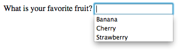 |
The <meter> and <progress> elements
Those two elements are a way to graphically represent a given numeric value. The difference between the two elements is mainly semantic:
- The
<meter>element represents a static value and its relative position between a minimum and a maximum value. - The
<progress>element represents a changing value that moves over time between a minimum value and a maximum value. It's worth noting that changing the value (and thereby the displayed progress indicator) has to be done with JavaScript. The element itself does not have any mechanism to do it on its own.
Due to their nature, these elements support a set of specific attributes:
| Attribute name | Default value | Description |
|---|---|---|
min |
0 | The lower numeric bound of the measured range. |
max |
1 | The upper numeric bound of the measured range. |
low |
the min value |
The upper numeric bound of the low end of the measured range. |
high |
the max value |
The lower numeric bound of the high end of the measured range. |
optimum |
The optimal numeric value. |
| Attribute name | Default value | Description |
|---|---|---|
max |
This attribute describes how much work the task indicated by the <progress> element requires before it's complete. |
The <button> element
A <button> element is the easiest way to create a form button. A button can be one of three types, depending on the value of the type attribute:
- A submit button sends the form's data to the web page defined by the
actionattribute of the<form>element. - A reset button resets all the form widgets to their default values immediately. From a user experience point of view, using these buttons is now considered bad practice and should be avoided; it makes it far too easy for the user to accidentally lose all their work.
- An anonymous button has no inherent meaning; instead, you use JavaScript to give it a function.
| Attribute name | Default value | Description |
|---|---|---|
type |
submit |
The type of the button. Possible values are: button, reset, or submit |
formaction |
If the button is a submit button, the value of this attribute overrides the value of the action attribute on the <form> element. |
|
formenctype |
If the button is a submit button, the value of this attribute overrides the value of the enctype attribute on the <form> element. |
|
formmethod |
If the button is a submit button, the value of this attribute overrides the value of the method attribute on the <form> element. |
|
formnovalidate |
If the button is a submit button, the value of this attribute overrides the value of the novalidate attribute on the <form> element. |
|
formtarget |
If the button is a submit button, the value of this attribute overrides the value of the target attribute on the <form> element. |
Technically speaking, there is almost no difference between a button defined with the <button> element or the <input> element. The only noticeable difference is the label of the button itself. Within an <input> element, the label can only be character data, whereas in a <button> element, the label can be HTML, so it can be styled accordingly.
<button> element wasn't used very often and in many forms developers preferred to use buttons made with the <input> element. This is due to a bug in legacy versions of Internet Explorer (IE). In IE6 and IE7, if you add a name and a value attribute to a <button> element, they do not send the content of the value attribute but the raw content of the button instead. This has been fixed since IE8, so there is no longer any reason to avoid using the <button> element.Common attributes
Many of the elements used to define form widgets have some of their own attributes. However, there is a set of attributes common to all form elements that give you some control over those widgets. Here is a list of those common attributes:
| Attribute name | Default value | Description |
|---|---|---|
autofocus |
(false) | This Boolean attribute lets you specify that the element should automatically have input focus when the page loads, unless the user overrides it, for example by typing in a different control. Only one form-associated element in a document can have this attribute specified. |
disabled |
(false) | This Boolean attribute indicates that the user cannot interact with the element. If this attribute is not specified, the element inherits its setting from the containing element, for example, <fieldset>; if there is no containing element with the disabled attribute set, then the element is enabled. |
form |
The form element that the widget is associated with. The value of the attribute must be the id attribute of a <form> element in the same document. In theory, it lets you set a form widget outside of a <form> element. In practice, however, there is no browser which supports that feature. |
|
name |
The name of the element; this is submitted with the form data. | |
value |
The element's initial value. |
Using ARIA to structure HTML forms
ARIA is a W3C Candidate Recommendation, which adds to HTML improved accessibility for rich Internet applications, including for forms. We will discuss its use in more detail in the "How to build custom form widgets" article, but here are some good basics to know.
Before going further, it's worth noting that support for ARIA and assistive technologies among browsers is far from perfect, but it's improving. Just to understand the issue, when a browser encounters an ARIA attribute, it has to send information to the operating system's accessibility layer. Not all browsers are good at doing this cross platform. The assistive technologies, on their own, have to connect themselves to the OS accessibility layer to handle the information that comes from the browsers. Surprisingly, not all assistive technologies do it well. So using ARIA does not mean that your web application will be accessible, but it means that you do your best to achieve this. Unfortunately, for the time being, ARIA remains a best effort technology, but it's always better than nothing.
If you want to dig into using ARIA with HTML forms, feel free to read the related section in the ARIA documentation.
The aria-labelledby attribute
This attribute is a convenient way to define a label without using the <label> element. The attribute is set on the widget element and references the id attribute of the element to use as a label.
<form>
  <p id="fruitLabel">What's your favorite fruit</p>
  <p>
    <input type="text" name="fruit" aria-labelledby="fruitLabel">
  </p>
</form>
Conceptually, it's the opposite of the for attribute on the <label> element. With the for attribute, you reference the id of the widget but with the aria-labelledby attribute, you reference the id of the label.
The aria-describedby attribute
This attribute works like the aria-labelledby attribute. The difference is mainly semantic. A label defines the essence of an object, while a description provides more information that the user might need. This attribute is not advised for form elements; you should rely on the aria-labelledby attribute, except if you want to provide extensive information on the current form element. It is to be used as a provider for a longer description.
The aria-label attribute
This attribute is used when there is no explicit label in the DOM for a given widget. It lets you provide a widget that will be passed to assistive technologies without actually creating a DOM node for it.
<form>
  <p>
    <input type="search" name="q" aria-label="Search" />
    <input type="submit" value="Go" />
  </p>
</form>
The role attribute
This is the most important ARIA attribute. It lets you give specific semantic information, understandable by assistive technologies, for a given HTML element. There are many roles available, and some of them are dedicated to form widgets.
ARIA tries to provide semantics for widgets that are not currently available in HTML as well as for elements that already exist. We will see in detail how to use those roles in the article: How to build custom form widgets.
Those roles for form widgets are:
- Button
- Checkbox
- Progressbar
- Radio
- Slider
- Spinbutton
- textbox
It's also worth noting that there's something called a composite role:
- Listbox
- Radiogroup
If those roles are extremely useful, know that there are more; ARIA is a very large specification. Digging into it can help you improve accessibility in areas far afield from HTML forms.
Conclusion
You now have all the knowledge to properly structure your HTML forms; the next article will dig into implementation details and functional expectations: The native form widgets.