Eine Spalte eines tree Elementes. Dieses Element zeigt einen Spaltenkopf an und beinhaltet Informationen über Größe und andere Eingenschaften über die Spalte. Außerdem können splitter Elemente zwischen den einzelnen Spalten gesetzt werden, um Veränderungen an der Spaltengröße zu erlauben. Es sollte immer ein id Attribut für ein treecol Element festgelegt werden, um sicher zu gehen, dass die Spaltenpositionierung richtig angewendet wird.
Weitere Informationen finden sich im XUL Tutorial.
- Attribute
- crop, cycler, dragging, editable, fixed, hidden, hideheader, ignoreincolumnpicker, label, primary, sort, sortActive, sortDirection, src, type, width
- Eigenschaften
- accessibleType
- Style Klassen
- treecol-image
Beispiele
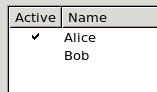
Dieses Beispiel zeigt eine Checkbox in der ersten Spalte.
<tree flex="1" editable="true">

  <treecols>
    <treecol label="Active" type="checkbox" editable="true"/>
    <treecol label="Name" flex="1" />
  </treecols>

  <treechildren>
    <treeitem>
      <treerow>
      	<treecell value="true"/>
        <treecell label="Alice"/>
      </treerow>
    </treeitem>
    <treeitem>
      <treerow>
        <treecell value="false"/>
        <treecell label="Bob"/>
      </treerow>
    </treeitem>
  </treechildren>

</tree>
Um die Checkbox auf einigen Plattformen sichtbar zu machen, müssen die folgenden Angaben zum Stylesheet hinzugefügt werden (siehe treecol.type). Bei Firefox 2.x und 3.x, benutzen alle Betriebssysteme außer Mac OS X diese Angaben bereits als Standard. Um Firefox für Mac OS X mit einzubeziehen, sollten diese Angaben auf jeden Fall notiert werden und ein eigenes Checkbox-Bild verwendet werden. Für SeaMonkey auf Mac OS X ist das Bild chrome://global/skin/checkbox/cbox-check.gif jedoch verfügbar.
treechildren::-moz-tree-checkbox {
  /* nicht angewählte Baumzellen. Dieser Deklaration MUSS vor treechildren::-moz-tree-checkbox(checked) erfolgen, sonst führt es zu keinem Effekt.  */
  list-style-image: none;
}

treechildren::-moz-tree-checkbox(checked){
  /* css für angewählte Zellen. cbox-check.gif ist in Firefox 1, 2, und 3 auf Mac OS X nicht verfügbar, es sollte also eine URL auf ein Bild in der Erweiterung oder woanders festgelegt werden. */
  list-style-image: url("chrome://global/skin/checkbox/cbox-check.gif");
}
Attribute
-
crop - Type: one of the values below
-
If the label of the element is too big to fit in its given space, the text will be cropped on the side specified by the
cropattribute. An ellipsis will be used in place of the cropped text. If the box direction is reversed, the cropping is reversed. -
-
start - The text will be cropped on its left side in left-to-right text locales, and the right side in right-to-left locales.
-
end - The text will be cropped on its right side in left-to-right text locales, and the right side in right-to-left locales.
-
left - The text will be cropped on its left side.
-
right - The text will be cropped on its right side.
-
center - The text will be cropped in the middle, showing both the start and end of the text normally.
-
none - The text will be not be cropped using an ellipsis. However, the text will simply be cut off if it is too large. The side depends on the CSS text alignment.
-
-
Depending on the platform and theme being used, some elements will have set a maximum width so they will always appear cropped. If you wish to use the value
noneand the displayed text is larger than this maximum width, you may be able to use the max-width CSS property (or the maxwidth attribute) to override this size. For example, for a menuitem in a menu you can add the following CSS rule when you want to use the valuenone: -
menupopup > menuitem, menupopup > menu { max-width: none; }
-
cycler - Type: boolean
- If
true, then the column is a cycler column. In the case, clicking on a cell in the column will alternate its state between on and off. This is used, for example, in a mail window, for a column that indicates that the message is read or unread with a small mark in the cell. If the cycler attribute is not set, the cell is a regular text cell.
-
dragging - Type: boolean
- This attribute will be set to
trueif the column is being dragged. This attribute is set automatically; you shouldn't adjust it yourself.
-
editable - Type: boolean
- Allows the contents of cells in the column to be changed, especially useful when
type="checkbox". When the user double-clicks an editable cell, a text field appears in which the user can edit the contents of the cell.
-
fixed - Type: boolean
- If
true, the size of the column in the tree cannot be adjusted by the user. Anysplitterto either side will resize those columns while keeping the fixed column at a constant size. Iffalseor not specified, the user can adjust the size of the column, typically by dragging the column header with the mouse.
-
hideheader - Type: boolean
- Set this to
trueto indicate that the tree column header should be displayed without any column header styling. If you don't set alabelfor that column either, the header is not displayed at all.
-
ignoreincolumnpicker - Type: boolean
- If
true, the column does not appear in the column picker.
label- Typ: string
- Die Beschriftung für das Element. Wird das Attribut nicht angegeben, so erscheint auch kein Beschriftungstext.
primary- Type: boolean
- If set to
true, thetreecolwill have indentation and twisties drawn to the left of it to indicate the hierarchy level of the rows. If no column has the primary attribute set totrue, thetreemay still contain nested rows, although no indication will be given to the user. The attribute also controls whether the column picker allows the user to deselect this column.
sort- Type: URI or XML attribute
- Set this to a RDF property or XML attribute to have the data in the column sorted based on that property. The property will usually be the same as that of the cell label.
-
sortActive - Type: boolean
- This should be set to
truefor the column which should be sorted by default.
sortDirection- Type: one of the values below
- Set this attribute to set the direction that template-generated content is sorted. Use the
sortResourceattribute to specify the sort key.ascending- The data is sorted in ascending order.
descending- The data is sorted in descending order.
natural- The data is sorted in natural order, which means the order that it is stored in.
src- Typ: Bild-URL
- Um für das
treecolElement ein Bild für den Kopf, statt eineslabelAttribut zu benutzen, kann dieses Attribut gesetzt werden. Im Kopf können nicht gleichzeitig Bild und Beschriftung angezeigt werden. Die URL eines Bildes, das als Spaltenkopf des Baums angezeigt wird, kann mit diesem Attribut festgelegt werden. Wird das Attribut nicht angegeben, erscheint kein Bild und es wird stattdessen die Beschriftung angezeigt. Damit das Bild erscheint, muss die Klassetreecol-imagefür dastreecolElement gesetzt werden. Einlabelsollte dennoch für die Benutzung im Spaltenwähler angegeben werden, fallsignoreincolumnpickernichttrueist undhidecolumnpickerfür dentreeebenfalls nichttrueist .
type- Type: one of the values below
- The type of tree column. The default is a text column that displays the content as text.
-
checkbox- The content of the columns are checkboxes.
progressmeter- The content of the columns are a progress meters. This is used in Mozilla's download manager window.
text- The content of the columns is text.
-
width - Type: string (representing an integer)
- The preferred width of the tree column. The value should not include a unit as all values are in pixels. Specifying widths for your columns causes Gecko to allow the tree to be scrolled horizontally if it is wider than the available space.
Eigenschaften
| Geerbte Eigenschaften |
Methoden
Style Klassen
Die folgenden Style Klassen können verwendet werden, um das Aussehen des Elementes zu verändern. Diese Klasse sollte verwendet werden, anstatt das Aussehen des Elementes direkt zu verändern, damit es dann besser mit dem, vom Benutzer gewählten, Theme zusammenarbeiten kann.
treecol-image- Um ein Bild als Kopf der Baumspalte anzuzeigen, wird diese Klasse benutzt. Das Bild selbst wird über das Attribut
srcangegeben.
Verwandte Themen
- Elemente
- tree, treecols, treechildren, treeitem, treerow, treecell und treeseparator.
- Schnittstellen
- nsIAccessibleProvider