这是一个实验中的功能
此功能某些浏览器尚在开发中,请参考浏览器兼容性表格以得到在不同浏览器中适合使用的前缀。由于该功能对应的标准文档可能被重新修订,所以在未来版本的浏览器中该功能的语法和行为可能随之改变。
当 CSS 属性发生变化时, CSS transition 能控制其变化的动画速率。 其可以让属性变化成为一个持续一段时间的过程,而不是立即生效的。比如,将一个元素的颜色从白色改为黑色,通常这个改变是立即生效的,使用 CSS transitions 后该元素的颜色将逐渐从白色变为黑色,按照一定的曲线速率变化。这个过程可以自定义。
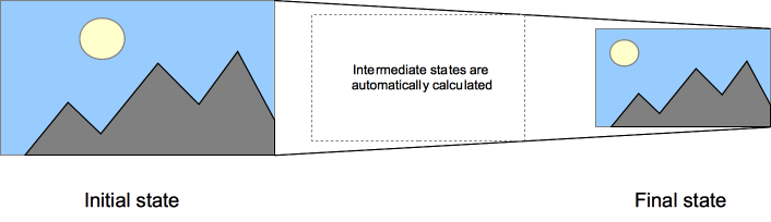
通常将两个状态之间的过渡称为隐式过渡(implicit transitions),因为开始与结束之间的状态由浏览器决定。
CSS transitions 可以决定哪些属性发生动画效果 (明确地列出这些属性),何时开始 (设置 delay),持续多久 (设置 duration) 以及如何动画 (定义timing funtion,比如匀速地或先快后慢)。
Note: transition 可以不用厂商前缀,不过鉴于标准刚刚稳定,对于基于 Webkit的浏览器仍然需要厂商前缀。如果想兼容旧版本的浏览器那么也需要厂商前缀(例如Firefox 15 及之前版本, Opera 12 及之前版本)。详情见本页底部的兼容性表格。
哪些 CSS 属性可以动画?
网页制作者可以定义哪个属性以哪种方式动画,这样能制作出复杂的过渡。因为有些属性动画无意义,所以 可动画属性列表 是一个有限集合。
Note: 可动画的属性集将有变动,开发者应关注。
auto 值常常较复杂,规范指出不要在它上动画。一些用户代理,比如基于 Gecko 的,遵循这点;一些,比如基于 WebKit的,没有这么严格限制。在 auto 上动画结果可能不可预期,这取决于浏览器及其版本,应当避免使用。
同时应当留意这种情形,在插入元素(如 .appendChild())或改变属性 display: none 后立即使用过渡, 元素将视为没有开始状态,始终处于结束状态。简单的解决办法,改变属性前用 window.setTimeout() 延迟几毫秒。
多个属性一起动画示例
HTML 内容
<body>
    <p>盒子的多个属性一起动画: width, height, background-color, transform. 将光标悬停在盒子上查看动画。</p>
    <div class="box"></div>
</body>
CSS 内容
.box {
    border-style: solid;
    border-width: 1px;
    display: block;
    width: 100px;
    height: 100px;
    background-color: #0000FF;
    -webkit-transition:width 2s, height 2s,
        background-color 2s, -webkit-transform 2s;
    transition:width 2s, height 2s, background-color 2s, transform 2s;
}
.box:hover {
    background-color: #FFCCCC;
    width:200px;
    height:200px;
    -webkit-transform:rotate(180deg);
    transform:rotate(180deg);
}
定义过渡
CSS 过渡 由简写属性 transition 定义是最好的方式,可以避免属性值列表长度不一,节省调试时间。
也可以用下面子属性来控制过渡的各部分:
(注意下面示例中过渡无限循环是为了说明例子,过渡只是从开始到结束变化,如果需要循环,查看 animation 。)
transition-property- 指定哪个或哪些 CSS 属性用于过渡。只有指定的属性才会在过渡中发生动画,其它属性仍如通常那样瞬间变化。
transition-duration- 指定过渡的时长。或者为所有属性指定一个值,或者指定多个值,为每个属性指定不同的时长。
transition-duration: 0.5s
 <div class="parent">
  <div class="box">Lorem</div>
</div>
.parent { width: 250px; height:125px;}
.box {
    width: 100px;
    height: 100px;
    background-color: red;
    font-size: 20px;
    left: 0px;
    top: 0px;
    position:absolute;
    -webkit-transition-property: width height background-color font-size left top transform -webkit-transform color;
    -webkit-transition-duration:0.5s;
    -webkit-transition-timing-function: ease-in-out;
    transition-property: width height background-color font-size left top transform -webkit-transform color;
    transition-duration:0.5s;
    transition-timing-function: ease-in-out;
}
.box1{
    transform: rotate(270deg);
    -webkit-transform: rotate(270deg);
    width: 50px;
    height: 50px;
    background-color: blue;
    color: yellow;
    font-size: 18px;
    left: 150px;
    top:25px;
    position:absolute;
    -webkit-transition-property: width height background-color font-size left top transform -webkit-transform color;
    -webkit-transition-duration:0.5s;
    -webkit-transition-timing-function: ease-in-out;
    transition-property: width height background-color font-size left top transform -webkit-transformv color;
    transition-duration:0.5s;
    transition-timing-function: ease-in-out;
}
function updateTransition() {
  var el = document.querySelector("div.box");

  if (el) {
    el.className = "box1";
  } else {
    el = document.querySelector("div.box1");
    el.className = "box";
  }

  return el;
}

var intervalID = window.setInterval(updateTransition, 7000);
transition-duration: 1s
 <div class="parent">
  <div class="box">Lorem</div>
</div>
.parent { width: 250px; height:125px;}
.box {
    width: 100px;
    height: 100px;
    background-color: red;
    font-size: 20px;
    left: 0px;
    top: 0px;
    position:absolute;
    -webkit-transition-property: width height background-color font-size left top -webkit-transform color;
    -webkit-transition-duration:1s;
    -webkit-transition-timing-function: ease-in-out;
    transition-property: width height background-color font-size left top transform color;
    transition-duration:1s;
    transition-timing-function: ease-in-out;
}
.box1{
    transform: rotate(270deg);
    -webkit-transform: rotate(270deg);
    width: 50px;
    height: 50px;
    background-color: blue;
    color: yellow;
    font-size: 18px;
    left: 150px;
    top:25px;
    position:absolute;
    -webkit-transition-property: width height background-color font-size left top -webkit-transform transform color;
    -webkit-transition-duration:1s;
    -webkit-transition-timing-function: ease-in-out;
    transition-property: width height background-color font-size left top transform -webkit-transform color;
    transition-duration:1s;
    transition-timing-function: ease-in-out;
}
function updateTransition() {
  var el = document.querySelector("div.box");

  if (el) {
    el.className = "box1";
  } else {
    el = document.querySelector("div.box1");
    el.className = "box";
  }

  return el;
}

var intervalID = window.setInterval(updateTransition, 7000);
transition-duration: 2s
 <div class="parent">
  <div class="box">Lorem</div>
</div>
.parent { width: 250px; height:125px;}
.box {
    width: 100px;
    height: 100px;
    background-color: red;
    font-size: 20px;
    left: 0px;
    top: 0px;
    position:absolute;
    -webkit-transition-property: width height background-color font-size left top transform -webkit-transform color;
    -webkit-transition-duration:2s;
    -webkit-transition-timing-function: ease-in-out;
    transition-property: width height background-color font-size left top transform -webkit-transform color;
    transition-duration:2s;
    transition-timing-function: ease-in-out;
}
.box1{
    transform: rotate(270deg);
    -webkit-transform: rotate(270deg);
    width: 50px;
    height: 50px;
    background-color: blue;
    color: yellow;
    font-size: 18px;
    left: 150px;
    top:25px;
    position:absolute;
    -webkit-transition-property: width height background-color font-size left top transform -webkit-transform color;
    -webkit-transition-duration:2s;
    -webkit-transition-timing-function: ease-in-out;
    transition-property: width height background-color font-size left top transform -webkit-transform color;
    transition-duration:2s;
    transition-timing-function: ease-in-out;
}
function updateTransition() {
  var el = document.querySelector("div.box");

  if (el) {
    el.className = "box1";
  } else {
    el = document.querySelector("div.box1");
    el.className = "box";
  }

  return el;
}

var intervalID = window.setInterval(updateTransition, 7000);
transition-duration: 4s
 <div class="parent">
  <div class="box">Lorem</div>
</div>
.parent { width: 250px; height:125px;}
.box {
    width: 100px;
    height: 100px;
    background-color: red;
    font-size: 20px;
    left: 0px;
    top: 0px;
    position:absolute;
    -webkit-transition-property: width height background-color font-size left top transform -webkit-transform color;
    -webkit-transition-duration:4s;
    -webkit-transition-timing-function: ease-in-out;
    transition-property: width height background-color font-size left top transform -webkit-transform color;
    transition-duration:4s;
    transition-timing-function: ease-in-out;
}
.box1{
    transform: rotate(270deg);
    -webkit-transform: rotate(270deg);
    width: 50px;
    height: 50px;
    background-color: blue;
    color: yellow;
    font-size: 18px;
    left: 150px;
    top:25px;
    position:absolute;
    -webkit-transition-property: width height background-color font-size left top transform -webkit-transform color;
    -webkit-transition-duration:4s;
    -webkit-transition-timing-function: ease-in-out;
    transition-property: width height background-color font-size left top transform -webkit-transform color;
    transition-duration:4s;
    transition-timing-function: ease-in-out;
}
function updateTransition() {
  var el = document.querySelector("div.box");

  if (el) {
    el.className = "box1";
  } else {
    el = document.querySelector("div.box1");
    el.className = "box";
  }

  return el;
}

var intervalID = window.setInterval(updateTransition, 7000);
transition-timing-function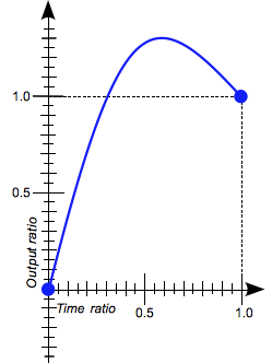 指定一个函数,定义属性值怎么变化。缓动函数 Timing functions 定义属性如何计算。多数 timing functions 由四点定义一个 bezier 曲线。也可以从 Easing Functions Cheat Sheet 选择缓动效果。
-
transition-timing-function: ease
 <div class="parent">
  <div class="box">Lorem</div>
</div>
.parent { width: 250px; height:125px;}
.box {
    width: 100px;
    height: 100px;
    background-color: red;
    font-size: 20px;
    left: 0px;
    top: 0px;
    position:absolute;
    -webkit-transition-property: width height background-color font-size left top color;
    -webkit-transition-duration:2s;
    -webkit-transition-timing-function: ease;
    transition-property: width height background-color font-size left top color;
    transition-duration:2s;
    transition-timing-function: ease;
}
.box1{
    width: 50px;
    height: 50px;
    background-color: blue;
    color: yellow;
    font-size: 18px;
    left: 150px;
    top:25px;
    position:absolute;
    -webkit-transition-property: width height background-color font-size left top color;
    -webkit-transition-duration:2s;
    -webkit-transition-timing-function: ease;
    transition-property: width height background-color font-size left top color;
    transition-duration:2s;
    transition-timing-function: ease;
}
function updateTransition() {
  var el = document.querySelector("div.box");

  if (el) {
    el.className = "box1";
  } else {
    el = document.querySelector("div.box1");
    el.className = "box";
  }

  return el;
}

var intervalID = window.setInterval(updateTransition, 7000);
transition-timing-function: linear
 <div class="parent">
  <div class="box">Lorem</div>
</div>
.parent { width: 250px; height:125px;}
.box {
    width: 100px;
    height: 100px;
    background-color: red;
    font-size: 20px;
    left: 0px;
    top: 0px;
    position:absolute;
    -webkit-transition-property: width height background-color font-size left top color;
    -webkit-transition-duration:2s;
    -webkit-transition-timing-function: linear;
    transition-property: width height background-color font-size left top color;
    transition-duration:2s;
    transition-timing-function: linear;
}
.box1{
    width: 50px;
    height: 50px;
    background-color: blue;
    color: yellow;
    font-size: 18px;
    left: 150px;
    top:25px;
    position:absolute;
    -webkit-transition-property: width height background-color font-size left top color;
    -webkit-transition-duration:2s;
    -webkit-transition-timing-function: linear;
    transition-property: width height background-color font-size left top color;
    transition-duration:2s;
    transition-timing-function: linear;
}
function updateTransition() {
  var el = document.querySelector("div.box");

  if (el) {
    el.className = "box1";
  } else {
    el = document.querySelector("div.box1");
    el.className = "box";
  }

  return el;
}

var intervalID = window.setInterval(updateTransition, 7000);
transition-timing-function: step-end
 <div class="parent">
  <div class="box">Lorem</div>
</div>
.parent { width: 250px; height:125px;}
.box {
    width: 100px;
    height: 100px;
    background-color: red;
    font-size: 20px;
    left: 0px;
    top: 0px;
    position:absolute;
    -webkit-transition-property: width height background-color font-size left top color;
    -webkit-transition-duration:2s;
    -webkit-transition-timing-function: step-end;
    transition-property: width height background-color font-size left top color;
    transition-duration:2s;
    transition-timing-function: step-end;
}
.box1{
    width: 50px;
    height: 50px;
    background-color: blue;
    color: yellow;
    font-size: 18px;
    left: 150px;
    top:25px;
    position:absolute;
    -webkit-transition-property: width height background-color font-size left top color;
    -webkit-transition-duration:2s;
    -webkit-transition-timing-function: step-end;
    transition-property: width height background-color font-size left top color;
    transition-duration:2s;
    transition-timing-function: step-end;
}
function updateTransition() {
  var el = document.querySelector("div.box");

  if (el) {
    el.className = "box1";
  } else {
    el = document.querySelector("div.box1");
    el.className = "box";
  }

  return el;
}

var intervalID = window.setInterval(updateTransition, 7000);
transition-timing-function: steps(4, end)
 <div class="parent">
  <div class="box">Lorem</div>
</div>
.parent { width: 250px; height:125px;}
.box {
    width: 100px;
    height: 100px;
    background-color: red;
    font-size: 20px;
    left: 0px;
    top: 0px;
    position:absolute;
    -webkit-transition-property: width height background-color font-size left top color;
    -webkit-transition-duration:2s;
    -webkit-transition-timing-function: steps(4, end);
    transition-property: width height background-color font-size left top color;
    transition-duration:2s;
    transition-timing-function: steps(4, end);
}
.box1{
    width: 50px;
    height: 50px;
    background-color: blue;
    color: yellow;
    font-size: 18px;
    left: 150px;
    top:25px;
    position:absolute;
    -webkit-transition-property: width height background-color font-size left top color;
    -webkit-transition-duration:2s;
    -webkit-transition-timing-function: steps(4, end);
    transition-property: width height background-color font-size left top color;
    transition-duration:2s;
    transition-timing-function: steps(4, end);
}
function updateTransition() {
  var el = document.querySelector("div.box");

  if (el) {
    el.className = "box1";
  } else {
    el = document.querySelector("div.box1");
    el.className = "box";
  }

  return el;
}

var intervalID = window.setInterval(updateTransition, 7000);
transition-delay- 指定延迟,即属性开始变化时与过渡开始发生时之间的时长。
-
transition-delay: 0.5s
 <div class="parent">
  <div class="box">Lorem</div>
</div>
.parent { width: 250px; height:125px;}
.box {
    width: 100px;
    height: 100px;
    background-color: red;
    font-size: 20px;
    left: 0px;
    top: 0px;
    position:absolute;
    -webkit-transition-property: width height background-color font-size left top color;
    -webkit-transition-duration:2s;
    -webkit-transition-delay:0.5s;
    -webkit-transition-timing-function: linear;
    transition-property: width height background-color font-size left top color;
    transition-duration:2s;
    transition-delay:0.5s;
    transition-timing-function: linear;
}
.box1{
    width: 50px;
    height: 50px;
    background-color: blue;
    color: yellow;
    font-size: 18px;
    left: 150px;
    top:25px;
    position:absolute;
     -webkit-transition-property: width height background-color font-size left top color;
    -webkit-transition-duration:2s;
    -webkit-transition-delay:0.5s;
    -webkit-transition-timing-function: linear;
    transition-property: width height background-color font-size left top color;
    transition-duration:2s;
    transition-delay:0.5s;
    transition-timing-function: linear;
}
function updateTransition() {
  var el = document.querySelector("div.box");

  if (el) {
    el.className = "box1";
  } else {
    el = document.querySelector("div.box1");
    el.className = "box";
  }

  return el;
}

var intervalID = window.setInterval(updateTransition, 7000);
transition-delay: 1s
 <div class="parent">
  <div class="box">Lorem</div>
</div>
.parent { width: 250px; height:125px;}
.box {
    width: 100px;
    height: 100px;
    background-color: red;
    font-size: 20px;
    left: 0px;
    top: 0px;
    position:absolute;
     -webkit-transition-property: width height background-color font-size left top color;
    -webkit-transition-duration:2s;
    -webkit-transition-delay:1s;
    -webkit-transition-timing-function: linear;
    transition-property: width height background-color font-size left top color;
    transition-duration:2s;
    transition-delay:1s;
    transition-timing-function: linear;
}
.box1{
    width: 50px;
    height: 50px;
    background-color: blue;
    color: yellow;
    font-size: 18px;
    left: 150px;
    top:25px;
    position:absolute;
    -webkit-transition-property: width height background-color font-size left top color;
    -webkit-transition-duration:2s;
    -webkit-transition-delay:1s;
    -webkit-transition-timing-function: linear;
    transition-property: width height background-color font-size left top color;
    transition-duration:2s;
    transition-delay:1s;
    transition-timing-function: linear;
}
function updateTransition() {
  var el = document.querySelector("div.box");

  if (el) {
    el.className = "box1";
  } else {
    el = document.querySelector("div.box1");
    el.className = "box";
  }

  return el;
}

var intervalID = window.setInterval(updateTransition, 7000);
transition-delay: 2s
 <div class="parent">
  <div class="box">Lorem</div>
</div>
.parent { width: 250px; height:125px;}
.box {
    width: 100px;
    height: 100px;
    background-color: red;
    font-size: 20px;
    left: 0px;
    top: 0px;
    position:absolute;
    -webkit-transition-property: width height background-color font-size left top color;
    -webkit-transition-duration:2s;
    -webkit-transition-delay:2s;
    -webkit-transition-timing-function: linear;
    transition-property: width height background-color font-size left top color;
    transition-duration:2s;
    transition-delay:2s;
    transition-timing-function: linear;
}
.box1{
    width: 50px;
    height: 50px;
    background-color: blue;
    color: yellow;
    font-size: 18px;
    left: 150px;
    top:25px;
    position:absolute;
    -webkit-transition-property: width height background-color font-size left top color;
    -webkit-transition-duration:2s;
    -webkit-transition-delay:2s;
    -webkit-transition-timing-function: linear;
    transition-property: width height background-color font-size left top color;
    transition-duration:2s;
    transition-delay:2s;
    transition-timing-function: linear;
}
function updateTransition() {
  var el = document.querySelector("div.box");

  if (el) {
    el.className = "box1";
  } else {
    el = document.querySelector("div.box1");
    el.className = "box";
  }

  return el;
}

var intervalID = window.setInterval(updateTransition, 7000);
transition-delay: 4s
 <div class="parent">
  <div class="box">Lorem</div>
</div>
.parent { width: 250px; height:125px;}
.box {
    width: 100px;
    height: 100px;
    background-color: red;
    font-size: 20px;
    left: 0px;
    top: 0px;
    position:absolute;
    -webkit-transition-property: width height background-color font-size left top color;
    -webkit-transition-duration:2s;
    -webkit-transition-delay:4s;
    -webkit-transition-timing-function: ease-in-out;
    transition-property: width height background-color font-size left top color;
    transition-duration:2s;
    transition-delay:4s;
    transition-timing-function: ease-in-out;
}
.box1{
    width: 50px;
    height: 50px;
    background-color: blue;
    color: yellow;
    font-size: 18px;
    left: 150px;
    top:25px;
    position:absolute;
    -webkit-transition-property: width height background-color font-size left top color;
    -webkit-transition-duration:2s;
    -webkit-transition-delay:4s;
    -webkit-transition-timing-function: ease-in-out;
    transition-property: width height background-color font-size left top color;
    transition-duration:2s;
    transition-delay:4s;
    transition-timing-function: ease-in-out;
}
function updateTransition() {
  var el = document.querySelector("div.box");

  if (el) {
    el.className = "box1";
  } else {
    el = document.querySelector("div.box1");
    el.className = "box";
  }

  return el;
}

var intervalID = window.setInterval(updateTransition, 7000);
简写语法:
div {
    transition: <property> <duration> <timing-function> <delay>;
}
检测过渡是否完成
当过渡完成时触发一个事件,在符合标准的浏览器下,这个事件是 transitionend, 在 WebKit 下是 webkitTransitionEnd. 详情查看页面底部的兼容性表格。 transitionend 事件提供两个属性:
propertyName- 字符串,指示已完成过渡的属性。
elapsedTime- 浮点数,指示当触发这个事件时过渡已运行的时间(秒)。这个值不受
transition-delay 影响。
照例可以用 element.addEventListener() 方法来监听这个事件:
el.addEventListener("transitionend", updateTransition, true);
Note: 如果取消了过渡则不会触发 transitionend 事件,因为在过渡完成前动画的属性值改变了。
当属性值列表长度不一致时
以 transition-property 的值列表长度为标准,如果某个属性值列表长度短于它的,则重复其值以长度一致, 例如:
div {
  transition-property: opacity, left, top, height;
  transition-duration: 3s, 5s;
}
将按下面这样处理:
div {
  transition-property: opacity, left, top, height;
  transition-duration: 3s, 5s, 3s, 5s;
}
类似地,如果某个属性的值列表长于 transition-property 的,将被截短。 例如:
div {
  transition-property: opacity, left;
  transition-duration: 3s, 5s, 2s, 1s;
}
将按下面这样处理:
div {
  transition-property: opacity, left;
  transition-duration: 3s, 5s;
}
简单例子
这个例子实现这样的效果:4s 过渡改变字体大小,2s 延迟——在元素上鼠标悬停时与开始动画效果之间:
#delay1 {
  position: relative;
  transition-property: font-size;
  transition-duration: 4s;
  transition-delay: 2s;
  font-size: 14px;
}

#delay1:hover {
  transition-property: font-size;
  transition-duration: 4s;
  transition-delay: 2s;
  font-size: 36px;
}
高亮菜单过渡效果
CSS 的一个常用地方是当鼠标悬停在菜单上时高亮此菜单,使用 transition 效果更佳。
HTML 内容
<div class="sidebar">
  <p><a class="menuButton" href="home">Home</a></p>
  <p><a class="menuButton" href="about">About</a></p>
  <p><a class="menuButton" href="contact">Contact Us</a></p>
  <p><a class="menuButton" href="links">Links</a></p>
</div>
CSS 内容
.menuButton {
  position: relative;
  transition-property: background-color, color;
  transition-duration: 1s;
  transition-timing-function: ease-out;
  text-align: left;
  background-color: grey;
  left: 5px;
  top: 5px;
  height: 26px;
  color: white;
  border-color: black;
  font-family: sans-serif;
  font-size: 20px;
  text-decoration: none;
  box-shadow: 2px 2px 1px black;
  padding: 2px 4px;
  border: solid 1px black;
}

.menuButton:hover {
  position: relative;
  transition-property: background-color, color;
  transition-duration: 1s;
  transition-timing-function: ease-out;
  background-color:white;
  color:black;
  box-shadow: 2px 2px 1px black;
}
这个 CSS 设置了菜单的外观,在:hover时,菜单里的元素的文字、颜色及背景色都发生了变化。
transition 让 JavaScript 效果更平滑
transition 是非常好的工具,可以让 JavaScript 效果平滑而不用修改 JavaScript。 看下面例子。
<p>随便点击某处来移动球</p>
<div id="foo"></div>
使用 JavaScript 将球移动到一个位置 :
var f = document.getElementById('foo');
document.addEventListener('click', function(ev){
    f.style.left = (ev.clientX-25)+'px';
    f.style.top = (ev.clientY-25)+'px';
},false);
使用CSS 来平滑移动,只用简单地添加一个过渡 :
p {
  padding-left: 60px;

#foo {
  border-radius: 50px;
  width: 50px;
  height: 50px;
  background: #c00;
  position: absolute;
  top: 0;
  left: 0;
  transition:  all 1s;
}
演示: https://jsfiddle.net/RwtHn/5/
规范
| Specification |
Status |
Comment |
| CSS Transitions |
Working Draft |
Initial specification. |
浏览器兼容性
| Feature |
Chrome |
Firefox (Gecko) |
Internet Explorer |
Opera |
Safari (WebKit) |
| Basic support |
1.0 -webkit
26.0 |
4.0 (2.0) -moz
16.0 (16.0) |
10 |
10.5 -o
12.10 |
3.2 -webkit |
transitionend event |
1.0 as webkitTransitionEnd
26.0 |
4.0 (2.0) |
10 |
10.5 as oTransitionEnd
12 as otransitionend
12.10 as transitionend |
3.2 as webkitTransitionEnd |
| Feature |
Android |
Firefox Mobile (Gecko) |
IE Phone |
Opera Mobile |
Safari Mobile |
| Basic support |
2.1 |
4.0 (2.0) -moz
16.0 (16.0) |
? |
10 -o
12.10 |
3.2 |
transitionend event |
2.1 as webkitTransitionEnd |
4.0 (2.0) |
? |
10 as oTransitionEnd
12 as otransitionend
12.10 as transitionend |
3.2 as webkitTransitionEnd |
另见