这篇文章需要文法复核。如何帮忙。
概述
CSS的float 属性可以使一个元素脱离正常的文档流,然后被安放到它所在容器的的左端或者右端,并且其他的文本和行内元素围绕它安放。
一个 浮动元素(floating element) 是一个float属性计算值不是none的元素。
| 初始值 | none |
|---|---|
| 适用元素 | all elements, but has no effect if the value of display is none. |
| 是否是继承属性 | 否 |
| 适用媒体 | visual |
| 计算值 | as specified |
| 是否适用于 CSS 动画 | 否 |
| 正规顺序 | the unique non-ambiguous order defined by the formal grammar |
由于float 使用块框架(block layout)来显示,所以使用了float,就会隐式地改变 display的计算值。以下是display的计算值改变的一些情况:
| 指定值 | 计算值 |
|---|---|
inline |
block |
inline-block |
block |
inline-table |
table |
table-row |
block |
table-row-group |
block |
table-column |
block |
table-column-group |
block |
table-cell |
block |
table-caption |
block |
table-header-group |
block |
table-footer-group |
block |
flex |
flex, but float has no effect on such elements |
inline-flex |
inline-flex, but float has no effect on such elements |
| other | unchanged |
element.style对象来修改float属性,那么你必须使用element.style对象的cssFloat属性来操作。另外还要注意到在 Internet Explorer 8 和更老的IE当中,要使用styleFloat属性。这是DOM驼峰命名和CSS所用的连字符分隔命名法对应关系中的一个特例。(这么做的原因是在JavaScript中"float"是一个保留字,因为同样的原因,"class"被改成了"className" 、"for"被改成了"htmlFor"。语法
float: left;
float: right;
float: none;

/* Global values */
float: inherit;
float: initial;
float: unset;
取值
left- 表明元素必须漂浮在其所在的块容器左侧的关键字。
right- 表明元素必须漂浮在其所在的块容器右侧的关键字。
none- 表明元素不得进行浮动的关键字。
-
形式化语法
left | right | none | inline-start | inline-end
例子
<style type="text/css">
  div { border: solid red;  max-width: 70ex; }
  h4  { float: left;  margin: 0; }
</style>

<div>
  <h4>HELLO!</h4>
  This is some text. This is some text. This is some text.
  This is some text. This is some text. This is some text.
  This is some text. This is some text. This is some text.
  This is some text. This is some text. This is some text.
</div>
HELLO!
This is some text. This is some text. This is some text. This is some text. This is some text. This is some text. This is some text. This is some text. This is some text. This is some text. This is some text. This is some text.HELLO!
This is some text. This is some text. This is some text. This is some text. This is some text. This is some text. This is some text. This is some text. This is some text. This is some text. This is some text. This is some text.浮动元素是如何定位的
正如我们前面提到的那样,当一个元素浮动之后,它会被移出正常的文档流,然后向左或者向右平移,一直平移到碰到了所处的容器的边框,或者碰到了另外一个浮动的元素。
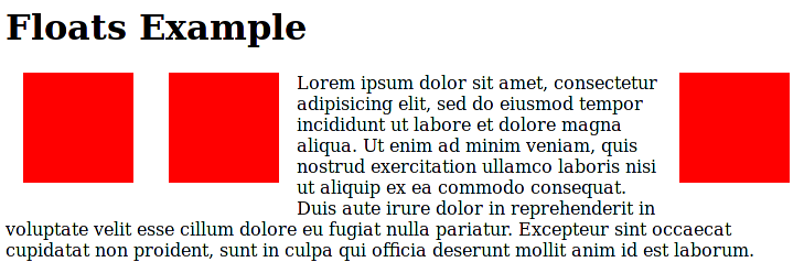
在下面的图片中,有三个红色的正方形。其中有两个向左浮动,一个向右浮动。要注意到第二个向左浮动的正方形被放在第一个向左浮动的正方形的右边。如果还有更多的正方形这样浮动,它们会从左到右依次排开,直到填满一整行,然后往下一行填。
清除浮动
在前面的例子当中,浮动的元素的高度比它们所在的容器元素(是块元素)的高度小。然而如果块元素内的文本太短,不足以把块元素的大小撑到高度大于所有浮动元素的高度,那么会产生一些意料之外的效果。例如,如果上面图片中的文字只有"Lorem ipsum dolor sit amet,",并且接下来是另外一个和"Floats Example"这个标题一样风格的标题元素,那么第二个标题元素会出现在红色的正方形之间。然而正常情况下我们希望这个标题元素是靠左对齐的。为了实现这个效果,我们需要清除浮动。
清除浮动最简单的方法就是给新的标题元素使用clear属性,这样确保它按照正常的方式靠左对齐:
h2.secondHeading { clear: both; }
然而这个方法只是在同一块级格式化上下文(block formatting context)中没有其他元素的时候才是有效的。如果我们的 H2 有兄弟元素是向左浮动和向右浮动的边栏,那么使用clear 会导致这个标题元素出现在边栏的下方,这显然不是我们期望的结果。(译注:原文“what we want”应该是指如果红色方块作为边栏,而我们不希望 H2 位于边栏下面,同时还要容器包裹住其内容。总之,经实验,个人觉得这段话说得意思不明确)
如果不能使用清除浮动,另一种做法是浮动容器的限制块级格式化上下文。还是上面的例子,有三个红色的正方形和一个P元素。我们可以设置P元素的overflow属性值变成hidden 或者auto,因为这样可以让容器元素伸展到能够包含红色正方形,而不是让他们超出块元素的底部。
p.withRedBoxes { overflow: hidden; height: auto; }
overflow为scroll 也可以让块元素撑大来包含所有的浮动子元素,但是这样不论内容有多少都会显示出一个滚动条。即使 height 默认值为 auto,我们还是设置了,是为了表明容器应该增大高度以便包裹住里面的内容。规范
| 规范 | 状态 | 说明 |
|---|---|---|
| CSS Basic Box Model float |
Working Draft | 大量新属性值,但目前还没完全定义清楚。任何与新特性无关的浏览器差异应该是无意中造成的,需要报告。 |
| CSS Level 2 (Revision 1) float |
Recommendation | 没有改变。 |
| CSS Level 1 float |
Recommendation | 最初的定义。 |
浏览器兼容性
| 特性 | Chrome | Firefox (Gecko) | Internet Explorer | Opera | Safari |
|---|---|---|---|---|---|
| 基本支持 | 1.0 | 1.0 (1.7 or earlier) | 4.0 | 7.0 | 1.0 |
| 特性 | Android | Firefox Mobile (Gecko) | IE Mobile | Opera Mobile | Safari Mobile |
|---|---|---|---|---|---|
| 基本支持 | 1.0 | 1.0 (1) | 6.0 | 6.0 | 1.0 |