Outside of the different colors and imagery that apps use, an app's design isn't necessarily dynamic: the principles of designing a flexible app are largely the same. But the style and tools a developer uses in coding an application is a completely different story. Numerous libraries and frameworks are available for coding mobile apps.
Bibliotecas JavaScript
jQuery Mobile
O framework jQuery oficial para dispositivos móveis é o jQuery Mobile. O jQuery Mobile prove um sistema de interface unificado, baseado em HTML5 para todas as plataformas de dispotivos móveis mais populares. O jQuery Mobile também prove um construtor de tema para o design aplictivo bem como o desenvolvimento.
Dojo Mobile
O Dojo Mobile é um framework para dispositivos móveis Dojo Toolkit's mobile framework, boasting a series of flexible views and widgets, automatic device detection and themes, and more. The Dojo Mobile Showcase shows advanced Dojo Mobile usage in action.
MooTools Moobile
The unofficial mobile framework of MooTools is called Moobile. Moobile provides a mobile application boilerplate as well as a host of simple mobile widgets.
Numerous other mobile JavaScript frameworks are available to aid the development of mobile web apps. When looking for a good mobile web app JavaScript framework, look for multi-device support, touch and gesture event support, and a unified API with its host framework.
The web app built in this tutorial will utilize jQuery Mobile. Experiment and evaluate different mobile frameworks based on the goals of your app before selecting one (or deciding against using any at all). In many cases, a framework app will be save you time; in other cases, a framework could be overkill.
CSS libraries, helpers, and techniques
CSS plays an important role in any web-based technology. There are a variety of CSS libraries than may aid you in creating, maintaining, and organizing your CSS.
CSS preprocessors
While CSS is a simple language, its lack of variables and the need for repeated style assignments with vendor prefixes can make CSS difficult to maintain—a pain no mobile app developer needs. CSS preprocessors ease development of apps, allowing for better code organization and faster development.
With one of those CSS preprocessors, LESS, CSS can be written like this:
@someColor: #000; /* color var */

.rounded-corners (@radius: 5px) { /* function */
  border-radius: @radius;
  -webkit-border-radius: @radius;
  -moz-border-radius: @radius;
}

p {
  color: @someColor;
  a {
    color: #fff;
    background: @someColor;

    .rounded-corners;
  }
}
This gets converted into the following by the LESS preprocessor:
p {
  color: #000;
}

p a {
  color: #fff;
  background: #000;
  border-radius: 5px;
  -webkit-border-radius: 5px;
  -moz-border-radius: 5px;
}
While LESS is the most popular CSS preprocessor, SASS and Stylus are also available and useful.
CSS3 techniques
Web apps may take advantage of numerous CSS techniques that allow for enriched design and strategies for avoiding the need for imagery.
Gradients
CSS3 provides the ability to create linear and radial gradients with some simple CSS code:
h1 {
  background-image: -moz-linear-gradient(#6facd5, #497bae);
}
Box and text shadows
Box shadows and text shadows provide a subtle depth enhancement to block elements and text:
.shadower {
  -moz-box-shadow: 10px 5px 5px #000;
  text-shadow: 1px 1px 2px black, 0 0 1em blue, 0 0 0.2em blue;
  color: white;
  font: 1.5em Georgia, "Bitstream Charter", "URW Bookman L", "Century Schoolbook L", serif;
}
Shapes with CSS
CSS also provides the ability to cleverly create shapes likes triangles and circles:
.arrowRight {
  width:0px;
  height:0px;
  border-bottom:5px solid transparent;
  border-top:5px solid transparent;
  border-left:5px solid #2f2f2f;
  font-size:0px;
  line-height:0px;
}

.circle {
  border-radius: 50%;
  width: 200px;
  height: 200px;
}
Creating responsive layouts
Coding responsive layouts is paramount in creating flexible apps that work on multiple devices and in multiple orientations. The following are some techniques for creating such a design.
Our desktop layout
Our mobile device & phone layouts
Percentage widths
Fixed pixel widths should rarely be used. Percentage widths are preferred as they let elements adjust to device viewport dimensions. Fixed widths (and heights) should generally be used only for small, genuinely fixed-sized items.
Viewport size-dependent element display
Showing and hiding elements based on viewport size is a common practice. Instead of cramming a lot of content into a smaller space, or changing an app's design completely, simply hiding those "supporting" elements may be the best option.
Viewport size-dependent imagery
Adapting image sizes to the device viewport size is also a common practice, making vector images (using SVG, for example) the best practice for your web app.
Media queries
CSS media queries let developers adjust layout and element styles to viewport size, orientation, aspect ratio, and more:
/* screen size media queries */
@media only screen and (min-device-width : 768px) and (max-device-width : 1024px) {

}


/* orientation media queries */
@media (orientation:portrait) {

}
@media (orientation:landscape) {

}

/* advanced media query usage */
@media all and (max-width: 699px) and (min-width: 520px), (min-width: 1151px) {

}

/* aspect ratio */
@media screen and (device-aspect-ratio: 16/9) {

}
orientationchange and resize events
Orientation changes can also be detected with JavaScript. Most browsers fire an orientationchange event while all browsers are known to fire the resize event.
window.addEventListener("resize", function() {
  // Detect orientation based on width
  var orientation = window.innerWidth > window.innerHeight ? "landscape" : "portrait";

  // Execute more code accordingly...
}, false);
Web app bootstraps
Server side processing of information can be handled by the server side technology of your choice. Popular server side languages include PHP, Python, and NodeJS + express. There's a likelihood that your application will want to implement BrowserID for app sign in. You can find the code required to implement BrowserID on MDN.
App manifests
Apps submitted to the Firefox Marketplace require an application manifest. This manifest contains basic information that a web browser needs to interact with an app. Manifests are written in JSON. A sample manifest could look like this:
{
"version": "0.1",
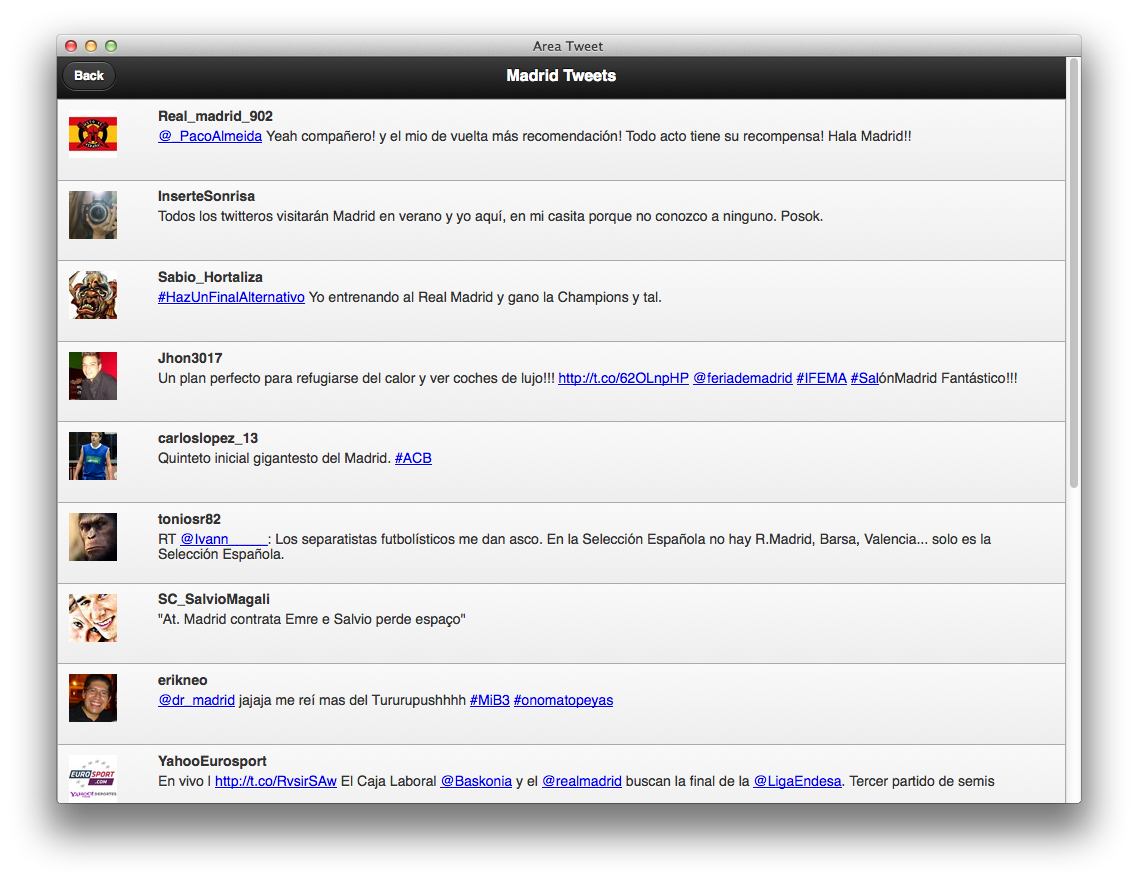
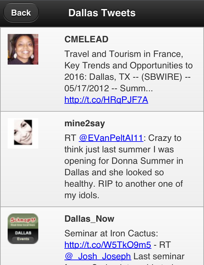
"name": "Area Tweet",
"description": "Find tweets by for any location",
"icons": {
"16": "https://areatweet.com/images/icon-16.png",
"48": "https://areatweet.com/images/icon-48.png",
"128": "https://areatweet.com/images/icon-128.png"
},
"developer": {
"name": "David Walsh",
"url": "https://areatweet.com"
},
"installs_allowed_from": [
"https://marketplace.firefox.com",
"https://areatweet.com"
],
"default_locale": "en"
}
The application manifest lives on the host server, not the Firefox Marketplace. It's recommended that your manifest be saved with a .webapp extension. The manifest must be served with a Content-Type HTTP header of application/x-web-app-manifest+json. Use of HTTPS is recommended.
A complete listing of all manifest properties can be found here. There's also a Frequently Asked Questions document which provides tips for creating your manifest and explanations for why the manifest hosting process is the way it is.
Use absolute paths within the manifest, even for images. The Firefox Marketplace will not currently accept manifests with relative paths.
Application cache
See Using the application cache for details.
Navigation
When an Open Web App is running in the Web runtime, no navigation controls are displayed. If you want to detect this, check the window.locationbar.visible property. If window.locationbar.visible is false, no navigation is displayed. You might want to check for this so you can provide navigation controls for the app user.