XUL has two elements used for the entry of numeric values or ranges, and well as two elements for entering dates and times. These elements are only available in Firefox 3 and later.
Number Fields
A textbox may be used for entering numbers by setting the value of the type attribute to the value number. This type of textbox may only be used to enter numbers. Other characters are not allowed and are just ignored if typed. In addition, arrow buttons appear beside the textbox to allow the user to cycle through the values.

As with other textboxes, the default value can be specified with the value attribute. Naturally, this value should be a number. However, the minimum and maximum values can also be specified using the min and max attributes. If these are set, you can control the range of values that the textbox may be set to. If the user enters a value less or greater than this value, it will be reset to the minimum or maximum value as necessary. For instance, the following numeric textbox has a range between 1 and 20.
<textbox type="number" min="1" max="20"/>
As the default value isn't specified, it will default to 1, the minimum value. The min attribute is set to 1 to indicate a minimum possible value of 1 and the max attribute is set to 20 to indiciate a maximum possible value of 20. If the minimum value is not specified, it has a default value of 0. The maximum value defaults to the special value Infinity which means that there is no limit.
Other numeric textbox attributes
The increment attribute may be used to specify by how much the value changes when the arrows are pressed. The default value is 1, but specifying a different value allows the number to change by a larger amount. For instance, the following example steps in multiples of 10.
<textbox type="number" increment="10" max="100"/>
This textbox steps in multiples of 10 from 0 to 100. Since the min attribute was not specified, it defaults to 0. Note that the user can still enter other values if they are typed in. The increment attribute only affects the arrow buttons. The user may also increment or decrement the value using this increment by using the up and down cursor keys while the textbox is focused.
The decimalplaces attribute indicates how many decimal places to show. The default value is 0, which means show integers only. However a different value may be used to show decimal values.
<textbox type="number" decimalplaces="2"/>
In this example, two digits right of the decimal point are shown. Values with additional fractional digits are rounded to two digits.
Scales
A scale element may also be used to select from a range of values. Instead of a textbox however, a sliding scale is used. The user may drag the thumb of the scale to adjust the value.

Many of the same attributes as a numeric textbox may be used with a scale: value, min, max and increment may all be used in a similar fashion. The scale does not actually show the value as a number, but it may be used in a script. A scale will fire a change event whenever the scales's value is modified.
<scale value="40" min="1" max="50"/>
This scale defaults to a value of 40 and has a range between 1 and 50.
A numeric textbox would normally be used when the value was important to the user, for instance, a field to enter a number of days, or the maximum size of a file. A scale would be used when the actual value isn't important, just that sliding the scale decreases or increases a state. For instance, a volume slider or a zoom level.
The default arrangement of a scale is horizontal with lower values to the left and higher values to the right. However, you can change this orientation with the orient and dir attributes.
<scale orient="vertical" dir="reverse"/>
This scale will be shown vertical with lower values at the bottom and higher values at the top.
Date and Time Entry Fields
The datepicker and timepicker elements may be used to allow the user to enter dates and times. When used, they display a set of numeric textboxes to enter each of the components of the date or time.
<datepicker value="2004-03-24"/>
<timepicker value="15:30:00"/>
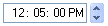
The value attribute is used to set the default value; if this attribute is omitted, the field will be initially set to the current date or time. The format of the attribute is exactly as above, that is dates are of the form YYYY/MM/DD and times are of the form HH:MM:SS (although the seconds and the accompanying colon may be omitted).
These two elements ensure that the user enters a value date or time. This way, you do not have to check for valid dates, ensure that the day isn't greater than the number of days in the month, handle leap years, and so forth.
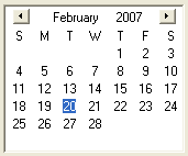
While the timepicker only comes is one style, the datepicker has three different variations. The default style shows three fields for entering the year, month and date. The type attribute may be used to select the other two. Using a value of grid uses a calendar grid, as shown in the image below.
You can also use the value popup which creates a combination of the two types. This type has three fields for entering the year, month and date, as well as a dropdown button for displaying a popup calendar grid for selecting a day.
<datepicker type="popup"/>