XUL有两种输入数值或者范围的元素,两种输入日期和时间的元素。这些元素仅适用于Firefox 3以及后续版本。
XUL has two elements used for the entry of numeric values or ranges, and well as two elements for entering dates and times. These elements are only available in Firefox 3 and later.
数值域Number Fields
textbox元素也可以用于输入数值,只要设置type属性的值为number即可。这种类型的textbox可以仅用于输入数字而会忽略输入的其他类型字符。另外,textbox一侧添加了上下箭头,允许用户增减输入的值。
A textbox may be used for entering numbers by setting the value of the type attribute to the value number. This type of textbox may only be used to enter numbers. Other characters are not allowed and are just ignored if typed. In addition, arrow buttons appear beside the textbox to allow the user to cycle through the values.

和其他类型的textbox一样,可以通过value属性指定默认值。自然,这个值应该是一个数值。另外,可以通过min属性和max属性指定元素的最小和最大值。如果指定了最小和最大值,你就设定了textbox可以输入的值域。如果用户输入了一个超出上下界的值,它会自动取最大值或最小值代替。例如,下面的数值类型textbox的值域是1到20。
As with other textboxes, the default value can be specified with the value attribute. Naturally, this value should be a number. However, the minimum and maximum values can also be specified using the min and max attributes. If these are set, you can control the range of values that the textbox may be set to. If the user enters a value less or greater than this value, it will be reset to the minimum or maximum value as necessary. For instance, the following numeric textbox has a range between 1 and 20.
<textbox type="number" min="1" max="20"/>
由于没有指定默认值,元素默认取值1,即最小值。设置min属性为1表明元素的最小可能值是1,同时设置max属性为20表明最大可能值是20。如果没有设置最小值,那么默认是0。max属性默认是Infinity,即最大值没有限制。
As the default value isn't specified, it will default to 1, the minimum value. The min attribute is set to 1 to indicate a minimum possible value of 1 and the max attribute is set to 20 to indiciate a maximum possible value of 20. If the minimum value is not specified, it has a default value of 0. The maximum value defaults to the special value Infinity which means that there is no limit.
其他数值型textbox属性Other numeric textbox attributes
increment属性指定当点击箭头时数值的改变量。默认值是1,当然可以设置一个更大的值来加大改变量。例如,下面的例子设置为以10的倍数改变值。
The increment attribute may be used to specify by how much the value changes when the arrows are pressed. The default value is 1, but specifying a different value allows the number to change by a larger amount. For instance, the following example steps in multiples of 10.
<textbox type="number" increment="10" max="100"/>
这个textbox从0到100,依次取10的倍数。由于没有指定min属性,默认是0。注意,用户仍然可以直接输入其他值。increment属性只会影响到上下箭头。当textbox有焦点时,用户可以通过上箭头增加值,用下箭头减小值。
This textbox steps in multiples of 10 from 0 to 100. Since the min attribute was not specified, it defaults to 0. Note that the user can still enter other values if they are typed in. The increment attribute only affects the arrow buttons. The user may also increment or decrement the value using this increment by using the up and down cursor keys while the textbox is focused.
decimalplaces属性表明需要显示的小数位数。默认值是0,表明只显示整数部分。指定其他值则可用于显示小数。
The decimalplaces attribute indicates how many decimal places to show. The default value is 0, which means show integers only. However a different value may be used to show decimal values.
<textbox type="number" decimalplaces="2"/>
在这个例子中,textbox将显示小数点后两位数字。小数位数多于两位的数值会被舍入到两位小数。
In this example, two digits right of the decimal point are shown. Values with additional fractional digits are rounded to two digits.
滑块Scales
scale元素也可以用来从一个区间中选择值。和textbox不同的是滑轨代替了文本框。用户可以拖动滑轨上的滑块来调整值。
A scale element may also be used to select from a range of values. Instead of a textbox however, a sliding scale is used. The user may drag the thumb of the scale to adjust the value.

Scale与textbox有很多相同的属性:value, min, max and increment,使用方法也类似。Scale并不实际显示数值,但这个值可能在脚本中用到。当值改变时,Scale将触发change事件。
Many of the same attributes as a numeric textbox may be used with a scale: value, min, max and increment may all be used in a similar fashion. The scale does not actually show the value as a number, but it may be used in a script. A scale will fire a change event whenever the scales's value is modified.
<scale value="40" min="1" max="50"/>
这个例子设置了一个默认值是40,值域是1到50的Scale元素。
This scale defaults to a value of 40 and has a range between 1 and 50.
数值型textbox一般应用于数值对用户而言很重要的情况,例如需要用户输入天数或者文件的最大大小。而Scale则应该用于实际值对用户不那么重要,只要用户能改变它就可以的情况。例如调整音量或者缩放。
A numeric textbox would normally be used when the value was important to the user, for instance, a field to enter a number of days, or the maximum size of a file. A scale would be used when the actual value isn't important, just that sliding the scale decreases or increases a state. For instance, a volume slider or a zoom level.
Scale元素的默认布局是小值在左,大值在右,水平放置。可以通过改变orient属性和dir属性修改。
The default arrangement of a scale is horizontal with lower values to the left and higher values to the right. However, you can change this orientation with the orient and dir attributes.
<scale orient="vertical" dir="reverse"/>
这个例子设置Scale垂直显示,且小值在下,大值在上。
This scale will be shown vertical with lower values at the bottom and higher values at the top.
日期时间输入域Date and Time Entry Fields
datepicker元素和timepicker元素用于用户输入日期和时间。他们会显示一组数值textbox用于输入日期和时间的各部分。
The datepicker and timepicker elements may be used to allow the user to enter dates and times. When used, they display a set of numeric textboxes to enter each of the components of the date or time.
<datepicker value="2004-03-24"/>
<timepicker value="15:30:00"/>
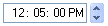
value属性用于设置默认值;如果没有显示指定,则初始化为当前日期或时间。属性值的格式严格按照例子所示,日期为YYYY-MM-DD,时间是HH:MM:SS(也可以省去秒以及前面的冒号)。
The value attribute is used to set the default value; if this attribute is omitted, the field will be initially set to the current date or time. The format of the attribute is exactly as above, that is dates are of the form YYYY/MM/DD and times are of the form HH:MM:SS (although the seconds and the accompanying colon may be omitted).
这两个元素保证用户输入一个有效的日期或者时间,因此你就不用再自己校验用户输入的日是不是大于当月的总天数以及闰年等等。
These two elements ensure that the user enters a value date or time. This way, you do not have to check for valid dates, ensure that the day isn't greater than the number of days in the month, handle leap years, and so forth.
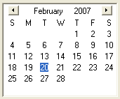
timepicker元素只有一种样式,而datepicker元素有三种不同的样式。默认样式是显示三个输入域分别对应年月日。type属性用于选择另外两种样式。grid样式效果如下。
While the timepicker only comes is one style, the datepicker has three different variations. The default style shows three fields for entering the year, month and date. The type attribute may be used to select the other two. Using a value of grid uses a calendar grid, as shown in the image below.
你也可以使用popup样式,该样式结合了另两种,也有三个输入域用于输入年月日,同时提供一个下拉按钮,用于显示日历供用户选择一天。
You can also use the value popup which creates a combination of the two types. This type has three fields for entering the year, month and date, as well as a dropdown button for displaying a popup calendar grid for selecting a day.
<datepicker type="popup"/>