This translation is incomplete. Please help translate this article from English.
কোরডিনেটের স্থান পরিবর্তন করে এবং নরমাল ডকোমেন্তের ফ্লো অপরিবর্তীত রেখে CSS রুপান্তর এফেক্টেড উপাদানের স্থান এবং আকার পরিবর্তন করে ।এই নির্দেশনা আপনাকে ট্রান্সফর্ম গুলো ব্যাবহার করার একটি পরিচিতি সরবরাহ করবে।
CSS রুপান্তর গুলো করা হয় CSS প্রোপার্টিজ এর একটি সেট ব্যাবহার করে ,যেটা আপনাকে HTML উপাদানের উপর লিনিয়ার রূপান্তর প্রয়োগ করতে দেবে ।এই রূপান্তরগুলোর মধ্যে রয়েছে রুটেশন, স্কিইং, স্কেলিং,এবং অনুবাদ। প্ল্যান এবং ত্রিমাত্রিক উভয় মাধমে এই রূপান্তর গুলো করা যায়।
CSS রূপান্তরের বৈশিষ্ট্য (প্রোপার্টিজ)
CSS রূপান্তরের জন্য দুটি প্রধান প্রোপার্টিজ ব্যাবহার করা হয় ঃ
:transform এবং transform-origin
transform-originট্যাগটি- মূল স্থানটিকে নির্দেশ করে । এমনিতে এটি উপাদানের কেন্দ্রবিন্দুতে থাকে এবং সরানোও যায়। এটি বিভিন্ন ধরনের রূপান্তরের জন্য ব্যাবহার করা হয় যেমন রুটেশন , স্কিইং অথবা স্কেলিং যেগুলোর জন্য প্যারামিটার হিসেবে একটি নিরদ্রিস্ত পয়েন্ট এর প্রয়োজন হয়।
transformটাগটি- ঐসব রূপান্তর গুলোকে নির্দেশ করে যেগুলো কোন উপাদানের উপর প্রয়োগ করা হয়।এটি রূপান্তরের স্পেস পৃথকারী তালিকা ,যেগুলোকে কম্পোজিশন অপারেশান অনুসারে একের পর এক প্রয়োগ করা হয় ।
- উদাহরণসমূহ
উদাহরণ: রুটেটিং
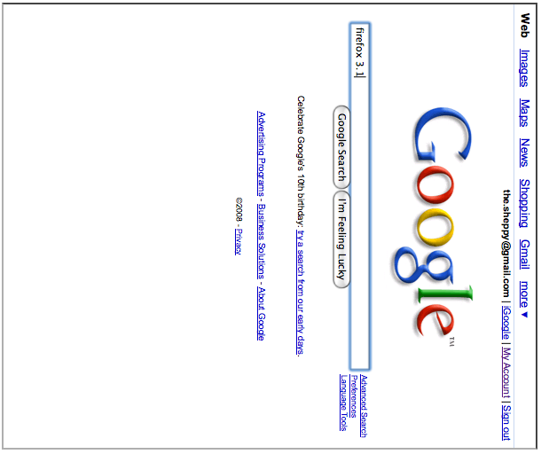
এই উদাহরণটি একটি iframe তৈরি করে যেটা আপনাকে GOOGLE এর হোম পেজ ব্যাবহার করতে দেবে যেটা নীচ থেকে বামে ৯০ ডিগ্রী কোণে ঘুরানো।
সরাসরি উদাহরণ দেখা উদাহরণের SCREENSHOT দেখা
<div style="transform: rotate(90deg); transform-origin: bottom left;">
  <iframe src="https://www.google.com/" width="500" height="600"></iframe>
</div>
উদাহরণ: স্কিইং এবং অনুবাদ
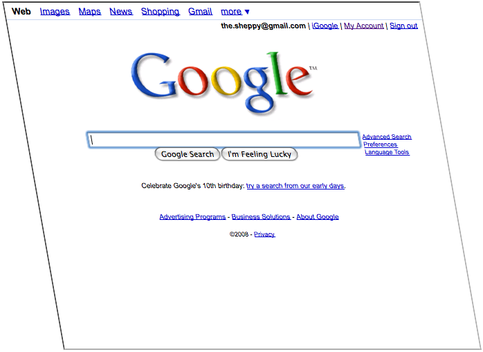
This example creates an iframe that lets you use Google's home page, skewed by 10 degrees and translated by 150 pixels on the X axis.
View live example View screenshot of example
<div style="transform: skewx(10deg) translatex(150px);
            transform-origin: bottom left;">
  <iframe src="https://www.google.com/" width="600" height="500"></iframe>
</div>
3D specific CSS properties
Performing CSS transformations in 3D space is a little bit more complex. You have to start by configuring the 3D space by giving it a perspective, then you have to configure how your 2D elements will behave in that space.
Setting up a perspective
The first element to set is the perspective. The perspective is what gives the 3D impression. The farther from the viewer the elements are, the smaller they are.
How quick they shrink is defined by the perspective property. The smaller its value is, the deeper the perspective is.
perspective:0; |
perspective:250px; |
|---|---|
|
1
2
3
4
5
6
|
1
2
3
4
5
6
|
perspective:300px; |
perspective:350px; |
|---|---|
|
1
2
3
4
5
6
|
1
2
3
4
5
6
|
The second element to configure is the position of the viewer, with the perspective-origin property. By default, the perspective is centered on the viewer, which is not always adequate.
perspective-origin:150px 150px; |
perspective-origin:50% 50%; |
perspective-origin:-50px -50px; |
|---|---|---|
|
1
2
3
4
5
6
|
1
2
3
4
5
6
|
1
2
3
4
5
6
|
Once you have done this, you can work on the element in the 3D space.
See also
- Using deviceorientation with 3D Transforms
- Intro to CSS 3D transforms (Blog post by David DeSandro)