Перевод не завершен. Пожалуйста, помогите перевести эту статью с английского.
CSS3 Flexible Box, или просто flexbox — это режим разметки, созданный для упорядочения элементов на странице таким образом, чтобы они вели себя предсказуемо в случаях, когда разметка страницы адаптирована под различные размеры экрана и устройства. Во многих случаях флексбоксы лучше блочной модели разметки, поскольку не использует обтекания (floats) и не выполняет схлопывание отступлений flex-контейнера и его содержимого (margin collapse).
Для многих дизайнеров модель использования флексбоксов будет более простой для применения. Дочерние элементы внутри флексбокса могут размещаться в любом направлении и могут менять размер, чтобы адаптироваться к различным размерам дисплея. Позиционирование элементов в таком случае является простым и комплексная разметка достигается значительно легче и с более чистым кодом, поскольку порядок отображения элементов не связан с их порядком в коде. Эта независимость умышленно касается только визуального рендеринга, оставляя порядок интерпретации и навигацию зависимыми от порядка в исходниках.
Концепция Flexbox
Главной концепцией Flexbox есть возможность изменения высоты и/или ширины его элементов, чтобы лучше заполнять пространство любого дисплея. Flex-контейнер увеличивает элементы, чтобы заполнить доступное пространство или уменьшает чтобы предотвратить перекрытие.
Алгоритм разметки флексбоксами агностичен к направлеию в противовес блочной разметке, которая ориентирована строго вертикально, или горизонтально-ориентированной инлайн-разметке. Несмотря на то что разметка блоками хорошо подходит для страницы, ей не хватает объективного механизма для поддержки компонентов, которые должны менять ориентацию, размеры а также растягиваться или сжиматься при изменениях размера экрана, изменении ориентации с вертикальной на горизонтальную и так далее. Разметка флексбоксами наиболее желательна для компонентов приложения и шаблонов, мало масштабируются, тогда как grid-разметка создана для больших шаблонов. Обе технологии являются частью разработки CSS Working Group которая должна способствовать совместимости web-приложений с различными браузерами, режимами а также большей гибкости.
Терминология
Поскольку описание флексбоксов не включает таких словосочетаний, как горизонтальная / inline и вертикальная / block оси, объяснение модели предусматривает новую терминологию. Используйте следующую диаграмму при просмотре словаря терминов. Она изображает flex-контейнер, имеющий flex-направление ряда, что означает, что каждый flex item расположен горизонтально, друг за другом по главной оси (main axis) в соответствии с установленного режима написания, направления текста элемента. Слева направо в данном случае.
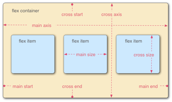
- Flex-контейнер
- Родительский элемент, в котором содержатся flex-Айтем. Flex-контейнер определяется установкой свойства
displayвflexилиinline-flex. - Flex-элемент, flex item
-
Каждый дочерний элемент flex-контейнера становится flex-элементом. Текст, который напрямую содержится в flex-контейнере, оборачивается анонимным flex-элементом.
- Оси
-
Каждый flexible-бокс шаблон строится по двум осям. Главная ось (main axis) — это ось, вдоль которой flex-элементы следуют один за другим, а перекрёстная ось (cross axis) перпендикулярна ей.
- Свойство
flex-directionустанавливает главную ось. - Свойство
justify-contentопределяет расположение элементов вдоль главной оси в текущем ряду. - Свойство
align-itemsрасположение элементов вдоль перекрёстной оси в текущем ряду. - Свойство
align-selfустанавливает, как отдельный flex-элемент выровнен по перекрёстной оси, переопределяя значения, установленные с помощьюalign-items.
- Свойство
- Направления
-
Главное начало и конец (main) и перекрёстноее начало и конец (cross start/end) — это стороны контейнерра, определяющие начало и окончание потока flex-элемментов. Они следуют по главной и перекрестной осями flex-контейнера в векторе, установленном режимом написания (
writing-mode) (слева направо, справа налево и т. д.).- Свойство
orderприсваивает элементы порядковым группам и определяет, в каком порядке их показывать. - Свойство
flex-flow— это короткая форма, состоящая из свойствflex-directionиflex-wrap, определяющих расплолжение элементов.
- Свойство
- Линии
-
Flex-элементы могут размещаться на одной или нескольких линиях в зависимости от значения свойства
flex-wrap, которое контролирует направление перекрестных линий и направление в котором складываются новые линии. - Dimensions
-
The flex items' agnostic equivalents of height and width are main size and cross size, which respectively follow the main axis and cross axis of the flex container.
- The
min-heightandmin-widthproperties initial value is 0. - The
flexproperty shorthands theflex-grow,flex-shrink, andflex-basisproperties to establish the flexibility of the flex items.
- The
Делаем элемент флексбоксом
Чтобы сделать элемент flexible-боксом, укажите значение display следующим образом:
display: flex
или
display: inline-flex
Таким образом мы определяем элемент как флексбокс, а его дочерниие элементы — как flex-элементы. Значение flex делает контейнер блочным элементом, а inline-flex значение превращает его в инлайн-элемент.
display: -webkit-flex.Flex Item Considerations
Text that is directly contained inside a flex container is automatically wrapped in an anonymous flex item. However, an anonymous flex item that contains only white space is not rendered, as if it were designated display: none.
Absolutely positioned children of a flex container are positioned so that their static position is determined in reference to the main start content-box corner of their flex container.
The margins of adjacent flex items do not collapse. Using auto margins absorbs extra space in the vertical or horizontal direction and can be used for alignment or to separate adjacent flex items. See Aligning with 'auto' margins in the W3C Flexible Box Layout Model specification for more details.
Flexbox's alignment properties do "true" centering, unlike other centering methods in CSS. This means that the flex items will stay centered, even if they overflow the flex container. This can sometimes be problematic, however, if they overflow past the top edge of the page, or the left edge (in LTR languages like English; the problem occurs on the right edge in RTL languages like Arabic), as you can't scroll to that area, even if there is content there! In a future release, the alignment properties will be extended to have a "safe" option as well. For now, if this is a concern, you can instead use margins to achieve centering, as they'll respond in a "safe" way and stop centering if they overflow. Instead of using the align- properties, just put auto margins on the flex items you wish to center. Instead of the justify- properties, put auto margins on the outside edges of the first and last flex items in the flex container. The auto margins will "flex" and assume the leftover space, centering the flex items when there is leftover space, and switching to normal alignment when not. However, if you're trying to replace justify-content with margin-based centering in a multi-line flexbox, you're probably out of luck, as you need to put the margins on the first and last flex item on each line. Unless you can predict ahead of time which items will end up on which line, you can't reliably use margin-based centering in the main axis to replace the justify-content property.
Recall that while the display order of the elements is independent of their order in the source code, this independence affects only the visual rendering, leaving speech order and navigation based on the source order. Even the order property does not affect speech or navigation sequence. Thus developers must take care to order elements properly in the source so as not to damage the document's accessibility.
Flexible Box Properties
Properties not affecting flexible boxes
Because flexible boxes use a different layout algorithm, some properties do not make sense on a flex container:
column-*properties of the multiple column module have no effect on a flex item.clearhas no effect on a flex item.floatcauses thedisplayproperty of the element to compute toblock.vertical-alignhas no effect on the alignment of flex items.
Examples
Basic flex example
This basic example shows how to apply "flexibility" to an element and how sibling elements behave in a flexible state.
<!DOCTYPE html>
<html lang="en">
<head>
<style>
.flex {
/* basic styling */
width: 350px;
height: 200px;
border: 1px solid #555;
font: 14px Arial;
/* flexbox setup */
display: flex;
flex-direction: row;
}
.flex > div {
flex: 1 1 auto;
width: 30px; /* To make the transition work nicely. (Transitions to/from
"width:auto" are buggy in Gecko and Webkit, at least.
See https://bugzil.la/731886 for more info.) */
transition: width 0.7s ease-out;
}
/* colors */
.flex > div:nth-child(1){ background: #009246; }
.flex > div:nth-child(2){ background: #F1F2F1; }
.flex > div:nth-child(3){ background: #CE2B37; }
.flex > div:hover {
width: 200px;
}
</style>
</head>
<body>
<p>Flexbox nuovo</p>
<div class="flex">
<div>uno</div>
<div>due</div>
<div>tre</div>
</div>
</body>
</html>
Holy Grail Layout example
This example demonstrates how flexbox provides the ability to dynamically change the layout for different screen resolutions. The following diagram illustrates the transformation.
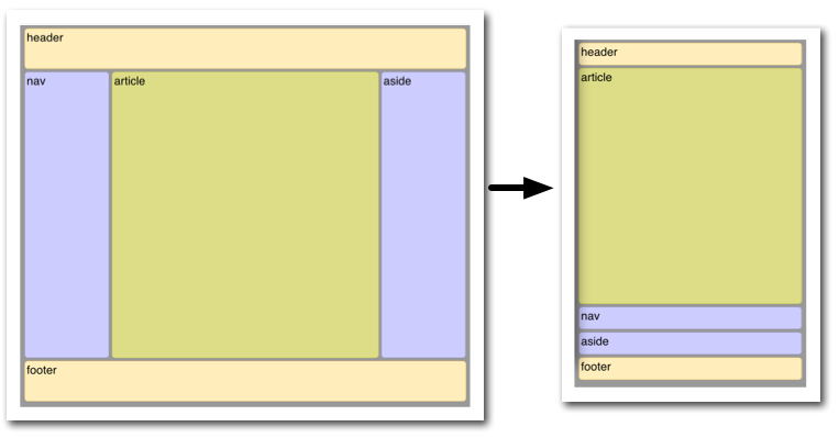
Illustrated here is the case where the page layout suited to a browser window must be optimized for a smart phone window. Not only must the elements reduce in size, but the order in which they are presented must change. Flexbox makes this very simple.
<!DOCTYPE html>
<html lang="en">
<head>
<style>
body {
font: 24px Helvetica;
background: #999999;
}
#main {
min-height: 800px;
margin: 0px;
padding: 0px;
display: flex;
flex-flow: row;
}
#main > article {
margin: 4px;
padding: 5px;
border: 1px solid #cccc33;
border-radius: 7pt;
background: #dddd88;
flex: 3 1 60%;
order: 2;
}
#main > nav {
margin: 4px;
padding: 5px;
border: 1px solid #8888bb;
border-radius: 7pt;
background: #ccccff;
flex: 1 6 20%;
order: 1;
}
#main > aside {
margin: 4px;
padding: 5px;
border: 1px solid #8888bb;
border-radius: 7pt;
background: #ccccff;
flex: 1 6 20%;
order: 3;
}
header, footer {
display: block;
margin: 4px;
padding: 5px;
min-height: 100px;
border: 1px solid #eebb55;
border-radius: 7pt;
background: #ffeebb;
}
/* Too narrow to support three columns */
@media all and (max-width: 640px) {
#main, #page {
flex-direction: column;
}
#main > article, #main > nav, #main > aside {
/* Return them to document order */
order: 0;
}
#main > nav, #main > aside, header, footer {
min-height: 50px;
max-height: 50px;
}
}
</style>
</head>
<body>
<header>header</header>
<div id='main'>
<article>article</article>
<nav>nav</nav>
<aside>aside</aside>
</div>
<footer>footer</footer>
</body>
</html>
Playground
There are a few flexbox playgrounds available online for experimenting:
Things to keep in mind
The algorithm describing how flex items are laid out can be pretty tricky at times. Here are a few things to consider to avoid bad surprises when designing using flexible boxes.
Flexible boxes are laid out in conformance of the writing mode, which means that main start and main end are laid out according to the position of start and end.
cross start and cross end rely on the definition of the start or before position that depends on the value of direction.
Page breaks are possible in flexible boxes layout as long as break- property allows it. CSS3 break-after, break-before, and break-inside as well as CSS 2.1 page-break-before, page-break-after, and page-break-inside properties are accepted on a flex container, flex items, and inside flex items.
Browser compatibility
| Feature | Firefox (Gecko) | Chrome | Internet Explorer | Opera | Safari |
|---|---|---|---|---|---|
| Basic support (single-line flexbox) | 18.0 (18.0)[6]-moz[2] 22.0 (22.0) |
21.0-webkit 29.0 |
11[3] | 12.10-webkit[5] | 6.1-webkit[1] |
| Multi-line flexbox | 28.0 (28.0) | 21.0-webkit 29.0 |
11[3] | 12.10[5] 15 -webkit |
6.1-webkit[1] |
| Feature | Firefox Mobile (Gecko) | Firefox OS | Android | IE Phone | Opera Mobile | Safari Mobile |
|---|---|---|---|---|---|---|
| Basic support (single-line flexbox) | 18.0 (18.0)-moz[2] 22.0 (22.0) |
1.0-moz[2] |
2.1-webkit[4] 4.4 |
11 | 12.10[5] 15-webkit |
7-webkit[1] |
| Multi-line flexbox | 28.0 (28.0) | 1.3 | 2.1-webkit[4] 4.4 |
11 | 12.10[5] 15-webkit |
7-webkit[1] |
[1] Safari up to version 6.0 (iOS.1) supported an old incompatible draft version of the specification. Safari 6.1 (and Safari on iOS 7) has been updated to support the final version.
[2] Up to Firefox 22, to activate flexbox support, the user has to change the about:config preference layout.css.flexbox.enabled to true. From Firefox 22 to Firefox 27, the preference is true by default, but the preference has been removed in Firefox 28.
[3] Internet Explorer 10 supports an old incompatible draft version of the specification; Internet Explorer 11 has been updated to support the final version.
[4] Android browser up to 4.3 supported an old incompatible draft version of the specification. Android 4.4 has been updated to support the final version.
[5] While in the initial implementation in Opera 12.10 flexbox was not prefixed, it got prefixed in versions 15 to 16 of Opera and 15 to 19 of Opera Mobile with -webkit. The prefix was removed again in Opera 17 and Opera Mobile 24.
[6] Up to Firefox 29, specifying visibility: collapse on a flex item causes it to be treated as if it were display: none instead of the intended behavior, treating it as if it were visibility: hidden. The suggested workaround is to use visibility:hidden for flex items that should behave as if they were designated visibility:collapse. For more information, see баг 783470.
See also
- The Flexbugs project for information on bugs in browsers' implementations of flexbox.