This is an experimental technology
Because this technology's specification has not stabilized, check the compatibility table for usage in various browsers. Also note that the syntax and behavior of an experimental technology is subject to change in future versions of browsers as the specification changes.
CSS Flexible Box Layout Model (Modelo de Layout Caixas Flexíveis de CSS), também conhecida como "flexbox", é parte do rascunho da especificação do CSS3. Ele provê uma CSS Box Model otimizada para o design de interfaces com o usuário. Elementos filhos no layout flex podem ser posicionados em qualquer direção e possuem dimensões flexíveis para se adaptar ao espaço disponível. Posicionar esses nodos filhos pode ser feito facilmente, e layouts complexos podem ser construídos de uma maneira mais clara e limpa. A ordem de exibição dos elementos é independente da ordem no código fonte.
-ms-, -moz-, -o- e -webkit- para garantir a compatibilidade com os navegadores Internet Explorer, Firefox (Gecko), Opera e Chrome/Safari (Webkit), respectivamente.Veja Flexbox para uma introdução à API.
Conceito de Caixas Flexíveis
O algoritmo de layout flexbox é agnóstico a direcionamento, em oposição ao layout de bloco (block layout), que é orientado verticalmente, ou ao layout inline, que é orientado horizontamente. Enquanto o layout de bloco funciona bem para páginas, ele carece de definição suficiente para suportar componentes de aplicação que necessitam mudar de orientação, tamanho, aumentar ou encolher, redirecionar da vertical para horizontal, e assim por diante. Flexbox layout é o mais apropriado para os componentes de uma aplicação, ou layouts de pequena escala, enquanto o (emergente) layout de Grid (Grid layout) é planejado para larga escala. Ambos fazem parte de um esforço mais amplo com o CSS3 para proporcionar uma maior interoperabilidade de aplicações web com diferentes agentes de usuário, diferentes modos de escrita, e outras demandas de flexibilidade.
Terminologia de Caixas Flexíveis
Ainda que a discussão sobre flexbox gire em torno de termos como eixos horizontais ou em linha, ou eixos verticais ou em bloco, faz-se necessário uma nova terminologia para melhor descrever esse novo modelo. O diagrama abaixo ilustra os termos que serão apresentados a seguir. Ele mostra um container flex que tem uma direção no sentido da linha (NT: flex-direction of row), o que significa que os itens flex seguem uns aos outros horizontalmente através do eixo principal (NT: main axis) de acordo com o sentido de escrita (sentido em que o texto flui), nesse caso da esquerda para a direita.
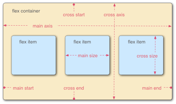
- Container Flex
- O elemento pai sobre o qual os itens flex estão contidos. Um container flex é definido usando os valores
flexouinline-flexda propriedadedisplay. - Item Flex
-
Cada nó filho de um container flex é um item flex. Quando um texto é adicionado diretamente ao container flex, ele é encapsulado e um item flex anônimo.
Nota: Se um bloco anônimo contém apenas espaços em braco, o box poderá não ser gerado se ele tiver a propriedadedisplay:none.Nota: Os filhos de um container flex que que possuem posicionamento absoluto são posicionados staticamente de acordo com o canto inicial (NT: head start corner) do container flex pai. - Eixos
-
Cada layout flexbox possui dois eixos: o eixo principal (NT: main axis), por onde os itens flex seguem uns aos outros e o eixo cruzado (NT: cross axis), perpendicular ao eixo principal.
- A propriedade
flex-directiondefine o eixo principal. - A propriedade
justify-contentdefine como os itens flex são posicionados sobre o eixo principal em uma determinada linha. - A propriedade
align-itemsdefine o padrão sobre como os itens flex são posicionados sobre o eixo cruzado em uma determinada linha. - A propriedade
align-selfdefine como um determinado item flex deve ser alinhado no eixo principal. Essa propriedade sobrescreve o padrão estabelecido poralign-items.
- A propriedade
- Directions
-
The main start/main end and cross start/cross end sides pairs of the flex container describe the origin and terminus of the flow of flex items. They follow the main axis and cross axis of the flex container in the vector established by the
writing-mode(left-to-right, right-to-left, etc.).- The
orderproperty assigns elements to ordinal groups and determines which elements appear first. - The
flex-flowproperty shorthands theflex-directionandflex-wrapproperties to lay out the flex items.
- The
- Lines
-
Flex items can be laid out on either a single line or on several lines according to the
flex-wrapproperty, which controls the direction of the cross axis and the direction in which new lines are stacked. - Dimensions
-
The flex items' agnostic equivalents of height and width are main size and cross size, which respectively follow the main axis and cross axis of the flex container.
- The
min-heightandmin-widthproperties have a new value,autothat establishes the minimum size of a flex item. - The
flexproperty shorthands theflex-basis,flex-grow, andflex-shrinkproperties to establish the flexibility of the flex items.
- The
Designating a flexible box
To designate the CSS for elements using this style, set the display property as follows:
display : flex
or
display : inline-flex
Doing so defines the element as a flex container and its children as flex items. The flex value makes the flex container a block-level element. The inline-flex value makes the flex container an atomic inline-level element.
display : -webkit-flex.Flexible box properties
Properties not affecting flexible boxes
Since flexible boxes uses a different layout algorithm, some properties do not make sense on a flex container.
- column-* properties of the Multicol module have no effect on a flex.
floatandclearhave no effect on a flex item. Usingfloatcause thedisplayproperty of the element to compute toblock.vertical-alignhas no effect on the alignment of flex items.
Examples
These examples run in Chrome version 21 (or Chrome Canary which you can install in addition to Chrome). You can run the examples by creating a file with the code provided and loading it in Chrome Canary.
Basic flex example
This basic example shows how to apply "flexibility" to an element, and how sibling elements behave in a flexible state.
<!DOCTYPE html>
<html lang="en">
<head>
<style>
.flex
{
/* basic styling */
width: 350px;
height: 200px;
border: 1px solid #555;
font: 14px Arial;
/* flexbox setup */
display: -webkit-flex;
-webkit-flex-direction: row;
display: flex;
flex-direction: row;
}
.flex > div
{
-webkit-flex: 1 1 auto;
flex: 1 1 auto;
-webkit-transition: width 0.7s ease-out;
transition: width 0.7s ease-out;
}
/* colors */
.flex > div:nth-child(1){ background : #009246; }
.flex > div:nth-child(2){ background : #F1F2F1; }
.flex > div:nth-child(3){ background : #CE2B37; }
.flex > div:hover
{
width: 200px;
}
</style>
</head>
<body>
<p>Flexbox nuovo</p>
<div class="flex">
<div>uno</div>
<div>due</div>
<div>tre</div>
</div>
</body>
</html>
Holy Grail Layout example
This example demonstrates how flexbox provides the ability to dynamically change the layout for different screen resolutions. The following diagram illustrates the transformation.
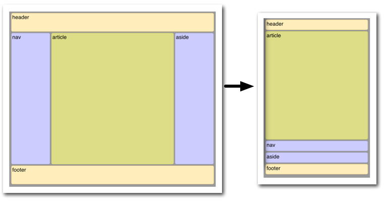
Illustrated here is the case where the page layout suited to a browser window must be optimized for a smart phone window. Not only must the elements reduce in size, but the order in which they are presented must change. Flexbox makes this very simple.
<!DOCTYPE html>
<html lang="en">
<head>
<style>
body {
font: 24px Helvetica;
background: #999999;
}
#main {
min-height: 800px;
margin: 0px;
padding: 0px;
display: -webkit-flex;
-webkit-flex-flow: row;
flex-flow: row;
}
#main > article {
margin: 4px;
padding: 5px;
border: 1px solid #cccc33;
border-radius: 7pt;
background: #dddd88;
-webkit-flex: 3 1 60%;
flex: 3 1 60%;
-webkit-order: 2;
order: 2;
}
#main > nav {
margin: 4px;
padding: 5px;
border: 1px solid #8888bb;
border-radius: 7pt;
background: #ccccff;
-webkit-flex: 1 6 20%;
flex: 1 6 20%;
-webkit-order: 1;
order: 1;
}
#main > aside {
margin: 4px;
padding: 5px;
border: 1px solid #8888bb;
border-radius: 7pt;
background: #ccccff;
-webkit-flex: 1 6 20%;
flex: 1 6 20%;
-webkit-order: 3;
order: 3;
}
header, footer {
display: block;
margin: 4px;
padding: 5px;
min-height: 100px;
border: 1px solid #eebb55;
border-radius: 7pt;
background: #ffeebb;
}
/* Too narrow to support three columns */
@media all and (max-width: 640px) {
#main, #page {
-webkit-flex-flow: column;
flex-flow: column;
}
#main > article, #main > nav, #main > aside {
/* Return them to document order */
-webkit-order: 0;
order: 0;
}
#main > nav, #main > aside, header, footer {
min-height: 50px;
max-height: 50px;
}
}
</style>
</head>
<body>
<header>header</header>
<div id='main'>
<article>article</article>
<nav>nav</nav>
<aside>aside</aside>
</div>
<footer>footer</footer>
</body>
</html>
Things to keep in mind
The algorithm describing how flex items are laid out can be pretty tricky at times. Here are a few things to consider to avoid bad surprises when designing using flexible boxes.
Flexibles boxes are laid out in conformance of the writing mode. Which means that main start and main end are laid out according to the position of start and end.
cross start and cross end rely on the definition of the start or before position that depends on the value of direction.
Page breaks are possible in flexible boxes layout as long as break- property allows it. CSS3 break-after, break-before and break-inside as well as CSS 2.1 page-break-before, page-break-after and page-break-inside properties are accepted on a flex container, flex items and inside flex items.
Browser compatibility
| Feature | Firefox (Gecko) | Chrome | Internet Explorer | Opera | Safari |
|---|---|---|---|---|---|
| Basic support | ? | 21.0-webkit | ? | ? | ? |
| Feature | Firefox Mobile (Gecko) | Android | IE Phone | Opera Mobile | Safari Mobile |
|---|---|---|---|---|---|
| Basic support | ? | ? | ? | ? | ? |