<p><strong>CSS transform</strong>를 사용하면 다른 엘리먼트에 영향을 미치지 않고 특정 엘리먼트의 위치를 바꿀 수 있다. 몇 가지 CSS 속성을 이용하여 엘리먼트에 아핀 선형 변환을 적용할 수 있다. 여기에는 회전, 비틀기, 확대, 축소, 평면과 3D 공간에서 이동 등이 있다.</p>
<h2 id="CSS_transforms_.EC.86.8D.EC.84.B1">CSS transforms 속성</h2>
<p>CSS transform에서 가장 중요한 속성은 {{ cssxref("transform") }} 과 {{ cssxref("transform-origin") }} 이다.</p>
<dl>
<dt>
{{ cssxref("transform-origin") }}</dt>
<dd>
원점의 위치를 지정한다. 기본값은 엘리먼트의 왼쪽 위이다. 회전, 확대, 축소, 비틀기 같이 한 점을 기준으로 수행되는 변환에 대해서 이 속성을 지정할 수 있다.</dd>
<dt>
{{ cssxref("transform") }}</dt>
<dd>
엘리먼트에 적용될 변환을 지정한다. 몇 가지 변환을 공백으로 구분하여 동시에 적용할 수 있다. </dd>
</dl>
<h2 id=".EC.98.88.EC.A0.9C">예제</h2>
<h3 id=".EC.98.88.EC.A0.9C.3A_.ED.9A.8C.EC.A0.84">예제: 회전</h3>
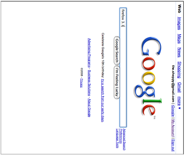
<p>이 예제는 구글 홈페이지를 90도 회전하여 보여준다. </p>
<p><a class="internal" href="/@api/deki/files/2921/=rotated-google-sample.html" title="/@api/deki/files/2921/=rotated-google-sample.html">예제 보기</a><br />
<a class="internal" href="/@api/deki/files/2920/=google-rotated.png" title="/@api/deki/files/2920/=google-rotated.png">스크린샷 보기</a></p>
<pre class="brush: html">
<div style="transform: rotate(90deg); transform-origin: bottom left;">
  <iframe src="https://www.google.com/" width="500" height="600"></iframe>
</div>
</pre>
<h3 id=".EC.98.88.EC.A0.9C.3A.C2.A0.EB.B9.84.ED.8B.80.EA.B3.A0_.EC.98.AE.EA.B8.B0.EA.B8.B0">예제: 비틀고 옮기기</h3>
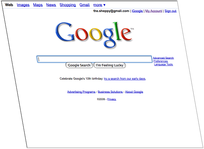
<p>이 예제는 구글 홈페이지를 10도 비틀고 x축으로 150 픽셀만큼 옮겨서 보여준다.</p>
<p><a class="external" href="/@api/deki/files/2922/=skewed-google-sample.html" title="https://developer.mozilla.org/editor/fckeditor/core/editor/@api/deki/files/2922/=skewed-google-sample.html">예제 보기</a><br />
<a class="internal" href="/@api/deki/files/2923/=skewed-google.png" title="/@api/deki/files/2923/=skewed-google.png">스크린샷 보기</a></p>
<pre class="brush: html">
<div style="transform: skewx(10deg) translatex(150px);
            transform-origin: bottom left;">
  <iframe src="https://www.google.com/" width="600" height="500"></iframe>
</div>
</pre>
<h2 id="3D_.EA.B4.80.EB.A0.A8_CSS_.EC.86.8D.EC.84.B1">3D 관련 CSS 속성</h2>
<p>CSS 속성을 공간에서 지정하는건 조금 까다롭다. 먼저 시점을 주고 2차원 엘리먼트가 보일지 결정한다.</p>
<h3 id=".EC.8B.9C.EC.A0.90_.EC.A0.95.ED.95.98.EA.B8.B0">원근감 정하기</h3>
<p>먼저 정해야할건 <em>원근감</em>이다. 원근감 때문에 3차원 공간의 느낌이 난다. 엘리먼트가 사용자로부터 멀어질수록 작아진다.</p>
<p>멀어질수록 얼마나 빨리 작아질지는 {{ cssxref("perspective") }} 속성을 통해 지정한다. 작은 값을 지정할수록 원근감이 깊어진다. (역자: 아래 예제의 CSS 속성들은 -moz- 접두어를 가지고 있다. 파이어폭스 브라우저에서 보길 바란다.)</p>
<div>
<table class="standard-table">
<tbody>
<tr>
<td><code>perspective:0;</code></td>
<td><code>perspective:250px;</code></td>
<td><code>perspective:300px;</code></td>
<td><code>perspective:350px;</code></td>
</tr>
<tr>
<td>
<div class="container" style="width:200px;height:200px;margin:75px 0 0 75px;border:none;">
<div class="cube" style="width:100%;height:100%;-moz-perspective:0;-moz-transform-style:preserve-3d;-moz-perspective-origin:150% 150%;">
<div class="middle" style="display: block;position: absolute;width: 100px;height: 100px;border: 1px dashed black;line-height: 100px;font-family: arial, sans-serif;font-size: 60px;color: white;text-align: center;background: transparent;">
</div>
<div class="front" style="display: block;position: absolute;width: 100px;height: 100px;border: none;line-height: 100px;font-family: arial, sans-serif;font-size: 60px;color: white;text-align: center;background: rgba( 0, 0, 0, 0.3 );-moz-transform: translateZ( 50px );">
1</div>
<div class="back" style="display: block;position: absolute;width: 100px;height: 100px;border: none;line-height: 100px;font-family: arial, sans-serif;font-size: 60px;color: white;text-align: center;background: rgba( 0, 255, 0, 1 ); color: black;-moz-transform: translateZ( -50px );">
2</div>
<div class="right" style="display: block;position: absolute;width: 100px;height: 100px;border: none;line-height: 100px;font-family: arial, sans-serif;font-size: 60px;color: white;text-align: center;background: rgba( 196, 0, 0, 0.7 );-moz-transform: rotateY( 90deg) translateZ( 50px );">
3</div>
<div class="left" style="display: block;position: absolute;width: 100px;height: 100px;border: none;line-height: 100px;font-family: arial, sans-serif;font-size: 60px;color: white;text-align: center;background: rgba( 0, 0, 196, 0.7 );-moz-transform: rotateY(-90deg) translateZ( 50px );">
4</div>
<div class="top" style="display: block;position: absolute;width: 100px;height: 100px;border: none;line-height: 100px;font-family: arial, sans-serif;font-size: 60px;color: white;text-align: center;background: rgba( 196, 196, 0, 0.7 );-moz-transform: rotateX( 90deg) translateZ( 50px );">
5</div>
<div class="bottom" style="display: block;position: absolute;width: 100px;height: 100px;border: none;line-height: 100px;font-family: arial, sans-serif;font-size: 60px;color: white;text-align: center;background: rgba( 196, 0, 196, 0.7);-moz-transform: rotateX(-90deg) translateZ( 50px );">
6</div>
</div>
</div>
</td>
<td>
<div class="container" style="width:200px;height:200px;margin:75px 0 0 75px;border:none;">
<div class="cube" style="width:100%;height:100%;-moz-perspective:250px;-moz-transform-style:preserve-3d;-moz-perspective-origin:150% 150%;">
<div class="middle" style="display: block;position: absolute;width: 100px;height: 100px;border: 1px dashed black;line-height: 100px;font-family: arial, sans-serif;font-size: 60px;color: white;text-align: center;background: transparent;">
</div>
<div class="front" style="display: block;position: absolute;width: 100px;height: 100px;border: none;line-height: 100px;font-family: arial, sans-serif;font-size: 60px;color: white;text-align: center;background: rgba( 0, 0, 0, 0.3 );-moz-transform: translateZ( 50px );">
1</div>
<div class="back" style="display: block;position: absolute;width: 100px;height: 100px;border: none;line-height: 100px;font-family: arial, sans-serif;font-size: 60px;color: white;text-align: center;background: rgba( 0, 255, 0, 1 ); color: black;-moz-transform: translateZ( -50px );">
2</div>
<div class="right" style="display: block;position: absolute;width: 100px;height: 100px;border: none;line-height: 100px;font-family: arial, sans-serif;font-size: 60px;color: white;text-align: center;background: rgba( 196, 0, 0, 0.7 );-moz-transform: rotateY( 90deg) translateZ( 50px );">
3</div>
<div class="left" style="display: block;position: absolute;width: 100px;height: 100px;border: none;line-height: 100px;font-family: arial, sans-serif;font-size: 60px;color: white;text-align: center;background: rgba( 0, 0, 196, 0.7 );-moz-transform: rotateY(-90deg) translateZ( 50px );">
4</div>
<div class="top" style="display: block;position: absolute;width: 100px;height: 100px;border: none;line-height: 100px;font-family: arial, sans-serif;font-size: 60px;color: white;text-align: center;background: rgba( 196, 196, 0, 0.7 );-moz-transform: rotateX( 90deg) translateZ( 50px );">
5</div>
<div class="bottom" style="display: block;position: absolute;width: 100px;height: 100px;border: none;line-height: 100px;font-family: arial, sans-serif;font-size: 60px;color: white;text-align: center;background: rgba( 196, 0, 196, 0.7);-moz-transform: rotateX(-90deg) translateZ( 50px );">
6</div>
</div>
</div>
</td>
<td>
<div class="container" style="width:200px;height:200px;margin:75px 0 0 75px;border:none;">
<div class="cube" style="width:100%;height:100%;-moz-perspective:300px;-moz-transform-style:preserve-3d;-moz-perspective-origin:150% 150%;">
<div class="middle" style="display: block;position: absolute;width: 100px;height: 100px;border: 1px dashed black;line-height: 100px;font-family: arial, sans-serif;font-size: 60px;color: white;text-align: center;background: transparent;">
</div>
<div class="front" style="display: block;position: absolute;width: 100px;height: 100px;border: none;line-height: 100px;font-family: arial, sans-serif;font-size: 60px;color: white;text-align: center;background: rgba( 0, 0, 0, 0.3 );-moz-transform: translateZ( 50px );">
1</div>
<div class="back" style="display: block;position: absolute;width: 100px;height: 100px;border: none;line-height: 100px;font-family: arial, sans-serif;font-size: 60px;color: white;text-align: center;background: rgba( 0, 255, 0, 1 ); color: black;-moz-transform: translateZ( -50px );">
2</div>
<div class="right" style="display: block;position: absolute;width: 100px;height: 100px;border: none;line-height: 100px;font-family: arial, sans-serif;font-size: 60px;color: white;text-align: center;background: rgba( 196, 0, 0, 0.7 );-moz-transform: rotateY( 90deg) translateZ( 50px );">
3</div>
<div class="left" style="display: block;position: absolute;width: 100px;height: 100px;border: none;line-height: 100px;font-family: arial, sans-serif;font-size: 60px;color: white;text-align: center;background: rgba( 0, 0, 196, 0.7 );-moz-transform: rotateY(-90deg) translateZ( 50px );">
4</div>
<div class="top" style="display: block;position: absolute;width: 100px;height: 100px;border: none;line-height: 100px;font-family: arial, sans-serif;font-size: 60px;color: white;text-align: center;background: rgba( 196, 196, 0, 0.7 );-moz-transform: rotateX( 90deg) translateZ( 50px );">
5</div>
<div class="bottom" style="display: block;position: absolute;width: 100px;height: 100px;border: none;line-height: 100px;font-family: arial, sans-serif;font-size: 60px;color: white;text-align: center;background: rgba( 196, 0, 196, 0.7);-moz-transform: rotateX(-90deg) translateZ( 50px );">
6</div>
</div>
</div>
</td>
<td>
<div class="container" style="width:200px;height:200px;margin:75px 0 0 75px;border:none;">
<div class="cube" style="width:100%;height:100%;-moz-perspective:350px;-moz-transform-style:preserve-3d;-moz-perspective-origin:150% 150%;">
<div class="middle" style="display: block;position: absolute;width: 100px;height: 100px;border: 1px dashed black;line-height: 100px;font-family: arial, sans-serif;font-size: 60px;color: white;text-align: center;background: transparent;">
</div>
<div class="front" style="display: block;position: absolute;width: 100px;height: 100px;border: none;line-height: 100px;font-family: arial, sans-serif;font-size: 60px;color: white;text-align: center;background: rgba( 0, 0, 0, 0.3 );-moz-transform: translateZ( 50px );">
1</div>
<div class="back" style="display: block;position: absolute;width: 100px;height: 100px;border: none;line-height: 100px;font-family: arial, sans-serif;font-size: 60px;color: white;text-align: center;background: rgba( 0, 255, 0, 1 ); color: black;-moz-transform: translateZ( -50px );">
2</div>
<div class="right" style="display: block;position: absolute;width: 100px;height: 100px;border: none;line-height: 100px;font-family: arial, sans-serif;font-size: 60px;color: white;text-align: center;background: rgba( 196, 0, 0, 0.7 );-moz-transform: rotateY( 90deg) translateZ( 50px );">
3</div>
<div class="left" style="display: block;position: absolute;width: 100px;height: 100px;border: none;line-height: 100px;font-family: arial, sans-serif;font-size: 60px;color: white;text-align: center;background: rgba( 0, 0, 196, 0.7 );-moz-transform: rotateY(-90deg) translateZ( 50px );">
4</div>
<div class="top" style="display: block;position: absolute;width: 100px;height: 100px;border: none;line-height: 100px;font-family: arial, sans-serif;font-size: 60px;color: white;text-align: center;background: rgba( 196, 196, 0, 0.7 );-moz-transform: rotateX( 90deg) translateZ( 50px );">
5</div>
<div class="bottom" style="display: block;position: absolute;width: 100px;height: 100px;border: none;line-height: 100px;font-family: arial, sans-serif;font-size: 60px;color: white;text-align: center;background: rgba( 196, 0, 196, 0.7);-moz-transform: rotateX(-90deg) translateZ( 50px );">
6</div>
</div>
</div>
</td>
</tr>
</tbody>
</table>
</div>
<p>다음으로 지정해야할 요소는 관찰자의 위치이다. {{ cssxref("perspective-origin") }} 속성을 통해 지정한다. 기본 값으로 관찰자의 중심이다.</p>
<div>
<table class="standard-table">
<tbody>
<tr>
<td><code>perspective-origin:150px 150px;</code></td>
<td><code>perspective-origin:50% 50%;</code></td>
<td><code>perspective-origin:-50px -50px;</code></td>
</tr>
<tr>
<td>
<div class="container" style="width:100px;height:100px;margin:25px;border:none;">
<div class="cube" style="width:100%;height:100%;-moz-perspective:300px;-moz-transform-style:preserve-3d;-moz-perspective-origin:150% 150%;">
<div class="front" style="display: block;position: absolute;width: 100px;height: 100px;border: none;line-height: 100px;font-family: arial, sans-serif;font-size: 60px;color: white;text-align: center;background: rgba( 0, 0, 0, 0.3 );-moz-transform: translateZ( 50px );">
1</div>
<div class="back" style="display: block;position: absolute;width: 100px;height: 100px;border: none;line-height: 100px;font-family: arial, sans-serif;font-size: 60px;color: white;text-align: center;background: rgba( 0, 255, 0, 1 ); color: black;-moz-transform: translateZ( -50px );">
2</div>
<div class="right" style="display: block;position: absolute;width: 100px;height: 100px;border: none;line-height: 100px;font-family: arial, sans-serif;font-size: 60px;color: white;text-align: center;background: rgba( 196, 0, 0, 0.7 );-moz-transform: rotateY( 90deg) translateZ( 50px );">
3</div>
<div class="left" style="display: block;position: absolute;width: 100px;height: 100px;border: none;line-height: 100px;font-family: arial, sans-serif;font-size: 60px;color: white;text-align: center;background: rgba( 0, 0, 196, 0.7 );-moz-transform: rotateY(-90deg) translateZ( 50px );">
4</div>
<div class="top" style="display: block;position: absolute;width: 100px;height: 100px;border: none;line-height: 100px;font-family: arial, sans-serif;font-size: 60px;color: white;text-align: center;background: rgba( 196, 196, 0, 0.7 );-moz-transform: rotateX( 90deg) translateZ( 50px );">
5</div>
<div class="bottom" style="display: block;position: absolute;width: 100px;height: 100px;border: none;line-height: 100px;font-family: arial, sans-serif;font-size: 60px;color: white;text-align: center;background: rgba( 196, 0, 196, 0.7);-moz-transform: rotateX(-90deg) translateZ( 50px );">
6</div>
</div>
</div>
</td>
<td>
<div class="container" style="width:100px;height:100px;margin:25px;border:none;">
<div class="cube" style="width:100%;height:100%;-moz-perspective:300px;-moz-transform-style:preserve-3d;-moz-perspective-origin:50% 50%;">
<div class="front" style="display: block;position: absolute;width: 100px;height: 100px;border: none;line-height: 100px;font-family: arial, sans-serif;font-size: 60px;color: white;text-align: center;background: rgba( 0, 0, 0, 0.3 );-moz-transform: translateZ( 50px );">
1</div>
<div class="back" style="display: block;position: absolute;width: 100px;height: 100px;border: none;line-height: 100px;font-family: arial, sans-serif;font-size: 60px;color: white;text-align: center;background: rgba( 0, 255, 0, 1 ); color: black;-moz-transform: translateZ( -50px );">
2</div>
<div class="right" style="display: block;position: absolute;width: 100px;height: 100px;border: none;line-height: 100px;font-family: arial, sans-serif;font-size: 60px;color: white;text-align: center;background: rgba( 196, 0, 0, 0.7 );-moz-transform: rotateY( 90deg) translateZ( 50px );">
3</div>
<div class="left" style="display: block;position: absolute;width: 100px;height: 100px;border: none;line-height: 100px;font-family: arial, sans-serif;font-size: 60px;color: white;text-align: center;background: rgba( 0, 0, 196, 0.7 );-moz-transform: rotateY(-90deg) translateZ( 50px );">
4</div>
<div class="top" style="display: block;position: absolute;width: 100px;height: 100px;border: none;line-height: 100px;font-family: arial, sans-serif;font-size: 60px;color: white;text-align: center;background: rgba( 196, 196, 0, 0.7 );-moz-transform: rotateX( 90deg) translateZ( 50px );">
5</div>
<div class="bottom" style="display: block;position: absolute;width: 100px;height: 100px;border: none;line-height: 100px;font-family: arial, sans-serif;font-size: 60px;color: white;text-align: center;background: rgba( 196, 0, 196, 0.7);-moz-transform: rotateX(-90deg) translateZ( 50px );">
6</div>
</div>
</div>
</td>
<td>
<div class="container" style="width:100px;height:100px;margin:25px;border:none;">
<div class="cube" style="width:100%;height:100%;-moz-perspective:300px;-moz-transform-style:preserve-3d;-moz-perspective-origin:-50% -50%;">
<div class="front" style="display: block;position: absolute;width: 100px;height: 100px;border: none;line-height: 100px;font-family: arial, sans-serif;font-size: 60px;color: white;text-align: center;background: rgba( 0, 0, 0, 0.3 );-moz-transform: translateZ( 50px );">
1</div>
<div class="back" style="display: block;position: absolute;width: 100px;height: 100px;border: none;line-height: 100px;font-family: arial, sans-serif;font-size: 60px;color: white;text-align: center;background: rgba( 0, 255, 0, 1 ); color: black;-moz-transform: translateZ( -50px );">
2</div>
<div class="right" style="display: block;position: absolute;width: 100px;height: 100px;border: none;line-height: 100px;font-family: arial, sans-serif;font-size: 60px;color: white;text-align: center;background: rgba( 196, 0, 0, 0.7 );-moz-transform: rotateY( 90deg) translateZ( 50px );">
3</div>
<div class="left" style="display: block;position: absolute;width: 100px;height: 100px;border: none;line-height: 100px;font-family: arial, sans-serif;font-size: 60px;color: white;text-align: center;background: rgba( 0, 0, 196, 0.7 );-moz-transform: rotateY(-90deg) translateZ( 50px );">
4</div>
<div class="top" style="display: block;position: absolute;width: 100px;height: 100px;border: none;line-height: 100px;font-family: arial, sans-serif;font-size: 60px;color: white;text-align: center;background: rgba( 196, 196, 0, 0.7 );-moz-transform: rotateX( 90deg) translateZ( 50px );">
5</div>
<div class="bottom" style="display: block;position: absolute;width: 100px;height: 100px;border: none;line-height: 100px;font-family: arial, sans-serif;font-size: 60px;color: white;text-align: center;background: rgba( 196, 0, 196, 0.7);-moz-transform: rotateX(-90deg) translateZ( 50px );">
6</div>
</div>
</div>
</td>
</tr>
</tbody>
</table>
</div>
<p>여기까지 왔다면 공간에서도 문제 없을 것이다.</p>
<h3 id="3.EC.B0.A8.EC.9B.90_.EA.B3.B5.EA.B0.84.EC.97.90.EC.84.9C_2.EC.B0.A8.EC.9B.90_.EC.97.98.EB.A6.AC.EB.A8.BC.ED.8A.B8.EB.93.A4">3차원 공간에서 2차원 엘리먼트들</h3>
<h2 id=".EB.8D.94_.EB.B3.B4.EA.B8.B0">더 보기</h2>
<ul>
<li>{{ CSS_Reference:Transforms() }}</li>
<li><a href="/en/Using_Deviceorientation_In_3D_Transforms" title="Using Deviceorientation In 3D Transforms">Using deviceorientation in 3D Transforms</a></li>
</ul>