웹은 변화하고 있습니다. 페이지 중심의 정적이던 사이트들은 동적으로 변화하고 있고, 데스크톱 웹 어플리케이션들이 JS와 AJAX를 중점으로 사용하며 제작되고 있습니다. 디자이너들은 새로운 위젯들과 컨트롤을 한결같이 JavaScript, HTML, CSS를 조합해서 만들고 있습니다. 이런 변화는 사용성과 반응형 향상에는 극적으로 도움을 주지만, 또 다른 많은 유저들은 접근성 격차로 인해 제약이 발생하는 리스크도 안고 있습니다. JavaScript는 스크린리더 같은 보조기술을 사용하는 유저들이 접근하기 힘들다고 알려져 있었습니다. 하지만 현재는 다양한 사용자가 접근할 수 있는 동적 웹 어플리케이션을 만들 수 있습니다.
문제
대부분의 자바스크립트 개발도구는 데스크톱 인터페이스의 동작을 유사하게 만들 수 있도록 클라이언트-사이드 위젯 라이브러리를 제공하고 있습니다. Slider, Menu bar, Filelist View 등을 JavaScript, CSS, HTML을 이용해서 만들 수 있습니다. HTML4 명세가 나왔을 때는 HTML 태그에서 이런 위젯들의 설명이 제공되지 않았으며, 개발자들은 보통 <div>나 <span>같은 것들을 활용하여 개발하였습니다. 이런 시대의 결과로 데스크톱 위젯들은 충분한 정보를 제공하지 못하였으며 이는 기술적으로 전혀 도움이 되지 않았습니다. 동적 콘텐츠는 이유가 어떻든 스크린을 보지 못하는 사람에게 문제가 되었습니다. 주식 시세 표시 위젯, 트위터 라이브 피드 갱신, 프로그레스바 같은 것들을 보조공학기술(AT)로 인식하지 못하는 경우가 많았습니다. ARIA가 필요한 이유가 여기에 있습니다.
Example 1: 탭 위젯을 ARIA 레이블링 없이 만든 마크업. 마크업에서 위젯의 폼과 동작에 대해 설명하고 있지 않습니다.
<!-- 탭 위젯을 위한 코드입니다. 어떻습니까? 마크업만 보고서 가늠이 되나요? -->
<ol>
<li id="ch1Tab">
<a href="#ch1Panel">Chapter 1</a>
</li>
<li id="ch2Tab">
<a href="#ch2Panel">Chapter 2</a>
</li>
<li id="quizTab">
<a href="#quizPanel">Quiz</a>
</li>
</ol>
<div>
<div id="ch1Panel">Chapter 1 content goes here</div>
<div id="ch2Panel">Chapter 2 content goes here</div>
<div id="quizPanel">Quiz content goes here</div>
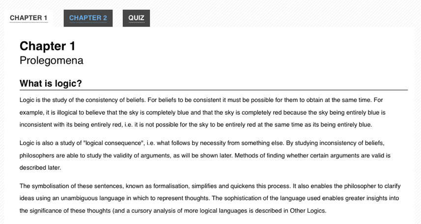
</div>Example 2: 탭 위젯의 렌더링 화면. 유저는 비주얼로 확인 가능하지만, 보조기술과 같은 기계들은 읽지 못합니다.
ARIA
Accessible Rich Internet Applications(WAI-ARIA)는 W3C의 Web Accessibility Initiative에서 제작하고, 스크린리더 같은 보조기기에서 필요한 정보들을 추가하는 방법을 제공합니다. ARIA는 마크업에서 특별한 속성을 추가하여 개발자들이 위젯의 디테일한 정보를 제공할 때 사용합니다. 동적 웹 어플리케이션에서 찾을 수 있는 데스크톱 스타일 콘트롤과 표준 HTML 태그 사이에 있는 차이를 채우기 위해, ARIA는 친숙한 UI 위젯의 동작 상태(state)와 역할(Role)에 대한 설명을 제공합니다.
ARIA는 다른 타입의 속성 세개 roles, states, properties를 분할하여 정의하고 있습니다. Roles는 slider, menu bar, dialog와 같은 HTML4에서 사용하지 못하는 위젯을 설명합니다. Properties는 드래그가 가능하다는 것이나, 요소가 필요하다는 것이나, 팝업이 뜨는 것과 같은 위젯의 특징에 대해 설명합니다. State는 요소의 현재 상태에 대해 설명합니다. 이 정보는 보조기기에서 요소의 접근이 불가하거나, 숨겨져 있는 상태라는 것을 명시합니다.
ARIA attributes are designed to be interpreted automatically by the browser and translated to the operating system's native accessibility APIs. When ARIA is present, assistive technologies are able to recognize and interact with custom JavaScript controls in the same way that they do with desktop equivalents. This has the potential for providing a much more consistent user experience than was possible in the previous generation of web applications, since assistive technology users can apply all of their knowledge of how desktop applications work when they are using web-based applications.
Example 3: Markup for the tabs widget with ARIA attributes added.
<!-- Now *these* are Tabs! --><!-- We've added role attributes to describe the tab list and each tab. --><ol role="tablist"><li id="ch1Tab" role="tab"> <a href="#ch1Panel">Chapter 1</a> </li> <li id="ch2Tab" role="tab"> <a href="#ch2Panel">Chapter 2</a> </li> <li id="quizTab" role="tab"> <a href="#quizPanel">Quiz</a> </li> </ol> <div> <!-- Notice the role and aria-labelledby attributes we've added to describe these panels. --> <div id="ch1Panel" role=”tabpanel” aria-labelledby="ch1Tab">Chapter 1 content goes here</div> <div id="ch2Panel" role=”tabpanel” aria-labelledby="ch2Tab">Chapter 2 content goes here</div> <div id="quizPanel" role=”tabpanel” aria-labelledby="quizTab">Quiz content goes here</div> </div>
ARIA is supported in the latest versions of all major browsers, including Firefox, Safari, Opera, Chrome, and Internet Explorer. Many assistive technologies, such as the open source NVDA and Orca screen readers, also support ARIA. Increasingly, JavaScript widget libraries such as jQuery UI, YUI, Google Closure and Dojo Dijit include ARIA markup as well.
Presentational changes
Dynamic presentational changes include using CSS to change the appearance of content (such as a red border around invalid data, or changing the background colour of a checked checkbox), as well as showing or hiding content.
State changes
ARIA provides attributes for declaring the current state of a UI widget. Examples include (but are certainly not limited to):
- aria-checked: indicates the state of a checkbox or radio button
- aria-disabled: indicates that an element is visible, but not editable or otherwise operable
- aria-grabbed: indicates the 'grabbed' state of an object in a drag-and-drop operation
(For a full list of ARIA states, consult the ARIA list of states and properties.)
Developers should use ARIA states to indicate the state of UI widget elements and use CSS attribute selectors to alter the visual appearance based on the state changes (rather than using script to change a class name on the element).
The Open Ajax Alliance website provides an example of CSS attribute selectors based on ARIA states. The example shows a WYSIWYG editor interface with a dynamic menu system. Items currently selected in a menu, such as the font face, are visually distinguished from other items. The relevant parts of the example are explained below.
In this example, the HTML for a menu has the form shown in Example 1a. Note how, on lines 7 and 13, the aria-checked property is used to declare the selection state of the menu items.
Example 1a. HTML for a selectable menu (adapted from https://www.oaa-accessibility.org/example/25/).
<ul id="fontMenu" class="menu" role="menu" aria-hidden="true">
  <li id="sans-serif"
      class="menu-item"
      role="menuitemradio"
      tabindex="-1"
      aria-controls="st1"
      aria-checked="true">Sans-serif</li>
  <li id="serif"
      class="menu-item"
      role="menuitemradio"
      tabindex="-1"
      aria-controls="st1"
      aria-checked="false">Serif</li>
  ...
The CSS that is used to alter the visual appearance of the selected item is shown in Example 1b. Note that there is no custom classname used, only the status of the aria-checked attribute on line 1.
Example 1b. Attribute-based selector for indicating state (from https://www.oaa-accessibility.org/example/25/).
li[aria-checked="true"] {
  font-weight: bold;
  background-image: url('/images/dot.png');
  background-repeat: no-repeat;
  background-position: 5px 10px;
}
The JavaScript to update the aria-checked property has the form shown in Example 1c. Note that the script only updates the aria-checked attribute (lines 3 and 8); it does not need to also add or remove a custom classname.
Example 1c. JavaScript to update the aria-checked attribute (based on https://www.oaa-accessibility.org/example/25/).
var processMenuChoice = function(item) {
  // 'check' the selected item
  item.setAttribute('aria-checked', 'true');
  // 'un-check' the other menu items
  var sib = item.parentNode.firstChild;
  for (; sib; sib = sib.nextSibling ) {
    if ( sib.nodeType === 1 && sib !== item ) {
      sib.setAttribute('aria-checked', 'false');
    }
  }
};
Visibility changes
When content visibility is changed (i.e. an element is hidden or shown), developers should change the aria-hidden property value. The techniques described above should be used to declare CSS to visually hide an element using display:none.
The Open Ajax Alliance website provides an example of a tooltip that uses aria-hidden to control the visibility of the tooltip. The example shows a simple web form with tooltips containing instructions associated with the entry fields. The relevant parts of the example are explained below.
In this example, the HTML for the tooltip has the form shown in Example 2a. Line 9 sets the aria-hidden state to true.
Example 2a. HTML for a tooltip (adapted from https://www.oaa-accessibility.org/example/39/).
<div class="text">
    <label id="tp1-label" for="first">First Name:</label>
    <input type="text" id="first" name="first" size="20"
           aria-labelledby="tp1-label"
           aria-describedby="tp1"
           aria-required="false" />
    <div id="tp1" class="tooltip"
         role="tooltip"
         aria-hidden="true">Your first name is a optional</div>
</div>
The CSS for this markup is shown in Example 2b. Note that there is no custom classname used, only the status of the aria-hidden attribute on line 1.
Example 2b. Attribute-based selector for indicating state (from https://www.oaa-accessibility.org/example/39/).
div.tooltip[aria-hidden="true"] {
  display: none;
}
The JavaScript to update the aria-hidden property has the form shown in Example 2c. Note that the script only updates the aria-hidden attribute (line 2); it does not need to also add or remove a custom classname.
Example 2c. JavaScript to update the aria-checked attribute (based on https://www.oaa-accessibility.org/example/39/).
var showTip = function(el) {
  el.setAttribute('aria-hidden', 'false');
}
Role changes
ARIA allows developers to declare a semantic role for an element that otherwise offers incorrect or no semantics. For example, when an unordered list is used to create a menu, the <ul> should be given a role of menubar and each <li> should be given a role of menuitem.
The role of an element should not change. Instead, remove the original element and replace it with an element with the new role.
For example, consider an "inline edit" widget: a component that allows users to edit a piece of text in place, without switching contexts. This component has a "view" mode, in which the text is not editable, but is activatable, and an "edit" mode, in which the text can be edited. A developer might be tempted to implement the "view" mode using a read-only text <input> element and setting its ARIA role to button, then switching to "edit" mode by making the element writable and removing the role attribute in "edit" mode (since <input> elements have their own role semantics).
Do not do this. Instead, implement the "view" mode using a different element altogether, such as a <div> or <span> with a role of button, and the "edit" mode using a text <input> element.
Asynchronous content changes
Keyboard navigation
Often times developers overlook support for the keyboard when they create custom widgets. To be accessible to a variety of users, all features of a web application or widget should also be controllable with the keyboard, without requiring a mouse. In practice, this usually involves following the conventions supported by similar widgets on the desktop, taking full advantage of the Tab, Enter, Spacebar, and arrow keys.
Traditionally, keyboard navigation on the web has been limited to the Tab key. A user presses Tab to focus each link, button, or form on the page in a linear order, using Shift-Tab to navigate backwards. It's a one-dimensional form of navigation—forward and back, one element at a time. On fairly dense pages, a keyboard-only user often has to press the Tab key dozens of times before they can access the section they need. Implementing desktop-style keyboard conventions on the web has the potential to significantly speed up navigation for many users.
Here's a summary of how keyboard navigation should work in an ARIA-enabled web application:
- The Tab key should provide focus to the widget as a whole. For example, tabbing to a menu bar should put focus on the menu's first elem
- The arrow keys should allow for selection or navigation within the widget. For example, using the left and right arrow keys should move focus to the previous and next menu items
- When the widget is not inside a form, both the Enter and Spacebar keys should select or activate the control
- Within a form, the Spacebar key should select or activate the control, while the Enter key should submit the form's default action.
- If in doubt, mimic the standard desktop behavior of the control you are creating.
So, for the Tabs widget example above, the user should be able to navigate into and out of the widget's container (the <ol> in our markup) using the Tab and Shift-Tab keys. Once keyboard focus is inside the container, the arrow keys should allow the user to navigate between each tab (the <li> elements). From here, conventions vary from platform to platform. On Windows, the next tab should automatically be activated when the user presses the arrow keys. On Mac OS X, the user can press either Enter or the Spacebar to activate the next tab. An in-depth tutorial for creating Keyboard-navigable JavaScript widgets describes how to implement this behavior with JavaScript.
For more detail about desktop-style keyboard navigation conventions, a comprehensive DHTML style guide is available. It provides an overview of how keyboard navigation should work for each type of widget supported by ARIA. The W3C also offers a helpful ARIA Best Practices document that includes keyboard navigation and shortcut conventions for a variety of widgets.