This article needs a technical review. How you can help.
Erasing part of what one has created might at first sight look contradictory. But when you try to create a semicircle in SVG, you will find out the use of the following properties quickly.
Clipping refers to removing parts of elements defined by other parts. In this case, any half-transparent effects are not possible, it's an all-or-nothing approach.
Masking on the other hand allows soft edges by taking transparency and grey values of the mask into account.
Creating clips
We create the above mentioned semicircle based on a circle element:
<svg version="1.1" xmlns="https://www.w3.org/2000/svg" xmlns:xlink="https://www.w3.org/1999/xlink">
  <defs>
    <clipPath id="cut-off-bottom">
      <rect x="0" y="0" width="200" height="100" />
    </clipPath>
  </defs>

  <circle cx="100" cy="100" r="100" clip-path="url(#cut-off-bottom)" />
</svg>
Centered at (100,100) a circle with radius 100 is painted. The attribute clip-path references a <clipPath>rect element. This rectangular on its own would paint the upper half of the canvas black. Note, that the clipPath element is usually placed in a defs section.
The rect will not be painted, however. Instead its pixel data will be used to determine, which pixels of the circle "make it" to the final rendering. Since the rectangle covers only the upper half of the circle, the lower half of the circle will vanish:
| Screenshot | Live sample |
|---|---|
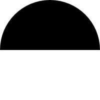 |
We now have a semicircle without having to deal with arcs in path elements. For the clipping, every path inside the clipPath is inspected and evaluated together with its stroke properties and transformation. Then every part of the target lying in a transparent area of the resulting clipPath's content will not rendered. Color, opacity and such have no effect as long as they don't let parts vanish completely.
Masking
The effect of masking is most impressively presented with a gradient. If you want an element to fade out, you can achieve this effect quite quickly with masks.
<svg width="200" height="200" version="1.1" xmlns="https://www.w3.org/2000/svg" xmlns:xlink="https://www.w3.org/1999/xlink">
  <defs>
    <linearGradient id="Gradient">
      <stop offset="0" stop-color="white" stop-opacity="0" />
      <stop offset="1" stop-color="white" stop-opacity="1" />
    </linearGradient>
    <mask id="Mask">
      <rect x="0" y="0" width="200" height="200" fill="url(#Gradient)"  />
    </mask>
  </defs>

  <rect x="0" y="0" width="200" height="200" fill="green" />
  <rect x="0" y="0" width="200" height="200" fill="red" mask="url(#Mask)" />
</svg>
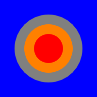
You see a green-filled rect at the lowest layer and on top a red-filled rect. The latter has the mask attribute pointing to the mask element. The content of the mask is a single rect element, that is filled with a transparent-to-white gradient. As a result the pixels of the red rectangle inherit the alpha value (the transparency) of the mask content, and we see a green-to-red gradient as a result:
| Screenshot | Live sample |
|---|---|
 |
Transparency with opacity
There is a simple possibility to set the transparency for a whole element. It's the opacity attribute:
<rect x="0" y="0" width="100" height="100" opacity=".5" />
The above rectangle will be painted half-transparent. For the fill and stroke there are two separate attributes, fill-opacity and stroke-opacity, that control each of those property opacities separately. Note, that the stroke will be painted on top of the filling. Hence, if you set a stroke opacity on an element, that also has a fill, the fill will shine through on half of the stroke, while on the other half the background will appear:
<svg width="200" height="200" version="1.1" xmlns="https://www.w3.org/2000/svg" xmlns:xlink="https://www.w3.org/1999/xlink">
  <rect x="0" y="0" width="200" height="200" fill="blue" />
  <circle cx="100" cy="100" r="50" stroke="yellow" stroke-width="40" stroke-opacity=".5" fill="red" />
</svg>
| Screenshot | Live sample |
|---|---|
 |
You see in this example the red circle on blue background. The yellow stroke is set to 50% opacity, which leads effectively to a double-color stroke.
Using well-known CSS techniques
One of the most powerful tools in a web developer's toolbox is display: none. It is therefore little surprise, that it was decided to take this CSS property into SVG as well, together with visibility and clip as defined by CSS 2. For reverting a previously set display: none it is important to know, that the initial value for all SVG elements is inline.