« SVG Attribute reference home
The transform attribute defines a list of transform definitions that are applied to an element and the element's children. The items in the transform list are separated by whitespace and/or commas, and are applied from right to left.
Usage context
| Categories | None |
|---|---|
| Value | <transform-list> |
| Animatable | Yes |
| Normative document | SVG 1.1 (2nd Edition) |
Types of transform definition
- matrix(<a> <b> <c> <d> <e> <f>)
- This transform definition specifies a transformation in the form of a transformation matrix of six values.
matrix(a,b,c,d,e,f)is equivalent to applying the transformation matrix which maps coordinates from a new coordinate system into a previous coordinate system by the following matrix equalities: - translate(<x> [<y>])
- This transform definition specifies a translation by
xandy. This is equivalent tomatrix(1 0 0 1 x y). Ifyis not provided, it is assumed to be zero. - scale(<x> [<y>])
- This transform definition specifies a scale operation by
xandy. This is equivalent tomatrix(x 0 0 y 0 0). If y is not provided, it is assumed to be equal tox. - rotate(<a> [<x> <y>])
- This transform definition specifies a rotation by
adegrees about a given point. If optional parametersxandyare not supplied, the rotate is about the origin of the current user coordinate system. The operation corresponds to the matrix If optional parametersxandyare supplied, the rotate is about the point(x, y). The operation represents the equivalent of the following transform definitions list:translate(<x>, <y>) rotate(<a>) translate(-<x>, -<y>). - skewX(<a>)
- This transform definition specifies a skew transformation along the x axis by
adegrees. The operation corresponds to the matrix - skewY(<a>)
- This transform definition specifies a skew transformation along the y axis by
adegrees. The operation corresponds to the matrix
Example
Rotating and Translating an SVG element
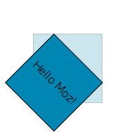
In this simple example we rotate and translate (move) an SVG element using transform SVG attribute. The original element before transform is shown with a low opacity.
CSS (optional):
text {
  font: 1em sans-serif;
}
SVG:
<svg width="180" height="200"
  xmlns="https://www.w3.org/2000/svg"
  xmlns:xlink="https://www.w3.org/1999/xlink">

  <!-- This is the element before translation and rotation are applied -->
  <rect x="50" y="50" height="100" width="100" style="stroke:#000; fill: #0086B2" fill-opacity=0.2 stroke-opacity=0.2></rect>

  <!-- Now we add a text element and apply rotate and translate to both -->
  <rect x="50" y="50" height="100" width="100" style="stroke:#000; fill: #0086B2" transform="translate(30) rotate(45 50 50)"></rect>
  <text x="60" y="105" transform="translate(30) rotate(45 50 50)"> Hello Moz! </text>

</svg>
| Screenshot | Live sample |
|---|---|
 |
General Transformation
Here is a basic example to understand a general transformation. We consider the transform matrix(1,2,3,4,5,6) and draw a thick blue line from (10,20) to (30,40) in the new coordinate system. A thin white line with the same end points is drawn above it using the original coordinate system.
<svg width="160" height="230" xmlns="https://www.w3.org/2000/svg">

  <g transform="matrix(1,2,3,4,5,6)">
    <!-- New coordinate system (thick blue line)
         x1 = 10 | x2 = 30
         y1 = 20 | y2 = 40
      -->
    <line x1="10" y1="20" x2="30" y2="40" style="stroke-width: 10px; stroke: blue;"/>
  </g>

  <!-- Previous coordinate system (thin white line)
       x1 = 1 * 10 + 3 * 20 + 5 = 75  | x2 = 1 * 30 + 3 * 40 + 5 = 155
       y1 = 2 * 10 + 4 * 20 + 6 = 106 | y2 = 2 * 30 + 4 * 40 + 6 = 226
    -->
  <line x1="75" y1="106" x2="155" y2="226" style="stroke-width: 1px; stroke: white;"/>

</svg>
Elements
The following elements can use the transform attribute:
<a><clipPath><defs><foreignObject><g><switch><use><svg>(SVG 2 onwards)- Graphics elements »