Please note, this is a STATIC archive of website developer.mozilla.org from 03 Nov 2016, cach3.com does not collect or store any user information, there is no "phishing" involved.

Revision 1085303 of Using CSS transitions

  • Revision slug: Web/CSS/CSS_Transitions/Using_CSS_transitions
  • Revision title: Using CSS transitions
  • Revision id: 1085303
  • Created:
  • Creator: jsx
  • Is current revision? No
  • Comment Removed an external link that I didn't think really added much to the page

Revision Content

{{CSSref}}{{SeeCompatTable}}

CSS transitions, provide a way to control animation speed when changing CSS properties. Instead of having property changes take effect immediately, you can cause the changes in a property to take place over a period of time. For example, if you change the color of an element from white to black, usually the change is instantaneous. With CSS transitions enabled, changes occur at time intervals that follow an acceleration curve, all of which can be customized.

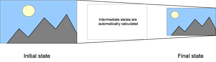
Animations that involve transitioning between two states are often called implicit transitions as the states in between the start and final states are implicitly defined by the browser.

A CSS transition tells the browser to draw the intermediate states between the initial and final states, showing the user a smooth transitions.

CSS transitions let you decide which properties to animate (by listing them explicitly), when the animation will start (by setting a delay), how long the transition will last (by setting a duration), and how the transition will run (by defining a timing function, e.g. linearly or quick at the beginning, slow at the end).

Note: CSS transition properties can be used without any prefix provider, but since the specification has only recently achieved stability, the vendor prefixes can still be necessary for browsers based on WebKit. They are also necessary for compatibility with older browser versions (e.g.: Firefox 15 and earlier, Opera 12 and earlier). A compatibility table is available at the bottom of this page with more information.

Which CSS properties are animatable?

The Web author can define which property has to be animated and in which way. This allows the creation of complex transitions. As it doesn't make sense to animate some properties, the list of animatable properties is limited to a finite set.

Note: The set of properties that can be animated is subject to change. Developers should proceed with caution.

Also the auto value is often a very complex case. The specification asks not to animate from and to such a value. Some user agents, like those based on Gecko, implement this requirement and others, like those based on WebKit, are less strict. Using animations with auto may lead to unpredictable results, depending on the browser and its version, and should be avoided.

Care should also be taken when using a transition immediately after adding the element to the DOM using .appendChild() or removing its display: none; property. This is seen as if the initial state had never occurred and the element was always in its final state. The easy way to overcome this limitation is to apply a window.setTimeout() of a handful of milliseconds before changing the CSS property you intend to transition to.

Multiple animated properties example

HTML Content

<body>
    <p>The box below combines transitions for: width, height, background-color, transform. Hover over the box to see these properties animated.</p>
    <div class="box"></div>
</body>

CSS Content

.box {
    border-style: solid;
    border-width: 1px;
    display: block;
    width: 100px;
    height: 100px;
    background-color: #0000FF;
    -webkit-transition: width 2s, height 2s, background-color 2s, -webkit-transform 2s;
    transition: width 2s, height 2s, background-color 2s, transform 2s;
}

.box:hover {
    background-color: #FFCCCC;
    width: 200px;
    height: 200px;
    -webkit-transform: rotate(180deg);
    transform: rotate(180deg);
}

{{EmbedLiveSample('Multiple_animated_properties_example', 600, 300)}}

CSS properties used to define transitions

CSS Transitions are controlled using the shorthand {{cssxref("transition")}} property. This is the best way to configure transitions, as it makes it easier to avoid that the lengths of the parameter list are out of sync, which can be very frustrating to have to spend lots of time debugging the CSS.

You can control the individual components of the transition with the following sub-properties:

(Note that these transitions loop infinitely only for the purpose of our examples; CSS transitions only visualize a property change from start to finish. If you need visualizations that loop, look into the CSS animation property.)

{{cssxref("transition-property")}}
Specifies the name or names of the CSS properties to which transitions should be applied. Only properties listed here are animated during transitions; changes to all other properties occur instantaneously as usual.
{{cssxref("transition-duration")}}
Specifies the duration over which transitions should occur. You can specify a single duration that applies to all properties during the transition, or multiple values to allow each property to transition over a different period of time.

transition-duration: 0.5s

 <div class="parent">
  <div class="box">Lorem</div>
</div>
  
.parent { width: 250px; height:125px;}
.box {
    width: 100px;
    height: 100px;
    background-color: red;
    font-size: 20px;
    left: 0px;
    top: 0px;
    position:absolute;
    -webkit-transition-property: width height background-color font-size left top transform -webkit-transform color;
    -webkit-transition-duration: 0.5s;
    -webkit-transition-timing-function: ease-in-out;
    transition-property: width height background-color font-size left top transform -webkit-transform color;
    transition-duration: 0.5s;
    transition-timing-function: ease-in-out;
}
.box1{
    transform: rotate(270deg);
    -webkit-transform: rotate(270deg);
    width: 50px;
    height: 50px;
    background-color: blue;
    color: yellow;
    font-size: 18px;
    left: 150px;
    top: 25px;
    position: absolute;
    -webkit-transition-property: width height background-color font-size left top transform -webkit-transform color;
    -webkit-transition-duration: 0.5s;
    -webkit-transition-timing-function: ease-in-out;
    transition-property: width height background-color font-size left top transform -webkit-transformv color;
    transition-duration: 0.5s;
    transition-timing-function: ease-in-out;
}
function updateTransition() {
  var el = document.querySelector("div.box");
   
  if (el) {
    el.className = "box1";
  } else {
    el = document.querySelector("div.box1");
    el.className = "box";
  }
   
  return el;
}

var intervalID = window.setInterval(updateTransition, 7000);
{{EmbedLiveSample("duration_0_5s", 275, 150)}}

transition-duration: 1s

 <div class="parent">
  <div class="box">Lorem</div>
</div>
  
.parent { width: 250px; height:125px;}
.box {
    width: 100px;
    height: 100px;
    background-color: red;
    font-size: 20px;
    left: 0px;
    top: 0px;
    position: absolute;
    -webkit-transition-property: width height background-color font-size left top -webkit-transform color;
    -webkit-transition-duration: 1s;
    -webkit-transition-timing-function: ease-in-out;
    transition-property: width height background-color font-size left top transform color;
    transition-duration: 1s;
    transition-timing-function: ease-in-out;
}
.box1{
    transform: rotate(270deg);
    -webkit-transform: rotate(270deg);
    width: 50px;
    height: 50px;
    background-color: blue;
    color: yellow;
    font-size: 18px;
    left: 150px;
    top: 25px;
    position: absolute;
    -webkit-transition-property: width height background-color font-size left top -webkit-transform transform color;
    -webkit-transition-duration: 1s;
    -webkit-transition-timing-function: ease-in-out;
    transition-property: width height background-color font-size left top transform -webkit-transform color;
    transition-duration: 1s;
    transition-timing-function: ease-in-out;
}
function updateTransition() {
  var el = document.querySelector("div.box");
   
  if (el) {
    el.className = "box1";
  } else {
    el = document.querySelector("div.box1");
    el.className = "box";
  }
   
  return el;
}

var intervalID = window.setInterval(updateTransition, 7000);
{{EmbedLiveSample("duration_1s",275,150)}}

transition-duration: 2s

 <div class="parent">
  <div class="box">Lorem</div>
</div>
  
.parent { width: 250px; height:125px;}
.box {
    width: 100px;
    height: 100px;
    background-color: red;
    font-size: 20px;
    left: 0px;
    top: 0px;
    position: absolute;
    -webkit-transition-property: width height background-color font-size left top transform -webkit-transform color;
    -webkit-transition-duration: 2s;
    -webkit-transition-timing-function: ease-in-out;
    transition-property: width height background-color font-size left top transform -webkit-transform color;
    transition-duration: 2s;
    transition-timing-function: ease-in-out;
}
.box1{
    transform: rotate(270deg);
    -webkit-transform: rotate(270deg);
    width: 50px;
    height: 50px;
    background-color: blue;
    color: yellow;
    font-size: 18px;
    left: 150px;
    top: 25px;
    position: absolute;
    -webkit-transition-property: width height background-color font-size left top transform -webkit-transform color;
    -webkit-transition-duration: 2s;
    -webkit-transition-timing-function: ease-in-out;
    transition-property: width height background-color font-size left top transform -webkit-transform color;
    transition-duration: 2s;
    transition-timing-function: ease-in-out;
}
function updateTransition() {
  var el = document.querySelector("div.box");
   
  if (el) {
    el.className = "box1";
  } else {
    el = document.querySelector("div.box1");
    el.className = "box";
  }
   
  return el;
}

var intervalID = window.setInterval(updateTransition, 7000);
{{EmbedLiveSample("duration_2s",275,150)}}

transition-duration: 4s

 <div class="parent">
  <div class="box">Lorem</div>
</div>
  
.parent { width: 250px; height:125px;}
.box {
    width: 100px;
    height: 100px;
    background-color: red;
    font-size: 20px;
    left: 0px;
    top: 0px;
    position: absolute;
    -webkit-transition-property: width height background-color font-size left top transform -webkit-transform color;
    -webkit-transition-duration: 4s;
    -webkit-transition-timing-function: ease-in-out;
    transition-property: width height background-color font-size left top transform -webkit-transform color;
    transition-duration: 4s;
    transition-timing-function: ease-in-out;
}
.box1{
    transform: rotate(270deg);
    -webkit-transform: rotate(270deg);
    width: 50px;
    height: 50px;
    background-color: blue;
    color: yellow;
    font-size: 18px;
    left: 150px;
    top: 25px;
    position: absolute;
    -webkit-transition-property: width height background-color font-size left top transform -webkit-transform color;
    -webkit-transition-duration: 4s;
    -webkit-transition-timing-function: ease-in-out;
    transition-property: width height background-color font-size left top transform -webkit-transform color;
    transition-duration: 4s;
    transition-timing-function: ease-in-out;
}
function updateTransition() {
  var el = document.querySelector("div.box");
   
  if (el) {
    el.className = "box1";
  } else {
    el = document.querySelector("div.box1");
    el.className = "box";
  }
   
  return el;
}

var intervalID = window.setInterval(updateTransition, 7000);
{{EmbedLiveSample("duration_4s",275,150)}}
{{cssxref("transition-timing-function")}}
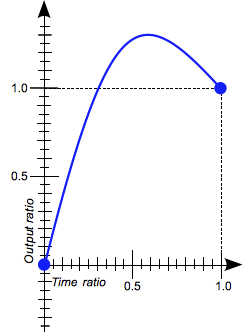
Specifies a function to define how intermediate values for properties are computed. Timing functions determine how intermediate values of the transition are calculated. Most timing functions can be specified by providing the graph of the corresponding function, as defined by four points defining a cubic bezier. You can also choose easing from Easing Functions Cheat Sheet.

transition-timing-function: ease

 <div class="parent">
  <div class="box">Lorem</div>
</div>
  
.parent { width: 250px; height:125px;}
.box {
    width: 100px;
    height: 100px;
    background-color: red;
    font-size: 20px;
    left: 0px;
    top: 0px;
    position: absolute;
    -webkit-transition-property: width height background-color font-size left top color;
    -webkit-transition-duration: 2s;
    -webkit-transition-timing-function: ease;
    transition-property: width height background-color font-size left top color;
    transition-duration: 2s;
    transition-timing-function: ease;
}
.box1{
    width: 50px;
    height: 50px;
    background-color: blue;
    color: yellow;
    font-size: 18px;
    left: 150px;
    top: 25px;
    position:absolute;
    -webkit-transition-property: width height background-color font-size left top color;
    -webkit-transition-duration: 2s;
    -webkit-transition-timing-function: ease;
    transition-property: width height background-color font-size left top color;
    transition-duration: 2s;
    transition-timing-function: ease;
}
function updateTransition() {
  var el = document.querySelector("div.box");
   
  if (el) {
    el.className = "box1";
  } else {
    el = document.querySelector("div.box1");
    el.className = "box";
  }
   
  return el;
}

var intervalID = window.setInterval(updateTransition, 7000);
{{EmbedLiveSample("ttf_ease",275,150)}}

transition-timing-function: linear

 <div class="parent">
  <div class="box">Lorem</div>
</div>
  
.parent { width: 250px; height:125px;}
.box {
    width: 100px;
    height: 100px;
    background-color: red;
    font-size: 20px;
    left: 0px;
    top: 0px;
    position: absolute;
    -webkit-transition-property: width height background-color font-size left top color;
    -webkit-transition-duration: 2s;
    -webkit-transition-timing-function: linear;
    transition-property: width height background-color font-size left top color;
    transition-duration: 2s;
    transition-timing-function: linear;
}
.box1{
    width: 50px;
    height: 50px;
    background-color: blue;
    color: yellow;
    font-size: 18px;
    left: 150px;
    top:25px;
    position: absolute;
    -webkit-transition-property: width height background-color font-size left top color;
    -webkit-transition-duration: 2s;
    -webkit-transition-timing-function: linear;
    transition-property: width height background-color font-size left top color;
    transition-duration: 2s;
    transition-timing-function: linear;
}
function updateTransition() {
  var el = document.querySelector("div.box");
   
  if (el) {
    el.className = "box1";
  } else {
    el = document.querySelector("div.box1");
    el.className = "box";
  }
   
  return el;
}

var intervalID = window.setInterval(updateTransition, 7000);
{{EmbedLiveSample("ttf_linear",275,150)}}

transition-timing-function: step-end

 <div class="parent">
  <div class="box">Lorem</div>
</div>
  
.parent { width: 250px; height:125px;}
.box {
    width: 100px;
    height: 100px;
    background-color: red;
    font-size: 20px;
    left: 0px;
    top: 0px;
    position: absolute;
    -webkit-transition-property: width height background-color font-size left top color;
    -webkit-transition-duration: 2s;
    -webkit-transition-timing-function: step-end;
    transition-property: width height background-color font-size left top color;
    transition-duration: 2s;
    transition-timing-function: step-end;
}
.box1{
    width: 50px;
    height: 50px;
    background-color: blue;
    color: yellow;
    font-size: 18px;
    left: 150px;
    top:25px;
    position: absolute;
    -webkit-transition-property: width height background-color font-size left top color;
    -webkit-transition-duration: 2s;
    -webkit-transition-timing-function: step-end;
    transition-property: width height background-color font-size left top color;
    transition-duration: 2s;
    transition-timing-function: step-end;
}
function updateTransition() {
  var el = document.querySelector("div.box");
   
  if (el) {
    el.className = "box1";
  } else {
    el = document.querySelector("div.box1");
    el.className = "box";
  }
   
  return el;
}

var intervalID = window.setInterval(updateTransition, 7000);
{{EmbedLiveSample("ttf_stepend",275,150)}}

transition-timing-function: steps(4, end)

 <div class="parent">
  <div class="box">Lorem</div>
</div>
  
.parent { width: 250px; height:125px;}
.box {
    width: 100px;
    height: 100px;
    background-color: red;
    font-size: 20px;
    left: 0px;
    top: 0px;
    position: absolute;
    -webkit-transition-property: width height background-color font-size left top color;
    -webkit-transition-duration: 2s;
    -webkit-transition-timing-function: steps(4, end);
    transition-property: width height background-color font-size left top color;
    transition-duration: 2s;
    transition-timing-function: steps(4, end);
}
.box1{
    width: 50px;
    height: 50px;
    background-color: blue;
    color: yellow;
    font-size: 18px;
    left: 150px;
    top: 25px;
    position: absolute;
    -webkit-transition-property: width height background-color font-size left top color;
    -webkit-transition-duration: 2s;
    -webkit-transition-timing-function: steps(4, end);
    transition-property: width height background-color font-size left top color;
    transition-duration: 2s;
    transition-timing-function: steps(4, end);
}
function updateTransition() {
  var el = document.querySelector("div.box");
   
  if (el) {
    el.className = "box1";
  } else {
    el = document.querySelector("div.box1");
    el.className = "box";
  }
   
  return el;
}

var intervalID = window.setInterval(updateTransition, 7000);
{{EmbedLiveSample("ttf_step4end",275,150)}}
{{cssxref("transition-delay")}}
Defines how long to wait between the time a property is changed and the transition actually begins.

transition-delay: 0.5s

 <div class="parent">
  <div class="box">Lorem</div>
</div>
  
.parent {
    width: 250px;
    height: 125px;
}

.box {
    width: 100px;
    height: 100px;
    background-color: red;
    font-size: 20px;
    left: 0px;
    top: 0px;
    position: absolute;
    -webkit-transition-property: width height background-color font-size left top color;
    -webkit-transition-duration: 2s;
    -webkit-transition-delay: 0.5s;
    -webkit-transition-timing-function: linear;
    transition-property: width height background-color font-size left top color;
    transition-duration: 2s;
    transition-delay: 0.5s;
    transition-timing-function: linear;
}

.box1 {
    width: 50px;
    height: 50px;
    background-color: blue;
    color: yellow;
    font-size: 18px;
    left: 150px;
    top:25px;
    position: absolute;
     -webkit-transition-property: width height background-color font-size left top color;
    -webkit-transition-duration: 2s;
    -webkit-transition-delay: 0.5s;
    -webkit-transition-timing-function: linear;
    transition-property: width height background-color font-size left top color;
    transition-duration: 2s;
    transition-delay: 0.5s;
    transition-timing-function: linear;
}
function updateTransition() {
  var el = document.querySelector("div.box");
   
  if (el) {
    el.className = "box1";
  } else {
    el = document.querySelector("div.box1");
    el.className = "box";
  }
   
  return el;
}

var intervalID = window.setInterval(updateTransition, 7000);
{{EmbedLiveSample("delay_0_5s",275,150)}}

transition-delay: 1s

 <div class="parent">
  <div class="box">Lorem</div>
</div>
  
.parent {
    width: 250px;
    height: 125px;
}

.box {
    width: 100px;
    height: 100px;
    background-color: red;
    font-size: 20px;
    left: 0px;
    top: 0px;
    position: absolute;
     -webkit-transition-property: width height background-color font-size left top color;
    -webkit-transition-duration: 2s;
    -webkit-transition-delay: 1s;
    -webkit-transition-timing-function: linear;
    transition-property: width height background-color font-size left top color;
    transition-duration: 2s;
    transition-delay: 1s;
    transition-timing-function: linear;
}

.box1{
    width: 50px;
    height: 50px;
    background-color: blue;
    color: yellow;
    font-size: 18px;
    left: 150px;
    top: 25px;
    position: absolute;
    -webkit-transition-property: width height background-color font-size left top color;
    -webkit-transition-duration: 2s;
    -webkit-transition-delay: 1s;
    -webkit-transition-timing-function: linear;
    transition-property: width height background-color font-size left top color;
    transition-duration: 2s;
    transition-delay: 1s;
    transition-timing-function: linear;
}
function updateTransition() {
  var el = document.querySelector("div.box");
   
  if (el) {
    el.className = "box1";
  } else {
    el = document.querySelector("div.box1");
    el.className = "box";
  }
   
  return el;
}

var intervalID = window.setInterval(updateTransition, 7000);
{{EmbedLiveSample("delay_1s",275,150)}}

transition-delay: 2s

 <div class="parent">
  <div class="box">Lorem</div>
</div>
  
.parent {
    width: 250px;
    height: 125px;
}

.box {
    width: 100px;
    height: 100px;
    background-color: red;
    font-size: 20px;
    left: 0px;
    top: 0px;
    position: absolute;
    -webkit-transition-property: width height background-color font-size left top color;
    -webkit-transition-duration: 2s;
    -webkit-transition-delay: 2s;
    -webkit-transition-timing-function: linear;
    transition-property: width height background-color font-size left top color;
    transition-duration: 2s;
    transition-delay: 2s;
    transition-timing-function: linear;
}

.box1 {
    width: 50px;
    height: 50px;
    background-color: blue;
    color: yellow;
    font-size: 18px;
    left: 150px;
    top: 25px;
    position: absolute;
    -webkit-transition-property: width height background-color font-size left top color;
    -webkit-transition-duration: 2s;
    -webkit-transition-delay: 2s;
    -webkit-transition-timing-function: linear;
    transition-property: width height background-color font-size left top color;
    transition-duration: 2s;
    transition-delay: 2s;
    transition-timing-function: linear;
}
function updateTransition() {
  var el = document.querySelector("div.box");
   
  if (el) {
    el.className = "box1";
  } else {
    el = document.querySelector("div.box1");
    el.className = "box";
  }
   
  return el;
}

var intervalID = window.setInterval(updateTransition, 7000);
{{EmbedLiveSample("delay_2s",275,150)}}

transition-delay: 4s

 <div class="parent">
  <div class="box">Lorem</div>
</div>
  
.parent {
    width: 250px;
    height: 125px;
}

.box {
    width: 100px;
    height: 100px;
    background-color: red;
    font-size: 20px;
    left: 0px;
    top: 0px;
    position: absolute;
    -webkit-transition-property: width height background-color font-size left top color;
    -webkit-transition-duration: 2s;
    -webkit-transition-delay: 4s;
    -webkit-transition-timing-function: ease-in-out;
    transition-property: width height background-color font-size left top color;
    transition-duration: 2s;
    transition-delay: 4s;
    transition-timing-function: ease-in-out;
}

.box1 {
    width: 50px;
    height: 50px;
    background-color: blue;
    color: yellow;
    font-size: 18px;
    left: 150px;
    top: 25px;
    position: absolute;
    -webkit-transition-property: width height background-color font-size left top color;
    -webkit-transition-duration: 2s;
    -webkit-transition-delay: 4s;
    -webkit-transition-timing-function: ease-in-out;
    transition-property: width height background-color font-size left top color;
    transition-duration: 2s;
    transition-delay: 4s;
    transition-timing-function: ease-in-out;
}
function updateTransition() {
  var el = document.querySelector("div.box");
   
  if (el) {
    el.className = "box1";
  } else {
    el = document.querySelector("div.box1");
    el.className = "box";
  }
   
  return el;
}

var intervalID = window.setInterval(updateTransition, 7000);
{{EmbedLiveSample("delay_4s",275,150)}}

The shorthand CSS syntax is written as follows:

div {
    transition: <property> <duration> <timing-function> <delay>;
}

Detecting the completion of a transition

There is a single event that is fired when transitions complete. In all standard-compliant browsers, the event is transitionend, in WebKit it is webkitTransitionEnd. See the compatibility table at the bottom for more. The transitionend event offers two properties:

propertyName
A string indicating the name of the CSS property whose transition completed.
elapsedTime
A float indicating the number of seconds the transition had been running at the time the event fired. This value isn't affected by the value of {{cssxref("transition-delay")}}.

As usual, you can use the element.addEventListener() method to monitor for this event (see {{domxref("eventtarget.addEventListener()")}}):

el.addEventListener("transitionend", updateTransition, true);
Note: The transitionend event doesn't fire if the transition is aborted before the transition is completed because either the element is made {{cssxref("display")}}: none or the animating property's value is changed.

When property value lists are of different lengths

If any property's list of values is shorter than the others, its values are repeated to make them match. For example:

div {
  transition-property: opacity, left, top, height;
  transition-duration: 3s, 5s;
}

This is treated as if it were:

div {
  transition-property: opacity, left, top, height;
  transition-duration: 3s, 5s, 3s, 5s;
}

Similarly, if any property's value list is longer than that for {{cssxref("transition-property")}}, it's truncated, so if you have the following CSS:

div {
  transition-property: opacity, left;
  transition-duration: 3s, 5s, 2s, 1s;
}

This gets interpreted as:

div {
  transition-property: opacity, left;
  transition-duration: 3s, 5s;
}

A simple example

This example performs a four-second font size transition with a two-second delay between the time the user mouses over the element and the beginning of the animation effect:

#delay1 {
  position: relative;
  transition-property: font-size;
  transition-duration: 4s;
  transition-delay: 2s;
  font-size: 14px;
}

#delay1:hover {
  transition-property: font-size;
  transition-duration: 4s;
  transition-delay: 2s;
  font-size: 36px;
}

Using transitions when highlighting menus

A common use of CSS is to highlight items in a menu as the user hovers the mouse cursor over them. It's easy to use transitions to make the effect even more attractive.

Before we look at code snippets, you might want to take a look at the live demo (assuming your browser supports transitions). You can also take a look directly at the CSS it uses.

First we set up the menu using HTML:

<div class="sidebar">
  <p><a class="menuButton" href="home">Home</a></p>
  <p><a class="menuButton" href="about">About</a></p>
  <p><a class="menuButton" href="contact">Contact Us</a></p>
  <p><a class="menuButton" href="links">Links</a></p>
</div>

Then we build the CSS to implement the look and feel of our menu. The relevant portions are shown here:

.menuButton {
  position: relative;
  transition-property: background-color, color;
  transition-duration: 1s;
  transition-timing-function: ease-out;
  text-align: left;
  background-color: grey;
  left: 5px;
  top: 5px;
  height: 26px;
  color: white;
  border-color: black;
  font-family: sans-serif;
  font-size: 20px;
  text-decoration: none;
  box-shadow: 2px 2px 1px black;
  padding: 2px 4px;
  border: solid 1px black;
}

.menuButton:hover {
  position: relative;
  transition-property: background-color, color;
  transition-duration: 1s;
  transition-timing-function: ease-out;
  background-color:white;
  color:black;
  box-shadow: 2px 2px 1px black;
}

This CSS establishes the look of the menu, with the background and text colors both changing when the element is in its {{cssxref(":hover")}} state.

Instead of describing the effect at length, you can take a look at the live sample if your browser has transitions support.

Using transitions to make JavaScript functionality smooth

Transitions are a great tool to make things look much smoother without having to do anything to your JavaScript functionality. Take the following example.

<p>Click anywhere to move the ball</p>
<div id="foo"></div>

Using JavaScript you can make the effect of moving the ball to a certain position happen:

var f = document.getElementById('foo');
document.addEventListener('click', function(ev){
    f.style.transform = 'translateY('+(ev.clientY-25)+'px)';
    f.style.transform += 'translateX('+(ev.clientX-25)+'px)';
},false);

With CSS you can make it smooth without any extra effort. Simply add a transition to the element and any change will happen smoothly:

p {
  padding-left: 60px;
}

#foo {
  border-radius: 50px;
  width: 50px;
  height: 50px;
  background: #c00;
  position: absolute;
  top: 0;
  left: 0;
  transition: transform 1s;
}

You can play with this here: https://jsfiddle.net/9h261pzo/291/

Specifications

Specification Status Comment
{{SpecName('CSS3 Transitions', '', '')}} {{Spec2('CSS3 Transitions')}} Initial definition

Browser compatibility

{{CompatibilityTable}}

Feature Chrome Firefox (Gecko) Internet Explorer Opera Safari (WebKit)
Basic support 1.0 {{property_prefix("-webkit")}}
26.0
{{CompatGeckoDesktop("2.0")}} {{property_prefix("-moz")}}
{{CompatGeckoDesktop("16.0")}}
10 10.5 {{property_prefix("-o")}}
12.10
3.2 {{property_prefix("-webkit")}}
transitionend event 1.0[1]
26.0
{{CompatGeckoDesktop("2.0")}} 10 10.5[2]
12
12.10
3.2[1]
6.0
Feature Android Firefox Mobile (Gecko) IE Phone Opera Mobile Safari Mobile
Basic support 2.1 {{CompatGeckoMobile("2.0")}} {{property_prefix("-moz")}}
{{CompatGeckoMobile("16.0")}}
10 10 {{property_prefix("-o")}}
12.10
3.2
transitionend event 2.1[1] {{CompatGeckoMobile("2.0")}} 10 10[2]
12
12.10
3.2[1]

[1] Chrome 1.0, WebKit 3.2 and Android 2.1 implemented this as the non-standard webkitTransitionEnd. Chrome 26.0 and WebKit 6.0 implement the standard transitionend.

[2] Opera 10.5 and Opera Mobile 10 implemented this as oTransitionEnd, version 12 as otransitionend and version 12.10 as the standard transitionend.

See also

  • The {{domxref("TransitionEvent")}} interface and the {{event("transitionend")}} event.\
  • Using CSS animations

Revision Source

<p>{{CSSref}}{{SeeCompatTable}}</p>

<p><span class="seoSummary"><strong>CSS transitions</strong>, provide a way to control animation speed when changing CSS properties. Instead of having property changes take effect immediately, you can cause the changes in a property to take place over a period of time.</span> For example, if you change the color of an element from white to black, usually the change is instantaneous. With CSS transitions enabled, changes occur at time intervals that follow an acceleration curve, all of which can be customized.</p>

<p>Animations that involve transitioning between two states are often called <em>implicit transitions</em> as the states in between the start and final states are implicitly defined by the browser.</p>

<p><img alt="A CSS transition tells the browser to draw the intermediate states between the initial and final states, showing the user a smooth transitions." src="/files/4529/TransitionsPrinciple.png" style="display:block; height:196px; margin:auto; width:680px" /></p>

<p>CSS transitions let you decide which properties to animate (by <em>listing them explicitly</em>), when the animation will start (by setting a <em>delay)</em>, how long the transition will last (by setting a <em>duration</em>), and how the transition will run (by defining a <em>timing function</em>, e.g. linearly or quick at the beginning, slow at the end).</p>

<div class="note"><strong>Note:</strong> CSS transition properties can be used without any prefix provider, but since the specification has only recently achieved stability, the vendor prefixes can still be necessary for browsers based on WebKit. They are also necessary for compatibility with older browser versions (e.g.: Firefox 15 and earlier, Opera 12 and earlier). A compatibility table is available at the bottom of this page with more information.</div>

<h2 id="Which_CSS_properties_are_animatable">Which CSS properties are animatable?</h2>

<p>The Web author can define which property has to be animated and in which way. This allows the creation of complex transitions. As it doesn't make sense to animate some properties, the <a href="/en-US/docs/CSS/CSS_animated_properties">list of animatable properties</a> is limited to a finite set.</p>

<div class="note">Note: The set of properties that can be animated is subject to change. Developers should proceed with caution.</div>

<p class="note">Also the auto value is often a very complex case. The specification asks not to animate from and to such a value. Some user agents, like those based on Gecko, implement this requirement and others, like those based on WebKit, are less strict. Using animations with <code>auto</code>&nbsp;may lead to unpredictable results, depending on&nbsp;the browser and its version, and should be avoided.</p>

<p class="note">Care should also be taken when using a transition immediately after adding the element to the DOM using&nbsp;<code>.appendChild()</code> or removing its&nbsp;<code>display: none;&nbsp;</code>property. This is seen as if the initial state had never occurred and the element was always in its final state. The easy way to overcome this limitation is to apply a&nbsp;<code>window.setTimeout()</code> of a handful of milliseconds before changing the CSS property you intend to transition to.</p>

<h3 id="Multiple_animated_properties_example">Multiple animated properties example</h3>

<h4 id="HTML_Content">HTML Content</h4>

<pre class="brush: html; highlight:[3]">
&lt;body&gt;
&nbsp;&nbsp;&nbsp; &lt;p&gt;The box below combines transitions for: width, height, background-color, transform. Hover over the box to see these properties animated.&lt;/p&gt;
&nbsp;&nbsp;&nbsp; &lt;div class="box"&gt;&lt;/div&gt;
&lt;/body&gt;</pre>

<h4 id="CSS_Content">CSS Content</h4>

<pre class="brush: css; highlight:[8,9]">
.box {
&nbsp;&nbsp;&nbsp; border-style: solid;
&nbsp;&nbsp;&nbsp; border-width: 1px;
&nbsp;&nbsp;&nbsp; display: block;
&nbsp;&nbsp;&nbsp; width: 100px;
&nbsp;&nbsp;&nbsp; height: 100px;
&nbsp;&nbsp;&nbsp; background-color: #0000FF;
&nbsp;&nbsp;&nbsp; -webkit-transition: width 2s, height 2s, background-color 2s, -webkit-transform 2s;
&nbsp;&nbsp;&nbsp; transition: width 2s, height 2s, background-color 2s, transform 2s;
}

.box:hover {
&nbsp;&nbsp;&nbsp; background-color: #FFCCCC;
&nbsp;&nbsp;&nbsp; width: 200px;
&nbsp;&nbsp;&nbsp; height: 200px;
&nbsp;&nbsp;&nbsp; -webkit-transform: rotate(180deg);
&nbsp;&nbsp;&nbsp; transform: rotate(180deg);
}
</pre>

<p>{{EmbedLiveSample('Multiple_animated_properties_example', 600, 300)}}</p>

<h2 id="CSS_properties_used_to_define_transitions">CSS properties used to define transitions</h2>

<p>CSS Transitions are controlled using the shorthand<a href="https://developer.mozilla.org/en-US/docs/CSS/transition"> </a>{{cssxref("transition")}} property. This is the best way to configure transitions, as it makes it easier to avoid that the lengths of the parameter list are out of sync, which can be very frustrating to have to spend lots of time debugging the CSS.</p>

<p>You can control the individual components of the transition with the following sub-properties:</p>

<p><strong>(Note that these transitions loop infinitely only for the purpose of our examples; CSS <code>transition</code>s only visualize a property change from start to finish. If you need visualizations that loop, look into the CSS <a href="/en-US/docs/CSS/animation"><code>animation</code></a> property.)</strong></p>

<dl>
 <dt>{{cssxref("transition-property")}}</dt>
 <dd>Specifies the name or names of the CSS&nbsp;properties to which transitions should be applied. Only properties listed here are animated during transitions; changes to all other properties occur instantaneously as usual.</dd>
 <dt>{{cssxref("transition-duration")}}</dt>
 <dd>Specifies the duration over which transitions should occur. You can specify a single duration that applies to all properties during the transition, or multiple values to allow each property to transition over a different period of time.
 <div>
 <div id="duration_0_5s" style="width: 251px; display: inline-block; margin-right: 1px; margin-bottom: 1px;">
 <p><code>transition-duration: 0.5s</code></p>

 <div style="display: none;">
 <pre class="brush:html">
 &lt;div class="parent"&gt;
  &lt;div class="box"&gt;Lorem&lt;/div&gt;
&lt;/div&gt;
  </pre>

 <pre class="brush:css">
.parent { width: 250px; height:125px;}
.box {
    width: 100px;
    height: 100px;
    background-color: red;
    font-size: 20px;
    left: 0px;
    top: 0px;
    position:absolute;
    -webkit-transition-property: width height background-color font-size left top transform -webkit-transform color;
    -webkit-transition-duration: 0.5s;
    -webkit-transition-timing-function: ease-in-out;
    transition-property: width height background-color font-size left top transform -webkit-transform color;
    transition-duration: 0.5s;
    transition-timing-function: ease-in-out;
}
.box1{
    transform: rotate(270deg);
    -webkit-transform: rotate(270deg);
    width: 50px;
    height: 50px;
    background-color: blue;
    color: yellow;
    font-size: 18px;
    left: 150px;
    top: 25px;
    position: absolute;
    -webkit-transition-property: width height background-color font-size left top transform -webkit-transform color;
    -webkit-transition-duration: 0.5s;
    -webkit-transition-timing-function: ease-in-out;
    transition-property: width height background-color font-size left top transform -webkit-transformv color;
    transition-duration: 0.5s;
    transition-timing-function: ease-in-out;
}
</pre>

 <pre class="brush:js">
function updateTransition() {
  var el = document.querySelector("div.box");
   
  if (el) {
    el.className = "box1";
  } else {
    el = document.querySelector("div.box1");
    el.className = "box";
  }
   
  return el;
}

var intervalID = window.setInterval(updateTransition, 7000);
</pre>
 </div>

 <div>{{EmbedLiveSample("duration_0_5s", 275, 150)}}</div>
 </div>

 <div id="duration_1s" style="width: 251px; display: inline-block; margin-right: 1px; margin-bottom: 1px;">
 <p><code>transition-duration: 1s</code></p>

 <div style="display: none;">
 <pre class="brush:html">
 &lt;div class="parent"&gt;
  &lt;div class="box"&gt;Lorem&lt;/div&gt;
&lt;/div&gt;
  </pre>

 <pre class="brush: css">
.parent { width: 250px; height:125px;}
.box {
    width: 100px;
    height: 100px;
    background-color: red;
    font-size: 20px;
    left: 0px;
    top: 0px;
    position: absolute;
    -webkit-transition-property: width height background-color font-size left top -webkit-transform color;
    -webkit-transition-duration: 1s;
    -webkit-transition-timing-function: ease-in-out;
    transition-property: width height background-color font-size left top transform color;
    transition-duration: 1s;
    transition-timing-function: ease-in-out;
}
.box1{
    transform: rotate(270deg);
    -webkit-transform: rotate(270deg);
    width: 50px;
    height: 50px;
    background-color: blue;
    color: yellow;
    font-size: 18px;
    left: 150px;
    top: 25px;
    position: absolute;
    -webkit-transition-property: width height background-color font-size left top -webkit-transform transform color;
    -webkit-transition-duration: 1s;
    -webkit-transition-timing-function: ease-in-out;
    transition-property: width height background-color font-size left top transform -webkit-transform color;
    transition-duration: 1s;
    transition-timing-function: ease-in-out;
}
</pre>

 <pre class="brush:js">
function updateTransition() {
  var el = document.querySelector("div.box");
   
  if (el) {
    el.className = "box1";
  } else {
    el = document.querySelector("div.box1");
    el.className = "box";
  }
   
  return el;
}

var intervalID = window.setInterval(updateTransition, 7000);
</pre>
 </div>

 <div>{{EmbedLiveSample("duration_1s",275,150)}}</div>
 </div>

 <div id="duration_2s" style="width: 251px; display: inline-block; margin-right: 1px; margin-bottom: 1px;">
 <p><code>transition-duration: 2s</code></p>

 <div style="display: none;">
 <pre class="brush:html">
 &lt;div class="parent"&gt;
  &lt;div class="box"&gt;Lorem&lt;/div&gt;
&lt;/div&gt;
  </pre>

 <pre class="brush: css">
.parent { width: 250px; height:125px;}
.box {
    width: 100px;
    height: 100px;
    background-color: red;
    font-size: 20px;
    left: 0px;
    top: 0px;
    position: absolute;
    -webkit-transition-property: width height background-color font-size left top transform -webkit-transform color;
    -webkit-transition-duration: 2s;
    -webkit-transition-timing-function: ease-in-out;
    transition-property: width height background-color font-size left top transform -webkit-transform color;
    transition-duration: 2s;
    transition-timing-function: ease-in-out;
}
.box1{
    transform: rotate(270deg);
    -webkit-transform: rotate(270deg);
    width: 50px;
    height: 50px;
    background-color: blue;
    color: yellow;
    font-size: 18px;
    left: 150px;
    top: 25px;
    position: absolute;
    -webkit-transition-property: width height background-color font-size left top transform -webkit-transform color;
    -webkit-transition-duration: 2s;
    -webkit-transition-timing-function: ease-in-out;
    transition-property: width height background-color font-size left top transform -webkit-transform color;
    transition-duration: 2s;
    transition-timing-function: ease-in-out;
}
</pre>

 <pre class="brush:js">
function updateTransition() {
  var el = document.querySelector("div.box");
   
  if (el) {
    el.className = "box1";
  } else {
    el = document.querySelector("div.box1");
    el.className = "box";
  }
   
  return el;
}

var intervalID = window.setInterval(updateTransition, 7000);
</pre>
 </div>

 <div>{{EmbedLiveSample("duration_2s",275,150)}}</div>
 </div>

 <div id="duration_4s" style="width: 251px; display: inline-block; margin-right: 1px; margin-bottom: 1px;">
 <p><code>transition-duration: 4s</code></p>

 <div style="display: none;">
 <pre class="brush:html">
 &lt;div class="parent"&gt;
  &lt;div class="box"&gt;Lorem&lt;/div&gt;
&lt;/div&gt;
  </pre>

 <pre class="brush: css">
.parent { width: 250px; height:125px;}
.box {
    width: 100px;
    height: 100px;
    background-color: red;
    font-size: 20px;
    left: 0px;
    top: 0px;
    position: absolute;
    -webkit-transition-property: width height background-color font-size left top transform -webkit-transform color;
    -webkit-transition-duration: 4s;
    -webkit-transition-timing-function: ease-in-out;
    transition-property: width height background-color font-size left top transform -webkit-transform color;
    transition-duration: 4s;
    transition-timing-function: ease-in-out;
}
.box1{
    transform: rotate(270deg);
    -webkit-transform: rotate(270deg);
    width: 50px;
    height: 50px;
    background-color: blue;
    color: yellow;
    font-size: 18px;
    left: 150px;
    top: 25px;
    position: absolute;
    -webkit-transition-property: width height background-color font-size left top transform -webkit-transform color;
    -webkit-transition-duration: 4s;
    -webkit-transition-timing-function: ease-in-out;
    transition-property: width height background-color font-size left top transform -webkit-transform color;
    transition-duration: 4s;
    transition-timing-function: ease-in-out;
}
</pre>

 <pre class="brush:js">
function updateTransition() {
  var el = document.querySelector("div.box");
   
  if (el) {
    el.className = "box1";
  } else {
    el = document.querySelector("div.box1");
    el.className = "box";
  }
   
  return el;
}

var intervalID = window.setInterval(updateTransition, 7000);
</pre>
 </div>

 <div>{{EmbedLiveSample("duration_4s",275,150)}}</div>
 </div>
 </div>
 </dd>
 <dt>{{cssxref("transition-timing-function")}}</dt>
 <dd><img alt="" src="/files/3434/TF_with_output_gt_than_1.png" style="float:left; height:173px; margin-right:5px; width:130px" />Specifies a function to define how intermediate values for properties are computed. <em>Timing functions</em> determine how intermediate values of the transition are calculated. Most <a href="/en-US/docs/CSS/timing-function">timing functions</a> can be specified by providing the graph of the corresponding function, as defined by four points defining a cubic bezier. You can also choose easing from&nbsp;<a href="https://easings.net/">Easing Functions Cheat Sheet</a>.
 <div class="cleared">
 <div id="ttf_ease" style="width: 251px; display: inline-block; margin-right: 1px; margin-bottom: 1px;">
 <p><code>transition-timing-function: ease</code></p>

 <div style="display: none;">
 <pre class="brush:html">
 &lt;div class="parent"&gt;
  &lt;div class="box"&gt;Lorem&lt;/div&gt;
&lt;/div&gt;
  </pre>

 <pre class="brush: css">
.parent { width: 250px; height:125px;}
.box {
    width: 100px;
    height: 100px;
    background-color: red;
    font-size: 20px;
    left: 0px;
    top: 0px;
    position: absolute;
    -webkit-transition-property: width height background-color font-size left top color;
    -webkit-transition-duration: 2s;
    -webkit-transition-timing-function: ease;
    transition-property: width height background-color font-size left top color;
    transition-duration: 2s;
    transition-timing-function: ease;
}
.box1{
    width: 50px;
    height: 50px;
    background-color: blue;
    color: yellow;
    font-size: 18px;
    left: 150px;
    top: 25px;
    position:absolute;
    -webkit-transition-property: width height background-color font-size left top color;
    -webkit-transition-duration: 2s;
    -webkit-transition-timing-function: ease;
    transition-property: width height background-color font-size left top color;
    transition-duration: 2s;
    transition-timing-function: ease;
}
</pre>

 <pre class="brush:js">
function updateTransition() {
  var el = document.querySelector("div.box");
   
  if (el) {
    el.className = "box1";
  } else {
    el = document.querySelector("div.box1");
    el.className = "box";
  }
   
  return el;
}

var intervalID = window.setInterval(updateTransition, 7000);
</pre>
 </div>

 <div>{{EmbedLiveSample("ttf_ease",275,150)}}</div>
 </div>

 <div id="ttf_linear" style="width: 251px; display: inline-block; margin-right: 1px; margin-bottom: 1px;">
 <p><code>transition-timing-function: linear</code></p>

 <div style="display: none;">
 <pre class="brush:html">
 &lt;div class="parent"&gt;
  &lt;div class="box"&gt;Lorem&lt;/div&gt;
&lt;/div&gt;
  </pre>

 <pre class="brush: css">
.parent { width: 250px; height:125px;}
.box {
    width: 100px;
    height: 100px;
    background-color: red;
    font-size: 20px;
    left: 0px;
    top: 0px;
    position: absolute;
    -webkit-transition-property: width height background-color font-size left top color;
    -webkit-transition-duration: 2s;
    -webkit-transition-timing-function: linear;
    transition-property: width height background-color font-size left top color;
    transition-duration: 2s;
    transition-timing-function: linear;
}
.box1{
    width: 50px;
    height: 50px;
    background-color: blue;
    color: yellow;
    font-size: 18px;
    left: 150px;
    top:25px;
    position: absolute;
    -webkit-transition-property: width height background-color font-size left top color;
    -webkit-transition-duration: 2s;
    -webkit-transition-timing-function: linear;
    transition-property: width height background-color font-size left top color;
    transition-duration: 2s;
    transition-timing-function: linear;
}
</pre>

 <pre class="brush:js">
function updateTransition() {
  var el = document.querySelector("div.box");
   
  if (el) {
    el.className = "box1";
  } else {
    el = document.querySelector("div.box1");
    el.className = "box";
  }
   
  return el;
}

var intervalID = window.setInterval(updateTransition, 7000);
</pre>
 </div>

 <div>{{EmbedLiveSample("ttf_linear",275,150)}}</div>
 </div>

 <div id="ttf_stepend" style="width: 251px; display: inline-block; margin-right: 1px; margin-bottom: 1px;">
 <p><code>transition-timing-function: step-end</code></p>

 <div style="display: none;">
 <pre class="brush:html">
 &lt;div class="parent"&gt;
  &lt;div class="box"&gt;Lorem&lt;/div&gt;
&lt;/div&gt;
  </pre>

 <pre class="brush: css">
.parent { width: 250px; height:125px;}
.box {
    width: 100px;
    height: 100px;
    background-color: red;
    font-size: 20px;
    left: 0px;
    top: 0px;
    position: absolute;
    -webkit-transition-property: width height background-color font-size left top color;
    -webkit-transition-duration: 2s;
    -webkit-transition-timing-function: step-end;
    transition-property: width height background-color font-size left top color;
    transition-duration: 2s;
    transition-timing-function: step-end;
}
.box1{
    width: 50px;
    height: 50px;
    background-color: blue;
    color: yellow;
    font-size: 18px;
    left: 150px;
    top:25px;
    position: absolute;
    -webkit-transition-property: width height background-color font-size left top color;
    -webkit-transition-duration: 2s;
    -webkit-transition-timing-function: step-end;
    transition-property: width height background-color font-size left top color;
    transition-duration: 2s;
    transition-timing-function: step-end;
}
</pre>

 <pre class="brush:js">
function updateTransition() {
  var el = document.querySelector("div.box");
   
  if (el) {
    el.className = "box1";
  } else {
    el = document.querySelector("div.box1");
    el.className = "box";
  }
   
  return el;
}

var intervalID = window.setInterval(updateTransition, 7000);
</pre>
 </div>

 <div>{{EmbedLiveSample("ttf_stepend",275,150)}}</div>
 </div>

 <div id="ttf_step4end" style="width: 251px; display: inline-block; margin-right: 1px; margin-bottom: 1px;">
 <p><code>transition-timing-function: steps(4, end)</code></p>

 <div style="display: none;">
 <pre class="brush:html">
 &lt;div class="parent"&gt;
  &lt;div class="box"&gt;Lorem&lt;/div&gt;
&lt;/div&gt;
  </pre>

 <pre class="brush: css">
.parent { width: 250px; height:125px;}
.box {
    width: 100px;
    height: 100px;
    background-color: red;
    font-size: 20px;
    left: 0px;
    top: 0px;
    position: absolute;
    -webkit-transition-property: width height background-color font-size left top color;
    -webkit-transition-duration: 2s;
    -webkit-transition-timing-function: steps(4, end);
    transition-property: width height background-color font-size left top color;
    transition-duration: 2s;
    transition-timing-function: steps(4, end);
}
.box1{
    width: 50px;
    height: 50px;
    background-color: blue;
    color: yellow;
    font-size: 18px;
    left: 150px;
    top: 25px;
    position: absolute;
    -webkit-transition-property: width height background-color font-size left top color;
    -webkit-transition-duration: 2s;
    -webkit-transition-timing-function: steps(4, end);
    transition-property: width height background-color font-size left top color;
    transition-duration: 2s;
    transition-timing-function: steps(4, end);
}
</pre>

 <pre class="brush:js">
function updateTransition() {
  var el = document.querySelector("div.box");
   
  if (el) {
    el.className = "box1";
  } else {
    el = document.querySelector("div.box1");
    el.className = "box";
  }
   
  return el;
}

var intervalID = window.setInterval(updateTransition, 7000);
</pre>
 </div>

 <div>{{EmbedLiveSample("ttf_step4end",275,150)}}</div>
 </div>
 </div>
 </dd>
 <dt>{{cssxref("transition-delay")}}</dt>
 <dd>Defines how long to wait between the time a property is changed and the transition actually begins.
 <div>
 <div id="delay_0_5s" style="width: 251px; display: inline-block; margin-right: 1px; margin-bottom: 1px;">
 <p><code>transition-delay: 0.5s</code></p>

 <div style="display: none;">
 <pre class="brush:html">
 &lt;div class="parent"&gt;
  &lt;div class="box"&gt;Lorem&lt;/div&gt;
&lt;/div&gt;
  </pre>

 <pre class="brush: css">
.parent {
    width: 250px;
    height: 125px;
}

.box {
    width: 100px;
    height: 100px;
    background-color: red;
    font-size: 20px;
    left: 0px;
    top: 0px;
    position: absolute;
    -webkit-transition-property: width height background-color font-size left top color;
    -webkit-transition-duration: 2s;
    -webkit-transition-delay: 0.5s;
    -webkit-transition-timing-function: linear;
    transition-property: width height background-color font-size left top color;
    transition-duration: 2s;
    transition-delay: 0.5s;
    transition-timing-function: linear;
}

.box1 {
    width: 50px;
    height: 50px;
    background-color: blue;
    color: yellow;
    font-size: 18px;
    left: 150px;
    top:25px;
    position: absolute;
     -webkit-transition-property: width height background-color font-size left top color;
    -webkit-transition-duration: 2s;
    -webkit-transition-delay: 0.5s;
    -webkit-transition-timing-function: linear;
    transition-property: width height background-color font-size left top color;
    transition-duration: 2s;
    transition-delay: 0.5s;
    transition-timing-function: linear;
}
</pre>

 <pre class="brush:js">
function updateTransition() {
  var el = document.querySelector("div.box");
   
  if (el) {
    el.className = "box1";
  } else {
    el = document.querySelector("div.box1");
    el.className = "box";
  }
   
  return el;
}

var intervalID = window.setInterval(updateTransition, 7000);
</pre>
 </div>

 <div>{{EmbedLiveSample("delay_0_5s",275,150)}}</div>
 </div>

 <div id="delay_1s" style="width: 251px; display: inline-block; margin-right: 1px; margin-bottom: 1px;">
 <p><code>transition-delay: 1s</code></p>

 <div style="display: none;">
 <pre class="brush:html">
 &lt;div class="parent"&gt;
  &lt;div class="box"&gt;Lorem&lt;/div&gt;
&lt;/div&gt;
  </pre>

 <pre class="brush: css">
.parent {
    width: 250px;
    height: 125px;
}

.box {
    width: 100px;
    height: 100px;
    background-color: red;
    font-size: 20px;
    left: 0px;
    top: 0px;
    position: absolute;
     -webkit-transition-property: width height background-color font-size left top color;
    -webkit-transition-duration: 2s;
    -webkit-transition-delay: 1s;
    -webkit-transition-timing-function: linear;
    transition-property: width height background-color font-size left top color;
    transition-duration: 2s;
    transition-delay: 1s;
    transition-timing-function: linear;
}

.box1{
    width: 50px;
    height: 50px;
    background-color: blue;
    color: yellow;
    font-size: 18px;
    left: 150px;
    top: 25px;
    position: absolute;
    -webkit-transition-property: width height background-color font-size left top color;
    -webkit-transition-duration: 2s;
    -webkit-transition-delay: 1s;
    -webkit-transition-timing-function: linear;
    transition-property: width height background-color font-size left top color;
    transition-duration: 2s;
    transition-delay: 1s;
    transition-timing-function: linear;
}
</pre>

 <pre class="brush:js">
function updateTransition() {
  var el = document.querySelector("div.box");
   
  if (el) {
    el.className = "box1";
  } else {
    el = document.querySelector("div.box1");
    el.className = "box";
  }
   
  return el;
}

var intervalID = window.setInterval(updateTransition, 7000);
</pre>
 </div>

 <div>{{EmbedLiveSample("delay_1s",275,150)}}</div>
 </div>

 <div id="delay_2s" style="width: 251px; display: inline-block; margin-right: 1px; margin-bottom: 1px;">
 <p><code>transition-delay: 2s</code></p>

 <div style="display: none;">
 <pre class="brush:html">
 &lt;div class="parent"&gt;
  &lt;div class="box"&gt;Lorem&lt;/div&gt;
&lt;/div&gt;
  </pre>

 <pre class="brush: css">
.parent {
    width: 250px;
    height: 125px;
}

.box {
    width: 100px;
    height: 100px;
    background-color: red;
    font-size: 20px;
    left: 0px;
    top: 0px;
    position: absolute;
    -webkit-transition-property: width height background-color font-size left top color;
    -webkit-transition-duration: 2s;
    -webkit-transition-delay: 2s;
    -webkit-transition-timing-function: linear;
    transition-property: width height background-color font-size left top color;
    transition-duration: 2s;
    transition-delay: 2s;
    transition-timing-function: linear;
}

.box1 {
    width: 50px;
    height: 50px;
    background-color: blue;
    color: yellow;
    font-size: 18px;
    left: 150px;
    top: 25px;
    position: absolute;
    -webkit-transition-property: width height background-color font-size left top color;
    -webkit-transition-duration: 2s;
    -webkit-transition-delay: 2s;
    -webkit-transition-timing-function: linear;
    transition-property: width height background-color font-size left top color;
    transition-duration: 2s;
    transition-delay: 2s;
    transition-timing-function: linear;
}
</pre>

 <pre class="brush:js">
function updateTransition() {
  var el = document.querySelector("div.box");
   
  if (el) {
    el.className = "box1";
  } else {
    el = document.querySelector("div.box1");
    el.className = "box";
  }
   
  return el;
}

var intervalID = window.setInterval(updateTransition, 7000);
</pre>
 </div>

 <div>{{EmbedLiveSample("delay_2s",275,150)}}</div>
 </div>

 <div id="delay_4s" style="width: 251px; display: inline-block; margin-right: 1px; margin-bottom: 1px;">
 <p><code>transition-delay: 4s</code></p>

 <div style="display: none;">
 <pre class="brush:html">
 &lt;div class="parent"&gt;
  &lt;div class="box"&gt;Lorem&lt;/div&gt;
&lt;/div&gt;
  </pre>

 <pre class="brush: css">
.parent {
    width: 250px;
    height: 125px;
}

.box {
    width: 100px;
    height: 100px;
    background-color: red;
    font-size: 20px;
    left: 0px;
    top: 0px;
    position: absolute;
    -webkit-transition-property: width height background-color font-size left top color;
    -webkit-transition-duration: 2s;
    -webkit-transition-delay: 4s;
    -webkit-transition-timing-function: ease-in-out;
    transition-property: width height background-color font-size left top color;
    transition-duration: 2s;
    transition-delay: 4s;
    transition-timing-function: ease-in-out;
}

.box1 {
    width: 50px;
    height: 50px;
    background-color: blue;
    color: yellow;
    font-size: 18px;
    left: 150px;
    top: 25px;
    position: absolute;
    -webkit-transition-property: width height background-color font-size left top color;
    -webkit-transition-duration: 2s;
    -webkit-transition-delay: 4s;
    -webkit-transition-timing-function: ease-in-out;
    transition-property: width height background-color font-size left top color;
    transition-duration: 2s;
    transition-delay: 4s;
    transition-timing-function: ease-in-out;
}
</pre>

 <pre class="brush:js">
function updateTransition() {
  var el = document.querySelector("div.box");
   
  if (el) {
    el.className = "box1";
  } else {
    el = document.querySelector("div.box1");
    el.className = "box";
  }
   
  return el;
}

var intervalID = window.setInterval(updateTransition, 7000);
</pre>
 </div>

 <div>{{EmbedLiveSample("delay_4s",275,150)}}</div>
 </div>
 </div>
 </dd>
</dl>

<p>The shorthand CSS syntax is written as follows:</p>

<pre class="brush: css">
div {
    transition: &lt;property&gt; &lt;duration&gt; &lt;timing-function&gt; &lt;delay&gt;;
}</pre>

<h2 id="Detecting_the_completion_of_a_transition">Detecting the completion of a transition</h2>

<p>There is a single event that is fired when transitions complete. In all standard-compliant browsers, the event is <code>transitionend</code>, in WebKit it is <code>webkitTransitionEnd</code>. See the compatibility table at the bottom for more.&nbsp;The <code>transitionend</code>&nbsp;event offers two properties:</p>

<dl>
 <dt><code>propertyName</code></dt>
 <dd>A string indicating the name of the CSS property whose transition completed.</dd>
 <dt><code>elapsedTime</code></dt>
 <dd>A float indicating the number of seconds the transition had been running at the time the event fired. This value isn't affected by the value of {{cssxref("transition-delay")}}.</dd>
</dl>

<p>As usual, you can use the element.addEventListener()&nbsp;method to monitor for this event (see {{domxref("eventtarget.addEventListener()")}}):</p>

<pre class="brush: js">
el.addEventListener("transitionend", updateTransition, true);
</pre>

<div class="note"><strong>Note:</strong> The <code>transitionend</code> event doesn't fire if the transition is aborted before the transition is completed because either the element is made {{cssxref("display")}}<code>: none</code> or the animating property's value is changed.</div>

<h2 id="When_property_value_lists_are_of_different_lengths">When property value lists are of different lengths</h2>

<p>If any property's list of values is shorter than the others, its values are repeated to make them match. For example:</p>

<pre class="brush: css">
div {
&nbsp; transition-property:&nbsp;opacity, left, top, height;
&nbsp; transition-duration: 3s, 5s;
}
</pre>

<p>This is treated as if it were:</p>

<pre class="brush: css">
div {
&nbsp; transition-property:&nbsp;opacity, left, top, height;
&nbsp; transition-duration: 3s, 5s, 3s, 5s;
}</pre>

<p>Similarly, if any property's value list is longer than that for {{cssxref("transition-property")}}, it's truncated, so if you have the following CSS:</p>

<pre class="brush: css">
div {
&nbsp; transition-property:&nbsp;opacity, left;
&nbsp; transition-duration: 3s, 5s, 2s, 1s;
}</pre>

<p>This gets interpreted as:</p>

<pre class="brush: css">
div {
&nbsp; transition-property:&nbsp;opacity, left;
&nbsp; transition-duration: 3s, 5s;
}</pre>

<h2 id="A_simple_example">A simple example</h2>

<p>This example performs a four-second font size transition with a two-second delay between the time the user mouses over the element and the beginning of the animation effect:</p>

<pre class="brush: css">
#delay1 {
  position: relative;
  transition-property: font-size;
  transition-duration: 4s;
  transition-delay: 2s;
  font-size: 14px;
}

#delay1:hover {
  transition-property: font-size;
  transition-duration: 4s;
  transition-delay: 2s;
  font-size: 36px;
}
</pre>

<h2 id="Using_transitions_when_highlighting_menus">Using transitions when highlighting menus</h2>

<p>A common use of CSS is to highlight items in a menu as the user hovers the mouse cursor over them. It's easy to use transitions to make the effect even more attractive.</p>

<p>Before we look at code snippets, you might want to <a href="/samples/cssref/transitions/sample2">take a look at the live demo</a> (assuming your browser supports transitions). You can also take a <a href="/samples/cssref/transitions/sample2/transitions.css">look directly at the CSS</a> it uses.</p>

<p>First we set up the menu using HTML:</p>

<pre class="brush: html">
&lt;div class="sidebar"&gt;
  &lt;p&gt;&lt;a class="menuButton" href="home"&gt;Home&lt;/a&gt;&lt;/p&gt;
  &lt;p&gt;&lt;a class="menuButton" href="about"&gt;About&lt;/a&gt;&lt;/p&gt;
  &lt;p&gt;&lt;a class="menuButton" href="contact"&gt;Contact Us&lt;/a&gt;&lt;/p&gt;
  &lt;p&gt;&lt;a class="menuButton" href="links"&gt;Links&lt;/a&gt;&lt;/p&gt;
&lt;/div&gt;
</pre>

<p>Then we build the CSS to implement the look and feel of our menu. The relevant portions are shown here:</p>

<pre class="brush: css">
.menuButton {
  position: relative;
  transition-property: background-color, color;
  transition-duration: 1s;
  transition-timing-function: ease-out;
  text-align: left;
  background-color: grey;
  left: 5px;
  top: 5px;
  height: 26px;
  color: white;
  border-color: black;
  font-family: sans-serif;
  font-size: 20px;
  text-decoration: none;
  box-shadow: 2px 2px 1px black;
  padding: 2px 4px;
  border: solid 1px black;
}

.menuButton:hover {
  position: relative;
  transition-property: background-color, color;
  transition-duration: 1s;
  transition-timing-function: ease-out;
  background-color:white;
  color:black;
  box-shadow: 2px 2px 1px black;
}
</pre>

<p>This CSS&nbsp;establishes the look of the menu, with the background and text colors both changing when the element is in its {{cssxref(":hover")}} state.</p>

<p>Instead of describing the effect at length, you can take a <a href="/samples/cssref/transitions/sample2">look at the live sample</a> if your <a href="#Browser_compatibility">browser has transitions support</a>.</p>

<h2 id="Using_transitions_to_make_JavaScript_functionality_smooth">Using transitions to make JavaScript functionality smooth</h2>

<p>Transitions are a great tool to make things look much smoother without having to do anything to your JavaScript functionality. Take the following example.</p>

<pre class="brush: html">
&lt;p&gt;Click anywhere to move the ball&lt;/p&gt;
&lt;div id="foo"&gt;&lt;/div&gt;
</pre>

<p>Using JavaScript you can make the effect of moving the ball to a certain position happen:</p>

<pre class="brush: js">
var f = document.getElementById('foo');
document.addEventListener('click', function(ev){
    f.style.transform = 'translateY('+(ev.clientY-25)+'px)';
&nbsp; &nbsp; f.style.transform += 'translateX('+(ev.clientX-25)+'px)';
},false);
</pre>

<p>With CSS you can make it smooth without any extra effort. Simply add a transition to the element and any change will happen smoothly:</p>

<pre class="brush: css">
p {
  padding-left: 60px;
}

#foo {
  border-radius: 50px;
  width: 50px;
  height: 50px;
  background: #c00;
  position: absolute;
  top: 0;
  left: 0;
  transition: transform 1s;
}
</pre>

<p>You can play with this here: <a href="https://jsfiddle.net/9h261pzo/291/">https://jsfiddle.net/9h261pzo/291/</a></p>

<h2 id="Specifications">Specifications</h2>

<table class="standard-table">
 <thead>
  <tr>
   <th scope="col">Specification</th>
   <th scope="col">Status</th>
   <th scope="col">Comment</th>
  </tr>
 </thead>
 <tbody>
  <tr>
   <td>{{SpecName('CSS3 Transitions', '', '')}}</td>
   <td>{{Spec2('CSS3 Transitions')}}</td>
   <td>Initial definition</td>
  </tr>
 </tbody>
</table>

<h2 id="Browser_compatibility">Browser compatibility</h2>

<p>{{CompatibilityTable}}</p>

<div id="compat-desktop">
<table class="compat-table">
 <tbody>
  <tr>
   <th>Feature</th>
   <th>Chrome</th>
   <th>Firefox (Gecko)</th>
   <th>Internet Explorer</th>
   <th>Opera</th>
   <th>Safari (WebKit)</th>
  </tr>
  <tr>
   <td>Basic support</td>
   <td>1.0 {{property_prefix("-webkit")}}<br />
    26.0</td>
   <td>{{CompatGeckoDesktop("2.0")}} {{property_prefix("-moz")}}<br />
    {{CompatGeckoDesktop("16.0")}}</td>
   <td>10</td>
   <td>10.5 {{property_prefix("-o")}}<br />
    12.10</td>
   <td>3.2 {{property_prefix("-webkit")}}</td>
  </tr>
  <tr>
   <td><code>transitionend</code> event</td>
   <td>1.0<sup>[1]</sup><br />
    26.0</td>
   <td>{{CompatGeckoDesktop("2.0")}}</td>
   <td>10</td>
   <td>10.5<sup>[2]</sup><br />
    12<br />
    12.10</td>
   <td>3.2<sup>[1]</sup><br />
    6.0</td>
  </tr>
 </tbody>
</table>
</div>

<div id="compat-mobile">
<table class="compat-table">
 <tbody>
  <tr>
   <th>Feature</th>
   <th>Android</th>
   <th>Firefox Mobile (Gecko)</th>
   <th>IE&nbsp;Phone</th>
   <th>Opera Mobile</th>
   <th>Safari Mobile</th>
  </tr>
  <tr>
   <td>Basic support</td>
   <td>2.1</td>
   <td>{{CompatGeckoMobile("2.0")}} {{property_prefix("-moz")}}<br />
    {{CompatGeckoMobile("16.0")}}</td>
   <td>10</td>
   <td>10 {{property_prefix("-o")}}<br />
    12.10</td>
   <td>3.2</td>
  </tr>
  <tr>
   <td><code>transitionend</code> event</td>
   <td>2.1<sup>[1]</sup></td>
   <td>{{CompatGeckoMobile("2.0")}}</td>
   <td>10</td>
   <td>10<sup>[2]</sup><br />
    12<br />
    12.10</td>
   <td>3.2<sup>[1]</sup></td>
  </tr>
 </tbody>
</table>
</div>

<p>[1] Chrome 1.0, WebKit 3.2 and Android 2.1 implemented this as the non-standard <code>webkitTransitionEnd</code>. Chrome 26.0 and WebKit 6.0 implement the standard <code>transitionend</code>.</p>

<p>[2] Opera 10.5 and Opera Mobile 10 implemented this as <code>oTransitionEnd</code>, version 12 as <code>otransitionend</code> and version 12.10 as the standard <code>transitionend</code>.</p>

<h2 id="See_also">See also</h2>

<ul>
 <li>The {{domxref("TransitionEvent")}} interface and the {{event("transitionend")}} event.\</li>
 <li><a href="/en-US/docs/Web/CSS/CSS_Animations/Using_CSS_animations">Using CSS animations</a></li>
</ul>
Revert to this revision