The techniques described this article are no longer best practices for Web-based development. It is now preferable to use CSS for layout. However, these techniques may be relevant when the developer cannot assume that users have a modern browser, such as for HTML-based e-mail messages.
Almost no matter when you started creating Web pages, odds are pretty high you have one or more designs based on the classic "convoluted tables and lots of images" paradigm. Whether you've sliced up a logo so it fits in well with the design, or used tons of single-pixel spacer GIFs, the principles (and perils) remain largely the same. Back in the early days, this approach worked, because browsers would usually make a table cell exactly as wide and tall as an image it contained.
Fast forward to 2001, and the rise of standards-based browsers that lay out pages using HTML and CSS instead of their own private layout algorithms. Thanks to an obscure corner of the CSS specification, every design based on a precise layout of small images in table cells have become visual disasters just waiting to happen. All it takes is a modern browser and the right DOCTYPE, and kaboom!
The Components
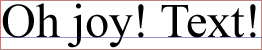
Let's take a close look at the breeding ground for trouble, and why this is a problem. We start with a simple case, illustrated in Figure 1: a one-cell table containing an image.

Obviously most designs are a touch more complicated than this, but we don't need anything more for our purposes. One image, one cell-- that's all it takes. There's nothing apparently wrong with that example. There isn't supposed to be, since it's an example of how browsers have traditionally behaved.
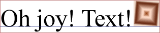
Now let's see what that same simple table looks like in a modern browser when the page has a strict DOCTYPE.

Notice the added space beneath the image in Figure 2. The markup of both table and cell remains unchanged-- it's the rendering mode that's different. Instead of "shrinkwrapping" the image itself, the browser is now wrapping around the line in which the image sits. The image is sitting in a line because images are, by default, inline content. That's all it takes.
How Inline Content is Constructed
In order to understand what just happened, let's take a look at the construction of a line box, the placement of images within a line box, and the placement of a line box within a table cell. First a basic line box containing text, shown in Figure 3.
The most crucial part of Figure 3 is the baseline (represented by the blue line), and its placement within the line box. The baseline's exact placement is dependent on the "default" font for the line box (represented by the red box), which is determined by the value of font-family for the element that contains the line box. It isn't possible for an author to change the baseline's position directly, so wherever it ends up is where it will be. The space below the baseline is referred to as "descender space" since that's where the descenders in lowercase letters like "j", "y", and "q" are drawn. Figure 4 shows what happens when we add an image to the mix.
Note where the image sits by default: its bottom edge is aligned with the baseline of the line box. This placement can be changed with vertical-align-- we'll talk about that in a bit-- but almost nobody ever changes the value from its default. Let's take away the text, and leave only the image, as was done in Figure 5.

So we have an image sitting on the baseline of a line box that contains only the image. Now consider what happens when we put that line in a table cell (Figure 6).

And there you have it-- spaces opening up where none have ever been seen before. It gets even worse with small images, like ones that are one pixel tall, as illustrated in Figure 7.

Now there's all kinds of space unexpectedly opening up. It's enough to drive a designer mad.
How About a Fix?
There is one obvious fix-- stop creating designs that are dependent on tables and sliced up or single-pixel images-- but it's not terribly practical for many designers, and it sure doesn't help fix old designs that are suddenly blowing apart in recent browsers. There's another obvious fix, which is to make sure your document doesn't trigger the "standards"rendering mode.
You can do this by using a DOCTYPE that will trigger either "quirks" mode or "almost standards" mode, or not having a DOCTYPE appear in your document at all. The lack of a DOCTYPE will prevent validation, and so is not recommended. For authors who are working with legacy documents, a "quirks" mode DOCTYPE is the best choice. In cases where an author is writing a new document or trying to migrate a design to be as standards-based as possible, then "almost standards" mode is probably a better choice.
Of course, documents authored in XHTML Strict or HTML Strict will trigger the "standards" rendering mode, so we're going to go through two basic ways to address the problem in strict documents, and a number of ways to call on these "fixes."
Setting images to be blocks
The first choice, and one that will work for most graphically-intense designs, is to convert the image from being an inline element to a block-level element. Do that, and it no longer generates a line box, and so the problem goes away-- assuming that the image is the only thing that occupies that table cell. In the simplest case, we might add a style like this:
td img {display: block;}
Consider this rule when applied to the following markup:
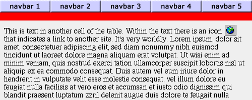
<table cellspacing="0" cellpadding="0" border="0" width="500">
<tr><td><img src="nav1.gif"><img src="nav2.gif"><img src="nav3.gif"><img
src="nav4.gif"><img src="nav5.gif"></td></tr>
<tr><td style="background: red;">
<img src="smallred.gif" height="1" width="1"></td></tr>
<tr><td>
<p style="margin: 0.5em;">This is text in another cell of the
 table.  Within the textthere is an icon <img src="icon2.gif">
 that indicates a link to another site.  It's very worldly.  Lorem
ipsum, dolor sit amet...</p></td></tr></table>
As we see in Figure 8, that works well in some cases but not so well in others.
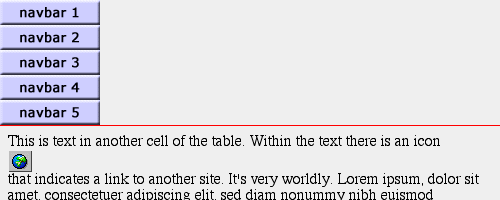
The thin red line shows that the single-pixel spacer GIF is now only making the cell one pixel tall, as the designer intended. Unfortunately, the buttons in the top cell are all now block-level and so end up stacked on top of one another instead of being shown side-by-side.
One potential solution is to add a class to any image that needs to be block-level and then write the rule to match.
td img.decoration {display: block;}

<td><img src="reddot.gif" class="decoration"></td>
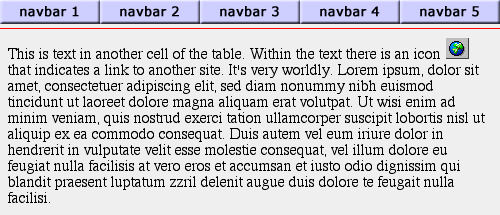
Depending on the design, though, that could lead to a lot of classes added for this one simple effect. This would be especially true if there are many single-pixel cells intended to create cool stacked lines, or something like that. If you have markup that lends itself well to this approach, you could class the table rows instead of the images. Thus you might have:
tr.decoration img {display: block;}
...along with the following change in the markup:
<tr class="decoration"><td style="background: red;">
<img src="smallred.gif" height="1" width="1">
</td></tr>
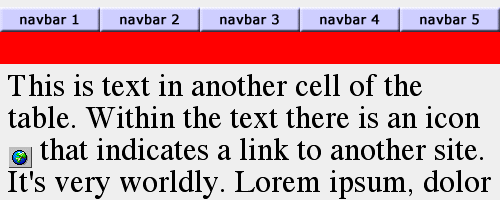
The result is that of only making the spacer GIF block-level, thus leaving the other images alone. This leads to the result seen in Figure 9.
Alternatively, you could class table cells instead of rows, if that's a better choice for you. In any of these cases, though, making images block-level could have unintended side effects if your table cells have more than just a single image in them, as in Figure 8.
Of course, while we have a single-pixel spacer cell in Figure 9, there is still unwanted space underneath the navigation buttons across the top. Getting rid of this space could be as easy as putting each image in its own cell and making them all block-level, but let's leave them all together in a single cell so we can illustrate another approach.
Using vertical alignment
The other main choice is leave the image inline and alter the vertical alignment of the image with respect to the line box. For example, you could try the following:
td img {vertical-align: bottom;}
This will cause the bottom edges of the images to be aligned with the bottom of the line box, instead of the baseline. As we can see in Figure 10, this has the intended effect: the space underneath our navbar images is gone. However, the decorative cell is still too tall, and other images are misaligned with respect to the text around them.
Again, we could class images, cells, or rows in order to narrow down the focus of the effect. However, the styles shown above won't overcome the problem of one-pixel images, because the line box surrounding them will be the height of the font-size for the table cell, and so won't shrink down. The image will move to the bottom of the cell, but the cell won't "shrinkwrap" the image. In addition, any other image which is shorter than the line box is tall will still have space appear around it-- as happened with the red spacer cell. The one-pixel image in the cell is aligned with the bottom of the cell now, but the line box is back and it's the size of normal text.
See, for example, Figure 11, where the font-size of the document has been raised to a large amount. The navbar images now have space appearing above them, and the red spacer got even bigger.
It's difficult to avoid this, because the images are (in this approach) still inline and so still participate in the creation of a line box. If that line box gets tall enough, space will begin to appear around the images.
Looking Forward To a Fix
Thanks to Mozilla's thorough implementation of CSS2, the problem of inline images in table cells forcing open unwanted space has come to the attention of the CSS Working Group. There have been many proposals to fix the problem, but one of the most promising approaches is the property line-box-contain, which has been proposed for inclusion in CSS3. Should this property be adopted, then any browser supporting it could emulate traditional "shrinkwrap" behavior without risking other layout upset with the following rule:
td {line-box-contain: font replaced;} /* proposed for CSS3 */
There are other possible fixes contained within the current CSS3 Working Drafts, such as line-height-policy. Obviously, the sooner a solution can be found and implemented, the happier authors everywhere will be.
Recommendations
Absent support for CSS3, it is difficult to provide a clear set of steps for fixing every instance of these problems, because the best solution for a given document will greatly depend on its structure. If your document uses transitional markup, make sure your DOCTYPE reflects that fact and does not trigger "standards" mode. This will prevent browsers from using standards-based rendering, and thus all the image-layout problems are avoided. If you're using strict markup, or you need for other reasons to be in "standards" rendering, then remember these guidelines:
- Any image alone in a table cell (e.g., single-pixel spacer images) should be made block-level.
- Any image in a table cell with other images should be vertically aligned with the bottom of the line box.
- Any image in a table cell with other images and text should have its vertical alignment changed as necessary, if at all.
With a judicious mixture of approaches and a reduction of single-pixel image tricks-- which, in a CSS-capable browser, are unnecessary anyway-- it is quite possible to sidestep this strange effect of standards support. The best solution may be to ensure that images are always in a cell by themselves, thus allowing authors to make them block-level, but as always this will depend on the author's design.
Related Links
Original Document Information
- Author(s): Eric A. Meyer
- Last Updated Date: March 21st, 2003
- Copyright © 2001-2003 Netscape.