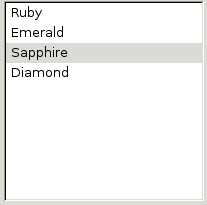
A single row in a listbox. The text of the listitem is specified either using listcell elements, or by placing a label attribute directly on the listitem element. By default it contains a single listcell element of type and class appropriate to that of the listitem.
More information is available in the XUL tutorial.
- Attributes
- accesskey, checked, command, crop, current, disabled, image, label, preference, selected, tabindex, type, value
- Properties
- accessKey, accessible, checked, control, crop, current, disabled, image, label, selected, tabIndex, value
- Style classes
- listitem-iconic
Examples

<listbox id="theList">
  <listitem label="Ruby"/>
  <listitem label="Emerald"/>
  <listitem label="Sapphire" selected="true"/>
  <listitem label="Diamond"/>
</listbox>
Attributes
-
accesskey - Type: character
-
This should be set to a character that is used as a shortcut key. This should be one of the characters that appears in the
labellabel for the element.
-
checked - Type: boolean
- Indicates whether the element is checked or not.
- Use
hasAttribute()to determine whether this attribute is set instead ofgetAttribute(). - For buttons, the
typeattribute must be set tocheckboxorradiofor this attribute to have any effect.
-
crop - Type: one of the values below
-
If the label of the element is too big to fit in its given space, the text will be cropped on the side specified by the
cropattribute. An ellipsis will be used in place of the cropped text. If the box direction is reversed, the cropping is reversed. -
-
start - The text will be cropped on its left side in left-to-right text locales, and the right side in right-to-left locales.
-
end - The text will be cropped on its right side in left-to-right text locales, and the right side in right-to-left locales.
-
left - The text will be cropped on its left side.
-
right - The text will be cropped on its right side.
-
center - The text will be cropped in the middle, showing both the start and end of the text normally.
-
none - The text will be not be cropped using an ellipsis. However, the text will simply be cut off if it is too large. The side depends on the CSS text alignment.
-
-
Depending on the platform and theme being used, some elements will have set a maximum width so they will always appear cropped. If you wish to use the value
noneand the displayed text is larger than this maximum width, you may be able to use the max-width CSS property (or the maxwidth attribute) to override this size. For example, for a menuitem in a menu you can add the following CSS rule when you want to use the valuenone: -
menupopup > menuitem, menupopup > menu { max-width: none; }
-
current - Type: boolean
- This attribute will be set to
trueif thelistitemis the current item. This is typically used by a theme to customize the focus ring. To change the currently selected item in alistbox, use thelistboxpropertyselectedItem.
-
disabled - Type: boolean
-
Indicates whether the element is disabled or not. If this element is set to
truethe element is disabled. Disabled elements are usually drawn with grayed-out text. If the element is disabled, it does not respond to user actions, it cannot be focused, and thecommandevent will not fire. -
Visible controls have a
disabledproperty which, except for menus and menuitems, is normally preferred to use of the attribute, as it may need to update additional state.
-
label - Type: string
-
The label that will appear on the element. If this is left out, no text appears. For an editable
menuitemelement the value of this attribute is copied to themenulist.value property upon user selection of themenuitem.
preference- Type: id
- Connects the element to a corresponding
preference. This attribute only has any effect when used inside aprefwindow. More information is available in the Preferences System article.
-
selected - Type: boolean
- Indicates whether the element is selected or not. This value is read-only. To change the selection, set either the
selectedIndexorselectedItemproperty of the containing element.
-
tabindex - Type: integer
- The tab order of the element. The tab order is the order in which the focus is moved when the user presses the "
tab" key. Elements with a highertabindexare later in the tab sequence.
-
value - Type: string
-
The string attribute allows you to associate a data value with an element. It is not used for any specific purpose, but you can access it with a script for your own use. Be aware, however, that some elements, such as textbox will display the value visually, so in order to merely associate data with an element, you could 1) Use another attribute like "value2" or "data-myAtt" (as in the HTML5 draft), as XUL does not require validation (less future-proof); 2) Use setAttributeNS() to put custom attributes in a non-XUL namespace (serializable and future-proof); 3) Use setUserData() (future-proof and clean, but not easily serializable). For user editable
menulistelements, the contents, as visible to the user, are read and set using the Menulist.value syntax. For those elements, setAttribute("value", myValue) and getAttribute("value") do not access or affect the contents displayed to the user.
Properties
-
accessible -
Type:
nsIAccessible - Returns the accessibility object for the element.
-
selected - Type: boolean
-
This property's value is
trueif this element is selected, orfalseif it is not. This property is read only. This property is available formenuitemandmenuseparatorelements in Firefox 3.
-
value - Type: string
-
Gets and sets the value of the
valueattribute. Fortextboxand user editablemenulistelements, the contents, as visible to the user, are read and set using theTextbox.valueand Menulist.value syntax.
Methods
Style classes
The following classes may be used to style the element. These classes should be used instead of changing the style of the element directly since they will fit more naturally with the user's selected theme.
-
listitem-iconic - Use this class to have an image appear on the
listitem. Specify the image using theimageattribute.