A container used to display the contents of a popup menu. When a menupopup is open, it floats above the window and may extend outside the window border. There are several ways in which a menupopup may be used:
- It may be placed inside a
menu,menulist,toolbarbutton, or abuttonwith the type attribute set to "menu" to create a popup that will open when the menu or button is pressed. - It may be attached to any element using the
popupattribute. When the element is clicked with the left mouse button, the menupopup will be displayed. - It may be attached to any element using the
contextattribute. When a context menu is opened, the menupopup will be displayed. A context menu may be opened by right-clicking the element, or by pressing the menu key on the keyboard.
More information is available in the XUL tutorial and Popup Guide.
- Attributes
- ignorekeys, left, onpopuphidden, onpopuphiding, onpopupshowing, onpopupshown, position, top
- Properties
- accessibleType, anchorNode, popupBoxObject, position, state, triggerNode
- Methods
- hidePopup, moveTo, openPopup, openPopupAtScreen, setConsumeRollupEvent, showPopup, sizeTo
Examples
The following example shows how a menupopup may be attached to a menulist.
<menulist>
  <menupopup>
    <menuitem label="Mozilla" value="https://mozilla.org"/>
    <menuitem label="Slashdot" value="https://slashdot.org"/>
    <menuitem label="Sourceforge" value="https://sf.net"/>
    <menuitem label="Freshmeat" value="https://freshmeat.net"/>
  </menupopup>
</menulist>
The following example shows how a menupopup can be used as a context menu for an element. When the label is right-clicked, the menu will be displayed.
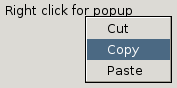
<menupopup id="clipmenu">
  <menuitem label="Cut"/>
  <menuitem label="Copy"/>
  <menuitem label="Paste"/>
</menupopup>
<label value="Right click for popup" context="clipmenu"/>
Attributes
-
ignorekeys - Type: boolean
- If
true, keyboard navigation between items in the popup is disabled.
-
onpopuphiding - Type: script code
- This event is sent to a popup when it is about to be hidden.
-
onpopupshowing - Type: script code
- This event is sent to a popup just before it is opened. This handler is usually used to dynamically set the contents when the user requests to display it. Returning
falsefrom this event handler prevents the popup from appearing.
-
onpopupshown - Type: script code
- This event is sent to a popup after it has been opened, much like the
onloadevent is sent to a window when it is opened.
-
position - Type: string
-
The
positionattribute determines where the popup appears relative to the element the user clicked to invoke the popup. This allows you to place the popup on one side of a button. Note that a context menu will never respect this attribute, always appearing relative to the mouse cursor. -
This value can be specified either as a single word offering pre-defined alignment positions, or as 2 words specifying exactly which part of the anchor and popup should be aligned. -
If specified as 2 words, the value indicates which corner or edge of the anchor (the first word) is aligned which which corner of the popup (the second word). The anchor value (ie, the first word) can be one oftopleft,topright,bottomleft,bottomright,leftcenter,rightcenter,topcenterorbottomcenter. The popup value (ie, the second word) can be one oftopleft,topright,bottomleftorbottomright. -
Positions specified as a single word string are shortcuts for the values above. Valid single-word values areafter_start,after_end,before_start,before_end,end_after,end_before,start_after,start_before,overlap,at_pointerorafter_pointer. - For more details, including examples, please see popup positioning
Properties
-
accessibleType - Type: integer
- A value indicating the type of accessibility object for the element.
anchorNode- Type:
nsIDOMElement - This read-only property holds the DOM node that was specified as the anchor when opening the popup.
-
popupBoxObject -
Type:
nsIPopupBoxObject -
This read-only property holds the
nsIPopupBoxObjectthat implements the popup. You wouldn't normally need to use this property as all of its functions are available via the popup itself.
-
state - Type: string
-
This read only property indicates whether the popup is open or not. Four values are possible:
closed: The popup is closed and not visible.open: The popup is open and visible on screen.showing: A request has been made to open the popup, but it has not yet been shown. This state will occur during the popupshowing event.hiding: The popup is about to be hidden. This state will occur during the popuphiding event.
triggerNode- Type:
nsIDOMNode - This read-only property holds the DOM node that generated the event triggering the opening of the popup. The value is
nullif the popup isn't open.
Methods
-
hidePopup() - Return type: no return value
- Closes the popup immediately.
-
moveTo( x, y ) - Return type: no return value
- Moves the popup to a new location defined by screen coordinates (and not client coordinates).
- If both x and y have the value -1 the call will realign the popup with its anchor node.
-
openPopup( anchor , position , x , y , isContextMenu, attributesOverride, triggerEvent ) - Return type: no return value
Opens the popup relative to a specified node at a specific location.
- anchor
-
The popup may be either anchored to another node or opened freely. To anchor a popup to a node, supply an anchor node and set the position to a string indicating the manner in which the popup should be anchored. The anchor node does not need to be in the same document as the popup. Unanchored popups may be created by supplying
nullas the anchor node. The direction in which the popup is oriented depends on the direction of the anchor. - position
-
Possible values for position are:
before_start,before_end,after_start,after_end,start_before,start_after,end_before,end_after,overlap, andafter_pointer. Check Positioning of the Popup Guide for a precise description of the effect of the different values. - x, y
-
For an anchored popup, the
xandyarguments may be used to offset the popup from its anchored position by some number, measured in CSS pixels. An unanchored popup appears at the position specified by x and y, relative to the viewport of the document containing the popup node. In this case, thepositionandattributesOverridearguments are ignored. - isContextMenu
-
The
isContextMenuargument should betruefor context menus andfalsefor all other types of popups. It affects menu item highlighting; that is, while a context menu is open, menus opened earlier do not highlight or execute their items. - attributesOverride
-
If the
attributesOverrideargument istrue, the position attribute on the popup node overrides thepositionvalue argument. IfattributesOverrideisfalse, the attribute is only used if thepositionargument is empty. - triggerEvent
- The event that triggered the popup (such as a mouse click, if the user clicked something to open the popup).
-
openPopupAtScreen( x, y, isContextMenu ) - Return type: no return value
- Open the popup at a specific screen position specified by x and y. This position may be adjusted if it would cause the popup to be off of the screen. The x and y coordinates are measured in CSS pixels.
setConsumeRollupEvent( consume )- Return type: no return value
Controls whether or not the event that caused the popup to be automatically dismissed (or "rolled up") should be consumed or be dispatched as a normal event. If a non-default behavior is desired, this method should be called immediately prior to calling openPopup or openPopupAtScreen.
Possible values for consume are:
ROLLUP_DEFAULT- The default for the current platform.
ROLLUP_CONSUME- Consume the rollup event.
ROLLUP_NO_CONSUME- Don't consume the rollup event.
-
showPopup( element, x, y, popupType, anchor, align )Deprecated since Gecko 1.9 -
Return type: no return value
Deprecated in favor of openPopup and openPopupAtScreen -
Opens a popup element. There are two ways of specifying where the popup appears, either at a specific screen position, or relative to some element in the window. If either x or y are set to values, the popup will appear at the screen coordinate (x,y). If x and y are
-1, the popup will be positioned relative to the element specified as the first argument. This is what you might do to show a popup below a button, for example. In this latter case, the anchor and align arguments may be used to further control where the popup appears relative to the element. The anchor argument corresponds to thepopupanchorattribute on the element. The align argument corresponds to thepopupalignattribute on the element. The anchor and align arguments are ignored if either x or y are not-1.
-
To have a popup appear relative to another element yet still offset by some number of pixels, determine the actual screen position of the element using the
boxObject.screenX andboxObject.screenY properties of the element, and use those as the x and y arguments offset by the desired values.
-
The popupType should be either the string
popup,context, ortooltip. Each type of popup is intended to be displayed only temporarily; they are not expected to be displayed permanently. Only one popup may be displayed at a time.
-
sizeTo( width, height ) - Return type: no return value
- Changes the current size of the popup to the new width and height.
Related
- Elements
-
menu,menubar,menuitem,menulist,menuseparator
- Interfaces
-
nsIAccessibleProvider,nsIDOMXULPopupElement