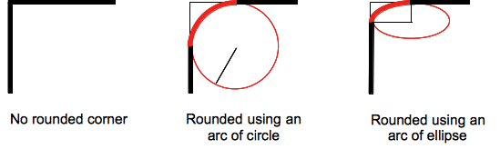
The border-top-left-radius CSS property sets the rounding of the top-left corner of the element. The rounding can be a circle or an ellipse, or if one of the value is 0,no rounding is done and the corner is square.
A background, being an image or a color, is clipped at the border, even a rounded one; the exact location of the clipping is defined by the value of the {{cssxref("background-clip")}} property.
border-top-left-radius CSS property, the value of this property is then reset to its initial value by the shorthand property.{{cssinfo}}
Syntax
/* the corner is a circle */
/* border-top-left-radius: radius */
border-top-left-radius: 3px;

/* the corner is an ellipsis */
/* border-top-left-radius: horizontal vertical */
border-top-left-radius: 0.5em 1em;

border-top-left-radius: inherit;
where:
- radius
- Is a {{cssxref("")}} or a {{cssxref("<percentage>")}} denoting the radius of the circle to use for the border in that corner.
- horizontal
- Is a {{cssxref("")}} or a {{cssxref("<percentage>")}} denoting the horizontal semi-major axis of the ellipsis to use for the border in that corner.
- vertical
- Is a {{cssxref("")}} or a {{cssxref("<percentage>")}} denoting the vertical semi-major axis of the ellipsis to use for the border in that corner.
Values
<length>- Denotes the size of the circle radius or the semi-major and semi-minor axes of the ellipsis. It can be expressed in any unit allowed by the CSS {{cssxref("")}} data types. Negative values are invalid.
<percentage>- Denotes the size of the circle radius, or the semi-major and semi-minor axes of the ellipsis, using percentage values. Percentages for the horizontal axis refer to the width of the box, percentages for the vertical axis refer to the height of the box. Negative values are invalid.
Formal syntax
{{csssyntax}}
Examples
| Live example | Code |
|---|---|
|
|
An arc of ellipse is used as the border
div {
  border-top-left-radius: 40px 40px;
}
|
|
|
An arc of ellipse is used as the border
div {
  border-top-left-radius: 40px 20px;
}
|
|
|
The box is a square: an arc of circle is used as the border
div border-top-left-radius: 40%; } |
|
|
The box is not a square: an arc of ellipse is used as the border
div {
  border-top-left-radius: 40%;
}
|
|
|
The background color is clipped at the border
div {
  border-top-left-radius:40%;
  border-style: black 3px double;
  background-color: rgb(250,20,70);
  background-clip: content-box;
}
|
Specifications
| Specification | Status | Comment |
|---|---|---|
| {{SpecName('CSS3 Backgrounds', '#the-border-radius', 'border-top-left-radius')}} | {{Spec2('CSS3 Backgrounds')}} | Initial definition |
Browser compatibility
{{CompatibilityTable}}
| Feature | Chrome | Firefox (Gecko) | Internet Explorer | Opera | Safari (WebKit) |
|---|---|---|---|---|---|
| Basic support | 1.0 {{property_prefix("-webkit")}} 4.0 |
1.0 (1.0){{property_prefix("-moz")}}[1] 4.0 (2.0) |
9.0 | 10.5 | 3.0 (522){{property_prefix("-webkit")}} 5.0 (532.5) |
| Percentages | 4.0 | 1.0 (1.0)[2] 4.0 (2.0) |
9.0 | 10.5 | 5.0 (532.5) |
| Elliptical corners | 1.0 | 3.5 (1.9.1) | 9.0 | 10.5 | 3.0 (522) |
| Feature | Android | Firefox Mobile (Gecko) | IE Phone | Opera Mobile | Safari Mobile |
|---|---|---|---|---|---|
| Basic support | {{CompatUnknown}} | {{CompatUnknown}} | {{CompatUnknown}} | {{CompatUnknown}} | {{CompatUnknown}} |
| Percentages | {{CompatUnknown}} | {{CompatUnknown}} | {{CompatUnknown}} | {{CompatUnknown}} | {{CompatUnknown}} |
| Elliptical corners | {{CompatUnknown}} | {{CompatUnknown}} | {{CompatUnknown}} | {{CompatUnknown}} | {{CompatUnknown}} |
[1] The prefixed version (allowed from Firefox 1 to Firefox 12) of this property uses a different name, -moz-border-radius-topleft, than the final property as Mozilla implemented it before the final name was coined.
Gecko is not able to display dotted and dashed rounded corners correctly: it displays them as solid ({{bug("382721")}}).
[2] Before Firefox 4, the {{cssxref("<percentage>")}} was relative to the width of the box even when specifying the radius for a height). This implied that -moz-border-radius-topleft was always drawing an arc of circle, and never an ellipse, when followed by a single value.
See also
The border-radius-related CSS properties: the CSS shorthand {{cssxref("border-radius")}}, the properties for the other corners: {{cssxref("border-top-right-radius")}}, {{cssxref("border-bottom-right-radius")}}, and {{cssxref("border-bottom-left-radius")}}.