<p><span class="seoSummary">By modifying the coordinate space, <strong>CSS transforms</strong> change the position and shape of the affected content without disrupting the normal document flow. This guide provides an introduction to using transforms.</span></p>
<p>CSS transforms are implemented using a set of CSS properties that let you apply affine linear transformations to HTML elements. These transformations include rotation, skewing, scaling, and translation both in the plane and in the 3D space.</p>
<h2 id="CSS_transforms_properties">CSS transforms properties</h2>
<p>Two major properties are used to define CSS transforms: {{cssxref("transform")}} and {{cssxref("transform-origin")}}</p>
<dl>
<dt>{{cssxref("transform-origin")}}</dt>
<dd>Specifies the position of the origin. By default it is at the center of the element and can be moved. It is used by several transforms, like rotations, scaling or skewing, that need a specific point as parameter.</dd>
<dt>{{cssxref("transform")}}</dt>
<dd>Specifies the transforms to apply to the element. It is a space separated list of transforms, which are applied one after the other, as requested by the composition operation.</dd>
</dl>
<h2 id="Examples">Examples</h2>
<h3 id="Example_Rotating">Example: Rotating</h3>
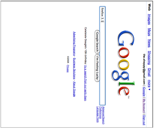
<p>This example creates an iframe that lets you use Google's home page, rotated 90 degrees from its bottom-left corner.</p>
<p><a class="button liveSample" href="/@api/deki/files/2921/=rotated-google-sample.html" title="/@api/deki/files/2921/=rotated-google-sample.html">View live example</a> <a class="button liveSample" href="/@api/deki/files/2920/=google-rotated.png" title="/@api/deki/files/2920/=google-rotated.png">View screenshot of example</a></p>
<pre class="brush: html">
<div style="transform: rotate(90deg); transform-origin: bottom left;">
  <iframe src="https://www.google.com/" width="500" height="600"></iframe>
</div>
</pre>
<h3 id="Example_Skewing_and_translating">Example: Skewing and translating</h3>
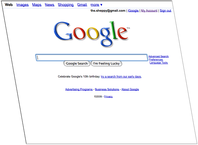
<p>This example creates an iframe that lets you use Google's home page, skewed by 10 degrees and translated by 150 pixels on the X axis.</p>
<p><a class="button liveSample" href="/@api/deki/files/2922/=skewed-google-sample.html" title="https://developer.mozilla.org/editor/fckeditor/core/editor/@api/deki/files/2922/=skewed-google-sample.html">View live example</a> <a class="button liveSample" href="/@api/deki/files/2923/=skewed-google.png" title="/@api/deki/files/2923/=skewed-google.png">View screenshot of example</a></p>
<pre class="brush: html">
<div style="transform: skewx(10deg) translatex(150px);
            transform-origin: bottom left;">
  <iframe src="https://www.google.com/" width="600" height="500"></iframe>
</div>
</pre>
<h2 id="3D_specific_CSS_properties">3D specific CSS properties</h2>
<p>Performing CSS transformations in 3D space is a little bit more complex. You have to start by configuring the 3D space by giving it a perspective, then you have to configure how your 2D elements will behave in that space.</p>
<h3 id="Setting_up_a_perspective">Setting up a perspective</h3>
<p>The first element to set is the <em>perspective</em>. The perspective is what gives the 3D impression. The farther from the viewer the elements are, the smaller they are.</p>
<p>How quick they shrink is defined by the {{ cssxref("perspective") }} property. The smaller its value is, the deeper the perspective is.</p>
<table class="standard-table">
<thead>
<tr>
<th><code>perspective:0;</code></th>
<th><code>perspective:250px;</code></th>
</tr>
</thead>
<tbody>
<tr>
<td>
<div class="container" style="width:200px;height:200px;margin:75px 0 0 75px;border:none;">
<div class="cube" style="width:100%;height:100%;-moz-perspective:0;-webkit-perspective:0;perspective:0;-moz-transform-style:preserve-3d;-webkit-transform-style:preserve-3d;transform-style:preserve-3d;-moz-perspective-origin:150% 150%;-webkit-perspective-origin:150% 150%;perspective-origin:150% 150%">
<div class="middle" style="display: block;position: absolute;width: 100px;height: 100px;border: 1px dashed black;line-height: 100px;font-family: arial, sans-serif;font-size: 60px;color: white;text-align: center;background: transparent;"> </div>
<div class="front" style="display: block;position: absolute;width: 100px;height: 100px;border: none;line-height: 100px;font-family: arial, sans-serif;font-size: 60px;color: white;text-align: center;background: rgba( 0, 0, 0, 0.3 );-moz-transform: translateZ( 50px );-webkit-transform: translateZ( 50px );transform:translateZ(50px)">1</div>
<div class="back" style="display: block;position: absolute;width: 100px;height: 100px;border: none;line-height: 100px;font-family: arial, sans-serif;font-size: 60px;color: white;text-align: center;background: rgba( 0, 255, 0, 1 ); color: black;-moz-transform: translateZ( -50px );-webkit-transform: translateZ( -50px );transforme:translateZ(-50px)">2</div>
<div class="right" style="display: block;position: absolute;width: 100px;height: 100px;border: none;line-height: 100px;font-family: arial, sans-serif;font-size: 60px;color: white;text-align: center;background: rgba( 196, 0, 0, 0.7 );-moz-transform: rotateY( 90deg) translateZ( 50px );-webkit-transform: rotateY( 90deg) translateZ( 50px );transform:rotateY(90deg) translateZ(50px)">3</div>
<div class="left" style="display: block;position: absolute;width: 100px;height: 100px;border: none;line-height: 100px;font-family: arial, sans-serif;font-size: 60px;color: white;text-align: center;background: rgba( 0, 0, 196, 0.7 );-moz-transform: rotateY(-90deg) translateZ( 50px );-webkit-transform: rotateY(-90deg) translateZ( 50px );transform:rotateY(-90deg) translateZ(50px)">4</div>
<div class="top" style="display: block;position: absolute;width: 100px;height: 100px;border: none;line-height: 100px;font-family: arial, sans-serif;font-size: 60px;color: white;text-align: center;background: rgba( 196, 196, 0, 0.7 );-moz-transform: rotateX( 90deg) translateZ( 50px );-webkit-transform: rotateX( 90deg) translateZ( 50px );transform:rotateX(90deg) translateZ(50px)">5</div>
<div class="bottom" style="display: block;position: absolute;width: 100px;height: 100px;border: none;line-height: 100px;font-family: arial, sans-serif;font-size: 60px;color: white;text-align: center;background: rgba( 196, 0, 196, 0.7);-moz-transform: rotateX(-90deg) translateZ( 50px );-webkit-transform: rotateX( -90deg) translateZ( 50px );transform:rotateX(-90deg) translateZ(50px)">6</div>
</div>
</div>
</td>
<td>
<div class="container" style="width:200px;height:200px;margin:75px 0 0 75px;border:none;">
<div class="cube" style="width:100%;height:100%;-moz-perspective:250px;-webkit-perspective:250px;perspective:250px;-moz-transform-style:preserve-3d;-webkit-transform-style:preserve-3d;transform-style:preserve-3d;-moz-perspective-origin:150% 150%;-webkit-perspective-origin:150% 150%;perspective-origin:150% 150%">
<div class="middle" style="display: block;position: absolute;width: 100px;height: 100px;border: 1px dashed black;line-height: 100px;font-family: arial, sans-serif;font-size: 60px;color: white;text-align: center;background: transparent;"> </div>
<div class="front" style="display: block;position: absolute;width: 100px;height: 100px;border: none;line-height: 100px;font-family: arial, sans-serif;font-size: 60px;color: white;text-align: center;background: rgba( 0, 0, 0, 0.3 );-moz-transform: translateZ( 50px );-webkit-transform: translateZ( 50px );transform:translateZ(50px)">1</div>
<div class="back" style="display: block;position: absolute;width: 100px;height: 100px;border: none;line-height: 100px;font-family: arial, sans-serif;font-size: 60px;color: white;text-align: center;background: rgba( 0, 255, 0, 1 ); color: black;-moz-transform: translateZ( -50px );-webkit-transform: translateZ( -50px );transforme:translateZ(-50px)">2</div>
<div class="right" style="display: block;position: absolute;width: 100px;height: 100px;border: none;line-height: 100px;font-family: arial, sans-serif;font-size: 60px;color: white;text-align: center;background: rgba( 196, 0, 0, 0.7 );-moz-transform: rotateY( 90deg) translateZ( 50px );-webkit-transform: rotateY( 90deg) translateZ( 50px );transform:rotateY(90deg) translateZ(50px)">3</div>
<div class="left" style="display: block;position: absolute;width: 100px;height: 100px;border: none;line-height: 100px;font-family: arial, sans-serif;font-size: 60px;color: white;text-align: center;background: rgba( 0, 0, 196, 0.7 );-moz-transform: rotateY(-90deg) translateZ( 50px );-webkit-transform: rotateY(-90deg) translateZ( 50px );transform:rotateY(-90deg) translateZ(50px)">4</div>
<div class="top" style="display: block;position: absolute;width: 100px;height: 100px;border: none;line-height: 100px;font-family: arial, sans-serif;font-size: 60px;color: white;text-align: center;background: rgba( 196, 196, 0, 0.7 );-moz-transform: rotateX( 90deg) translateZ( 50px );-webkit-transform: rotateX( 90deg) translateZ( 50px );transform:rotateX(90deg) translateZ(50px)">5</div>
<div class="bottom" style="display: block;position: absolute;width: 100px;height: 100px;border: none;line-height: 100px;font-family: arial, sans-serif;font-size: 60px;color: white;text-align: center;background: rgba( 196, 0, 196, 0.7);-moz-transform: rotateX(-90deg) translateZ( 50px );-webkit-transform: rotateX( -90deg) translateZ( 50px );transform:rotateX(-90deg) translateZ(50px)">6</div>
</div>
</div>
</td>
</tr>
</tbody>
</table>
<table class="standard-table">
<thead>
<tr>
<th><code>perspective:300px;</code></th>
<th><code>perspective:350px;</code></th>
</tr>
</thead>
<tbody>
<tr>
<td>
<div class="container" style="width:200px;height:200px;margin:75px 0 0 75px;border:none;">
<div class="cube" style="width:100%;height:100%;-moz-perspective:300px;-moz-transform-style:preserve-3d;-moz-perspective-origin:150% 150%;-webkit-perspective:300px;-webkit-transform-style:preserve-3d;-webkit-perspective-origin:150% 150%;perspective:300px;transform-style:preserve-3d;perspective-origin:150% 150%">
<div class="middle" style="display: block;position: absolute;width: 100px;height: 100px;border: 1px dashed black;line-height: 100px;font-family: arial, sans-serif;font-size: 60px;color: white;text-align: center;background: transparent;"> </div>
<div class="front" style="display: block;position: absolute;width: 100px;height: 100px;border: none;line-height: 100px;font-family: arial, sans-serif;font-size: 60px;color: white;text-align: center;background: rgba( 0, 0, 0, 0.3 );-moz-transform: translateZ( 50px );-webkit-transform: translateZ( 50px );transform:translateZ(50px)">1</div>
<div class="back" style="display: block;position: absolute;width: 100px;height: 100px;border: none;line-height: 100px;font-family: arial, sans-serif;font-size: 60px;color: white;text-align: center;background: rgba( 0, 255, 0, 1 ); color: black;-moz-transform: translateZ( -50px );-webkit-transform: translateZ( -50px );transforme:translateZ(-50px)">2</div>
<div class="right" style="display: block;position: absolute;width: 100px;height: 100px;border: none;line-height: 100px;font-family: arial, sans-serif;font-size: 60px;color: white;text-align: center;background: rgba( 196, 0, 0, 0.7 );-moz-transform: rotateY( 90deg) translateZ( 50px );-webkit-transform: rotateY( 90deg) translateZ( 50px );transform:rotateY(90deg) translateZ(50px)">3</div>
<div class="left" style="display: block;position: absolute;width: 100px;height: 100px;border: none;line-height: 100px;font-family: arial, sans-serif;font-size: 60px;color: white;text-align: center;background: rgba( 0, 0, 196, 0.7 );-moz-transform: rotateY(-90deg) translateZ( 50px );-webkit-transform: rotateY(-90deg) translateZ( 50px );transform:rotateY(-90deg) translateZ(50px)">4</div>
<div class="top" style="display: block;position: absolute;width: 100px;height: 100px;border: none;line-height: 100px;font-family: arial, sans-serif;font-size: 60px;color: white;text-align: center;background: rgba( 196, 196, 0, 0.7 );-moz-transform: rotateX( 90deg) translateZ( 50px );-webkit-transform: rotateX( 90deg) translateZ( 50px );transform:rotateX(90deg) translateZ(50px)">5</div>
<div class="bottom" style="display: block;position: absolute;width: 100px;height: 100px;border: none;line-height: 100px;font-family: arial, sans-serif;font-size: 60px;color: white;text-align: center;background: rgba( 196, 0, 196, 0.7);-moz-transform: rotateX(-90deg) translateZ( 50px );-webkit-transform: rotateX( -90deg) translateZ( 50px );transform:rotateX(-90deg) translateZ(50px)">6</div>
</div>
</div>
</td>
<td>
<div class="container" style="width:200px;height:200px;margin:75px 0 0 75px;border:none;">
<div class="cube" style="width:100%;height:100%;-moz-perspective:350px;-moz-transform-style:preserve-3d;-moz-perspective-origin:150% 150%;-webkit-perspective:350px;-webkit-transform-style:preserve-3d;-webkit-perspective-origin:150% 150%;perspective:350px;transform-style:preserve-3d;perspective-origin:150% 150%">
<div class="middle" style="display: block;position: absolute;width: 100px;height: 100px;border: 1px dashed black;line-height: 100px;font-family: arial, sans-serif;font-size: 60px;color: white;text-align: center;background: transparent;"> </div>
<div class="front" style="display: block;position: absolute;width: 100px;height: 100px;border: none;line-height: 100px;font-family: arial, sans-serif;font-size: 60px;color: white;text-align: center;background: rgba( 0, 0, 0, 0.3 );-moz-transform: translateZ( 50px );-webkit-transform: translateZ( 50px );transform:translateZ(50px)">1</div>
<div class="back" style="display: block;position: absolute;width: 100px;height: 100px;border: none;line-height: 100px;font-family: arial, sans-serif;font-size: 60px;color: white;text-align: center;background: rgba( 0, 255, 0, 1 ); color: black;-moz-transform: translateZ( -50px );-webkit-transform: translateZ( -50px );transforme:translateZ(-50px)">2</div>
<div class="right" style="display: block;position: absolute;width: 100px;height: 100px;border: none;line-height: 100px;font-family: arial, sans-serif;font-size: 60px;color: white;text-align: center;background: rgba( 196, 0, 0, 0.7 );-moz-transform: rotateY( 90deg) translateZ( 50px );-webkit-transform: rotateY( 90deg) translateZ( 50px );transform:rotateY(90deg) translateZ(50px)">3</div>
<div class="left" style="display: block;position: absolute;width: 100px;height: 100px;border: none;line-height: 100px;font-family: arial, sans-serif;font-size: 60px;color: white;text-align: center;background: rgba( 0, 0, 196, 0.7 );-moz-transform: rotateY(-90deg) translateZ( 50px );-webkit-transform: rotateY(-90deg) translateZ( 50px );transform:rotateY(-90deg) translateZ(50px)">4</div>
<div class="top" style="display: block;position: absolute;width: 100px;height: 100px;border: none;line-height: 100px;font-family: arial, sans-serif;font-size: 60px;color: white;text-align: center;background: rgba( 196, 196, 0, 0.7 );-moz-transform: rotateX( 90deg) translateZ( 50px );-webkit-transform: rotateX( 90deg) translateZ( 50px );transform:rotateX(90deg) translateZ(50px)">5</div>
<div class="bottom" style="display: block;position: absolute;width: 100px;height: 100px;border: none;line-height: 100px;font-family: arial, sans-serif;font-size: 60px;color: white;text-align: center;background: rgba( 196, 0, 196, 0.7);-moz-transform: rotateX(-90deg) translateZ( 50px );-webkit-transform: rotateX( -90deg) translateZ( 50px );transform:rotateX(-90deg) translateZ(50px)">6</div>
</div>
</div>
</td>
</tr>
</tbody>
</table>
<p>The second element to configure is the position of the viewer, with the {{ cssxref("perspective-origin") }} property. By default, the perspective is centered on the viewer, which is not always adequate.</p>
<div>
<table class="standard-table">
<thead>
<tr>
<th><code>perspective-origin:150px 150px;</code></th>
<th><code>perspective-origin:50% 50%;</code></th>
<th><code>perspective-origin:-50px -50px;</code></th>
</tr>
</thead>
<tbody>
<tr>
<td>
<div class="container" style="width:100px;height:100px;margin:25px;border:none;">
<div class="cube" style="width:100%;height:100%;-moz-perspective:300px;-moz-transform-style:preserve-3d;-moz-perspective-origin:150% 150%;-webkit-perspective:300px;-webkit-transform-style:preserve-3d;-webkit-perspective-origin:150% 150%;perspective:300px;transform-style:preserve-3d;perspective-origin:150% 150%">
<div class="middle" style="display: block;position: absolute;width: 100px;height: 100px;border: 1px dashed black;line-height: 100px;font-family: arial, sans-serif;font-size: 60px;color: white;text-align: center;background: transparent;"> </div>
<div class="front" style="display: block;position: absolute;width: 100px;height: 100px;border: none;line-height: 100px;font-family: arial, sans-serif;font-size: 60px;color: white;text-align: center;background: rgba( 0, 0, 0, 0.3 );-moz-transform: translateZ( 50px );-webkit-transform: translateZ( 50px );transform:translateZ(50px)">1</div>
<div class="back" style="display: block;position: absolute;width: 100px;height: 100px;border: none;line-height: 100px;font-family: arial, sans-serif;font-size: 60px;color: white;text-align: center;background: rgba( 0, 255, 0, 1 ); color: black;-moz-transform: translateZ( -50px );-webkit-transform: translateZ( -50px );transforme:translateZ(-50px)">2</div>
<div class="right" style="display: block;position: absolute;width: 100px;height: 100px;border: none;line-height: 100px;font-family: arial, sans-serif;font-size: 60px;color: white;text-align: center;background: rgba( 196, 0, 0, 0.7 );-moz-transform: rotateY( 90deg) translateZ( 50px );-webkit-transform: rotateY( 90deg) translateZ( 50px );transform:rotateY(90deg) translateZ(50px)">3</div>
<div class="left" style="display: block;position: absolute;width: 100px;height: 100px;border: none;line-height: 100px;font-family: arial, sans-serif;font-size: 60px;color: white;text-align: center;background: rgba( 0, 0, 196, 0.7 );-moz-transform: rotateY(-90deg) translateZ( 50px );-webkit-transform: rotateY(-90deg) translateZ( 50px );transform:rotateY(-90deg) translateZ(50px)">4</div>
<div class="top" style="display: block;position: absolute;width: 100px;height: 100px;border: none;line-height: 100px;font-family: arial, sans-serif;font-size: 60px;color: white;text-align: center;background: rgba( 196, 196, 0, 0.7 );-moz-transform: rotateX( 90deg) translateZ( 50px );-webkit-transform: rotateX( 90deg) translateZ( 50px );transform:rotateX(90deg) translateZ(50px)">5</div>
<div class="bottom" style="display: block;position: absolute;width: 100px;height: 100px;border: none;line-height: 100px;font-family: arial, sans-serif;font-size: 60px;color: white;text-align: center;background: rgba( 196, 0, 196, 0.7);-moz-transform: rotateX(-90deg) translateZ( 50px );-webkit-transform: rotateX( -90deg) translateZ( 50px );transform:rotateX(-90deg) translateZ(50px)">6</div>
</div>
</div>
</td>
<td>
<div class="container" style="width:100px;height:100px;margin:25px;border:none;">
<div class="cube" style="width:100%;height:100%;-moz-perspective:300px;-moz-transform-style:preserve-3d;-moz-perspective-origin:50% 50%;-webkit-perspective:300px;-webkit-transform-style:preserve-3d;-webkit-perspective-origin:50% 50%;perspective:300px;transform-style:preserve-3d;perspective-origin:50% 50%">
<div class="middle" style="display: block;position: absolute;width: 100px;height: 100px;border: 1px dashed black;line-height: 100px;font-family: arial, sans-serif;font-size: 60px;color: white;text-align: center;background: transparent;"> </div>
<div class="front" style="display: block;position: absolute;width: 100px;height: 100px;border: none;line-height: 100px;font-family: arial, sans-serif;font-size: 60px;color: white;text-align: center;background: rgba( 0, 0, 0, 0.3 );-moz-transform: translateZ( 50px );-webkit-transform: translateZ( 50px );transform:translateZ(50px)">1</div>
<div class="back" style="display: block;position: absolute;width: 100px;height: 100px;border: none;line-height: 100px;font-family: arial, sans-serif;font-size: 60px;color: white;text-align: center;background: rgba( 0, 255, 0, 1 ); color: black;-moz-transform: translateZ( -50px );-webkit-transform: translateZ( -50px );transforme:translateZ(-50px)">2</div>
<div class="right" style="display: block;position: absolute;width: 100px;height: 100px;border: none;line-height: 100px;font-family: arial, sans-serif;font-size: 60px;color: white;text-align: center;background: rgba( 196, 0, 0, 0.7 );-moz-transform: rotateY( 90deg) translateZ( 50px );-webkit-transform: rotateY( 90deg) translateZ( 50px );transform:rotateY(90deg) translateZ(50px)">3</div>
<div class="left" style="display: block;position: absolute;width: 100px;height: 100px;border: none;line-height: 100px;font-family: arial, sans-serif;font-size: 60px;color: white;text-align: center;background: rgba( 0, 0, 196, 0.7 );-moz-transform: rotateY(-90deg) translateZ( 50px );-webkit-transform: rotateY(-90deg) translateZ( 50px );transform:rotateY(-90deg) translateZ(50px)">4</div>
<div class="top" style="display: block;position: absolute;width: 100px;height: 100px;border: none;line-height: 100px;font-family: arial, sans-serif;font-size: 60px;color: white;text-align: center;background: rgba( 196, 196, 0, 0.7 );-moz-transform: rotateX( 90deg) translateZ( 50px );-webkit-transform: rotateX( 90deg) translateZ( 50px );transform:rotateX(90deg) translateZ(50px)">5</div>
<div class="bottom" style="display: block;position: absolute;width: 100px;height: 100px;border: none;line-height: 100px;font-family: arial, sans-serif;font-size: 60px;color: white;text-align: center;background: rgba( 196, 0, 196, 0.7);-moz-transform: rotateX(-90deg) translateZ( 50px );-webkit-transform: rotateX( -90deg) translateZ( 50px );transform:rotateX(-90deg) translateZ(50px)">6</div>
</div>
</div>
</td>
<td>
<div class="container" style="width:100px;height:100px;margin:25px;border:none;">
<div class="cube" style="width:100%;height:100%;-moz-perspective:300px;-moz-transform-style:preserve-3d;-moz-perspective-origin:-50% -50%;-webkit-perspective:300px;-webkit-transform-style:preserve-3d;-webkit-perspective-origin:-50% -50%;perspective:300px;transform-style:preserve-3d;perspective-origin:-50% -50%">
<div class="middle" style="display: block;position: absolute;width: 100px;height: 100px;border: 1px dashed black;line-height: 100px;font-family: arial, sans-serif;font-size: 60px;color: white;text-align: center;background: transparent;"> </div>
<div class="front" style="display: block;position: absolute;width: 100px;height: 100px;border: none;line-height: 100px;font-family: arial, sans-serif;font-size: 60px;color: white;text-align: center;background: rgba( 0, 0, 0, 0.3 );-moz-transform: translateZ( 50px );-webkit-transform: translateZ( 50px );transform:translateZ(50px)">1</div>
<div class="back" style="display: block;position: absolute;width: 100px;height: 100px;border: none;line-height: 100px;font-family: arial, sans-serif;font-size: 60px;color: white;text-align: center;background: rgba( 0, 255, 0, 1 ); color: black;-moz-transform: translateZ( -50px );-webkit-transform: translateZ( -50px );transforme:translateZ(-50px)">2</div>
<div class="right" style="display: block;position: absolute;width: 100px;height: 100px;border: none;line-height: 100px;font-family: arial, sans-serif;font-size: 60px;color: white;text-align: center;background: rgba( 196, 0, 0, 0.7 );-moz-transform: rotateY( 90deg) translateZ( 50px );-webkit-transform: rotateY( 90deg) translateZ( 50px );transform:rotateY(90deg) translateZ(50px)">3</div>
<div class="left" style="display: block;position: absolute;width: 100px;height: 100px;border: none;line-height: 100px;font-family: arial, sans-serif;font-size: 60px;color: white;text-align: center;background: rgba( 0, 0, 196, 0.7 );-moz-transform: rotateY(-90deg) translateZ( 50px );-webkit-transform: rotateY(-90deg) translateZ( 50px );transform:rotateY(-90deg) translateZ(50px)">4</div>
<div class="top" style="display: block;position: absolute;width: 100px;height: 100px;border: none;line-height: 100px;font-family: arial, sans-serif;font-size: 60px;color: white;text-align: center;background: rgba( 196, 196, 0, 0.7 );-moz-transform: rotateX( 90deg) translateZ( 50px );-webkit-transform: rotateX( 90deg) translateZ( 50px );transform:rotateX(90deg) translateZ(50px)">5</div>
<div class="bottom" style="display: block;position: absolute;width: 100px;height: 100px;border: none;line-height: 100px;font-family: arial, sans-serif;font-size: 60px;color: white;text-align: center;background: rgba( 196, 0, 196, 0.7);-moz-transform: rotateX(-90deg) translateZ( 50px );-webkit-transform: rotateX( -90deg) translateZ( 50px );transform:rotateX(-90deg) translateZ(50px)">6</div>
</div>
</div>
</td>
</tr>
</tbody>
</table>
</div>
<p>Once you have done this, you can work on the element in the 3D space.</p>
<h2 id="See_also">See also</h2>
<ul>
<li>{{ CSS_Reference:Transforms() }}</li>
<li><a href="/en-US/docs/DOM/Using_device_orientation_with_3D_transforms" title="Using Deviceorientation with 3D Transforms">Using deviceorientation with 3D Transforms</a></li>
<li><a href="https://desandro.github.com/3dtransforms/" title="https://desandro.github.com/3dtransforms/">Intro to CSS 3D transforms</a> (Blog post by David DeSandro)</li>
</ul>