The CSS3 Flexible Box, or flexbox, is a layout mode providing for the arrangement of elements on a page such that the elements behave predictably when the page layout must accommodate different screen sizes and different display devices. For many applications, the flexible box model provides an improvement over the block model in that it does not use floats, nor do the flex container's margins collapse with the margins of its contents.
Many designers will find the flexbox model easier to use. Child elements in a flexbox can be laid out in any direction and can have flexible dimensions to adapt to the display space. Positioning child elements is thus much easier, and complex layouts can be achieved more simply and with cleaner code, as the display order of the elements is independent of their order in the source code. This independence intentionally affects only the visual rendering, leaving speech order and navigation based on the source order.
Flexible boxes concept
The defining aspect of the flex layout is the ability to alter its items' width and/or height to best fill the available space on any display device. A flex container expands items to fill available free space, or shrinks them to prevent overflow.
The flexbox layout algorithm is direction-agnostic as opposed to the block layout, which is vertically-biased, or the inline layout, which is horizontally-biased. While the block layout works well for pages, it lacks sufficient definition to support application components that have to change orientation, resize, stretch, or shrink as the user agent changes, flips from vertical to horizontal, and so forth. Flexbox layout is most appropriate for the components of an application, and small-scale layouts, while the (emerging) Grid layout is intended for larger scale layouts. Both are part of a wider effort of the CSS Working Group to provide for greater interoperability of web applications with different user agents, different writing modes, and other demands on flexibility.
Flexible boxes vocabulary
While a discussion of flexible boxes is liberated from terms like horizontal/inline axis and vertical/block axis, it requires a new terminology to properly describe the model. Consider the following diagram when reviewing the vocabulary items below. It shows a flex container that has a flex-direction of row, meaning that the flex items follow each other horizontally across the main axis according to the established writing mode, the direction in which the element's text flows, in this case left-to-right.
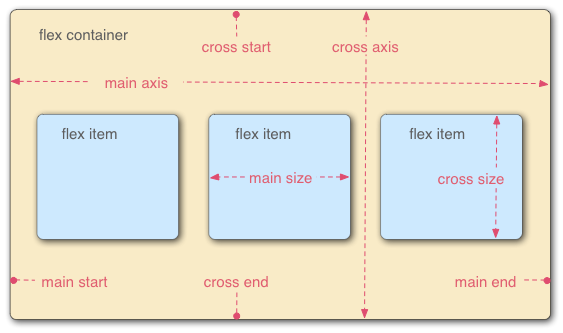
- Flex container
- The parent element in which flex items are contained. A flex container is defined using the
flexorinline-flexvalues of the {{Cssxref("display")}} property. - Flex item
-
Each child of a flex container becomes a flex item. Text directly contained in a flex container is wrapped in an anonymous flex item.
- Axes
-
Every flexible box layout follows two axes. The main axis is the axis along which the flex items follow each other. The cross axis is the axis perpendicular to the main axis.
- The
flex-directionproperty establishes the main axis. - The
justify-contentproperty defines how flex items are laid out along the main axis on the current line. - The
align-itemsproperty defines the default for how flex items are laid out along the cross axis on the current line. - The
align-selfproperty defines how a single flex item is aligned on the cross axis, and overrides the default established byalign-items.
- The
- Directions
-
The main start/main end and cross start/cross end sides of the flex container describe the origin and terminus of the flow of flex items. They follow the main axis and cross axis of the flex container in the vector established by the
writing-mode(left-to-right, right-to-left, etc.).- The
orderproperty assigns elements to ordinal groups and determines which elements appear first. - The
flex-flowproperty shorthands theflex-directionandflex-wrapproperties to lay out the flex items.
- The
- Lines
-
Flex items can be laid out on either a single line or on several lines according to the
flex-wrapproperty, which controls the direction of the cross axis and the direction in which new lines are stacked. - Dimensions
-
The flex items' agnostic equivalents of height and width are main size and cross size, which respectively follow the main axis and cross axis of the flex container.
- The
min-heightandmin-widthproperties initial value is 0. - The
flexproperty shorthands theflex-grow,flex-shrink, andflex-basisproperties to establish the flexibility of the flex items.
- The
Designating a flexible box
To designate the CSS for elements using this style, set the display property as follows:
display : flex
or
display : inline-flex
Doing so defines the element as a flex container and its children as flex items. The flex value makes the flex container a block-level element. The inline-flex value makes the flex container an atomic inline-level element.
display : -webkit-flex.Flex item considerations
Text that is directly contained inside a flex container is automatically wrapped in an anonymous flex item. However, an anonymous flex item that contains only white space is not rendered, as if it were designated display: none.
Absolutely positioned children of a flex container are positioned so that their static position is determined in reference to the main start content-box corner of their flex container.
Currently, due to a known issue, specifying visibility: collapse on a flex item causes it to be treated as if it were display: none instead of the intended behavior, treating it as if it were visibility: hidden. The suggested workaround until this issue is resolved is to use visibility:hidden for flex items that should behave as if they were designated visibility:collapse. For more information, see {{bug(783470)}}.
The margins of adjacent flex items do not collapse. Using auto margins absorbs extra space in the vertical or horizontal direction and can be used for alignment or to separate adjacent flex items. See Aligning with 'auto' margins in the W3C Flexible Box Layout Model specification for more details.
To ensure a reasonable default minimum size for flex items, use min-width:auto and/or min-height:auto. For flex items, the auto attribute value calculates the minimum width/height of the item to be no less than the width/height of its content, guaranteeing that the item is rendered large enough to hold the content. See {{cssxref("min-width")}} and {{cssxref("min-height")}} for more details.
Flexbox's alignment properties do "true" centering, unlike other centering methods in CSS. This means that the flex items will stay centered, even if they overflow the flex container. This can sometimes be problematic, however, if they overflow past the top edge of the page, or the left edge (in LTR languages like English; the problem occurs on the right edge in RTL languages like Arabic), as you can't scroll to that area, even if there is content there! In a future release, the alignment properties will be extended to have a "safe" option as well. For now, if this is a concern, you can instead use margins to achieve centering, as they'll respond in a "safe" way and stop centering if they overflow. Instead of using the align- properties, just put auto margins on the flex items you wish to center. Instead of the justify- properties, put auto margins on the outside edges of the first and last flex items in the flex container. The auto margins will "flex" and assume the leftover space, centering the flex items when there is leftover space, and switching to normal alignment when not. However, if you're trying to replace justify-content with margin-based centering in a multi-line flexbox, you're probably out of luck, as you need to put the margins on the first and last flex item on each line. Unless you can predict ahead of time which items will end up on which line, you can't reliably use margin-based centering in the main axis to replace the justify-content property.
Recall that while the display order of the elements is independent of their order in the source code, this independence affects only the visual rendering, leaving speech order and navigation based on the source order. Even the {{cssxref("order")}} property does not affect speech or navigation sequence. Thus developers must take care to order elements properly in the source so as not to damage the document's accessibility.
Flexible box properties
Properties not affecting flexible boxes
Because flexible boxes use a different layout algorithm, some properties do not make sense on a flex container:
column-*properties of the multiple column module have no effect on a flex item.- {{cssxref("float")}} and {{cssxref("clear")}} have no effect on a flex item. Using
floatcauses thedisplayproperty of the element to compute toblock. - {{cssxref("vertical-align")}} has no effect on the alignment of flex items.
Examples
Basic flex example
This basic example shows how to apply "flexibility" to an element and how sibling elements behave in a flexible state.
<!DOCTYPE html>
<html lang="en">
<head>
<style>
.flex
{
/* basic styling */
width: 350px;
height: 200px;
border: 1px solid #555;
font: 14px Arial;
/* flexbox setup */
display: -webkit-flex;
-webkit-flex-direction: row;
display: flex;
flex-direction: row;
}
.flex > div
{
-webkit-flex: 1 1 auto;
flex: 1 1 auto;
width: 30px; /* To make the transition work nicely. (Transitions to/from
"width:auto" are buggy in Gecko and Webkit, at least.
See https://bugzil.la/731886 for more info.) */
-webkit-transition: width 0.7s ease-out;
transition: width 0.7s ease-out;
}
/* colors */
.flex > div:nth-child(1){ background : #009246; }
.flex > div:nth-child(2){ background : #F1F2F1; }
.flex > div:nth-child(3){ background : #CE2B37; }
.flex > div:hover
{
width: 200px;
}
</style>
</head>
<body>
<p>Flexbox nuovo</p>
<div class="flex">
<div>uno</div>
<div>due</div>
<div>tre</div>
</div>
</body>
</html>
Holy Grail Layout example
This example demonstrates how flexbox provides the ability to dynamically change the layout for different screen resolutions. The following diagram illustrates the transformation.
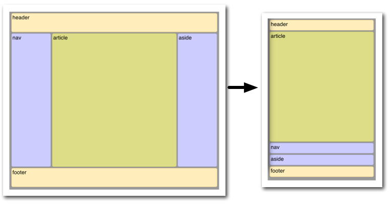
Illustrated here is the case where the page layout suited to a browser window must be optimized for a smart phone window. Not only must the elements reduce in size, but the order in which they are presented must change. Flexbox makes this very simple.
<!DOCTYPE html>
<html lang="en">
<head>
<style>
body {
font: 24px Helvetica;
background: #999999;
}
#main {
min-height: 800px;
margin: 0px;
padding: 0px;
display: -webkit-flex;
display: flex;
-webkit-flex-flow: row;
flex-flow: row;
}
#main > article {
margin: 4px;
padding: 5px;
border: 1px solid #cccc33;
border-radius: 7pt;
background: #dddd88;
-webkit-flex: 3 1 60%;
flex: 3 1 60%;
-webkit-order: 2;
order: 2;
}
#main > nav {
margin: 4px;
padding: 5px;
border: 1px solid #8888bb;
border-radius: 7pt;
background: #ccccff;
-webkit-flex: 1 6 20%;
flex: 1 6 20%;
-webkit-order: 1;
order: 1;
}
#main > aside {
margin: 4px;
padding: 5px;
border: 1px solid #8888bb;
border-radius: 7pt;
background: #ccccff;
-webkit-flex: 1 6 20%;
flex: 1 6 20%;
-webkit-order: 3;
order: 3;
}
header, footer {
display: block;
margin: 4px;
padding: 5px;
min-height: 100px;
border: 1px solid #eebb55;
border-radius: 7pt;
background: #ffeebb;
}
/* Too narrow to support three columns */
@media all and (max-width: 640px) {
#main, #page {
-webkit-flex-flow: column;
flex-direction: column;
}
#main > article, #main > nav, #main > aside {
/* Return them to document order */
-webkit-order: 0;
order: 0;
}
#main > nav, #main > aside, header, footer {
min-height: 50px;
max-height: 50px;
}
}
</style>
</head>
<body>
<header>header</header>
<div id='main'>
<article>article</article>
<nav>nav</nav>
<aside>aside</aside>
</div>
<footer>footer</footer>
</body>
</html>
Playground
There are a few flexbox playgrounds available online for experimenting:
Things to keep in mind
The algorithm describing how flex items are laid out can be pretty tricky at times. Here are a few things to consider to avoid bad surprises when designing using flexible boxes.
Flexible boxes are laid out in conformance of the writing mode, which means that main start and main end are laid out according to the position of start and end.
cross start and cross end rely on the definition of the start or before position that depends on the value of direction.
Page breaks are possible in flexible boxes layout as long as break- property allows it. CSS3 break-after, break-before, and break-inside as well as CSS 2.1 page-break-before, page-break-after, and page-break-inside properties are accepted on a flex container, flex items, and inside flex items.
Browser compatibility
{{CompatibilityTable}}
| Feature | Firefox (Gecko) | Chrome | Internet Explorer | Opera | Safari |
|---|---|---|---|---|---|
| Basic support (single-line flexbox) | {{CompatGeckoDesktop("18.0")}}{{property_prefix("-moz")}}[2] {{CompatGeckoDesktop("22.0")}} |
21.0{{property_prefix("-webkit")}} 29.0 |
11[3] | 12.10{{property_prefix("-webkit")}}[5] | 6.1{{property_prefix("-webkit")}}[1] |
| Multi-line flexbox | {{CompatGeckoDesktop("28.0")}} | 21.0{{property_prefix("-webkit")}} 29.0 |
11[3] | 12.10[5] 15 {{property_prefix("-webkit")}} |
6.1{{property_prefix("-webkit")}}[1] |
| Feature | Firefox Mobile (Gecko) | Firefox OS | Android | IE Phone | Opera Mobile | Safari Mobile |
|---|---|---|---|---|---|---|
| Basic support (single-line flexbox) | {{CompatGeckoMobile("18.0")}}{{property_prefix("-moz")}}[2] {{CompatGeckoMobile("22.0")}} |
1.0{{property_prefix("-moz")}}[2] |
2.1{{property_prefix("-webkit")}}[4] 4.4 |
11 | 12.10[5] 15{{property_prefix("-webkit")}} |
7{{property_prefix("-webkit")}}[1] |
| Multi-line flexbox | {{CompatGeckoMobile("28.0")}} | 1.3 | 2.1{{property_prefix("-webkit")}}[4] 4.4 |
11 | 12.10[5] 15{{property_prefix("-webkit")}} |
7{{property_prefix("-webkit")}}[1] |
[1] Safari up to version 6.0 (iOS.1) supported an old incompatible draft version of the specification. Safari 6.1 (and Safari on iOS 7) has been updated to support the final version.
[2] Up to Firefox 22, to activate flexbox support, the user has to change the about:config preference layout.css.flexbox.enabled to true. From Firefox 22 to Firefox 27, the preference is true by default, but the preference has been removed in Firefox 28.
[3] Internet Explorer 10 supports an old incompatible draft version of the specification; Internet Explorer 11 has been updated to support the final version.
[4] Android browser up to 4.3 supported an old incompatible draft version of the specification. Android 4.4 has been updated to support the final version.
[5] While in the initial implementation in Opera 12.10 flexbox was not prefixed, it got prefixed in versions 15 to 16 of Opera and 15 to 19 of Opera Mobile with {{property_prefix("-webkit")}}. The prefix was removed again in Opera 17 and Opera Mobile 24.
See also
- The Flexbugs project for information on bugs in browsers' implementations of flexbox.